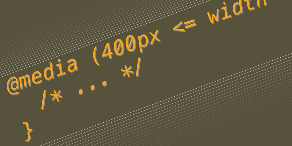
The New CSS Media Query Range Syntax
The Media Queries Level 4 specification has introduced a new syntax for targeting a range of viewport widths using common mathematical comparison operators, like <, >, and =, that make more sense syntactically while writing less code for responsive web design.


