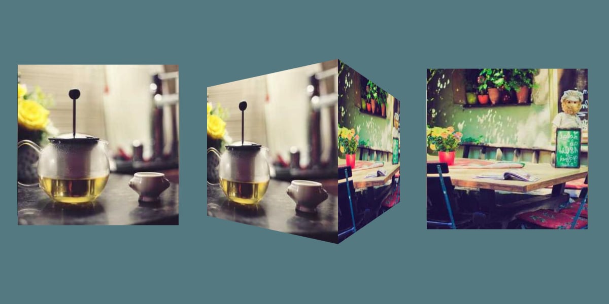
How to Make CSS Slanted Containers
I was updating my portfolio and wanted to use the forward slash (/
) as a visual element for the site’s main layout. I hadn’t attempted to create a slanted container in CSS before, but it seemed like it …
I was updating my portfolio and wanted to use the forward slash (/
) as a visual element for the site’s main layout. I hadn’t attempted to create a slanted container in CSS before, but it seemed like it …
You know, Porky Pig coming out of those red rings announcing the end of a Looney Tunes cartoon. We’ll get there, but first we need to cover some CSS concepts.…
The WebKit blog details how to use individual CSS Transform properties in the latest version of Safari Technology Preview. This brings the browser in line with the CSS Transforms Module Level 2 spec, which breaks out the translate()
, …
As someone who loves creating CSS animations, one of the more powerful tools I use is perspective
. While the perspective
property is not capable of 3D effects all by itself (since basic shapes can’t have depth), you can use …
This was always my favorite thing in Mad magazine. One page (the inside of the back cover, I think) was covered in a zany illustration. You folded that page in thirds, covering up the middle-third of that image, and a …
I was in a situation recently where I wanted to show an iPhone on a website. I wanted users to be able to interact with an application demo on this “mock” phone, so it had to be rendered in CSS, …
Nils Binder covers the ways:
…1. Use an SVG in the form of a triangle. This technique is nicely described by Erik Kennedy on CSS-Tricks.
2. Hide part of your section using
clip-path
. Read Diagonal Containers in
The design for Netflix’s browse page has remained pretty similar for a few years now. One mainstay component is the preview slider that allows users to scroll through content and hover on items to see a preview.
One unique characteristic …
Firefox 72 was first out of the gate with “independent transforms.” That is, instead of having to combine transforms together, like:
.el {
transform: translate(10px, 10px) scale(0.95) rotate(10deg);
}
…we can do:
.el {
rotate: 10deg;
scale: 0.95;
translate: 10px
… Earlier this year, I came across this demo by Florin Pop, which makes a line go either over or under the letters of a single line heading. I thought this was a cool idea, but there were a few little …
I’ve recently noticed an interesting change on CodePen: on hovering the pens on the homepage, there’s a rectangle with rounded corners expanding in the back.…