Direct link to the article How to Make a Media Query-less responsive Card Component

How to Make a Media Query-less responsive Card Component

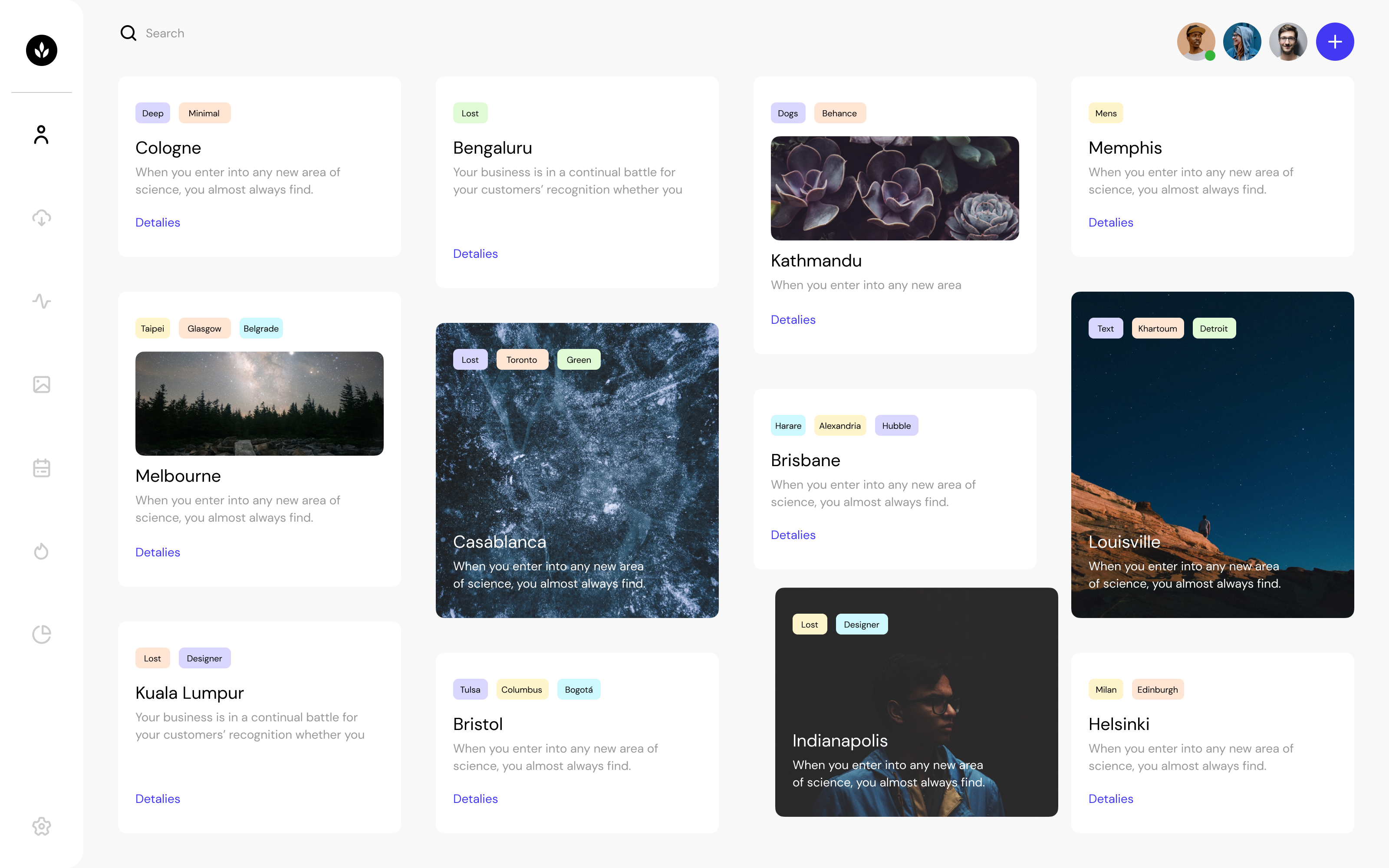
Fun fact: it’s possible to create responsive components without any media queries at all. Certainly, if we had container queries, those would be very useful for responsive design at the component level. But we don’t. Still, with or without …

Avatar of Geoffrey Crofte
Geoffrey Crofte on (Updated on )
Direct link to the article Simplified Fluid Typography

Simplified Fluid Typography

Fluid typography is the idea that font-size (and perhaps other attributes of type, like line-height) change depending on the screen size (or perhaps container queries if we had them).

The core trickery comes from viewport units. You can literally set type in viewport units (e.g. font-size: 4vw), but the fluctuations in size are so extreme that's usually undesirable. Let's look at a technique for tamping the extremes, but it basically a one-liner now that CSS is evolving!

Avatar of Chris Coyier
Chris Coyier on (Updated on )