The Devil’s Albatross
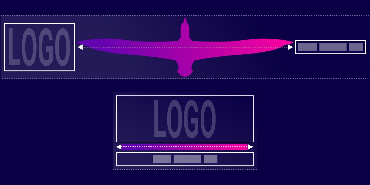
Nils Binder talks about a technique for spacing between two elements. Picture a header on a large screen with a logo in the upper left and nav in the upper right. Then a small screen, when they can no longer …
CSS doesn’t have max-font-size
, so if we need something that does something along those lines, we have to get tricky.
Why would you need it at all? Well, font-size
itself can be set in dynamic ways. For example, font-size:
…
Christian Schaefer has a great big write-up about dealing with web advertisements. The whole thing is interesting, first documenting all the challenges that ads present, and then presenting modern solutions to each of them.
One code snippet that caught …
Ever have that, “Ugighgk, another device to support?!” feeling? Like, perhaps when you heard that wrist devices have browsers? Ethan’s latest post is about that.
…Personally, the Apple Watch is interesting to me not because it’s a watch. Rather,
After all the hubbub with WWDC over the past couple of days, Ethan Marcotte is excited about the news that the Apple Watch will be able to view web content.
He writes:
…If I had to guess, I’d imagine
Media queries are great for changing values in sudden snaps at different screen sizes. But, combining the power of calc()
and viewport units like vw
and vh
, we can get an awful lot of fluidity across our layouts. For …
Kevin Vigneault:
…I don’t believe that the overall page length itself is inherently problematic. I have noticed though that in many responsive designs, purposeful groupings of content are easy to spot on larger screens, but get muddled when things start
Scaling our websites and applications so that they look great on every screen can be difficult. A big portion of that difficulty can be trying to get specific components, particularly ones that have pieces that have to stay a certain …
I’m guilty of using responsive images by taking a high res image and downsizing it a few times kinda randomly and using those as the srcset images. Basically the same “desktop”, “tablet”, “mobile” thinking I can also be guilty of …
Matthew Ström on how data tables can be better through things like alignment, rules, labels, backgrounds, and the type of numerals used:
…Oldstyle figures look nice in sentences, where they better match the size and spacing of lower-case letters; lining
The following is a guest post by Jon Yablonski. Jon told me he recently worked on a project where there was a lot of emphasis placed on giant screens. Jon is going to show us that just like RWD …