- This topic is empty.
-
AuthorPosts
-
April 13, 2012 at 5:30 am #37609
janmense
ParticipantHey there,
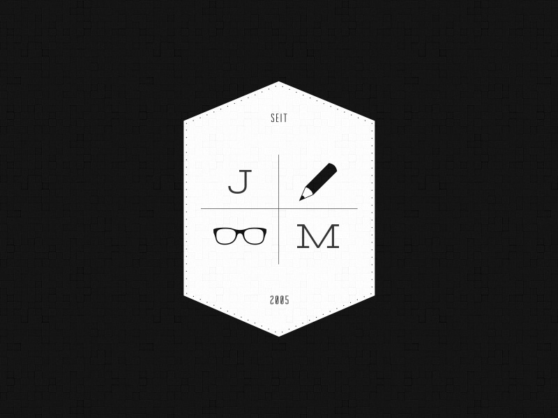
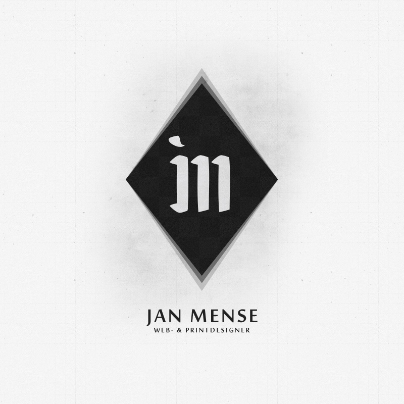
i actually redesign my logo!
My name is jan mense and my name will allways be shown next to it!
Please give me some feedback, thanks!
April 13, 2012 at 6:50 am #101142Participantis janeleo spam?
April 13, 2012 at 12:03 pm #101140chrisburton
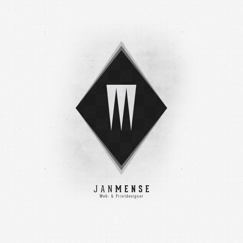
ParticipantPretty awesome start and it looks great on that background!
I think this just needs a few minor tweaks. I would tighten the loop of the “j”, bring the horizontal stroke further down and keep the stem more vertical. With those changes you might even have to add a stem to what looks like an “n”.
The typeface used on “Design Studio” and “Janmense” doesn’t really compliment the custom script. I would try experimenting a little more with that.
I hope this helps!
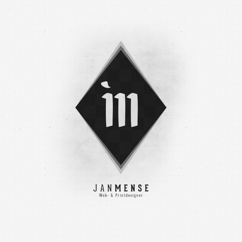
April 13, 2012 at 3:04 pm #101131Participant@Schmotty Scribble? My feedback would result to @janmense having to re-loop the “j” completely and most likely have the “m” connect in another way. If you look at the curves of the “m” then, where the “j” connects to the “m”, that whole loop looks odd as it’s wider. That makes the “m” seem like an “n”.
April 17, 2012 at 2:29 am #101288ParticipantOk, i’ll try it.
Do you have a suggestion for the typeface ?
April 17, 2012 at 12:35 pm #101311Participant@janmense Hmm. You know, personally, all I would do is experiment. I would stay more on the modern side, though. That would certainly compliment the monogram.
Once you complete it, I can probably help you more with that.
On a side note – This thread inspired me to actually sketch my own version.
April 18, 2012 at 4:52 am #101349April 18, 2012 at 8:30 am #101363April 18, 2012 at 9:22 am #101371ParticipantMe too but it now looks like “in”
The bottom text won’t be legible if you need to scale it down a little.
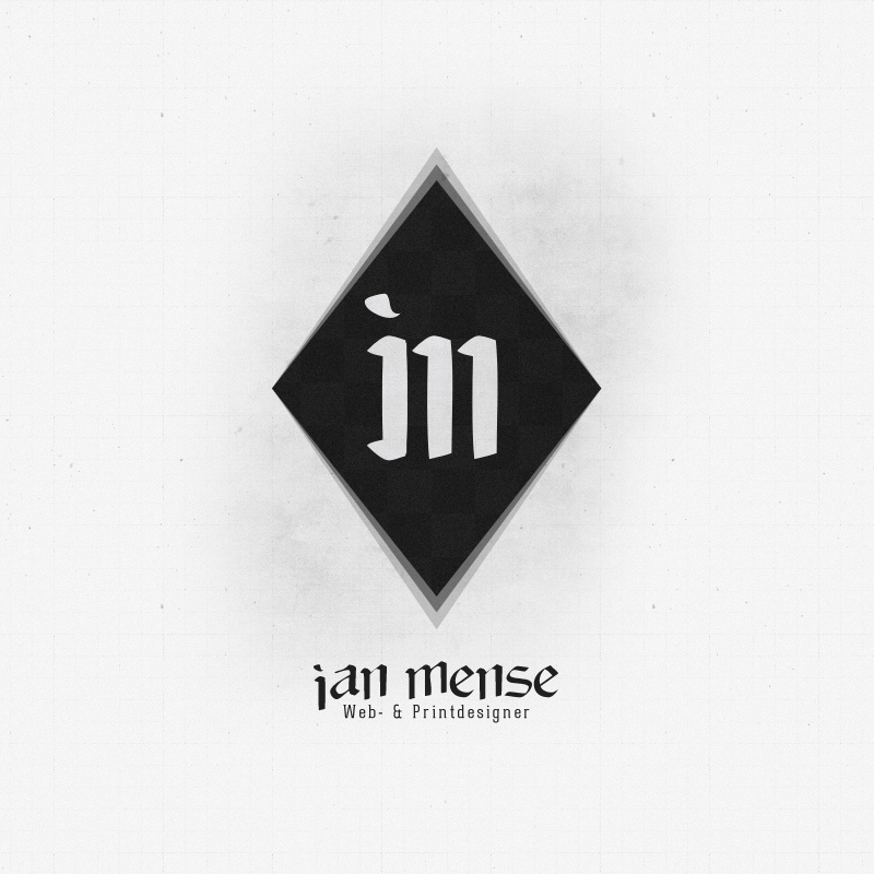
April 18, 2012 at 9:39 am #101373ParticipantApril 18, 2012 at 9:42 am #101374ParticipantNice, man. The other typeface looks a lot better with it, though.
Edit: Print Designer should be two words
April 18, 2012 at 9:48 am #101375Participantnot in germany ;-)
April 18, 2012 at 10:05 am #101378April 18, 2012 at 10:13 am #101379ParticipantThat doesn’t work in my opinion.
Also, it seems you went in a completely different direction with your logo, why?
April 18, 2012 at 10:19 am #101381Participantdo you have a tip for me?
serif, sans-serif, slab-serif etc ?
-
AuthorPosts
- The forum ‘Other’ is closed to new topics and replies.