In CSS, you might see a ruleset like this:
html {
  font-family: Lato, "Lucida Grande", Tahoma, Sans-Serif;
}
What the heck, right? Why don’t I just tell it what font I want to use and that’s that? The whole idea here is fallbacks. The browser will try to use the font you specified first (Lato, in this case), but if it doesn’t have that font available, it will keep going down that list. So to be really verbose here, what that rule is saying is:
- I’d like to use the Lato font here, please.
- If you don’t have that, try “Lucida Grande” next.
- If you don’t have that, try Tahoma.
- All else fails, use whatever you’ve got for the generic keyword
Sans-Serif
So in what situation would a browser not have the font you’re asking for? That’s pretty common. There are only a handful of fonts that are considered “web safe”—meaning that it’s likely most computers visiting your site have that font installed and so the browser can use it. Think: Arial, Times New Roman, Courier, Georgia, Verdana, and a handful of others.
But most websites, these days, use custom web fonts. They load up a font as a resource (just as a website loads CSS itself as a resource, or an image, or JavaScript), then that font is available to use. The widely popular Google Fonts makes that pretty clear:

Even when you load a font in this way, it’s still possible that the font doesn’t load. While Google is a generally very reliable host, you don’t control their servers; they do. Even more commonly, poor network connections may prevent a font from loading. In any font loading failure scenario, that’s another situation where a fallback font stack comes in handy.
Say I’m using the custom font Merriweather, and I set up my font stack like this:
html {
  font-family: Merriweather, Impact, Serif;
}
If Merriweather fails to load (or does load, but loads in such a way that it pops into place after it does—also known as FOUT), we’d see something like this:

Better to have your font fall back to something close to your top choice than to something totally unrelated! There is a fantastic tool by Monica Dinculescu call Font style matcher where you can play with fallbacks (that’s how I made that GIF above).
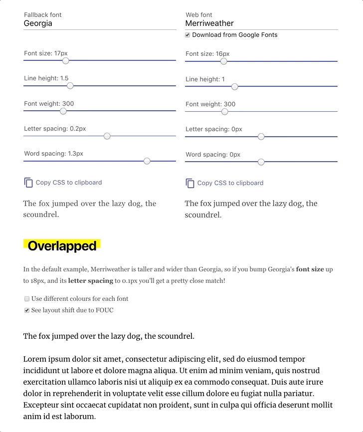
In the example above, we can see that Georgia is a much nicer fallback font than Impact is! The example is a little bit more fancy than just changing the font though. A couple of other settings were changed to make them match as closely as they are. To take advantage of that, you’re in font loading territory, which gets a bit complex. Your best bet there is consulting Zach Leatherman’s A Comprehensive Guide to Font Loading. In any case, picking a nice fallback font alone is worth doing.
Individual Characters
An interesting note about fallback fonts is that it’s not all-or-nothing. Individual characters in a font can fall down the stack if the specified font doesn’t have that character available.
As an extreme example, I’ll load the custom font Source Code Pro from Google Fonts but I’ll force it to only contain a handful of letters.

You can see in the first sentence how the fallback fonts took over and the end result wasn’t disastrous (like the second sentence) even though the custom font didn’t have some of the characters available. This will be more likely to happen with things like uncommon ASCII characters or even accented characters like ü, ā, or ñ.
As some side fun, here’s using that character fallback ability of CSS to do something unique:
More Reading
- Font Stack Snippets: Some common font stacks
- CSS Font Stack: A collection of web safe CSS font stacks
- System Font Stack: A snippet that uses the computer’s default system font
These “CSS Basics” series articles are nice for learning and for refreshing. Lots of really nice bits of information, good idea and good stuff Chris. I would maybe suggest adding a TAG for “CSS Basics” for each of these articles and pages though.
Realize this is titled fallback fonts, but wanted to share that using a font stack in reverse can provide many benefits as well.
Using a stack relying on resources the user mostly has in their environment saves a lot of overhead for the user and experience.