I recently came across this Pen and my first thought was that it could all be done with just three elements: a wrapper, a range input and an output. On the CSS side, this involves using a conic-gradient() with a stop set to a CSS variable.

In mid 2015, Lea Verou unveiled a polyfill for conic-gradient() during a conference talk where she demoed how they can be used for creating pie charts. This polyfill is great for getting started to play with conic-gradient(), as it allows us to use them to build stuff that works across the board. Sadly, it doesn’t work with CSS variables and CSS variables have become a key component of writing efficient code these days.
The good news is that things have moved a bit over the past two years and a half. Chrome and, in general, browsers using Blink that expose flags (like Opera for example) now support conic-gradient() natively (yay!), which means it has become possible to experiment with CSS variables as conic-gradient() stops. All we need to do is have the Experimental Web Platform Features flag enabled in chrome://flags (or, if you’re using Opera, opera://flags):

Alright, now we can get started!
The Initial Structure
We start with a wrapper element and a range input:
<div class="wrap">
  <input id="r" type="range"/>
</div>
Note that we don’t have an output element there. This is because we need JavaScript to update the value of the output element anyway and we don’t want to see an ugly useless non-updating element if the JavaScript is disabled or fails for some reason. So we add this element via JavaScript and also, based on whether the current browser supports conic-gradient() or not, we add a class on the wrapper to signal that.
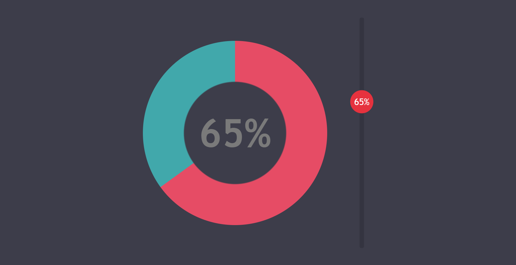
If our browser supports conic-gradient(), the wrapper gets a class of .full and we style the output into a chart. Otherwise, we just have a simple slider without a chart, the output being on the slider thumb.

conic-gradient() (top) and the fallback in browsers not supporting it (bottom).Basic Styles
Before anything else, we want to show a nice-looking slider on the screen in all browsers.
We start with the most basic reset possible and set a background on the body:
$bg: #3d3d4a;

* { margin: 0 }

body { background: $bg }
The second step is to prepare the slider for styling in WebKit browsers by setting -webkit-appearance: none on it and on its thumb (because the track already has it set by default for some reason) and we make sure we level the field by explicitly setting the properties that are inconsistent across browsers like padding, background or font:
[type='range'] {
  &, &::-webkit-slider-thumb { -webkit-appearance: none }

  display: block;
  padding: 0;
  background: transparent;
  font: inherit
}
If you need a refresher on how sliders and their components work in various browsers, check out my detailed article on understanding the range input.
We can now move on to the more interesting part. We decide upon the dimensions of the track and thumb and set these on the slider components via the corresponding mixins. We’ll also include some background values so that we have something visible on the screen as well as a border-radius to prettify things. For both components, we also reset the border to none so that we have consistent results across the board.
$k: .1;
$track-w: 25em;
$track-h: .02*$track-w;
$thumb-d: $k*$track-w;

@mixin track() {
  border: none;
  width: $track-w; height: $track-h;
  border-radius: .5*$track-h;
  background: #343440
}

@mixin thumb() {
  border: none;
  width: $thumb-d; height: $thumb-d;
  border-radius: 50%;
  background: #e6323e
}

[type='range'] {
  /* same styles as before */
  width: $track-w; height: $thumb-d;

  &::-webkit-slider-runnable-track { @include track }
  &::-moz-range-track { @include track }
  &::-ms-track { @include track }

  &::-webkit-slider-thumb {
    margin-top: .5*($track-h - $thumb-d);
    @include thumb
  }
  &::-moz-range-thumb { @include thumb }
  &::-ms-thumb {
    margin-top: 0;
    @include thumb
  }
}
We add a few more touches like setting a margin, an explicit width and a font on the wrapper:
.wrap {
  margin: 2em auto;
  width: $track-w;
  font: 2vmin trebuchet ms, arial, sans-serif
}
We don’t want to let this get too small or too big, so we limit the font-size:
.wrap {
  @media (max-width: 500px), (max-height: 500px) { font-size: 10px }
  @media (min-width: 1600px), (min-height: 1600px) { font-size: 32px }
}
And we now have a nice cross-browser slider:
See the Pen by thebabydino (@thebabydino) on CodePen.
The JavaScript
We start by getting the slider and the wrapper and creating the output element.
const _R = document.getElementById('r'),
      _W = _R.parentNode,
      _O = document.createElement('output');
We create a variable val where we store the current value of our range input:
let val = null;Next, we have an update() function that checks whether the current slider value is equal to the one we have already stored. If that’s not the case, we update the JavaScript val variable, the text content of the output and the CSS variable --val on the wrapper.
function update() {
  let newval = +_R.value;

  if(val !== newval)
    _W.style.setProperty('--val', _O.value = val = newval)
};
Before we move further with the JavaScript, we set a conic-gradient() on the output from the CSS:
output {
  background: conic-gradient(#e64c65 calc(var(--val)*1%), #41a8ab 0%)
}
We put things in motion by calling the update() function, adding the output to the DOM as a child of the wrapper and then testing whether the computed background-image of the output is the conic-gradient() we have set or not (note that we need to add it to the DOM before we do this).
If the computed background-image is not "none" (as it is the case if we have no native conic-gradient() support), then we add a full class on the wrapper. We also connect the output to the range input via a for attribute.
Via event listeners, we ensure the update() function is called every time we move the slider thumb.
_O.setAttribute('for', _R.id);
update();
_W.appendChild(_O);

if(getComputedStyle(_O).backgroundImage !== 'none')
  _W.classList.add('full');

_R.addEventListener('input', update, false);
_R.addEventListener('change', update, false);
We now have a slider and an output (that shows its value on a variable conic-gradient() background if we’re viewing it in a browser with native conic-gradient() support). Still ugly at this stage, but it’s functional—the output updates when we drag the slider:
See the Pen by thebabydino (@thebabydino) on CodePen.
We’ve also given the output a light color value so that we can see it better and added a % at the end via the ::after pseudo-element. We’ve also hidden the tooltip (::-ms-tooltip) in Edge by setting its display to none.
The no chart case
This is the case when we don’t have conic-gradient() support so we don’t have a chart. The result we’re aiming for can be seen below:

Prettifying the Output
In this case, we absolutely position the output element, make it take the dimensions of the thumb and put its text right in the middle:
.wrap:not(.full) {
  position: relative;

  output {
    position: absolute;

    /* ensure it starts from the top */
    top: 0;

    /* set dimensions */
    width: $thumb-d; height: $thumb-d
  }
}

/* we'll be using this for the chart case too */
output {
  /* place text in the middle */
  display: flex;
  align-items: center;
  justify-content: center;
}
If you need a refresher on how align-items and justify-content work, check out this comprehensive article on CSS alignment by Patrick Brosset.
The result can be seen in the following Pen, where we’ve also set an outline in order to clearly see the boundaries of the output:
See the Pen by thebabydino (@thebabydino) on CodePen.
This is starting to look like something, but our output isn’t moving with the slider thumb.
Making the Output Move
In order to fix this problem, let’s first remember how the motion of a slider thumb works. In Chrome, the border-box of the thumb moves within the limits of the track’s content-box, while in Firefox and Edge, the thumb’s border-box moves within the limits of the actual slider’s content-box.
While this inconsistency may cause problems in some situations, our use case here is a simple one. We don’t have margins, paddings or borders on the slider or on its components, so the three boxes (content-box, padding-box and border-box) coincide with both the slider itself and its track and thumb components. Furthermore, the width of the three boxes of the actual input coincides with the width of the three boxes of its track.
This means that when the slider value is at its minimum (which we haven’t set explicitly, so it’s the default 0), the left edge of the thumb’s boxes coincides with the left edge of the input (and with that of the track).
Also, when the slider value is at its maximum (again, not set explicitly, so it takes the default value 100), the right edge of the thumb’s boxes coincides with the right edge of the input (and with that of the track). This puts the left edge of the thumb one thumb width ($thumb-d) before (to the left of) the right edge of the slider (and of the track).
The following illustration shows this relative to the input width ($track-w)—this is shown to be 1. The thumb width ($thumb-d) is shown as a fraction k of the input width (since we’ve set it as $thumb-d: $k*$track-w).

From here, we get that the left edge of the thumb has moved by an input width ($track-w) minus a thumb width (thumb-d) in between the minimum and the maximum.
In order to move the output the same way, we use a translation. In its initial position, our output is at the leftmost position of the thumb, the one occupied when the slider value is at its minimum, so the transform we use is translate(0). To move it into the position occupied by the thumb when the slider value is at its maximum, we need to translate it by $track-w - $thumb-d = $track-w*(1 - $k).

output (live).Alright, but what about the values in between?
Well, remember that every time the slider value gets updated, we’re not only setting the new value to the output‘s text content, but also to a CSS variable --val on the wrapper. This CSS variable goes between 0 at the left end (when the slider value is its minimum, 0 in this case) and 100 at the other end (when the slider value is its maximum, 100 in this case).
So if we translate our output along the horizontal (x) axis by calc(var(--val)/100*#{$track-w - $thumb-d}), this moves it along with the thumb without us needing to do anything else:
See the Pen by thebabydino (@thebabydino) on CodePen.
Note how the above works if we click elsewhere on the track, but not if we try to drag the thumb. This is because the output now sits on top of the thumb and catches our clicks instead.
We fix this problem by setting pointer-events: none on the output.
See the Pen by thebabydino (@thebabydino) on CodePen.
In the demo above, we have also removed the ugly outline on the output element as we don’t need it anymore.
Now that we have a nice fallback for browsers that don’t support conic-gradient() natively, we can move on to building the result we want for those that do (Chrome/ Opera with flag enabled).
The Chart Case
Drawing the Desired Layout
Before we start writing any code, we need to clearly know what we’re trying to achieve. In order to do that, we do a layout sketch with dimensions relative to the track width ($track-w), which is also the width of the input and the edge of the wrapper’s content-box (wrapper padding not included).
This means the content-box of our wrapper is a square of edge 1 (relative to the track width), the input is a rectangle having one edge along and equal to an edge of the wrapper and the other one a fraction k of the same edge, while its thumb is a kxk square.

The chart is a square of edge 1 - 2·k, touching the wrapper edge opposite to the slider, a k gap away from the slider and in the middle along the other direction. Given that the edge of the wrapper is 1 and that of the chart is 1 - 2·k, it results we have k gaps between the edges of the wrapper and those of the chart along this direction as well.
Sizing Our Elements
The first step towards getting this layout is making the wrapper square and setting the dimensions of the output to (1 - 2*$k)*100%:
$k: .1;
$track-w: 25em;
$chart-d: (1 - 2*$k)*100%;

.wrap.full {
  width: $track-w;

  output {
    width: $chart-d; height: $chart-d
  }
}
The result can be seen below, where we’ve also added some outlines to see things better:

conic-gradient() support).This is a good start, as the output is already in the exact spot we want it to be.
Making the Slider Vertical
The “official” way of doing this for WebKit browsers is by setting -webkit-appearance: vertical on the range input. However, this would break the custom styles as they require us to have -webkit-appearance set to none and we cannot have it set to two different values at the same time.
So the only convenient solution we have is to use a transform. As it is, we have the minimum of the slider at the left end of the wrapper and the maximum at its right end. What we want is to have the minimum at the bottom of the wrapper and the maximum at the top of the wrapper.

This sounds like a 90° rotation in the negative direction (as the clockwise direction is the positive one) around the top right corner (which gives us a transform-origin that’s at 100% horizontally and 0% vertically).
See the Pen by thebabydino (@thebabydino) on CodePen.
That’s a good start, but now our slider is outside the wrapper boundary. In order to decide what’s the best next step to bring it inside in the desired position, we need to understand what this rotation has done. Not only has it rotated the actual input element, but it has also rotated its local system of coordinates. Now its x axis points up and its y axis points to the right.
So in order to bring it inside, along the right edge of the wrapper, we need to translate it by its own height in the negative direction of its y axis after the rotation. This means the final transform chain we apply is rotate(-90deg) translatey(-100%). (Remember that % values used in translate() functions are relative to the dimensions of the translated element itself.)
.wrap.full {
  input {
    transform-origin: 100% 0;
    transform: rotate(-90deg) translatey(-100%)
  }
}
This gives us the desired layout:

conic-gradient() support).Styling the Chart
Of course, the first step is to make it round with border-radius and tweak the color, font-size and font-weight properties.
.wrap.full {
  output {
    border-radius: 50%;
    color: #7a7a7a;
    font-size: 4.25em;
    font-weight: 700
  }
}
You may have noticed we’ve set the dimensions of the chart as (1 - 2*$k)*100% instead of (1 - 2*$k)*$track-w. This is because $track-w is an em value, meaning that the computed pixel equivalent depends on the font-size of the element that uses it.
However, we wanted to be able to increase the font-size here without having to tweak down an em-valued size. This is possible and not that complicated, but compared to just setting the dimensions as % values that don’t depend on the font-size, it’s still a bit of extra work.

conic-gradient() support).From Pie 🥧 to Doughnut 🍩
The simplest way to emulate that hole in the middle where we have the text is to add another background layer on top of the conic-gradient() one. We could probably add some blend modes to do the trick, but that’s not really necessary unless we have an image background. For a solid background as we have here, a simple cover layer will do.
$p: 39%;
background: radial-gradient($bg $p, transparent $p + .5% /* avoid ugly edge */),
            conic-gradient(#e64c65 calc(var(--val)*1%), #41a8ab 0%);
Alright, this does it for the chart itself!

conic-gradient() support).Showing the Value on the Thumb
We do this with an absolutely positioned ::after pseudo-element on the wrapper. We give this pseudo-element the dimensions of the thumb and position it in the bottom right corner of the wrapper, precisely where the thumb is when the slider value is at its minimum.
.wrap.full {
  position: relative;

  &::after {
    position: absolute;
    right: 0; bottom: 0;
    width: $thumb-d; height: $thumb-d;
    content: '';
  }
}
We also give it an outline just so that we can see it.

conic-gradient() support).Moving it along with the thumb is achieved exactly the same as in the no chart case, except this time the translation happens along the y axis in the negative direction (instead of along the x axis in the positive direction).
transform: translatey(calc(var(--val)/-100*#{$track-w - $thumb-d}))In order to be able to drag the thumb underneath, we have to also set pointer-events: none on this pseudo-element. The result can be seen below—dragging the thumb also moves the wrapper’s ::before pseudo-element.

conic-gradient() support).Alright, but what we really want here is to display the current value using this pseudo-element. Setting its content property to var(--val) does nothing, as --val is a number value, not a string. If we were to set it as a string, we could use it as a value for content, but then we couldn’t use it for calc() anymore.
Fortunately, we can get around this problem with a neat trick using CSS counters:
counter-reset: val var(--val);
content: counter(val)'%';
Now the whole thing is functional, yay!

conic-gradient() support).So let’s move on to prettifying and adding some nice touches. We put the text in the middle of the thumb, we make it white, we get rid of all the outlines and we set cursor: pointer on the input:
.wrap.full {
  &::after {
    line-height: $thumb-d;
    color: #fff;
    text-align: center
  }
}

[type='range'] {
  /* same as before */
  cursor: pointer
}
This gives us the following nice result:
conic-gradient() support).Eliminating Repetition
One thing that’s nagging me is the fact that we have a bunch of common styles on the output in the no chart case and on the .wrap:after in the chart case.

output in the no chart case vs. styles on the .wrap:after in the chart case.We can do something about this and that’s using a silent class we then extend:
%thumb-val {
  position: absolute;
  width: $thumb-d; height: $thumb-d;
  color: #fff;
  pointer-events: none
}

.wrap {
  &:not(.full) output {
    @extend %thumb-val;
    /* same other styles */
  }

  &:after {
    @extend %thumb-val;
    /* same other styles */
  }
}
Nice Focus Styles
Let’s say we don’t want to have that ugly outline on :focus, but we also want to clearly differentiate this state visually. So what could we do? Well, let’s say we make the thumb smaller and a bit desaturated when the input isn’t focused and that we also hide the text in this case.
Sounds like a cool idea…but, since we have no parent selector, we cannot trigger a property change on the ::after of the slider’s parent when the slider gets or loses focus. Ugh.
What we can do instead is use the output‘s other pseudo-element (the ::before) to display the value on the thumb. This doesn’t come without any of its own complications, which we’ll discuss in a moment, but it allows us to do something like this:
[type='range']:focus + output:before { /* focus styles */ }The problem with taking this approach is that we’re blowing up the font on the output itself, but for its ::before we need it to be the same size and weight as on the wrapper.
We can solve this by setting a relative font size as a Sass variable $fsr and then use that value to blow up the font on the actual output and bring it back down to its previous size on the output:before pseudo-element.
$fsr: 4;

.wrap {
  color: $fg;

  &.full {
    output {
      font-size: $fsr*1em;

      &:before {
        /* same styles as we had on .wrap:after */
        font-size: 1em/$fsr;
        font-weight: 200;
      }
    }
  }
}
Other than that, we just move the CSS declarations we had on the .wrap:after on the output:before.

output pseudo-element.Alright, now we can move on to the final step of differentiating between the normal and the focused look.
We start by hiding the ugly :focus state outline and the value on the thumb when the slider isn’t focused:
%thumb-val {
  /* same styles as before */
  opacity: 0;
}

[type='range']:focus {
  outline: none;

  .wrap:not(.full) & + output,
  .wrap.full & + output:before { opacity: 1 }
}
conic-gradient() support).Next, we set different styles for the normal and focused states of the slider thumb:
@mixin thumb() {
  /* same styles as before */
  transform: scale(.7);
  filter: saturate(.7)
}

@mixin thumb-focus() {
  transform: none;
  filter: none
}

[type='range']:focus {
  /* same as before */
  &::-webkit-slider-thumb { @include thumb-focus }
  &::-moz-range-thumb { @include thumb-focus }
  &::-ms-thumb { @include thumb-focus }
}
conic-gradient() support).The last step is to add a transition between these states:
$t: .5s;

@mixin thumb() {
  /* same styles as before */
  transition: transform $t linear, filter $t
}

%thumb-val {
  /* same styles as before */
  transition: opacity $t ease-in-out
}
conic-gradient() support).What About Screen Readers?
Since screen readers these days read generated content, we’d have the % value read twice in this case. So we go around this by setting role='img' on our output and then putting the current value that we want to be read in an aria-label attribute:
let conic = false;

function update() {
  let newval = +_R.value;

  if(val !== newval) {
    _W.style.setProperty('--val', _O.value = val = newval);
    if(conic) _O.setAttribute('aria-label', `${val}%`)
  }
};

update();

_O.setAttribute('for', _R.id);
_W.appendChild(_O);

if(getComputedStyle(_O).backgroundImage !== 'none') {
  conic = true;
  _W.classList.add('full');
  _O.setAttribute('role', 'img');
  _O.setAttribute('aria-label', `${val}%`)
}
The final demo can be found below. Note that we only see the fallback if your browser has no native conic-gradient() support
See the Pen by thebabydino (@thebabydino) on CodePen.
Final Words
While the browser support for this is still poor, the situation will change. For now it’s just Blink browsers that expose flags, but Safari lists conic-gradient() as being in development, so things are already getting better.
If you’d like cross-browser support to become a reality sooner rather than later, you can contribute by voting for conic-gradient() implementation in Edge or by leaving a comment on this Firefox bug on why you think this is important or what use cases you have in mind. here are mine for inspiration.
Awesome article, Ana. Thank you for writing it!
I love how we can interact with JavaScript and CSS via custom properties. It feels so much cleaner than some of the past approaches that we’ve employed.
The future (and present) is looking very bright :)
You mention CSS variables being critical these days. Are you referring to native CSS variables or preprocessor variables ?
I always mean native variables when I say “CSS variables”. Otherwise, I’d just say preprocessor variables.