The following is a guest post by Rajoshi Ghosh and Tanmai Gopal of 34 Cross. They emailed me to show me their new website and how performant it was despite having cool features, being visually rich, and responsive. I was like, hey, you should write about it! This is that. Bask in the math.
Update: they have updated the site since this article was published. They have kept the site up that this article refers to at old.34cross.in”, and I’ll change the links in this article to that.
Another Update: Looks like the “old” site is dead now too, we’ll just remove all links to it.
At 34 Cross, we wanted to develop our new website to be responsive, mobile-friendly, and easily load on even 2G networks using only HTML and CSS. In this article, we’ll tell you about the challenges we faced in both the design and speed optimization of the site, and how we overcame them. First, we’ll focus on the scrolling parallax effect. Next, we show some interactive features that are possible through CSS alone. Finally, we include a checklist of things to consider for performance in general.

Part 1. The CSS only parallax effect
We built our CSS parallax based on (perhaps the first) CSS parallax concept by Keith Clark. His key idea behind parallax is beautifully simple. Essentially elements that are “closer” to you move more quickly and elements “farther away” move slower as you scroll. It is a layered effect of different elements moving at different speeds.
This is unusual for a website, where normally all elements are placed on a flat plane and everything moves at the same speed when you scroll. But if we look at a website as a 3D world projected on our computer screen, we can move some stuff really far behind our screen, and let some other stuff remain in front. Scrolling vertically then makes things further away move slower and the things in front move faster. Voila, parallax! Exactly how it works in the real world.
1.1. A brief aside into CSS 3D geometry
CSS’s 3D transforms allow us to look at the elements of a website like this:

The point C is the computer screen center, and the top-left corner of the screen (from the user’s point of view) is the origin. Web elements can be positioned anywhere, and the browser rendering engine will project those elements onto our screen and let us view them. This is essentially the same thing as drawing in 3D.
The first step here is defining the perspective:
- Choose an element to be your 3D projection surface. It doesn’t need to be the entire screen.
- Tell the browser how far you want the projected surface to seem to be from your eyes.
Both of these things are done by defining the perspective property on an element. The perspective property essentially defines the length p from the figure above (Fig 1). The lower the value of p, the more intense the 3D effect. The larger the value, the less intense it is.
1.2. Implementing Parallax
Let’s define the element through which we’ll be viewing our 3D world.
- We want the entire viewport to be our view into the 3D world, so we’ll create a
#containerelement that covers the whole viewport. - Let’s define our value of
pto be1px. By default the perspective origin is the center of the element (pointC). - We’ll chunk the parallax elements into groups. The group we create will have an element in the background (by moving it back along the `-z` axis) and one in the foreground.
This results in the following action:
Special points to note:
- For reasons that we don’t truly understand, we need to chunk our parallax effects into groups. Chrome doesn’t really need that, but Firefox does.
preserve-3dis an important instruction for#group1, asking it to respect the 3d properties of its parent element. Otherwise, the perspective instructions would be ignored.
Now we have a gap of 500px from the top of the viewport in the foreground plane. The background appears smaller because it has been pushed away. It also has some whitespace around it because of its projection (d in Fig 1).
The next things we want to do is make it appear to be 500px in height so that it fills up the 500px gap. From Fig 1, the projected height is h_1.
Basic trigonometry tells us that:
p/(p-z) = h_1/h
Which gives us the projected height:
h_1 = h * (1 + z/(p-z))
Since we set z to -1px and p to 1px, we get:
h_1 = h / 2
So that would mean that the translation scales our image down by 1/2, and so scaling up our original element by 2 would make it appear to be 500px in height.
Let’s look at that in action. All the other CSS is as before.
The far away element is now 500px in height, but there still seems to be some whitespace remaining atop the element. Open the Pen above in a new tab and resize your window vertically. The whitespace on top of our pretend-foreground pastel-red-div will keep changing. Where is this whitespace coming from?
This calls for a little bit of detail into how scale works. Scale, applied on an element, scales that element from its center. Let’s look at a sideways view of our elements before and after scaling:
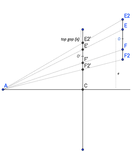
Going back to our HTML, we see that even though we scaled the image up so that it would be perceived at the same size, the element has a certain offset from the top. Let’s try correct this by solving for the top gap x:
his the height of the element in the background (EF)sis the scale applied. So,s.h = E_2F_2v/2is half the height of the viewporteis the vertical distance from the perspective origin to the element center, ande_1its projection on the viewport1 + z/(p-z)is the factor any height at `z` distance is multiplied with to result in the projected height.- Using the constraint that on the viewport projection:
x + E_2'O' + e_1is half of the viewport: x + s/2 * h * (1 + z/(p-z)) + e * (1 + z/(p-z)) = v/2x = h/2*(1-s) + h*z*(1-s)/(2*(p-z)) - v*z/(2*(p-z))- Applying our properties:
z = -1, p = 1, s = 2we get: x = (v-h)/4
It is important to note that the gap x depends on the viewport height. If we offset the top of our background element by this value, the top-edge will always be aligned. But since x is the perceived value of the gap, the background element will move up by (1 + z/(p-z))^-1 times that. That means we should move our element up by: ((p-z)/p) * x, which in our case is 2 . x.
But how do we apply this formula version of CSS height? CSS calc() to the rescue! With our element of height 500px, we get:
top: calc(250px - 50vh);Let’s see this in action:
Perfect! Now we can just keep adding more groups. Within each group, we position the elements as we need. Hack around with the z-index values to make sure the right elements come out on top.
Here’s a Sass module to help get you set up with the basic translate and scale math for parallax.
Part 2. Pure CSS Interactivity
2.1. Responsive menu navigation with CSS only
The site has an average links-in-a-row navigation bar when there is room for it. But on small screens, we wanted a CSS only push-down style navigation. This requires some interactivity (tap to reveal). The few HTML elements that have interactivity without any JS are form elements, like checkboxes. When these elements change state, CSS selectors allow us to detect those changes and do things.
How this works:
- A checkbox in the HTML:
<input type="checkbox"> - A pseudo state selector in the CSS:
input:checked - A sibling selector in the CSS to select the adjacent
<div>:input:checked ~ div, for toggling the height of the div on state change - Use
max-heightto transition height of the div rather thanheight, because the final height is probably unknown.
The result:
You can be creative with this, and make re-usable transitions for things like “read more” accordions. The key constraint that you have to respect is that the expandee element must follow the input element for the sibling selector to work. position: absolute will be your friend if you want the trigger element (like a “read more” link or arrow button) to appear to be below the element that’s getting expanded.
2.2. Animate the scroll with only CSS
This is just a trick, with a fairly big caveat.
We can only control style properties with CSS, not scrollbar position, which is only really possible with JavaScript (and user interaction). But we can use the CSS :target selector to animate the top value of the container <div> to a particular value slowly. The caveat is the user loses scroll control, since the top value has been set by CSS.
So while you can animate a scroll (as we’ll show here), you might not want to do this if you think users prefer just scrolling.
How this works:
- A click on an anchor link appends a fragment to the URL. (e.g. http://site.com/#id)
- The CSS
:targetpseudo selector activates when the URL fragment matches that ID (e.g.#id:target) - This can be used to animate the
topproperty, creating a scroll-like effect
In the sample below, we created some in-page anchor links. Instead of typically placing the anchors near the appropriate content, we create fake anchors that help us trigger the CSS animation.
Part 3. Optimization checklist
Optimizing page load speed is an endless effort. You’ll need to figure out a sweet spot between how much time you can dedicate to improving your existing infrastructure, upgrading your infrastructure, and how much you need to care. There are a few obvious, but very important pointers:
- Reduce the amount of data transferred per request: use only minified/compressed assets.
- Reduce the number of requests that the browser needs to make to render a page. Every CSS file, JavaScript file, and image file is yet another request. Also use browser caching on them so they don’t need to be requested multiple times.
- Improve your servers response time. Use nginx for static content and Apache otherwise. Tune the servers to get the maximum performance out of them. Use good application layer caching, especially if you have content that is frequently dynamically generated (say, through a complex SQL join).
- Reduce content blocking JavaScript.
- Don’t write irrelevant CSS rules. Always plan to write your CSS efficiently.
3.1. Image Compression
Images are a huge contributor to slow page loads. Here’s a checklist to follow to get the most out of your images:
3.1.1 Resizing images and choosing the right format
Different image formats have different advantages. Most formats are scale-sensitive like JPG, PNG and some are scale-invariant like SVG.
- Native image dimensions should be exactly or close to rendered image dimensions (i.e. it’s best if a 400x400px JPG is displayed at 400×400). Or use a scale-invariant format like SVG.
- Image types:
- Millions of colors (like a photo): JPG and lossy compression
- Illustrations or transparency requirements: PNG8, and then if you really need more than 256 colours, PNG truecolor
3.1.2 Compressing Images
There are many ways to compress and optimize images. Here are some close-to-the-metal techniques to reduce image sizes that will help you squeeze out the last few unnecessary bytes from your images.
To compress JPGs manually, a good place to start is this StackOverflow answer. Use ImageMagick and run:
convert -strip -interlace Plane -gaussian-blur 0.05 -quality 85% source.jpg result.jpgIf you don’t want blur, use:
-sampling-factor 4:2:0

To compress PNGs manually:
- Step 1: pngcrush tries a variety of methods to reduce the colour palette, discard useless chunks etc.
Source: File size reduction - YUI blog - Step 2: pngquant reduces your png to a 8bit format from a PNG truecolor. This is always worth checking for static images because sizes reduce to about a third! The only caveat is that you’ll have to look at the image manually and make sure that the quality is good enough.
Protip: Use progressive rendering for JPG or interlaced to get better looking image loads. See Progressive rendering on Coding Horror.
3.1.3 Sprites and Data URIs
An image sprite is a large image that contains many smaller images at different positions. They are most commonly rendered through CSS background-position shifting around to display the part you need. The important part: sprites reduce the number of overall requests to the server, which as we already covered, is good for performance.
Another advantage to spriting is that all the images are loaded, so lazy-loading problems are prevented. For example: when a hover transition displays a separate image, then there is an image flash, because the image is only fetched when required. Sprites prevent image preloading problems.
The biggest disadvantage to spriting is that it can be a pain to manage building the sprite yourself. This article has lots of techniques for that. If you have a set of similarly sized images, making a sprite is a painless task with ImageMagick’s montage:
montage -mode concatenate -tile 2x10 1.jpg 2.jpg ... out.jpgThis makes a 2 column by 10 row montage of images called out.jpg.
Data URIs are a nifty technique of embedding the required images within HTML or the CSS. Like sprites, data URIs reduce the number of overall requests to the server. However, beware: data URIs are up to 6x slower on mobile.
3.2. Caching and Minification
There are enough resources on good minification and caching techniques, however, here’s a dead-simple solution that is good to implement: Pagespeed’s nginx-module. The pagespeed modules for Apache and nginx are a lot of best practices combined. There are a lot of filters and options available, all worth reading about in detail. Build your own nginx with the pagespeed module, or use a docker image like this.
Conclusion
- There’s a lot you can do with just CSS. Some interactivity added with CSS is essentially a hack, but there is undeniable power in adding interaction and transitions declaratively.
- Always optimize your images! Use lossy compressions wherever you can and dedicate the time to get them right. Build automatic compression and resizing into your build processes.
- Pages should load fast! There’s probably nothing as effective (for the minimal effort) as Google’s pagespeed modules.
Great article. I learned many things from this example.
This is the business!
Seriously cool, love the performance.
As the technique is scrolling an overflow box, remember:
1) This parallax technique stops the iOS Safari chrome from receding on downwards scroll. Maybe that bugs you, maybe it doesn’t.
2) When using this technique also remember to use -webkit-overflow-scrolling: touch; to get your lovely momentum scrolling back on iOS.
Wish iOS Safari would just handle this instead.
Hey Mark,
Thanks for the comments. Just added the fix suggested by you and Chris to get the scrolling smooth on iOS too.
Ahhh, smoooth! I really want to trial this out now. Did you disable the parallax on small sizes for design? Or battery? or something?
Part of me wants to give request animation frame a go for parallax on mobile (now iOS finally fires scroll events during scroll) but I don’t have super js skills and would probably just make the page energy heavy. But I think with this perspective technique i might be able to do something like this more safely.
On iphone, there is no fluid vertical scroll. Was this intentional? The even simpler “careers” page, in contrast, has fluid scroll. It’s hard to scroll down thru the horizontal employee images, and after I do, the page seems to get stuck.
It’s only a landing page! How complex do we expect it to be? I did not even notice the parallax before reading the article.
Hey cba,
This page was an experiment in doing something different. So it is a bit of grabbing-your-ear-from-the-back-of-your-head thing sometimes, but fun to try out nonetheless.
Fixed the fluid scroll issue on iOS thanks to Mark and Chris. :)
So you have! Talk about responding to feedback :-)
First a quick word about parallax: Perspective doesn’t work on IE8 or IE9. I think some businesses are still paying for WinXP support.
For image compression, those lossy techniques are neat, but there’s more lossless compression that can be done. For JPEG I recommend JPEGrescan – which, full disclosure, I contributed to. It gets that sample image under 8000 bytes, a 2.25% reduction.
For PNG I have several suggestions. First, if an image looks like it has few colors, try posterizing it in PhotoShop or Gimp. This may remove unnecessary “blending” colors you didn’t know were there, or may remove JPEG artifacts if someone copy-pasted one into your PNG.
Second, there are many PNG optimizers out there, including Google’s Zopfli. You can usually use them one after the other. Always use Ben Jos Walbeehm’s DeflOpt.exe – which seems to be hard to find since his site is down – at the end for a few extra bytes of savings.
Re: 2.1. Responsive menu navigation with CSS only
I believe this can also be solved by placing the invisible checkbox above and using a
<label for="that-checkbox">as the trigger. (Tab index might need to be adjusted so that keyboard navigation works predictably, and you might want a[type=checkbox]:focus ~ labelstyle to specify some focus effect.)So much wasted dead space. Scrolling NIGHTMARE. The techniques are nice, but the design is horrid for usability…
I’ve tested 34cross.in in Safari on iPhone 6. There are some significant issues with scrolling on the page.
Safari’s chrome does not go away. Usually, when scrolling down the page, Safari shrinks the top chrome (address bar) by half and hides the bottom chrome (toolbar). This does not happen on your page. When we take into account that the site has a fairly large fixed header, the usable vertical viewport is significantly reduced.
The scrolling does not animate, but ends abruptly, and hence “feels off”. The fixed scrolling speed makes scrolling tiresome since it’s not possible to speed it up by quickly, repeatedly swiping up/down.
Certain parts of the page disable scrolling. (The part with the horizontal scrolling functionality.) This in conjunction with issue 1 makes scrolling these parts of the page almost impossible.
I wonder if a little bit of this would help somehow. I agree the scrolling is pretty rough. We get so used to that smooth momentum style that without it feels very wrong.
Hey Sime,
Fixed the fluid scroll issue, but the address bar receding issue is on all Chromes and perhaps has something to do with the fact that a content div the exact size of the entire viewport is not detected as a ‘tall’ page that deserves the receding effect. No way of solving this I think though. Any ideas?
An excellent article…learned a lot…I have to up my math skills…
For PNG compression I have used https://tinypng.com/
For JPG compression I have used http://www.jpegmini.com/
Great write-up. How did you get mathML to display properly 1. On WordPress without it’s WYSIWYG reformatting your mark-up, 2. On non-gecko browsers like Chrome?
I’m interested in this part:
What were you finding?
I’m impressed with the perspective of 1px and a translate-z of -1px in your code. I’d have spent ages playing with a balance of perspective in the hundreds against a translate-z of negative something big. Yours is much more elegant. The power of math(s) I’ll wager.
I was facing this issue when some of the content pushed back on the Z axis would suddenly disappear on parallax. For eg, look at Keith’s demo (on debug mode) http://keithclark.co.uk/articles/pure-css-parallax-websites/demo3/.
On debug mode, once you start scrolling down FF starts hiding some of the divs, where as Chrome keeps all the divs displayed. I had originally written the entire page in one parallax group, but the top panel would suddenly disappear once the user scrolled down by a few hundred pixels. Once I moved it into groups, things worked fine.
Any clues on why this happens? Maybe FF tries to optimize rendering by not rendering content it thinks is not in the viewport, but the translate + scale throws its calculations off?
The site is pretty slick, but it has poor usability when viewed in landscape mode on my mobile (1280 x 720) because the fixed header takes up too much precious screen real estate. Borrowing a page from Google’s Material Design, I suggest you shrink the header down into a collapsible icon that sits discreetly in a corner on mobile.
Hello, i just wanted to say thanks for such an awesome tour!
Really interesting article. What a awesome website they made!
Wonderful post! I was checking your website on iPhone 4 on 2G and it load up so fast that i was like “wait, what? it’s already loaded?! :D”. One note on iPhone 4 user experience, IMHO
.mobmis too height, it covers over 25% of the viewport which makes it a bit harder to consume the content screenshot here. Otherwise as I’ve said great post, I am saving and can’t wait to use this knowledge on my next project! :)Thats very cool. 2 things:
– “Scale, applied on an element, scales that element from its center”. That depends of your origin. As default transform-origin is in the center. Set that to 0 for y.
– Perspective has origin too. Set that also 0 for y.
After that you do not need calc() anymore! Plus you can use whatever translateZ() values, not only 1.
http://codepen.io/atirip/pen/qEjYpm
I’ve recently used this CSS-parallax effect in a web site and noticed some problems.
1st: Scaling and z-translating layers seems to have some rounding issues or whatever. In all samples here, the red layer is 4px less wide than the blue one, leaving an ugly white gap on the sides. I’ve solved this by scaling layers a little more than needed: 2.02x instead of 2x and so on.
2nd: Chrome on Windows has a major issue with scrolling. You can press the mouse wheel and scroll freely in all directions on windows. This allows you to scroll sideways off the page and further down than when using the scrollbar. It seems like Chrome calculates the bounding box on the 3d transformed layers rather than the un-transformed ones.
I could not fix this, so parallax is only active in FF on the web site for now. Sadly.
Here is an example of what I meant. Notice that is not “debug view”, I just scrolled off the page:
The “Responsive menu navigation with CSS only” is literally the most clever thing I’ve ever seen done with pure CSS! And since it’s predefined HTML, it’s much faster than using JavaScript and you can still access all the links if JavaScript is disabled.
One of the most useful articles i’ve read on CSS3 topics in a long time. Very cool.
Very cool! Can’t wait to see more in the future.