CSS-Tricks
  • Articles
  • Videos
  • Almanac
  • Newsletter
  • Guides
  • DigitalOcean
  • DO Community
Search

Articles Tagged
grid-template-columns

5 Articles
{
,

}
Direct link to the article Exploring CSS Grid’s Implicit Grid and Auto-Placement Powers
grid grid-auto-flow grid-template-columns grid-template-rows implicit grid

Exploring CSS Grid’s Implicit Grid and Auto-Placement Powers

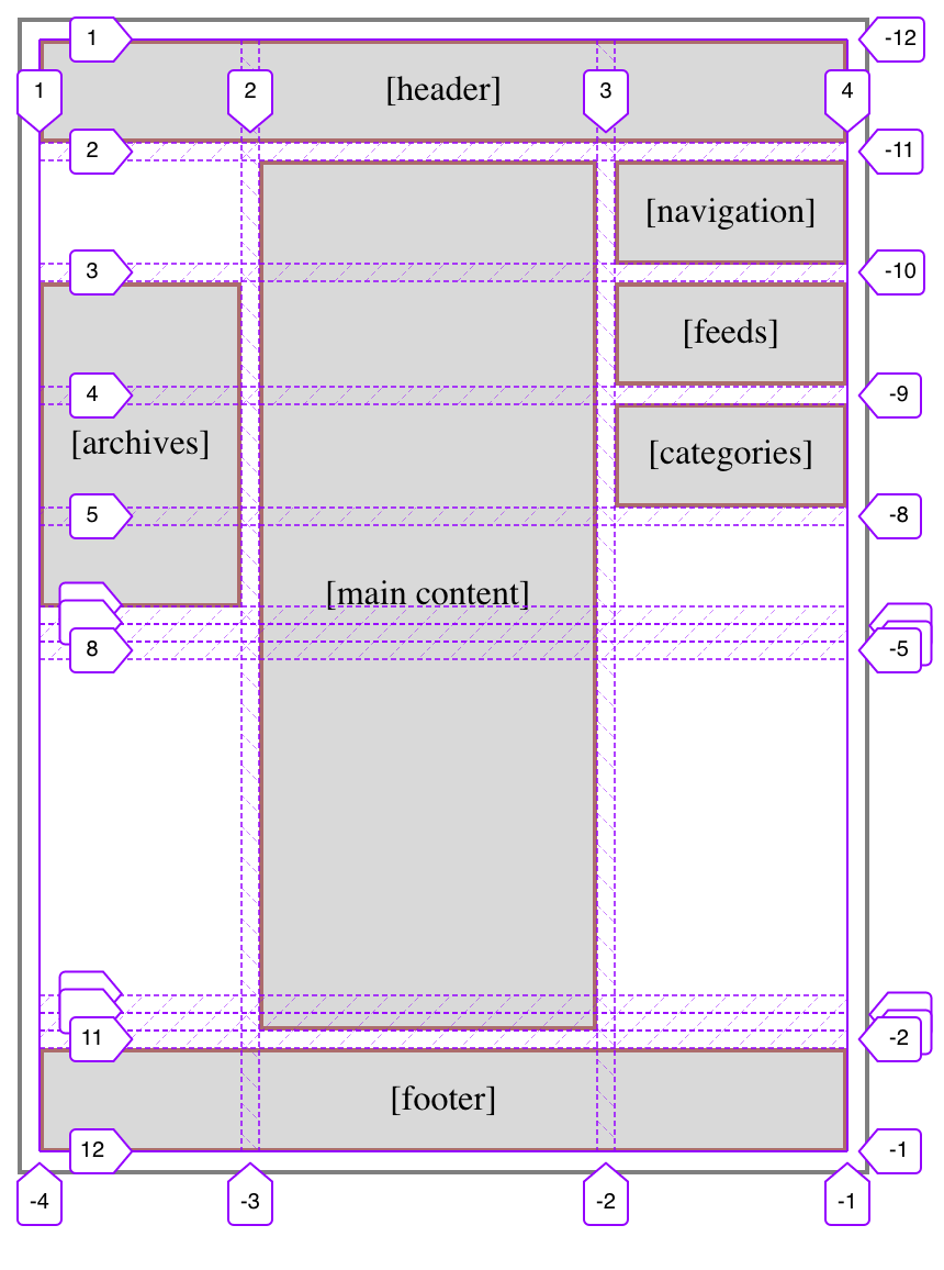
When working with CSS Grid, the first thing to do is to set display: grid on the element that we want to be become a grid container. Then we explicitly define the grid using a combination of grid-template-columns, grid-template-rows…

Avatar of Temani Afif
Temani Afif on Aug 1, 2022
Direct link to the article Accordion Rows in CSS Grid
grid grid-template-columns grid-template-rows

Accordion Rows in CSS Grid

Direct Link

I’d bet grid-template-columns is used about 10× more than grid-template-rows, but maybe everyone has just been missing out. Eric Meyer chucks a bunch of row lines onto his main site layout grid like this:

grid-template-rows: repeat(7, min-content) 1fr repeat(3, 
…
Avatar of Chris Coyier
Shared by Chris Coyier on Jul 23, 2020
Direct link to the article Equal Width Columns in CSS Grid are Kinda Weird
grid grid-template-columns minmax

Equal Width Columns in CSS Grid are Kinda Weird

Everything is flexible these days. If you write grid-template-columns: 200px 200px 200px;, sure, you’d have equal-width columns, but that’s a rare day. What you usually mean is three columns of equal fluid width.

We’ve got fractional units for …

Avatar of Chris Coyier
Chris Coyier on May 13, 2020 (Updated on Jan 27, 2022)
Direct link to the article 4 CSS Grid Properties (and One Value) for Most of Your Layout Needs
grid grid-template-columns

4 CSS Grid Properties (and One Value) for Most of Your Layout Needs

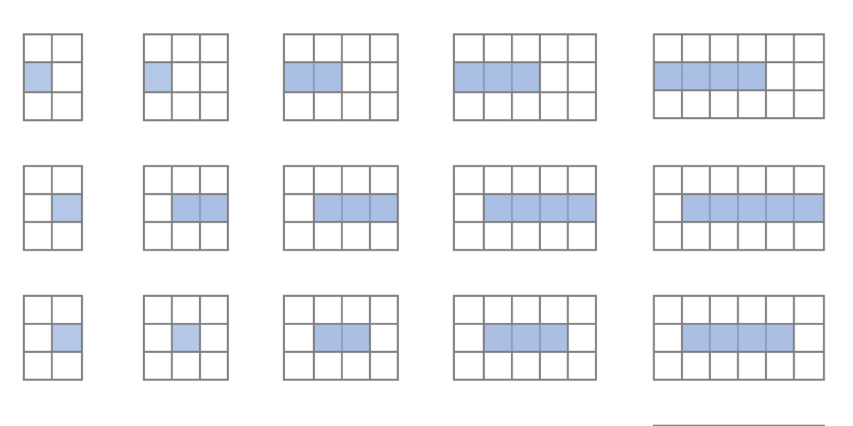
CSS Grid provides us with a powerful layout system for websites. The CSS-Tricks guide gives you a comprehensive overview of Grid’s properties with layout examples. What we’re going to do here is a reverse approach to show you the smallest …

Avatar of Anna Prenzel
Anna Prenzel on Mar 30, 2020
Direct link to the article Responsive Grid Magazine Layout in Just 20 Lines of CSS
grid grid-template-columns

Responsive Grid Magazine Layout in Just 20 Lines of CSS

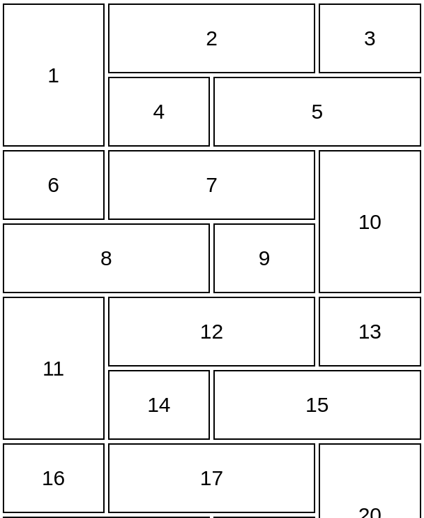
I was recently working on a modern take of the blogroll. The idea was to offer readers a selection of latest posts from those blogs in a magazine-style layout, instead of just popping a list of our favorite blogs in …

Avatar of Keir Watson
Keir Watson on Feb 25, 2020 (Updated on May 2, 2020)

CSS-Tricks is powered by DigitalOcean.

Keep up to date on web dev

with our hand-crafted newsletter

DigitalOcean
  • DigitalOcean
  • DigitalOcean Community
  • About DigitalOcean
  • Legal
  • Free Credit Offer
CSS-Tricks
  • Email
  • Guest Writing
  • Book
  • Advertising
Follow
  • Twitter
  • Instagram
  • YouTube
  • CodePen
  • iTunes
  • RSS
Back to Top