Different Ways to Get CSS Gradient Shadows
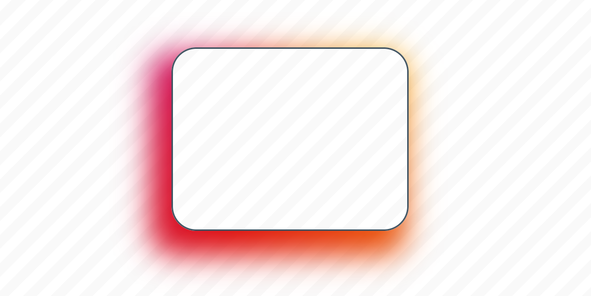
It’s a question I hear asked quite often: Is it possible to create shadows from gradients instead of solid colors? There is no specific CSS property that does this (believe me, I’ve looked) and any blog post you find about …
Temani Afif
on

