I’ve long been interested in design patterns. Common and proven-effective solutions to design problems. Too many settings to display at once and it’s confusing the user? Put them into logical groups and use an accordion design pattern! Patterns got even more interesting with the onset of responsive design. How do these patterns hold up as the available screen space changes?
We might be able to get six or more tabs on a laptop screen, but it’s only really practical to get three on most mobile devices. What do we do? Perhaps converting them into an accordion would work.
Brad Frost has done a great job in keeping a repository of Responsive Patterns. Brad and Dave and I were sitting around after InControl talking about design patterns that hadn’t been explored as much. Dave mentioned “Search with Filters” as an example. There can be quite a lot of UI involved in a search filter, so you have the challenge of displaying that without taking up too much room for the actual results, as well as allowing the user to change those filters without being too disruptive.
On desktop, you can do a split column design with the filters on the left and have plenty of room for results:

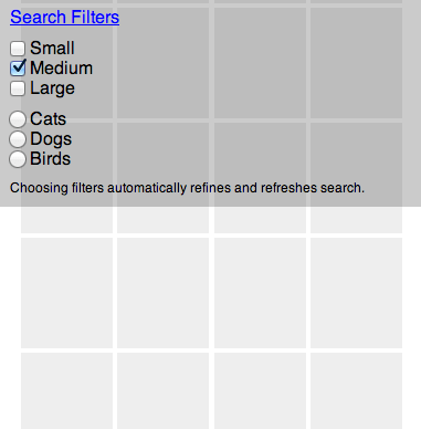
On a smaller screen though, you won’t have the room to pull off that split panel. You can squeeze down into one column though:

Notice how the title “Search Filters” became an obvious link (just CSS changes). This simple set of filters is already taking up quite a bit of room. Any more complicated and you’d have a full screen of filtering before you saw any results. Probably best to make that a link that hide/show’s the filters:

Now the question becomes: how do you access those filters once you’ve swiped down far enough they are gone? Perhaps you have an infinite scroll of search, which can be a great pattern for something like images. But you’ve scrolled down quite far and now want to alter the filters. Perhaps once we’ve scrolled past the filters, we could have a “filter bar” attach to the top of the screen allowing access no matter how far down you’ve scrolled:

Which can be opened and altered just like when it’s at the top of the page:
And that makes a pattern!
But, [insert retort]!
Surely this pattern doesn’t cover all possible needs. Design patterns often don’t. They are patterns, not dies.
Google Image Search (at least on iOS) has a paginated grid of images so you don’t lose sight of the header where you can filter.
Should the fixed bar have the search field in it too? Maybe. What happens if you change a filter and it reveals more stuff? Perhaps scroll them to the first new one it revealed. Perhaps keep their place as closely as you can and visually hint there is new results elsewhere. Wouldn’t a “back to top” link work just as well? Maybe. It’s all just food for thought.
The Pattern
The tech for this isn’t all that fascinating. I’m not sure it warrants a line-by-line CSS analysis. Essentially the two column design is squished into one while a narrow screen media query matches.
The JavaScript to fix the header position is slightly more interesting. I essentially used this “Persistant Headers” technique. Only in that article, the headers were cloned and the clone was shown when needed. I thought that was a bit heavy handed. In this case, the search filter area itself just becomes fixed position. In order to prevent the jump that would happen when an element that used to be “in the flow” becomes out of flow, I measure the height and add padding to compensate.
All the JavaScript, since it’s all related to “search”, is kept together in a single object which is a simple but nice way to structure JavaScript.
Got an improvement? Another pattern to solve the same issue? Tag it “filtered-search” on CodePen.
Of course, the real problem starts to show up when you need to filter sets that haven’t been loaded by the page yet.
Infinite scrolling presents some issues in that regard.
I’m confused about the need for Javascript here. Wouldn’t it be simpler to keep the header always
position:absolute‘d when narrow and add its height in padding above the grid?Disclaimer: Not an expert. Not even really very good at this.
Thanks for sharing. I like your comment preview very much. How we can implement it in our website ?
I recently did something slightly similar recently and found its nice to use a multiple select element for the filtering as on mobile platforms this gives you nice default UI which isn’t as fiddly to use on touch devices as checkboxes or radio buttons.
Problem is their ux and design is so awful in desktop browsers so I am still tweaking a best for both worlds solution, but want to do this without resulting to JS
I didn’t know the repository of Responsive Patterns.
It’s worth to be saved in my favourites.
Thanks for sharing!
Responsive Web Design (RWD) provide an optimal viewing experience, easy reading and navigation with a minimum of resizing, panning, and scrolling across a wide range of devices from mobile phones to desktop by using fluid grids, flexible images, and @media rule.
Awesome post! Thanks Chris.
Brad Frost have a great repository and great post,
SDFASFSDFASFDFASFDFASFASFASDFASDFASDF
And if you make show on top and hide when scroll down but show when scroll up?
Just like Google+ do on their android app…
Hey there,
we have a adopted a side load/slide-in approach to the filters on our site.
Have a look: http://team.skroutz.gr/posts/implicit-design-patterns/
I actually had this problem last week. We had to add functionality to an existing responsive(barely) site. I came up with something similar: http://www.what2cook.com/recipes
Fixed elements in zoomable devices is not a good solution :(