You need a mobile strategy for your site. You have to pick Responsive Design or a dedicated mobile site, right? Maybe not. Maybe you can mix and match a variety of strategies.
Me and the team are working hard on CodePen every day. But we’re a team of three. Our mobile strategy is to chip away at it the best we can as we 1) have time and 2) have good ideas on how to handle things.
Example of a Responsive Template
Take our Recent Activity page. This page is so simple that writing a couple of media queries to shuffle things around and a little bit of JavaScript to toggle the filters is a decent solution:

Example of a Mobile Specific Template
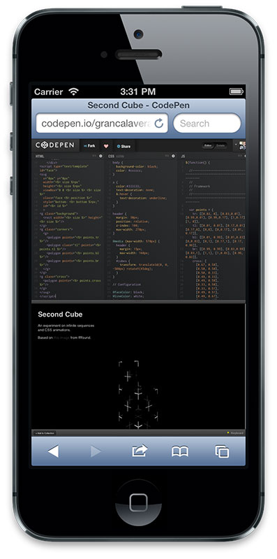
Now look at our Details page on desktop:

This page is far more complicated. It shares the same layout as the Editor view. You can click-and-drag the preview area to make it larger or smaller. There are keyboard commands. Leaving it at desktop size was awkward because the text was microscopic. Using the proper meta tags and making it load at mobile size made for very awkward layout and awkward scrolling, where it was possible at all.
This was our worst mobile view on the entire site.

I could have gone to war with this view with CSS and smashed it into shape. But even if I did that, there was quite a bit of JavaScript being loaded that no longer had any purpose. Instead, I decided to go with a mobile specific template. This way I was able to take complete control of the HTML, CSS, and JavaScript and only load what was needed. I was able to re-use almost everything, because we approached everything from a modular perspective. I could pick the HTML partials, JS modules, and compile a new CSS file of just the bits I needed – writing very little from scratch.
The Details view is a lot more usable now, not to mention quicker.

For the curious, we use the browser gem and choose the template to render at the controller level. It’s UA sniffing, which doesn’t feel great, but at least it’s server side1 and based on an open source project that is kept up to date.
if browser.mobile?
  render :template => 'details/mobile', :layout => "mobile-pages"
else
  render :template => 'details/index', :layout => "pages"
end
Also for the record, there is nothing you can’t do on the mobile version you can on the desktop version.
Example of the Uhm-Not-Quite-Ready View
Not every view on CodePen is great on small screens yet. The Editor, arguably the most important page of the app, doesn’t use responsive design or a mobile template.
It works pretty well on the iPad and large tablets, but smaller isn’t great. This view is not something we want to half-ass. Leaving the design at desktop size keeps it usable until the time comes we have a good idea for it and can tackle it head on. It will very likely be a mobile specific template.
Example of Mobile-Specific Parts in a Responsive Template
Check out our Profile view:
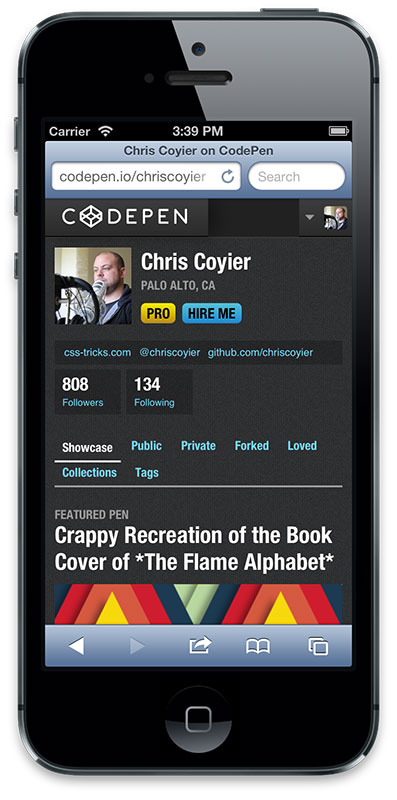
This is a responsive template. I think it works great, except for the “tabs” area where it’s broken into two lines. That’s awkward and won’t scale as we potentially add more navigation. Instead, we serve a different partial just in that one spot which outputs a <select> menu navigation instead of tabs.

A bit better, anyway.
It’s a Process
I’m not blogging this to show off CodePen as this beacon of mobile design perfection. It certainly is not. I do think it’s interesting to think about hybrid and iterative approaches to mobile development.
No separate domains/URLs, no separate repositories/code bases, no separate teams. Everything together as one big monster. Like I think it should be.
Very Related
RESS: Responsive Design + Server Side Components
1 I feel like server side UA sniffing is a bit better because 1) the right template gets served right away, it’s not a redirect and 2) client-side UA testing means serving up a big chunk of JavaScript just for that purpose.
I’m using this technique on my personal site now, though I’m in the process of moving to a fully responsive site and getting rid of the server-side device detection bit.
If you are just checking to see if a device is mobile or non-mobile, I don’t think there is much to worry about, but if you start to rely on UA device detection for categorizing a wider range of devices like, mobile, tablet, desktop, tv you’ll run into trouble. I wrote about some concerns with UA sniffing and server-side device detection.
I definitely think whether you choose to create a separate mobile site or a fully responsive site, both should be using media queries, fluid grids/images. This is a no brainer for a #RWD site, but I think people forget that media queries, fluid grids/images can be useful on separate mobile websites as well.
Glad to see some of the views on CodePen improving on mobile devices!
Word
Great article, I noticed the change on Codepen the other day and it’s a HUGE improvement. Loads way faster and it’s usable.
I think it was a great choice going with a mobile template as it allows the mobile user to get the content formatted the way they need.
Of course this begs the question, What is mobile? Or more precisely how small of a screen do you have to be to be mobile?
Are tablets mobile?, or resizing the browser window smaller?
Serving mobile templates is a nice option but it also comes with its own caveats.
Indeed. In this case it literally just detects iOS, Android, Blackberry browser, etc in the UA. That’s probably not going to work for too many more years.
What I’d really like to see is the best of both worlds: server side detection of screen size =)
Yes! I would love that.
I’m glad you are working on the codepen-on-phones issue. I can’t wait to use codepen on my phone/ipad. I might even get codepen pro when it happens :D
I think it works pretty darn good on iPad.
It does, but some things (like pasteing text) don’t work properly.
Interesting read, and nice design.
As to the New Pen page, what about just separating HTML, CSS and JS into tabs?
That’s likely what we’ll do, and perhaps even the preview as a tab, since space is so limited.
Honestly, I’d like to see everything as tabs as an option for the desktop version!
Thanks again for these tips! I surely hope no designers are really torturing themselves trying to create projects on mobile phones. Just use a good old keyboard or at least a tablet!
Love Codepen btw
Maybe I missed something from the post, but why are you using UA-sniffing? Why wouldn’t you simply base the design on the viewport width, for example < 640px for the mobile breakpoint (or even better…using ems)?
As for server-side viewport detection, you could set a cookie which is available at the next request from your server-side code. It’s not perfect, but with an intelligent default when no cookie is available, it can work in some cases.
That’s probably a good way to go about the detection. You lose that very first request needed to set the cookie (just a redirect, not too bad). Then each subsequent request would have the cookie and you could serve the right template. No UA sniffing and more granular control. I guess once in a while you’d have someone open the site with a super narrow desktop browser and then be stuck with a mobile layout – which would be awkward-ish. Maybe you’d only have the cookie last like 12 hours or something. I’d love to see the viewport width be sent along with the initial headers – that’d be something to ask the browser overlords for.
@Chris: You can simply reset the cookie on browser resize in js. It is true that the server will always be one request behind, but only border cases will be a problem then, which can be somewhat solved using a good default, if no cookie is present.
Great blog. It’s very helpful.
When you say “use the browser gem and choose the template to render at the controller level,” what is the “controller”? Is that a new term for client?
The example site (CodePen) is in Ruby on Rails, which is a MVC (Modal View Controller) framework. I’m not a master of explaining stuff like this, but briefly…
This keeps most logic out of the views themselves, which is a nice way to work (designers will like you). Because the controller decides which view to show, it’s a perfect place to put some logic (if mobile use this template, if not mobile use different template).
Chris, I have to say—I am in love with Codepen. Keep up the good work!
I agree, Anthony. Codepen is the shit!
Manny thanks for these informations. I am sure that I will use them in my new project.
Chris, we had the very same thoughts when redesigning our flagship site. Regarding the extra javascript loaded although the small-screen version did not need it, we avoided the bloat by using javascript mediaqueries and require.js, checking early in the load process via js mq’s what we need and dynamically loading it into the page.
Test
Loud and clear
Thanks a lot Chris.. I like to have Responsive Bootstrap CSS/JavaScript like Twitter Bootstrap they have a section of How to use some ready CSS Classes ..
IF you could have a public bootstrap .. we may use it.
I do think we can use what I call it DivDaving “It’s the way of using Divs for almost every part of the site” hiding all other controls . What do thing about that? have it work in all Browsers and all screens.
Maybe check out Detector which combines browser, feature and screen size detection.
I use a UA sniffer when absolutely necessary – I came across an issue on a PHP project where my client wanted a carousel to work in a very regimented way on a desktop, but when viewed on an iPad they wanted a lot of touch events and swipe-y actions.
The best I came up with was a template for the main page that would import chunks of the page, and certain parts (like the carousel) are imported and rendered differently.
It was cool as you would use the same URL’s on any device (none of this “http://m.website.com” stuff).
It is definitely a good way to make your mobile website stand out with a customized page although, it is an extra work to code a completely new design rather than doing a responsive website. I personally like how my responsive designs look and unless I have to make a very specific design for one of my clients I don’t even bother trying to make a mobile site. That’s just me of course everyone have different points of view.
I use the following card responsive design:
1- I have a special site downloader. I get a screen size of mobile phones or determined by the size, which is a computer and other design is not necessary, such as:
‘operamini’=>array(‘pattern’=>’Opera.Mini|Opera.Mobi|Android.*Opera’,’dev’=>’agent’,
‘model’=>’mobi_v’,’db_config’=>$db_mobile_config,’add_themes’=>’operamini’,
‘screen’=>’240-320’,’ItIs_mobile’=>TRUE),
2-Identifies the device on the user agent and the loading parameters:
3-If not set sizes Parameres (no ‘screen’), then pick from a list of sizes in standard sizes
4- Pre spend parser content. The result is stored in the form of JSON, it gives fast downloading of content.
5- Generate global labels, for example: ‘model’, ‘computer’, ‘mobile’, ‘screen’, ‘portrait’, ‘landscape’, ‘width’ and others
6- Using parameters ‘model’,’add_themes’, ‘screen’ …find a suitable template
7- Responsive use BBCode. For example [photo]. As a control, use the system, how many photos should be placed on the screen.
8- Content can be prepared on the basis of language and display devices. Global labels can select the desired content:
english: http://www.cotonti.mobi/page.php?al=example_nefertiti/en
russian: http://www.cotonti.mobi/page.php?al=example_nefertiti
mobile: http://www.cotonti.mobi/page.php?al=example_nefertiti&it=mobile
9- And other solutions
Sorry for bad English
So a couple of things. I am not a user of CodePen, and I know my comments will certainly cause an uproar from the die hard CodePen users, oh well, live and let live, but I find writing code in a nice IDE to be a far more beneficial experience. Is CodePen just used to showcase HTML/CSS/JS to others in a repository like fashion, its not meant to be used as an editor, correct? In other words, why would I not just test my code out on my computer? Just trying to understand the reason for using it I guess. In addition, when I did start entering some text in the HTML and CSS editor, I clicked on the back button to return where I was only to get the “Stay on Page / Leave Page” prompt consistently popping up to the point I had to kill my browser to get rid of it ( I am using Chrome). If CodePen works for many, then that is great, this is not meant as criticism, but I am trying to understand the value in the tool considering how much time was probably spent on it, especially considering the available editors and IDEs out on the market.
Hey Gary,
You’re not wrong – CodePen isn’t meant to replace your IDE. Maybe someday! It’s meant to have something directly in the browser to whip up samples for sharing and collaboration and feedback and a load of other reasons.
The “Stay on page” prompt is meant to bother you, so you don’t accidentally leave the page and lose work. You can click “leave page” and it will allow you leave.
Thanks for the quick response Chris, and that certainly helps explains things. The CodePen editor itself is very impressive to say the least. In fact, I was hesitant making any comments here since the posting was not completely about CodePen…sorry about that.
With regards to the prompt, just an FYI, I did try that “leave page” as well but I had the same results. Not too sure if it was because I had already clicked on Stay on Page option a couple of times, but I did get myself into quite a mess ;)
I love how this posting describes what I consider the most pragmatic approach to using everything at your disposal to address the various challenges. Sticking to one solution limits the benefits and freedom provided when using a variety of tools and techniques.
Responsive + conditional CSS/server-side templates + JS + anything else that makes sense is the way to go.
I particularly enjoyed this “Our mobile strategy is to chip away at it the best we can as we 1) have time and 2) have good ideas on how to handle things.” because it reflects how dev teams work in the real world.
Great post.
I heard about respond.js and css3-mediaqueries.js that adds support for media queries in browsers which do not support them. But these work only in a javascript enabled browser. So why can’t we alter the css through Javascript or jQuery itself. It’s quite easy to convert media queries to jQuery code. Wanted to know if doing this is right or am I missing something.
Keep them coming Chris. I love your website and I hope you release some more stuff on Lynda, especially on wordpress theme design. Thanks