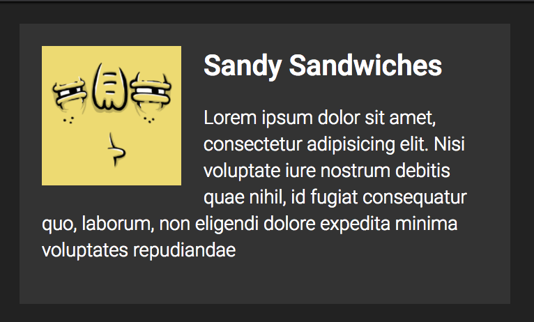
The Media Object pattern is: image thingy on the left, heading and text on the right.
That’s what Nicole Sullivan called it and the name stuck. It’s a pretty simple pattern, but like all things web design, it can be done many ways.

Let’s take a crack at a lot of those ways. In these demos, I’m not particularly focusing on naming conventions, semantics, or browser support. Just possibilities.
With Floats
Certainly, we could float the image to the left!
See the Pen Media Block #1 by Chris Coyier (@chriscoyier) on CodePen.
But just floating means you get wrapping. Wrapping might be perfectly fine, or you might not want it.

To fix that, we could make sure all the text is wrapped in an element, then make sure that element has padding-left equal to the width of the image and any white space between them.
See the Pen Media Block #2 by Chris Coyier (@chriscoyier) on CodePen.
Or, you could float both sides:
See the Pen Media Block #3 by Chris Coyier (@chriscoyier) on CodePen.
With Flexbox
Flexbox makes quick work of it!
See the Pen Media Block #4 by Chris Coyier (@chriscoyier) on CodePen.
Note that we’re allowing the <img> to become a flex item. We used align-items: flex-start; to make sure it doesn’t stretch out to the same height as the text.
With Tables
The media object could be a two-cell row of a table:
See the Pen Media Block #5 by Chris Coyier (@chriscoyier) on CodePen.
If you wanted to keep non-<table> markup, it’s still possible to make it behave like a table via display: table;:
See the Pen Media Block #6 by Chris Coyier (@chriscoyier) on CodePen.
With Grid
Grid layout allows us to define a set of columns. It’s quite easy to set up the first column to the fixed width we want, and the second column to take up the rest of the space.
See the Pen Media Block #7 by Chris Coyier (@chriscoyier) on CodePen.
Like in flexbox, we can avoid the image stretching itself out by aligning it to the top with align-self: start;.
I’m sure y’all can find about a dozen more ways to do it!
Food for thought on MORE WAYS:
Hi Chris,
This is interesting because I think you left out the most common pattern which is to style the siblings of the image/float as new block-formatting contexts (http://codepen.io/thierry/pen/JEOavP). The reason why this is the most common pattern is because it does not require to know the width of the “media”.
As a side note, this construct is nothing else than a 2 column layout but many people have a hard time associating that styling to anything other than a “media object”… :-(
Same. I ALWAYS do that way. Wrap “text content” in a div and make it overflow: hidden.
Yes! That’s a great approach.
I don’t know how to measure “most common”, but I would think it “whatever Bootstrap does” which is
table-cellin the “latest stable version”, interestingly enough. It’s flexbox in v4, which would certainly be my brain’s go-to.“Most common” in the sense that it is the oldest approach which means it has also the best browser support (by far). The only problem with it is when the box is a containing block and you need to position nested elements outside of it.
In any case, we’ll have soon a mean to solve this easily not by using
table-cellorflexbox(à la Bootstrap) but by usingdisplay:flow-root.This is great ! thanks.
I’m fond of absolutely positioning the image relative to the container and then padding the container in. This avoids wrapping the content in an extra container.
The main benefit of doing this with display:table is that you can vertically align of both the image-like and text-like content, and has better browser support than Flexbox.
In this form it’s commonly referred to as the Flag Object, popularised by Harry Roberts.
It’s worth bearing in mind that the image-like content can also be text (Or anything for that matter), for example it might contain a date. The important part is that the width of it’s child must be set.
I use the flag object ubiquitously and unless you are supporting <IE8 there’s no inherent reason to use the traditional media object with floats.
These flag objects can also be nested and composed. This is where the real power in them lie. Especially when paired with a powerful grid system. I only have occasional use for Flexbox, such is the power of composing these components together.
Hi,
A great article.
About the flexbox – it is always tricky when you have to support all the devices and browsers… It can cause SO many problems…
If you use autoprefixer, and know the quirks (https://github.com/philipwalton/flexbugs) its actually incredibly reliable/stable – I personally don’t use the old syntax (or tweener) and instead fallback to other methods. Flexbox IS more efficient and recommended over older layout models – https://developers.google.com/web/fundamentals/performance/rendering/avoid-large-complex-layouts-and-layout-thrashing#use_flexbox_over_older_layout_models
or same as above but
with floats