In a perfect world, our projects would have unlimited resources and time. Our teams would begin coding with well thought out and highly refined UX designs. There would be consensus among developers about the best way to approach styling. There’d be one or more CSS gurus on the team who could ensure that functionality and style could roll out simultaneously without it turning into a train-wreck.
I’ve actually seen this happen in large enterprise environments. It’s a beautiful thing. This article is not for those people.
On the flip side of the coin is the tiny startup that has zero funding, one or two front-end developers, and a very short timeline to demonstrate some functionality. It doesn’t have to look perfect, but it should at least render reasonably well on desktop, tablet, and mobile. This gets them to a point where it can be shown to advisors and early users; maybe even potential investors who’ve expressed an interest in the concept. Once they get some cashflow from sales and/or investment, they can get a dedicated UX designer and polish the interface.
What follows is for this latter group.
Project Kickoff Meeting
Let’s invent a company to get the ball rolling.
Solar Excursions is a small travel agency aiming to serve the near-future’s burgeoning space tourism industry.
Our tiny development team has agreed that React will be used for the UI. One of our front-end developers is big on Sass, and the other is enamored with CSS in JavaScript. But they’ll be hard pressed to knock out their initial sprint goals; there’s certainly no time for arguing about the best possible styling approach. Both coders agree the choice doesn’t matter much in the long run, as long as its consistently executed. They’re certain that implementing the styling from scratch under the gun now will incur technical debt that will have to be cleaned up later.
After some discussion, the team opts to plan for one or more “styling refactor” sprints. For now, we’ll just focus on getting something up on the screen using React-Bootstrap. That way we’ll be able to quickly build working desktop and mobile layouts without much fuss.
The less time spent on front-end styling the better, because we’ll also need the UI to hook up to the services our backend developer will be cranking out. And, as our application architecture begins to take shape, both front-enders agree it’s important that it be unit tested. They have a lot on their plate.
Based on my discussions with the Powers That Be, as a dedicated project manager, I slaved over Balsamiq for at least ten minutes to provide the team with mockups for the booking page on desktop and mobile. I assume they’ll make tablet meet in the middle and look reasonable.

Sprint Zero: Review Meeting
Pizza all around! The team worked really hard to hit its goals, and we now have a booking page with a layout that approximates the mockups. The infrastructure for services is coming together, but there’s quite a way to go before we can connect the UI to it. In the interim, the front-enders are using a hardcoded mock data structure.

Here’s a look at our UI code so far:
This is all straightforward React. We’re using some of that Hooks hotness, but it’s probably passé to most of you by now.
The key takeaway to notice here is how four of our five application components import and use components from react-bootstrap. Only the main App component is unaffected. That’s because it just composes the top level view with our custom components.
// App.js imports
import React, { useState } from "react";
import Navigation from "./Navigation";
import Page from "./Page";

// Navigation.js imports
import React from "react";
import { Navbar, Dropdown, Nav } from "react-bootstrap";

// Page.js imports
import React from "react";
import PosterCarousel from "./PosterCarousel";
import DestinationLayout from "./DestinationLayout";
import { Container, Row, Col } from "react-bootstrap";

// PosterCarousel.js imports
import React from "react";
import { Alert, Carousel, Image } from "react-bootstrap";

// DestinationLayout.js imports
import React, { useState, useEffect } from "react";
import {
  Button,
  Card,
  Col,
  Container,
  Dropdown,
  Jumbotron,
  ListGroup,
  Row,
  ToggleButtonGroup,
  ToggleButton
} from "react-bootstrap";
The decision to move fast with Bootstrap has allowed us to hit our sprint goals, but we’re already accumulating technical debt. This is just four affected components, but as the application grows, it’s clear the “styling refactor” sprints that we planned for are going to become exponentially harder. And we haven’t even customized these components much. Once we have tens of components, all using Bootstrap with lots of inline styling to pretty them up, refactoring them to remove react-bootstrap dependencies will be a scary proposition indeed.
Rather than building more of the booking pipeline pages, the team decides that we’ll spend the next sprint working to isolate the react-bootstrap usage in a custom component kit since our services are still under construction. Application components will only use components from this kit. That way, when it comes time to ween ourselves from react-bootstrap, the process will be much easier. We won’t have to refactor thirty usages of the react-bootstrap Button throughout the app, we’ll just rewrite the internals of our KitButton component.
Sprint One: Review Meeting
Well, that was easy. High-fives. No change to the visual appearance of the UI, but we now have a “kit” folder that’s sibling to “components” in our React source. It has a bunch of files like KitButton.js, which basically export renamed react-bootstrap components.
An example component from our kit looks like this:
// KitButton.js
import { Button, ToggleButton, ToggleButtonGroup } from "react-bootstrap";
export const KitButton = Button;
export const KitToggleButton = ToggleButton;
export const KitToggleButtonGroup = ToggleButtonGroup;
We wrap those all kit components up into a module like this:
// kit/index.js
import { KitCard } from "./KitCard";
import { KitHero } from "./KitHero";
import { KitList } from "./KitList";
import { KitImage } from "./KitImage";
import { KitCarousel } from "./KitCarousel";
import { KitDropdown } from "./KitDropdown";
import { KitAttribution } from "./KitAttribution";
import { KitNavbar, KitNav } from "./KitNavbar";
import { KitContainer, KitRow, KitCol } from "./KitContainer";
import { KitButton, KitToggleButton, KitToggleButtonGroup } from "./KitButton";
export {
  KitCard,
  KitHero,
  KitList,
  KitImage,
  KitCarousel,
  KitDropdown,
  KitAttribution,
  KitButton,
  KitToggleButton,
  KitToggleButtonGroup,
  KitContainer,
  KitRow,
  KitCol,
  KitNavbar,
  KitNav
};
And now our application components are completely free of react-bootstrap. Here are the imports for the affected components:
// Navigation.js imports
import React from "react";
import { KitNavbar, KitNav, KitDropdown } from "../kit";


// Page.js imports
import React from "react";
import PosterCarousel from "./PosterCarousel";
import DestinationLayout from "./DestinationLayout";
import { KitContainer, KitRow, KitCol } from "../kit";


// PosterCarousel.js imports
import React from "react";
import { KitAttribution, KitImage, KitCarousel } from "../kit";


// DestinationLayout.js imports
import React, { useState, useEffect } from "react";
import {
  KitCard,
  KitHero,
  KitList,
  KitButton,
  KitToggleButton,
  KitToggleButtonGroup,
  KitDropdown,
  KitContainer,
  KitRow,
  KitCol
} from "../kit";
Here’s the front-end codebase now:
Although we’ve corralled all of the react imports into our kit components, our application components still rely a bit on the react-bootstrap implementation because the attributes we place on our kit component instances are the same as those of react-bootstrap. That constrains us when it comes to re-implementing the kit components, because we need to adhere to the same API. For instance:
// From Navigation.js
<KitNavbar bg="dark" variant="dark" fixed="top">
Ideally, we wouldn’t have to add those react-bootstrap specific attributes when we instantiate our KitNavbar.
The front-enders promise to refactor those out as we go, now that we’ve identified them as problematic. And any new references to react-bootstrap components will go into our kit instead of directly into the application components.
Meanwhile, we’ve shared our mock data with the server engineer, who is working hard to build separate server environments, implement the database schema, and expose some services to us.
That gives us time to add some gloss to our UI in the next sprint — which is good because the Powers That Be would like to see separate themes for each destination. As the user browses destinations, we need to have the UI color scheme change to match the displayed travel poster. Also, we want to try and spiff up those components a bit to begin evolving our own look and feel. Once we have some money coming in, we’ll get a designer to do a complete overhaul, but hopefully we can reach a happy medium for our early users.
Sprint Two: Review Meeting
Wow! The team really pulled out all the stops this sprint. We got per-destination themes, customized components, and a lot of the lingering react-bootstrap API implementations removed from the application components.
Here’s what the desktop looks like now:
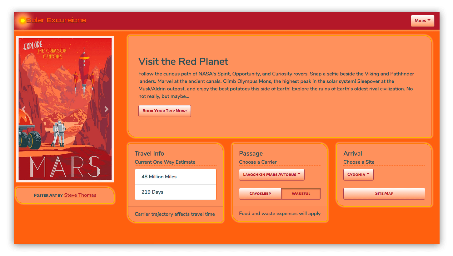
In order to pull this off, the front-enders brought in the Styled Components library. It made styling the individual kit components a breeze, as well as adding support for multiple themes.
Let’s look at a few highlights of their changes for this sprint.
First, for global things like pulling in fonts and setting the page body styles, we have a new kit component called KitGlobal.
// KitGlobal.js
import { createGlobalStyle } from "styled-components";
export const KitGlobal = createGlobalStyle`
  body {
    @import url('https://fonts.googleapis.com/css?family=Orbitron:500|Nunito:600|Alegreya+Sans+SC:700');
    background-color: ${props => props.theme.foreground};
    overflow-x: hidden;
  }
`;
It uses the createGlobalStyle helper to define the CSS for the body element. That imports our desired web fonts from Google, sets the background color to whatever the current theme’s “foreground” value is, and turns off overflow in the x-direction to eliminate a pesky horizontal scrollbar. We use that KitGlobal component in the render method of our App component.
Also in the App component, we import ThemeProvider from styled-components, and something called “themes” from ../theme. We use React’s useState to set the initial theme to themes.luna and React’s useEffect to call setTheme whenever the “destination” changes. The returned component is now wrapped in ThemeProvider, which is passed “theme” as a prop. Here’s the App component in its entirety.
// App.js
import React, { useState, useEffect } from "react";
import { ThemeProvider } from "styled-components";
import themes from "../theme/";
import { KitGlobal } from "../kit";
import Navigation from "./Navigation";
import Page from "./Page";
export default function App(props) {
  const [destinationIndex, setDestinationIndex] = useState(0);
  const [theme, setTheme] = useState(themes.luna);
  const destination = props.destinations[destinationIndex];
  useEffect(() => {
    setTheme(themes[destination.theme]);
  }, [destination]);

  return (
    <ThemeProvider theme={theme}>
      <React.Fragment>
        <KitGlobal />
        <Navigation
          {...props}
          destinationIndex={destinationIndex}
          setDestinationIndex={setDestinationIndex}
        />
        <Page
          {...props}
          destinationIndex={destinationIndex}
          setDestinationIndex={setDestinationIndex}
        />
      </React.Fragment>
    </ThemeProvider>
  );
}
KitGlobal is rendering like any other component. Nothing special there, only that the body tag is affected. ThemeProvider is using the React Context API to pass theme down to whatever components need it (which is all of them). In order to fully understand that, we also need to take a look at what a theme actually is.
To create a theme, one of our front-enders took all the travel posters and created palettes for each by extracting the prominent colors. That was fairly simple.

Obviously, we weren’t going to use all the colors. The approach was mainly to dub the most used two colors foreground and background. Then we took three more colors, generally ordered from lightest to darkest as accent1, accent2, and accent3. Finally, we picked two contrasting colors to call text1 and text2. For the above destination, that looked like:
// theme/index.js (partial list)
const themes = {
  ...
  mars: {
    background: "#a53237",
    foreground: "#f66f40",
    accent1: "#f8986d",
    accent2: "#9c4952",
    accent3: "#f66f40",
    text1: "#f5e5e1",
    text2: "#354f55"
  },
  ...
};
export default themes;
Once we have a theme for each destination, and it is being passed into all the components (including the kit components that our application components are now built from), we need to use styled-components to apply those theme colors as well as our custom visual styling, like the panel corners and “border glow.”
This is a simple example where we made our KitHero component apply the theme and custom styles to the Bootstrap Jumbotron:
// KitHero.js
import styled from "styled-components";
import { Jumbotron } from "react-bootstrap";

export const KitHero = styled(Jumbotron)`
  background-color: ${props => props.theme.accent1};
  color: ${props => props.theme.text2};
  border-radius: 7px 25px;
  border-color: ${props => props.theme.accent3};
  border-style: solid;
  border-width: 1px;
  box-shadow: 0 0 1px 2px #fdb813, 0 0 3px 4px #f8986d;
  font-family: "Nunito", sans-serif;
  margin-bottom: 20px;
`;
In this case, we’re good to go with what gets returned from styled-components, so we just name it KitHero and export it.
When we use it in the application, it looks like this:
// DestinationLayout.js (partial code)
const renderHero = () => {
  return (
    <KitHero>
      <h2>{destination.header}</h2>
      <p>{destination.blurb}</p>
      <KitButton>Book Your Trip Now!</KitButton>
    </KitHero>
  );
};
Then there are more complex cases where we want to preset some attributes on the react-bootstrap component. For instance, the KitNavbar component which we identified earlier as having a bunch of react-bootstrap attributes that we’d rather not pass from the application’s declaration of the component.
Now for a look at how that was handled:
// KitNavbar.js (partial code)
import React, { Component } from "react";
import styled from "styled-components";
import { Navbar } from "react-bootstrap";

const StyledBootstrapNavbar = styled(Navbar)`
  background-color: ${props => props.theme.background};
  box-shadow: 0 0 1px 2px #fdb813, 0 0 3px 4px #f8986d;
  display: flex;
  flex-direction: horizontal;
  justify-content: space-between;
  font-family: "Nunito", sans-serif;
`;

export class KitNavbar extends Component {
  render() {
    const { ...props } = this.props;
    return <StyledBootstrapNavbar fixed="top" {...props} />;
  }
}
First, we create a component called StyledBootstrapNavbar using styled-components. We were able to handle some of the attributes with the CSS we passed to styled-components. But in order to continue leveraging (for now) the reliable stickiness of the component to the top of the screen while everything else is scrolled, our front-enders elected to continue using react-bootstrap’s fixed attribute. In order to do that, we had to create a KitNavbar component that rendered an instance of StyledBootstrapNavbar with the fixed=top attribute. We also passed through all the props, which includes its children.
We only have to create a separate class that renders styled-component’s work and passes props through to it if we want to explicitly set some attributes in our kit component by default. In most cases, we can just name and return styled-component’s output and use it as we did with KitHero above.
Now, when we render the KitNavbar in our application’s Navigation component, it looks like this:
// Navigation.js (partial code)
return (
  <KitNavbar>
    <KitNavbarBrand>
      <KitLogo />
      Solar Excursions
    </KitNavbarBrand>
    {renderDestinationMenu()}
  </KitNavbar>
);
Finally, we took our first stabs at refactoring our kit components away from react-bootstrap. The KitAttribution component is a Bootstrap Alert which, for our purposes, is little more than an ordinary div. We were able to easily refactor to remove its dependency on react-bootstrap.
This is the component as it emerged from the previous sprint:
// KitAttribution.js (using react-bootstrap)
import { Alert } from "react-bootstrap";
export const KitAttribution = Alert;
This is what it looks like now:
// KitAttribution.js
import styled from "styled-components";
export const KitAttribution = styled.div`
  text-align: center;
  background-color: ${props => props.theme.accent1};
  color: ${props => props.theme.text2};
  border-radius: 7px 25px;
  border-color: ${props => props.theme.accent3};
  border-style: solid;
  border-width: 1px;
  box-shadow: 0 0 1px 2px #fdb813, 0 0 3px 4px #f8986d;
  font-family: "Alegreya Sans SC", sans-serif;
  > a {
    color: ${props => props.theme.text2};
    font-family: "Nunito", sans-serif;
  }
  > a:hover {
    color: ${props => props.theme.background};
    text-decoration-color: ${props => props.theme.accent3};
  }
`;
Notice how we no longer import react-bootstrap and we use styled.div as the component base. They won’t all be so easy, but it’s a process.
Here are the results of our team’s styling and theming efforts in sprint two:
View the themed page on its own here.
Conclusion
After three sprints, our team is well on its way to having a scalable component architecture in place for the UI.
- We are moving quickly thanks to react-bootstrap, but are no longer piling up loads of technical debt as a result of it.
- Thanks to styled-components, we were able to implement multiple themes (like how almost every app on the Internet these days sports dark and light modes). We also don’t look like an out-of-the-box Bootstrap app anymore.
- By implementing a custom component kit that contains all references to react-bootstrap, we can refactor away from it as time permits.
Fork the final codebase on GitHub.
Can you describe what the following is targeting the the styled components examples:
Hi Marc,
Good catch. Under the covers, this actually is a CSS trick.
In styled-components, the ampersand is replaced by the generated class name: https://www.styled-components.com/docs/api#supported-css
And in CSS, you can repeat a class name to increase specificity: https://www.w3.org/TR/selectors-3/#specificity
So when you are attempting to override existing styles, such as those on MenuItem in React-Bootstrap, and the style you define doesn’t actually override the one from the library, you can use this trick to force the override rather than resort to !important (which itself isn’t effective sometimes). You can just keep adding ampersands until the override works.
This is a stopgap of course, until you refactor out all of the pre-existing styles (if you are following a trajectory like the one discussed in he article).