This is the first post of a two-part series that looks into the way CSS variables can be used to make the code for complex layouts and interactions less difficult to write and a lot easier to maintain. This first installment walks through various use cases where this technique applies. The second post covers the use of fallbacks and invalid values to extend the technique to non-numeric values.
What if I told you a single CSS declaration makes the difference in the following image between the wide screen case (left) and the second one (right)? And what if I told you a single CSS declaration makes the difference between the odd and even items in the wide screen case?

Or that a single CSS declaration makes the difference between the collapsed and expanded cases below?

How is that even possible?
Well, as you may have guessed from the title, it’s all in the power of CSS variables.
There are already plenty of articles out there on what CSS variables are and how to get started with them, so we won’t be getting into that here.
Instead, we’ll dive straight into why CSS variables are useful for achieving these cases and others, then we’ll move on to a detailed explanation of the how for various cases. We’ll code an actual example from scratch, step by step, and, finally, you’ll be getting some eye candy in the form of a few more demos that use the same technique.
So let’s get started!
Why CSS variables are useful
For me, the best thing about CSS variables is that they’ve opened the door for styling things in a logical, mathematical and effortless way.
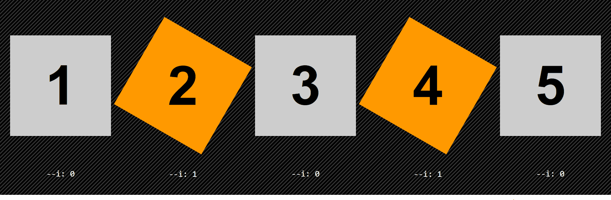
One example of this is the CSS variable version of the yin and yang loader I coded last year. For this version, we create the two halves with the two pseudo-elements of the loader element.

We use the same background, border-color, transform-origin and animation-delay values for the two halves. These values all depend on a switch variable --i that’s initially set to 0 on both halves (the pseudo-elements), but then we change it to 1 for the second half (the :after pseudo-element), thus dynamically modifying the computed values of all these properties.
Without CSS variables, we’d have to set all these properties (border-color, transform-origin, background, animation-delay) again on the :after pseudo-element and risk making some typo or even forgetting to set some of them.
How switching works in the general case
Switching between a zero and a non-zero value
In the particular case of the yin and yang loader, all the properties we change between the two halves (pseudo-elements) go from a zero value for one state of the switch and a non-zero value for the other state.
If we want our value to be zero when the switch is off (--i: 0) and non-zero when the switch is on (--i: 1), then we multiply it with the switch value (var(--i)). This way, if our non-zero value should be, let’s say an angular value of 30deg, we have:
- when the switch is off (
--i: 0),calc(var(--i)*30deg)computes to0*30deg = 0deg - when the switch is on (
--i: 1),calc(var(--i)*30deg)computes to1*30deg = 30deg
However, if we want our value to be non-zero when the switch is off (--i: 0) and zero when the switch is on (--i: 1), then we multiply it with the complementary of the switch value (1 - var(--i)). This way, for the same non-zero angular value of 30deg, we have:
- when the switch is off (
--i: 0),calc((1 - var(--i))*30deg)computes to(1 - 0)*30deg = 1*30deg = 30deg - when the switch is on (
--i: 1),calc((1 - var(--i))*30deg)computes to(1 - 1)*30deg = 0*30deg = 0deg
You can see this concept illustrated below:

calc() not working for angle values)For the particular case of the loader, we use HSL values for border-color and background-color. HSL stands for hue, saturation, lightness and can be best represented visually with the help of a bicone (which is made up of two cones with the bases glued together).

The hues go around the bicone, 0° being equivalent to 360° to give us a red in both cases.

The saturation goes from 0% on the vertical axis of the bicone to 100% on the bicone surface. When the saturation is 0% (on the vertical axis of the bicone), the hue doesn’t matter anymore; we get the exact same grey for all hues in the same horizontal plane.
The “same horizontal plane” means having the same lightness, which increases along the vertical bicone axis, going from 0% at the black bicone vertex to 100% at the white bicone vertex. When the lightness is either 0% or 100%, neither the hue nor the saturation matter anymore – we always get black for a lightness value of 0% and white for a lightness value of 100%.
Since we only need black and white for our ☯ symbol, the hue and saturation are irrelevant, so we zero them and then switch between black and white by switching the lightness between 0% and 100%.
.yin-yang {
  /* other styles that are irrelevant here */

  &:before, &:after {
    /* other styles that are irrelevant here */
    --i: 0;

    /* lightness of border-color when
     * --i: 0 is (1 - 0)*100% = 1*100% = 100% (white)
     * --i: 1 is (1 - 1)*100% = 0*100% =   0% (black) */
    border: solid $d/6 hsl(0, 0%, calc((1 - var(--i))*100%));

    /* x coordinate of transform-origin when
     * --i: 0 is 0*100% =   0% (left)
     * --i: 1 is 1*100% = 100% (right) */
    transform-origin: calc(var(--i)*100%) 50%;

    /* lightness of background-color when
     * --i: 0 is 0*100% =   0% (black)
     * --i: 1 is 1*100% = 100% (white) */
    background: hsl(0, 0%, calc(var(--i)*100%));

    /* animation-delay when
     * --i: 0 is 0*-$t = 0s
     * --i: 1 is 1*-$t = -$t */
    animation: s $t ease-in-out calc(var(--i)*#{-$t}) infinite alternate;
  }

  &:after { --i: 1 }
}
Note that this approach doesn’t work in Edge due to the fact that Edge doesn’t support calc() values for animation-delay.
But what if we want to have a non-zero value when the switch is off (--i: 0) and another different non-zero value when the switch is on (--i: 1)?
Switching between two non-zero values
Let’s say we want an element to have a grey background (#ccc) when the switch is off (--i: 0) and an orange background (#f90) when the switch is on (--i: 1).
The first thing we do is switch from hex to a more manageable format such as rgb() or hsl().
We could do this manually either by using a tool such as Lea Verou’s CSS Colors or via DevTools. If we have a background set on an element we can cycle through formats by keeping the Shift key pressed while clicking on the square (or circle) in front of the value in DevTools. This works in both Chrome and Firefox, though it doesn’t appear to work in Edge.
 value.”/>
Even better, if we’re using Sass, we can extract the components with red()/ green()/ blue() or hue()/ saturation()/ lightness() functions.
While rgb() may be the better known format, I tend to prefer hsl() because I find it more intuitive and it’s easier for me to get an idea about what to expect visually just by looking at the code.
So we extract the three components of the hsl() equivalents of our two values ($c0: #ccc when the switch is off and $c1: #f90 when the switch is on) using these functions:
$c0: #ccc;
$c1: #f90;

$h0: round(hue($c0)/1deg);
$s0: round(saturation($c0));
$l0: round(lightness($c0));

$h1: round(hue($c1)/1deg);
$s1: round(saturation($c1));
$l1: round(lightness($c1))
Note that we’ve rounded the results of the hue(), saturation() and lightness() functions as they may return a lot of decimals and we want to keep our generated code clean. We’ve also divided the result of the hue() function by 1deg, as the returned value is a degree value in this case and Edge only supports unit-less values inside the CSS hsl() function. Normally, when using Sass, we can have degree values, not just unit-less ones for the hue inside the hsl() function because Sass treats it as the Sass hsl() function, which gets compiled into a CSS hsl() function with a unit-less hue. But here, we have a dynamic CSS variable inside, so Sass treats this function as the CSS hsl() function that doesn’t get compiled into anything else, so, if the hue has a unit, this doesn’t get removed from the generated CSS.
Now we have that:
- if the switch is off (
--i: 0), ourbackgroundishsl($h0, $s0, $l0) - if the switch is on (
--i: 1), ourbackgroundishsl($h1, $s1, $l1)
We can write our two backgrounds as:
- if the switch is off (
--i: 0),hsl(1*$h0 + 0*$h1, 1*$s0 + 0*$s1, 1*$l0 + 1*$l1) - if the switch is on (
--i: 1),hsl(0*$h0 + 1*$h1, 0*$s0 + 1*$s1, 0*$l0 + 1*$l1)
Using the switch variable --i, we can unify the two cases:
--j: calc(1 - var(--i));
background: hsl(calc(var(--j)*#{$h0} + var(--i)*#{$h1}),
                calc(var(--j)*#{$s0} + var(--i)*#{$s1}),
                calc(var(--j)*#{$l0} + var(--i)*#{$l1}))
Here, we’ve denoted by --j the complementary value of --i (when --i is 0, --j is 1 and when --i is 1, --j is 0).

The formula above works for switching in between any two HSL values. However, in this particular case, we can simplify it because we have a pure grey when the switch is off (--i: 0).
Purely grey values have equal red, green and blue values when taking into account the RGB model.
When taking into account the HSL model, the hue is irrelevant (our grey looks the same for all hues), the saturation is always 0% and only the lightness matters, determining how light or dark our grey is.
In this situation, we can always keep the hue of the non-grey value (the one we have for the “on” case, $h1).
Since the saturation of any grey value (the one we have for the “off” case, $s0) is always 0%, multiplying it with either 0 or 1 always gives us 0%. So, given the var(--j)*#{$s0} term in our formula is always 0%, we can just ditch it and our saturation formula reduces to the product between the saturation of the “on” case $s1 and the switch variable --i.
This leaves the lightness as the only component where we still need to apply the full formula.
--j: calc(1 - var(--i));
background: hsl($h1,
                calc(var(--i)*#{$s1}),
                calc(var(--j)*#{$l0} + var(--i)*#{d1l}))
The above can be tested in this demo.
Similarly, let’s say we want the font-size of some text to be 2rem when our switch is off (--i: 0) and 10vw when the switch is on (--i: 1). Applying the same method, we have:
font-size: calc((1 - var(--i))*2rem + var(--i)*10vw)
Alright, let’s now move on to clearing another aspect of this: what is it exactly that causes the switch to flip from on to off or the other way around?
What triggers switching
We have a few options here.
Element-based switching
This means the switch is off for certain elements and on for other elements. For example, this can be determined by parity. Let’s say we want all the even elements to be rotated and have an orange background instead of the initial grey one.
.box {
  --i: 0;
  --j: calc(1 - var(--i));
  transform: rotate(calc(var(--i)*30deg));
  background: hsl($h1,
                  calc(var(--i)*#{$s1}),
                  calc(var(--j)*#{$l0} + var(--i)*#{$l1}));

  &:nth-child(2n) { --i: 1 }
}
calc() not working for angle values)In the parity case, we flip the switch on for every second item (:nth-child(2n)), but we can also flip it on for every seventh item (:nth-child(7n)), for the first two items (:nth-child(-n + 2)), for all items except the first and last two (:nth-child(n + 3):nth-last-child(n + 3)). We can also flip it on just for headings or just for elements that have a certain attribute.
State-based switching
This means the switch is off when the element itself (or a parent or one of its previous siblings) is in one state and off when it’s another state. In the interactive examples from the previous section, the switch was flipped when a checkbox before our element got checked or unchecked.
We can also have something like a white link that scales up and turns orange when focused or hovered:
$c: #f90;

$h: round(hue($c)/1deg);
$s: round(saturation($c));
$l: round(lightness($c));

a {
  --i: 0;
  transform: scale(calc(1 + var(--i)*.25));
  color: hsl($h, $s, calc(var(--i)*#{$l} + (1 - var(--i))*100%));

  &:focus, &:hover { --i: 1 }
}
Since white is any hsl() value with a lightness of 100% (the hue and saturation are irrelevant), we can simplify things by always keeping the hue and saturation of the :focus/ :hover state and only changing the lightness.

calc() values not being supported inside scale() functions)Media query-based switching
Another possibility is that switching is triggered by a media query, for example, when the orientation changes or when going from one viewport range to another.
Let’s say we have a white heading with a font-size of 1rem up to 320px, but then it turns orange ($c) and the font-size becomes 5vw and starts scaling with the viewport width.
h5 {
  --i: 0;
  color: hsl($h, $s, calc(var(--i)*#{$l} + (1 - var(--i))*100%));
  font-size: calc(var(--i)*5vw + (1 - var(--i))*1rem);

  @media (min-width: 320px) { --i: 1 }
}
Coding a more complex example from scratch
The example we dissect here is that of the expanding search shown at the beginning of this article, inspired by this Pen, which you should really check out because the code is pretty damn clever.

Note that from a usability point of view, having such a search box on a website may not be the best idea as one would normally expect the button following the search box to trigger the search, not close the search bar, but it’s still an interesting coding exercise, which is why I’ve chosen to dissect it here.
To begin with, my idea was to do it using only form elements. So, the HTML structure looks like this:
<input id='search-btn' type='checkbox'/>
<label for='search-btn'>Show search bar</label>
<input id='search-bar' type='text' placeholder='Search...'/>
What we do here is initially hide the text input and then reveal it when the checkbox before it gets checked — let’s dive into how that works!
First off, we use a basic reset and set a flex layout on the container of our input and label elements. In our case, this container is the body, but it could be another element as well. We also absolutely position the checkbox and move it out of sight (outside the viewport).
*, :before, :after {
  box-sizing: border-box;
  margin: 0;
  padding: 0;
  font: inherit
}

html { overflow-x: hidden }

body {
  display: flex;
  align-items: center;
  justify-content: center;
  margin: 0 auto;
  min-width: 400px;
  min-height: 100vh;
  background: #252525
}

[id='search-btn'] {
  position: absolute;
  left: -100vh
}
So far, so good…
See the Pen by thebabydino (@thebabydino) on CodePen.
So what? We have to admit it’s not exciting at all, so let’s move on to the next step!
We turn the checkbox label into a big round green button and move its text content out of sight using a big negative-valued text-indent and overflow: hidden.
$btn-d: 5em;

/* same as before */

[for='search-btn'] {
  overflow: hidden;
  width: $btn-d;
  height: $btn-d;
  border-radius: 50%;
  box-shadow: 0 0 1.5em rgba(#000, .4);
  background: #d9eb52;
  text-indent: -100vw;
  cursor: pointer;
}
See the Pen by thebabydino (@thebabydino) on CodePen.
Next, we polish the actual search bar by:
- giving it explicit dimensions
- providing a
backgroundfor its normal state - defining a different
backgroundand a glow for its focused state - rounding the corners on the left side using a
border-radiusthat equals half itsheight - Cleaning up the placeholder a bit
$btn-d: 5em;
$bar-w: 4*$btn-d;
$bar-h: .65*$btn-d;
$bar-r: .5*$bar-h;
$bar-c: #ffeacc;

/* same as before */

[id='search-bar'] {
  border: none;
  padding: 0 1em;
  width: $bar-w;
  height: $bar-h;
  border-radius: $bar-r 0 0 $bar-r;
  background: #3f324d;
  color: #fff;
  font: 1em century gothic, verdana, arial, sans-serif;

  &::placeholder {
    opacity: .5;
    color: inherit;
    font-size: .875em;
    letter-spacing: 1px;
    text-shadow: 0 0 1px, 0 0 2px
  }

  &:focus {
    outline: none;
    box-shadow: 0 0 1.5em $bar-c, 0 1.25em 1.5em rgba(#000, .2);
    background: $bar-c;
    color: #000;
  }
}
See the Pen by thebabydino (@thebabydino) on CodePen.
At this point, the right edge of the search bar coincides with the left edge of the button. However, we want a bit of overlap — let’s say an overlap such that the right edge of the search bar coincides with the button’s vertical midline. Given that we have a flexbox layout with align-items: center on the container (the body in our case), the assembly made up of our two items (the bar and the button) remains middle-aligned horizontally even if we set a margin on one or on the other or on both in between those items. (On the left of the leftmost item or on the right of the rightmost item is a different story, but we won’t be getting into that now.)

That’s an overlap of .5*$btn-d minus half a button diameter, which is equivalent to the button’s radius. We set this as a negative margin-right on the bar. We also adjust the padding on the right of the bar so that we compensate for the overlap:
$btn-d: 5em;
$btn-r: .5*$btn-d;

/* same as before */

[id='search-bar'] {
  /* same as before */
  margin-right: -$btn-r;
  padding: 0 calc(#{$btn-r} + 1em) 0 1em;
}
We now have the bar and the button in the positions for the expanded state:
See the Pen by thebabydino (@thebabydino) on CodePen.
Except the bar follows the button in DOM order, so it’s placed on top of it, when we actually want the button on top. Fortunately, this has an easy fix (at least for now — it won’t be enough later, but let’s deal with one issue at a time).
[for='search-btn'] {
  /* same as before */
  position: relative;
}
Now that we’ve given the button a non-static position value, it’s on top of the bar:
See the Pen by thebabydino (@thebabydino) on CodePen.
In this state, the total width of the bar and button assembly is the bar width $bar-w plus the button’s radius $btn-r (which is half the button diameter $btn-d) because we have an overlap for half the button. In the collapsed state, the total width of the assembly is just the button diameter $btn-d.

Since we want to keep the same central axis when going from the expanded to the collapsed state, we need to shift the button to the left by half the assembly width in the expanded state (.5*($bar-w + $btn-r)) minus the button’s radius ($btn-r).
We call this shift $x and we use it with minus on the button (since we shift the button to the left and left is the negative direction of the x axis). Since we want the bar to collapse into the button, we set the same shift $x on it, but in the positive direction (as we shift the bar to the right of the x axis).
We’re in the collapsed state when the checkbox isn’t checked and in the expanded state when it isn’t. This means our bar and button are shifted with a CSS transform when the checkbox isn’t checked and in the position we currently have them in (no transform) when the checkbox is checked.
In order to do this, we set a variable --i on the elements following our checkbox — the button (created with the label for the checkbox) and the search bar. This variable is 0 in the collapsed state (when both elements are shifted and the checkbox isn’t checked) and 1 in the expanded state (when our bar and button are in the positions they currently occupy, no shift, and the checkbox is checked).
$x: .5*($bar-w + $btn-r) - $btn-r;

[id='search-btn'] {
  position: absolute;
  left: -100vw;

  ~ * {
    --i: 0;
    --j: calc(1 - var(--i)) /* 1 when --i is 0, 0 when --i is 1 */
  }

  &:checked ~ * { --i: 1 }
}

[for='search-btn'] {
  /* same as before */
  /* if --i is 0, --j is 1 => our translation amount is -$x
   * if --i is 1, --j is 0 => our translation amount is 0 */
  transform: translate(calc(var(--j)*#{-$x}));
}

[id='search-bar'] {
  /* same as before */
  /* if --i is 0, --j is 1 => our translation amount is $x
   * if --i is 1, --j is 0 => our translation amount is 0 */
  transform: translate(calc(var(--j)*#{$x}));
}
And we now have something interactive! Clicking the button toggles the checkbox state (because the button has been created using the label of the checkbox).
See the Pen by thebabydino (@thebabydino) on CodePen.
Except now the button is a bit difficult to click since it’s under the text input again (because we’ve set a transform on the bar and this establishes a stacking context). The fix is pretty straightforward — we need to add a z-index to the button and this moves it above the bar.
[for='search-btn'] {
  /* same as before */
  z-index: 1;
}
See the Pen by thebabydino (@thebabydino) on CodePen.
But we still have another bigger problem: we can see the bar coming out from under the button on the right side. In order to fix this, we set clip-path with an inset() value on the bar. This specifies a clipping rectangle with the help of the distances from the top, right, bottom and left edges of the element’s border-box. Everything outside this clipping rectangle gets cut out and only what’s inside is displayed.

inset() function works (live).In the illustration above, each distance is going inward from the edges of the border-box. In this case, they’re positive. But they can also go outwards, in which case they’re negative and the corresponding edges of the clipping rectangle are outside the element’s border-box.
At first, you may think we’d have no reason to ever do that, but in our particular case, we do!
We want the distances from the top (dt), bottom (db) and left (dl) to be negative and big enough to contain the box-shadow that extends outside the element’s border-box in the :focus state as we don’t want it to get clipped out. So the solution is to create a clipping rectangle with edges outside the element’s border-box in these three directions.
The distance from the right (dr) is the full bar width $bar-w minus a button radius $btn-r in the collapsed case (checkbox not checked, --i: 0) and 0 in the expanded case (checkbox checked, --i: 1).
$out-d: -3em;

[id='search-bar'] {
  /* same as before */
  clip-path: inset($out-d calc(var(--j)*#{$bar-w - $btn-r}) $out-d $out-d);
}
We now have a search bar and button assembly that expands and collapses on clicking the button.
See the Pen by thebabydino (@thebabydino) on CodePen.
Since we don’t want an abrupt change in between the two states, we use a transition:
[id='search-btn'] {
  /* same as before */

  ~ * {
    /* same as before */
    transition: .65s;
  }
}
We also want our button’s background to be green in the collapsed case (checkbox not checked, --i: 0) and pink in the expanded case (checkbox checked, --i: 1). For this, we use the same technique as before:
[for='search-btn'] {
  /* same as before */
  $c0: #d9eb52; // green for collapsed state
  $c1: #dd1d6a; // pink for expanded state
  $h0: round(hue($c0)/1deg);
  $s0: round(saturation($c0));
  $l0: round(lightness($c0));
  $h1: round(hue($c1)/1deg);
  $s1: round(saturation($c1));
  $l1: round(lightness($c1));
  background: hsl(calc(var(--j)*#{$h0} + var(--i)*#{$h1}),
                  calc(var(--j)*#{$s0} + var(--i)*#{$s1}),
                  calc(var(--j)*#{$l0} + var(--i)*#{$l1}));
}
Now we’re getting somewhere!
See the Pen by thebabydino (@thebabydino) on CodePen.
What we still need to do is create the icon that morphs between a magnifier in the collapsed state and an “x” in the expanded state to indicate a closing action. We do this with the :before and :after pseudo-elements. We begin by deciding on a diameter for the magnifier and how much of this diameter the width of the icon lines represent.
$ico-d: .5*$bar-h;
$ico-f: .125;
$ico-w: $ico-f*$ico-d;
We absolutely position both pseudo-elements in the middle of the button taking their dimensions into account. We then make them inherit their parent’s transition. We give the :before a background, as this will be the handle of our magnifier, make the :after round with border-radius and give it an inset box-shadow.
[for='search-btn'] {
  /* same as before */

  &:before, &:after {
    position: absolute;
    top: 50%; left: 50%;
    margin: -.5*$ico-d;
    width: $ico-d;
    height: $ico-d;
    transition: inherit;
    content: ''
  }

  &:before {
    margin-top: -.4*$ico-w;
    height: $ico-w;
    background: currentColor
  }

  &:after {
    border-radius: 50%;
    box-shadow: 0 0 0 $ico-w currentColor
  }
}
We can now see the magnifier components on the button:
See the Pen by thebabydino (@thebabydino) on CodePen.
In order to make our icon to look more like a magnifier, we translate both of its components outwards by a quarter of the magnifier’s diameter. This means translating the handle to the right, in the positive direction of the x axis by .25*$ico-d and the main part to the left, in the negative direction of the x axis by the same .25*$ico-d.
We also scale the handle (the :before pseudo-element) horizontally to half its width with respect to its right edge (which means a transform-origin of 100% along the x axis).
We only want this to happen in the collapsed state (checkbox not checked, --i is 0 and, consequently --j is 1), so we multiply the translation amounts by --j and also use --j to condition the scaling factor:
[for='search-btn'] {
  /* same as before */

  &:before {
    /* same as before */
    height: $ico-w;
    transform:
      /* collapsed: not checked, --i is 0, --j is 1
       * translation amount is 1*.25*$d = .25*$d
       * expanded: checked, --i is 1, --j is 0
       * translation amount is 0*.25*$d = 0 */
      translate(calc(var(--j)*#{.25*$ico-d}))
      /* collapsed: not checked, --i is 0, --j is 1
       * scaling factor is 1 - 1*.5 = 1 - .5 = .5
       * expanded: checked, --i is 1, --j is 0
       * scaling factor is 1 - 0*.5 = 1 - 0 = 1 */
      scalex(calc(1 - var(--j)*.5))
  }

  &:after {
    /* same as before */
    transform: translate(calc(var(--j)*#{-.25*$ico-d}))
  }
}
We now have thew magnifier icon in the collapsed state:
See the Pen by thebabydino (@thebabydino) on CodePen.
Since we want both icon components to be rotated by 45deg, we add this rotation on the button itself:
[for='search-btn'] {
  /* same as before */
  transform: translate(calc(var(--j)*#{-$x})) rotate(45deg);
}
Now we have the look we want for the collapsed state:
See the Pen by thebabydino (@thebabydino) on CodePen.
This still leaves the expanded state, where we need to turn the round :after pseudo-element into a line. We do this by scaling it down along the x axis and bringing its border-radius from 50% to 0%. The scaling factor we use is the ratio between the width $ico-w of the line we want to get and the diameter $ico-d of the circle it forms in the collapsed state. We’ve called this ratio $ico-f.
Since we only want to do this in the expanded state, when the checkbox is checked and --i is 1, we make both the scaling factor and the border-radius depend on --i and --j:
$ico-d: .5*$bar-h;
$ico-f: .125;
$ico-w: $ico-f*$ico-d;

[for='search-btn'] {
  /* same as before */

  &:after{
    /* same as before */
    /* collapsed: not checked, --i is 0, --j is 1
     * border-radius is 1*50% = 50%
     * expanded: checked, --i is 1, --j is 0
     * border-radius is 0*50% = 0 */
    border-radius: calc(var(--j)*50%);
    transform:
      translate(calc(var(--j)*#{-.25*$ico-d}))
      /* collapsed: not checked, --i is 0, --j is 1
       * scaling factor is 1 + 0*$ico-f = 1
       * expanded: checked, --i is 1, --j is 0
       * scaling factor is 0 + 1*$ico-f = $ico-f */
      scalex(calc(1 - var(--j)*.5))
  }
}
See the Pen by thebabydino (@thebabydino) on CodePen.
Hmm, almost, but not quite. Scaling has also shrunk our inset box-shadow along the x axis, so let’s fix that with a second inset shadow that we only get in the expanded state (when the checkbox is checked and --i is 1) and therefore, its spread and alpha depend on --i:
$ico-d: .5*$bar-h;
$ico-f: .125;
$ico-w: $ico-f*$ico-d;

[for='search-btn'] {
  /* same as before */
  --hsl: 0, 0%, 0%;
  color: HSL(var(--hsl));

  &:after{
    /* same as before */
    box-shadow:
      inset 0 0 0 $ico-w currentcolor,
      /* collapsed: not checked, --i is 0, --j is 1
       * spread radius is 0*.5*$ico-d = 0
       * alpha is 0
       * expanded: checked, --i is 1, --j is 0
       * spread radius is 1*.5*$ico-d = .5*$ico-d
       * alpha is 1 */
      inset 0 0 0 calc(var(--i)*#{.5*$ico-d}) HSLA(var(--hsl), var(--i))
  }
}
This gives us our final result!
See the Pen by thebabydino (@thebabydino) on CodePen.
A few more quick examples
The following are a few more demos that use the same technique. We won’t be building these from scratch — we’ll merely go through the basic ideas behind them.
Responsive banners
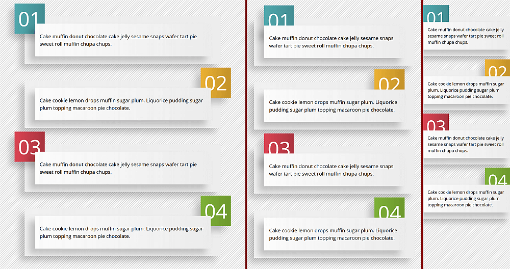
calc() value for font-size).In this case, our actual elements are the smaller rectangles in front, while the number squares and the bigger rectangles in the back are created with the :before and :after pseudo-elements, respectively.
The backgrounds of the number squares are individual and set using a stop list variable --slist that’s different for each item.
<p style='--slist: #51a9ad, #438c92'><!-- 1st paragraph text --></p>
<p style='--slist: #ebb134, #c2912a'><!-- 2nd paragraph text --></p>
<p style='--slist: #db4453, #a8343f'><!-- 3rd paragraph text --></p>
<p style='--slist: #7eb138, #6d982d'><!-- 4th paragraph text --></p>
The things that influence the styles on the banners are the parity and whether we’re in the wide, normal or narrow case. These give us our switch variables:
html {
  --narr: 0;
  --comp: calc(1 - var(--narr));
  --wide: 1;

  @media (max-width: 36em) { --wide: 0 }

  @media (max-width: 20em) { --narr: 1 }
}

p {
  --parity: 0;

  &:nth-child(2n) { --parity: 1 }
}
The number squares are absolutely positioned and their placement depends on parity. If the --parity switch is off (0), then they’re on the left. If it’s on (1), then they’re on the right.
A value of left: 0% aligns with the left edge of the number square along the left edge of its parent, while a value of left: 100% aligns its left edge along the parent’s right edge.
In order to have the right edge of the number square aligned with the right edge of its parent, we need to subtract its own width out of the previous 100% value. (Remember that % values in the case of offsets are relative to the parent’s dimensions.)
left: calc(var(--parity)*(100% - #{$num-d}))…where $num-d is the size of the numbering square.
In the wide screen case, we also push the numbering outwards by 1em — this means subtracting 1em from the offset we have so far for odd items (having the --parity switch off) and adding 1em to the offset we have so far for even items (having the --parity switch on).
Now the question here is… how do we switch the sign? The simplest way to do it is by using the powers of -1. Sadly, we don’t have a power function (or a power operator) in CSS, even though it would be immensely useful in this case:
/*
 * for --parity: 0, we have pow(-1, 0) = +1
 * for --parity: 1, we have pow(-1, 1) = -1
 */
pow(-1, var(--parity))
This means we have to make it work with what we do have (addition, subtraction, multiplication and division) and that leads to a weird little formula… but, hey, it works!
/*
 * for --parity: 0, we have 1 - 2*0 = 1 - 0 = +1
 * for --parity: 1, we have 1 - 2*1 = 1 - 2 = -1
 */
--sign: calc(1 - 2*var(--parity))
This way, our final formula for the left offset, taking into account both the parity and whether we’re in the wide case (--wide: 1) or not (--wide: 0), becomes:
left: calc(var(--parity)*(100% - #{$num-d}) - var(--wide)*var(--sign)*1em)We also control the width of the paragraphs with these variables and max-width as we want it to have an upper limit and only fully cover its parent horizontally in the narrow case (--narr: 1):
width: calc(var(--comp)*80% + var(--narr)*100%);
max-width: 35em;
The font-size also depends on whether we’re in the narrow case (--narr: 1) or not (--narr: 0):
calc(.5rem + var(--comp)*.5rem + var(--narr)*2vw)…and so do the horizontal offsets for the :after pseudo-element (the bigger rectangle in the back) as they’re 0 in the narrow case (--narr: 1) and a non-zero offset $off-x otherwise (--narr: 0):
right: calc(var(--comp)*#{$off-x});
left: calc(var(--comp)*#{$off-x});
Hover and focus effects

calc() bug).This effect is created with a link element and its two pseudo-elements sliding diagonally on the :hover and :focus states. The link’s dimensions are fixed and so are those of its pseudo-elements, set to the diagonal of their parent $btn-d (computed as the hypotenuse in the right triangle formed by a width and a height) horizontally and the parent’s height vertically.
The :before is positioned such that its bottom left corner coincides to that of its parent, while the :after is positioned such that its top right corner coincides with that of its parent. Since both should have the same height as their parent, the vertical placement is resolved by setting top: 0 and bottom: 0. The horizontal placement is handled in the exact same way as in the previous example, using --i as the switch variable that changes value between the two pseudo-elements and --j, its complementary (calc(1 - var(--i))):
left: calc(var(--j)*(100% - #{$btn-d}))We set the transform-origin of the :before to its left-bottom corner (0% 100%) and :after to its right-top corner (100% 0%), again, with the help of the switch --i and its complementary --j:
transform-origin: calc(var(--j)*100%) calc(var(--i)*100%)We rotate both pseudo-elements to the angle between the diagonal and the horizontal $btn-a (also computed from the triangle formed by a height and a width, as the arctangent of the ratio between the two). With this rotation, the horizontal edges meet along the diagonal.
We then shift them outwards by their own width. This means we’ll use a different sign for each of the two, again depending on the switch variable that changes value in between the :before and :after, just like in the previous example with the banners:
transform: rotate($btn-a) translate(calc((1 - 2*var(--i))*100%))In the :hover and :focus states, this translation needs to go back to 0. This means we multiply the amount of the translation above by the complementary --q of the switch variable --p that’s 0 in the normal state and 1 in the :hover or :focus state:
transform: rotate($btn-a) translate(calc(var(--q)*(1 - 2*var(--i))*100%))In order to make the pseudo-elements slide out the other way (not back the way they came in) on mouse-out or being out of focus, we set the switch variable --i to the value of --p for :before and to the value of --q for :after, reverse the sign of the translation, and make sure we only transition the transform property.
Responsive infographic
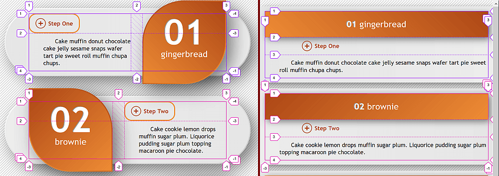
calc() bugs).In this case, we have a three-row, two-column grid for each item (article element), with the third row collapsed in the wide screen scenario and the second column collapsed in the narrow screen scenario. In the wide screen scenario, the widths of the columns depend on the parity. In the narrow screen scenario, the first column spans the entire content-box of the element and the second one has width 0. We also have a gap in between the columns, but only in the wide screen scenario.
// formulas for the columns in the wide screen case, where
// $col-a-wide is for second level heading + paragraph
// $col-b-wide is for the first level heading
$col-1-wide: calc(var(--q)*#{$col-a-wide} + var(--p)*#{$col-b-wide});
$col-2-wide: calc(var(--q)*#{$col-b-wide} + var(--p)*#{$col-a-wide});

// formulas for the general case, combining the wide and normal scenarios
$row-1: calc(var(--i)*#{$row-1-wide} + var(--j)*#{$row-1-norm});
$row-2: calc(var(--i)*#{$row-2-wide} + var(--j)*#{$row-2-norm});
$row-3: minmax(0, auto);
$col-1: calc(var(--i)*#{$col-1-wide} + var(--j)*#{$col-1-norm});
$col-2: calc(var(--i)*#{$col-2-wide});

$art-g: calc(var(--i)*#{$art-g-wide});

html {
  --i: var(--wide, 1); // 1 in the wide screen case
  --j: calc(1 - var(--i));

  @media (max-width: $art-w-wide + 2rem) { --wide: 0 }
}

article {
  --p: var(--parity, 0);
  --q: calc(1 - var(--p));
  --s: calc(1 - 2*var(--p));
  display: grid;
  grid-template: #{$row-1} #{$row-2} #{$row-3}/ #{$col-1} #{$col-2};
  grid-gap: 0 $art-g;
  grid-auto-flow: column dense;

  &:nth-child(2n) { --parity: 1 }
}
Since we’ve set grid-auto-flow: column dense, we can get away with only setting the first level heading to cover an entire column (second one for odd items and first one for even items) in the wide screen case and let the second level heading and the paragraph text fill the first free available cells.
// wide case, odd items: --i is 1, --p is 0, --q is 1
// we're on column 1 + 1*1 = 2
// wide case, even items: --i is 1, --p is 1, --q is 0
// we're on column 1 + 1*0 = 1
// narrow case: --i is 0, so var(--i)*var(--q) is 0 and we're on column 1 + 0 = 1
grid-column: calc(1 + var(--i)*var(--q));

// always start from the first row
// span 1 + 2*1 = 3 rows in the wide screen case (--i: 1)
// span 1 + 2*0 = 1 row otherwise (--i: 0)
grid-row: 1/ span calc(1 + 2*var(--i));
For each item, a few other properties depend on whether we’re in the wide screen scenario or not.
The vertical margin, vertical and horizontal padding values, box-shadow offsets and blur are all bigger in the wide screen case:
$art-mv: calc(var(--i)*#{$art-mv-wide} + var(--j)*#{$art-mv-norm});
$art-pv: calc(var(--i)*#{$art-pv-wide} + var(--j)*#{$art-p-norm});
$art-ph: calc(var(--i)*#{$art-ph-wide} + var(--j)*#{$art-p-norm});
$art-sh: calc(var(--i)*#{$art-sh-wide} + var(--j)*#{$art-sh-norm});

article {
  /* other styles */
  margin: $art-mv auto;
  padding: $art-pv $art-ph;
  box-shadow: $art-sh $art-sh calc(3*#{$art-sh}) rgba(#000, .5);
}
We have a non-zero border-width and border-radius in the wide screen case:
$art-b: calc(var(--i)*#{$art-b-wide});
$art-r: calc(var(--i)*#{$art-r-wide});

article {
  /* other styles */
  border: solid $art-b transparent;
  border-radius: $art-r;
}
In the wide screen scenario, we limit the items’ width, but let it be 100% otherwise.
$art-w: calc(var(--i)*#{$art-w-wide} + var(--j)*#{$art-w-norm});

article {
  /* other styles */
  width: $art-w;
}
The direction of the padding-box gradient also changes with the parity:
background:
  linear-gradient(calc(var(--s)*90deg), #e6e6e6, #ececec) padding-box,
  linear-gradient(to right bottom, #fff, #c8c8c8) border-box;
In a similar manner, margin, border-width, padding, width, border-radius, background gradient direction, font-size or line-height for the headings and the paragraph text also depend on whether we’re in the wide screen scenario or not (and, in the case of the first level heading’s border-radius or background gradient direction, also on the parity).
I can’t believe there aren’t any comments on this yet. This is really great. Complicated, sure, but finally some solid examples of why I’d use variables in the browser rather than just in sass. Thanks for taking the time!
This is really interesting stuff, I’ve been messing around with css variables for the past few days! Shame browser support is still a bit patchy, but exciting!!
“why I’d use variables in the browser rather than just in sass.”
For what it’s worth, CSS variables are read/write from JavaScript too. So there are a lot of interesting things you can apply from code. And if you get into Web Components / custom elements, CSS variables (along with manipulation from JS) are a good way to cross the Shadow DOM barrier