Headers are an important factor in web design, they can either make or break a design. Since web 2.0, we have seen many design trends and one of the most groundbreaking is the big header. However, headers have remained boxy throughout.
Blueflavor, a mobile design website, has bucked this trend with something I have yet to see elsewhere and does not require great CSS skills to create.
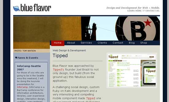
As you can see they have the menu and start of the content pushed into the header. Now how do they do that?
You can either slice the image into seperate pieces and try and fit them with (floating) divs. However, This leads to possible problems with browser differences with IE 6, 7 and Firefox.

The best way is to keep the image whole. Blue Flavor uses two columns with the first column sitting under the longer part of the header. The content div sits under the shorter part of the header. Normally the content div would sit on the same level as the first column. To move it up into the gap of the image, use a negative margin which will shift it up. Blue Flavor uses margin-top: -20px.
Negative margins are not usually used but this is a simple way to change the look and feel of a header.
Hey buddy, thanks for the plu :)
However you may want to change the title as it has favor instead of flavor (missing the ‘L’)
Its amazing what a negative margin (or padding) can do and it changes the normal structure to something different and exciting :)
Thanks again.
Sure thing.
Title is fixed too. Doh. =)
btw I have also used this technique over at a new website I am currently creating: http://www.jubileeworldharvest.com.au