Accessibility is a hot topic these days, and the older we web-makers get, the hotter it’s going to become! That might be a snarky outlook, but what I’m trying to say is that it’s about time we start designing the web for everyone because the web was meant to be for everyone, and less and less are we able to predict where, when, and how our work will be consumed.
Accessibility is not just up to developers
As developers, we often encounter accessibility post-design, when we do things like implementating the correct role and aria attributes, ensuring navigation is keyboard friendly, and responsibly hiding elements. In general, our accessibility efforts go towards thinking about how to make specific components and features accessible, such as an SVG icon system or helpful tool-tips.
Given our roles as developers, this makes sense. Accessibility flaws, however, often originate in the UI design itself, and depending on our work environment, we developers don’t necessarily have the authority or bandwidth to advocate for accessibility in the designs we are handed.
For example, let’s say you are tasked with turning a Sketch file into a one-page WordPress site.
The design has finally been approved by the client, and now you have a weekend to build the thing, plus another two days to work with QA to perfect it. As you take a look at the design for the first time, you notice that, on small devices, the dainty serif typeface overlaid on a background image would be difficult for low-sighted visitors to read.
You, the accessibility-minded developer, could proceed in a few ways:
- Remain silent and sate your accessibility conscience by making accessible choices in the code where you can
- Go ahead and make accessibility improvements to the UI as you develop, present them in the finished product, and explain yourself after
- Compile a list of suggested changes to send to the designer and request they be implemented in the mockups so you can then develop them
I was in a situation like this recently and, judge me if you will, I chose number one.
If I’d had the time and the guts, number 2 would’ve gotten me the furthest, but given the nature of my role as a first-time contractor at this high-speed agency I was hoping to develop a working relationship with, I felt I’d be overstepping my bounds and wasn’t ready to take the risk of being too vocal out of the gate. I chose not to do number 3 for similar reasons, mainly for fear of causing more work and stress for the already extremely busy designer.
Now that I have the benefit of hindsight, however, might I add a fourth item to the list?
- Send a succinct list of non-technical accessibility tips for UI design to everyone on the team so they make more accessible design choices in future
Where to find such a list? Well, you are in luck! Read on!
Non-technical Accessibility Tips for UI Design
What follows is a list of plain language, no-jargon, “Accessibility Tips for UI Design” you, developer, can share with everyone at work: UI designers, content providers, project managers, and clients alike. The more we can spread awareness about accessibility and think critically about the mockups we are handed to implement, the more accessible the web will be!
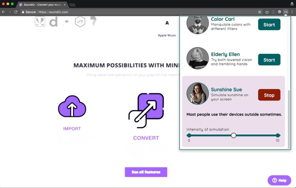
I have chosen the examples below from various trendy website feeds, and I used the fantastic Funkify Chrome Extension to simulate the viewing experience of site visitors with varying abilities and disabilities.
First up:
Easy on the animations.
With great power comes great responsibility. The modern web affords us the power to bounce-in, fly-in, or drop-in any content we please, but besides the wow factor, how are these animations contributing to a reader’s experience on your site? How are the animations triggered? Can they be mistakenly triggered, causing a confusing jolt in the flow of your site visitor’s experience?
Take this example of a car repair company’s website. I’ve applied the “Elderly Ellen” filter from Funkify to simulate slightly blurred vision and shaky hands:
If I were Ellen, this experience would likely steer me away from Service King’s services! Someone like Elderly Ellen is constantly frustrated with technology. It’s unnecessary to cause her that stress when she’s trying to read about a service for repairing her car after an already traumatizing fender bender.
Make sure background and text colors have enough contrast.
Although that medium grey text looks just right on that light grey background, it’s hard to read…and impossible to read if you are working out in the sunshine (not a common occurance, but I’ve done it before). Here’s an example of the aforementioned grey-on-grey scenario:
And now, the same example affected by the “Sunshine Sue” filter from Funkify deems our low contrast captions simply invisible!
The solution? Run your color choices through the WebAIM contrast checker to see if they meet standards for readability and color contrast, and if they don’t, adjust the color values until they do.

The Funkify extension can be used to test anything that is visible in a browser. Even if a design mock isn’t yet implemented in code, an image or PDF can be opened in the browser and the extension will still work!
Be very careful when overlaying text on images, or don’t.
It might look just right to have that dainty serif overlaid on the big header image, but can you read it if you slightly blur your vision? If not, up the contrast between the text and image, perhaps by brightening the text color and increasing the transparency of the image on a dark background.
On Burberry’s website, for example, the user must select from a drop-down in order to enter the site, but the text identifying the drop-down is barely readable over top the background image. There are many ways to solve this from a design standpoint, but for a quick example, we could add a dark background beneath the light text to provide a bit more contrast:

Similarly, while the delicate descriptive text below the image on Tesla’s new Semi website is delicate and beautiful, it is barely legiible when simulating slightly blurred vision with “Blurry Bianca”:

Double-check the readability of font weights and sizes.
The thinner the font weight and the smaller the size, the harder it is to read. Even I, as a hearing, well-sighted individual, find myself zooming in on body text at times because it is so darn lightweight and small, even if the color contrast is up to speed. If you must stick with the lightweight font, increasing the sizes and line height can do wonders as well.
I like to ask myself, does it pass the slightly-cross-eye test? That is when I slightly cross my eyes, can I still make out the text?

Indicate external links.
If it is a requirement for a link to open in a new tab, first question whether it should be a requirement, then indicate it visually with a small icon or note in the UI.
Additionally, designers can make a note in their designs where there should be screen-reader-only text indicating the link will navigate the user away from their current viewing portal. This was brought to mind by way of some excellent replies to a Twitter conversation; read through that here.
Differentiate between action-oriented social media links vs. profile links.
When we see small social media icons, I think the general assumption is that they link to the relevant social media profiles. Sometimes, however, these icons are actually actions that, rather than linking to a profile, open a “New Tweet” dialog or similar. These actions should be marked as such.
Don’t rely 100% on icons and colors to communicate.
It’s easy to assume everyone knows that a hamburger icon indicates a menu or that everyone is familiar with the various versions of LinkedIn’s icon. However, this is not the case, and it causes a moment of confusion and insult that isn’t necessary to site visitors that are less in-the-know than we are. Especially if your audience tends to be older and/or less tech-savvy, make sure you aren’t relying on what you think is common knowledge.
Reliance on colors for meaning causes a similar issue, and more-so for any users that deal with color blindness. A recent Smashing Magazine article covers this problem in detail and uses the example of a color picker on shoe sales website that, for color-blind users, results in an entirely different palette.
What would the design look like without interactivity?
If all a user could do was scroll, does the content still make sense? Are there areas where, rather than hiding the thumbnail caption under a fancy hover event, the caption could be plainly visible instead? What about on a touch screen, where hover events are treated quite differently?
What else?
Have you encountered issues with accessibility in designs you’ve implemented? How did you handle it? What other tips can we give designers and producers for creating more accessible UI designs?
The first step to advocating for accessible UI design is to simply think twice about what you, the developer, are told to implement. While coding up a design, try applying a few of these Funkify filters and see what results they yield. Think critically about the designs you are handed, and start a conversation with your coworkers.
Number 2 is definitely the best option: you’ve been hired for your skills, and any designer I’ve worked with that understands that system design is the process of helping a user from start to finish will want those accessibility changes baked it.
Hi Lara,
I just wanted to thank you for writing such a great article about why accessibility is important. I’ve just installed and started playing with the funkify plugin – love it. Definitely going to be sharing this article with my coworkers.
I’ve recently started an accessibility guild at work, involving UI devs, UX, design, content authors, business administrators. Pretty much anyone who has a passion for it.
We’re discussing ways of working, how to train / teach accessibility, how to test, etc.
I’ll add a link to this article in our wiki’s “documentation & resources” page. Thanks Lara..
A small improvement that seemed to work with the designers I’ve been working with is to give a requirements list:
– on interactive elements, I want the focus state, the active state, the visited state if applicable,
– on icon buttons, I want the title content…
It looks like a light requirement, but if you don’t get them in the first place, you can ask again, and you generally get it, because they feel like they had agreed to provide them.
I also often give little tricks like no “read more” links, or “click here”, with the explanation AFTER the link.
But I agree it is sometimes hard to tell others they’re doing their job wrong.
UX designer here. :) I think a mix between #2 and #3 is needed instead of just one or the other. The reason I can’t get behind #2 completely is that changing the design and waiting until after it’s done to say why is too late. In the moment, it’s best to go to the designer and state “hey the text here is really hard to read. can we increase font size/change color/etc.?” and work more as a team rather than working in a silo. Probably harder to do when you are a contractor v. integrated into the team but…
It then becomes more like “hey let’s discuss this together and then we’ll both update our respective stuff at the same time”.
Loved the list of resources – definitely using that contrast calculator! Beats the heck out of manually calculating it yourself. x_x
Thanks for great article and links to very useful tools!
I’m sure in the not-too-distant future, some AI bot, you know that device that recognises you, will understand your accessibility needs and make all the necessary and personal changes and preferences to what is being viewed on the fly! Until then my friends :)
Great piece, and discovering Funkify is worth the read by itself. Thank you!
However, I was chuckling at sending folks to read about accessibility on Smashing Magazine. In their site navigation, they have black text on red backgrounds, a challenge for some with color blindness, and the contrast is insufficient. The labels for the section links are in a tiny white serif on a bright red background, again, a problem for low-vision and older eyes. I brought up the accessibility issues with them when they were doing a sneak preview of the redesign, and sorry to say, the problems haven’t been addressed.
While I see how one could easily divide the 61 success criteria of WCAG 2.0 into technical and non-technical, I feel (very strongly) that doing so perpetuates a myth and a systemic operational bias that certain roles and titles have certain responsibilities for delivering an accessible product. It is everyone’s responsibility – regardless of role or title. If you are an account executive or a freelance production artist or the CFO, it is your job.
The best quote I saw during #ID24 (11/17): “The biggest misconception about accessibility is that by adding it you are doing someone a favor. You’re not. You’re doing your job.” — @jameswillweb in Decrease Your Conversion by @stefanjudis
Even if the client is unaware, the account team doesn’t care, the visual design team doesn’t understand, and the QA team doesn’t have any test cases for it, you as the one who understands can and should always have a view of “ship it anyway”.