The following is a guest post by Ben Terrill. Ben is co-author of the e-book Tablet Web Design Best Practices and is the VP of Customer Success at Mobify, where he works on big client sites like British Telecom, Starbucks and Expedia.
The tablet revolution is upon us. New data from Adobe shows that global websites now get more traffic from tablets than smartphones. And yet, a standard desktop site doesn’t work very well on a tablet. The typical desktop 12-pixel font is too small, as are buttons. Images aren’t sharp and, worst of all, some features simply don’t work.
The good news is you don’t have to completely revamp your website. A working desktop site is a great place to start building an effective tablet site. In this article, I’ll share six techniques from Mobify’s latest ebook Tablet Web Design Best Practices for significantly improving desktop websites on tablets.
Go 100% Touch Friendly
One of the best ways to make your desktop website sing on a tablet is to make it touch friendly. If website elements look as though they can be swiped, tapped or pinched, then you’ll need to build in that functionality to make your website tablet ready.
Consider adding elements like carousels and accordions, drawers and panels. Mobify has a variety of open source JavaScript modules you can use for this purpose.
Editor’s note: We recently covered the JavaScript for touch-friendly sliders. I also think Royal Slider is a nice slider that is touch-friendly and also responsive.
Bump Up Default Font Size and Line Height
Don’t make users double tap or pinch your content. Instead, increase the font size to at least 16px. You can also use a line height of 1.5 to allow for breathing room between text on content-rich pages, as Mashable does in the example below. Remember, text must always be legible, no matter how a user holds their tablet.

Be Finger Friendly
Our fingers are much clumsier than a cursor, so bumping up the spacing between different touch targets will improve user accuracy. And, make those touch targets big! Our fingertips typically require upwards of 44px to comfortably fit within a touch target so design for that.

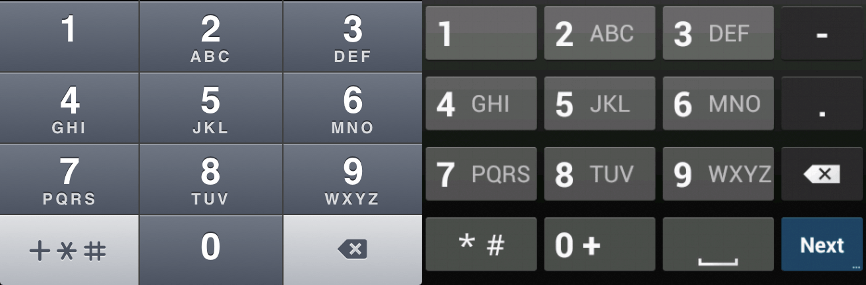
Enable Contextual Keyboards
The great thing about software keyboards is that they’re dynamic. That is, you can change their layout to suit context. For instance, if your input field requires an email address, the keyboard should feature the ‘@’ symbol, underscores and hyphens. If the user is asked to input a phone number, provide a numeric keypad. Try using the following input types on form fields:
- Standard keyboard |
<input type="text" /> - URL parameters |
<input type="url" /> - Email-specific keyboard |
<input type="email" /> - Numeric keyboard |
<input type="text" pattern="[0-9]*" />
Editor’s note: I also detailed data about HTML5 input attributes/types/elements. It’s getting a smidge old, but still useful.
Font-Based Icons for the Win
Resolutions and pixel densities on tablet screens are far greater than on desktop and laptop screens. As a result, graphics can look pixelated if they’re not designed with high resolution screens in mind. For this reason, font-based icons are a good choice because they scale well on super high resolution displays; they’re easy to colour and shade using CSS; and they only require one HTTP request to download. Plus, you don’t have to deal with a sprite sheet.
Create your own icon font sets, or use existing sets like Font Awesome, glyphish, iconsweets, symbolset, or icnfnt.

Editor’s note: I once did a massive roundup of icon fonts (which I still have to add to). I’m a fan of using these HTML techniques for adding them to the page, which keep them accessible. I’m also a fan of IcoMoon for the creating trimmed down, customized icon font sets.
Performance is Design
Modern web design techniques, like responsive design, can cripple website performance. Since 57% of users are likely to leave your website if it takes 3 seconds to load, performance considerations are critical. Some tips for improving mobile website performance include compressing images and concatenating CSS and JavaScript to reduce the number of HTTP requests and overall page size. With these fixes, you’ll notice significantly speedier page load time and happier, higher converting users. Use tools like Uglify, Sass, Compass and Mobify.js to automate performance improvements.
Editor’s note: I cover some of these performance techniques and some others in #114: Let’s Do Simple Stuff to Make Our Websites Faster
Go Forth!
With these tablet transformation techniques in your toolbox, there’s no reason to get stressed out about not having a totally tablet-optimized website. For more ways to make your desktop site tablet friendly, read Mobify’s free ebook, Tablet Web Design Best Practices.
The Numeric keyboard input is something i’ve been wondering about. Thanks for sharing all these!
Thanks!
I never knew about –> <input type=”text” pattern=”[0-9]*” /> to get a numeric keyboard…will have to try this out…
Thanks for the informative post…
If you want greater control over the number input, there’s also the “type=’number'” option, which can give you control over the minimum/maximum number entered and also give desktop users a dynamic way to input the numbers by increasing/decreasing them by a step you specify.
Full HTML5 input options here:
http://html5doctor.com/html5-forms-input-types/
The downside to type=”number”, and why the type=”text” and pattern option can be a good idea, is that Apple devices will show you the full keyboard, and not the number pad (although maybe they’ll fix that in the next iOS). However, I’d argue that it’s better to be semantically accurate and cover the majority of devices than to be a bit hacky just to deal with one subset of devices that might eventually fix their lack of support through updates. Especially when the only impact is that there are a few extra keys for Apple users to ignore as they still have the full number-range at the top of the keyboard.
Couple of comments:
1) Your 57% reference link is broken; looks like there’s a tag in the link itself? Editor’s note: fixed.
2) I did find the actual reference, and it is 57% of of visitors to TRAVEL WEB SITES, e.g. airline sites or cruise web sites, not visitors to any web site overall or even eCommerce sites in general. That makes more sense, as that number did seem a bit high. You should update your data quote to reflect this rather than applying a very specific industry stat to the Internet in general
Is the free eBook link correct?
I got a 404 reply.
fixed.
I call bullshit on the three second rule/research. If the results are accurate, they should add more detail about it. It seems more likely that someone would leave a site within three seconds if they don’t see anything loading within three seconds, as opposed to leaving within three seconds if all of the assets have not finished loading yet. The infographic isn’t clear on this little detail. Amirite? Or am I thinking about it too much?
Think “seeing something within 3 seconds” is closer. It’s certainly how I view sites. If I get a blank screen for a few seconds I’ve already left. It informs how I code as I don’t have fixed-line internet where I live currently, relying instead on 3G mobile internet. To be fair it is reliable and has acceptable speed for most basic uses (3-4mbit/s) but obviously has lower data usage limits. So I go for slim and quick.
Quite some useful tips. Thanks buddy. Another must practice (at least for our project) is only display relative information. Most of us just go for responsive design but forget about omitting unnecessary content.
Thanks for the tips on the icon fonts. I just recently learned about them.
Quick note on webfonts…
Web fonts are great but remember they don’t work on the windows phone.
Apparently they’ve fixed this now in windows 8 but a number of people are still using windows phone 7.5 and under myself included (I ordered an android phone they just sent me the wrong one and it took so long to turn up I thought I’d give it a go.)
I’ve not tested this yet but you can probably work around this with a IE conditional comment and an @media query
Also for input types
I’ve been using input type=”tel” for phone numbers and input type=”number” for other numerical fields is there an advantage to using input type=”text” pattern=”[0-9]*” or am I ok as I am?
Cheers,
Mark
Hey Mark,
Designer at Mobify and one of the contributors to the book here. First of all, thanks very much for taking the time to comment and I hope you’re liking the book.
Great point on the Windows Phone 7.5 webfont support. Those devices definitely don’t support webfonts and so you’ll want to make sure you have a good fallback in place. We didn’t include that consideration in the book just because this is tablet focused but it’s definitely a great thing to keep in mind when you’re building for multi-screen.
As for the input types, generally right now using ‘tel’ is okay although I say that with a couple of caveats. Using ‘tel’ relies on the current browser implementation of tel showing the numeric keypad — which is a nice workaround — but in the future we can’t be sure that they will always do that. For instance, they might start by showing the contact list or possibly autosuggesting your phone number. By using the [number] field, we can ensure that the browser always gives the keyboard type that we want — essentially specifying the correct type instead of relying on one that just works. It’s a little more to type but it’s worth it.
Hope this answers your questions, if you have any more don’t hesitate to shoot me an email at [firstname]@mobify.com or send me a note on twitter @kpeatt.
Thanks,
Kyle
Hi Kyle,
Yeah that makes sense about the input types I’ll have a play around with that later.
Cheers,
Mark
Font based icons have been superb since its introduction and im a huge fan of fontawesome. And ive tried using bootstrap and fallen in love with it ever since.. If you have good jquery/javascript knowledge, then combine it with bootstrap and you get killer results..
Great advice on the input types, thanks!
I have implemented them immediately, but found out that using
input type="number"actually works andinput type="text" pattern="[0-9]*"does not work (on an Android 2.3.6).It’s very cool to see the keyboard switch between standard text, email address and numbers.
I was not able to design tablet friendly websites before reading this post, But Now I can create my websites tablet friendly by using above tips & guide. Thanks for this post.
Within this single article you provide lot of references, which makes us to learn more about responsive design as well as other related topics.
Thanks for posting such a nice article.
Good Ideas..