There are quite a few properties in CSS that take a length as a value. The box model properties are the obvious ones: width, height, margin, padding, border. But plenty of others as well: the offset and sizing of a box-shadow or the size and spacing of fonts. What are all the accepted “length” properties in CSS? There are quite a few.
The Absolute Lengths
px
.wrap {
  width: 400px;
}
Pixels don’t have anything to do with the literal screen pixels in the display you are looking at. It’s actually an angular measurement.
Nerdy bits about what pixels are in CSS
Pixels in CSS are anchored to the CSS reference pixel which is the visual angle of one pixel, 0.0213 degrees or 1.278 minutes of arc. This is based on a device with a pixel density of 96 DPI and a distance from the reader of an arm’s length of 28 inches. Device manufacturers can thus use the reference pixel to set a size based on intended/expected visual distance.
It is supposed to be a value that is normalized across devices and displays, but that increasingly isn’t true anymore. For instance, websites on the iPad mini render the same as on the iPad, meaning if those values were set in pixels that normalization is rather out the window.
Pixels are still a canonical measurement on the web though as they are consistently handled, many other lengths map directly to pixels, and JavaScript speaks in pixels.
in
.wrap {
  width: 4in;
}
Inches are a physical measurement, but in CSS land, they just map directly to pixels. Feel free to chime in with use cases in the comments and I’ll add them here, but I have never seen a practical use case for this or the rest of these physical measurements.
1in == 96pxcm
.wrap {
  width: 20cm;
}
For most of the world, centimeters are more familiar and useful as a physical measurement. They also just map to pixels:
1cm == 37.8pxmm
.wrap {
  width: 200mm;
}
And an order of magnitude smaller…
1mm == 0.1cm == 3.78pxThe Font-Relative Lengths
Em
.wrap {
  width: 40em;
}
A relative unit. Originally a typographic measurement based on the current typefaces capital letter “M”. Although the length doesn’t change when you change font-family, it does change when you change the font-size.
Without any CSS at all, 1em would be:
1em == 16px == 0.17in == 12pt == 1pc == 4.2mm == 0.42cmIf any CSS changes the font size (at any level in the document), 1em becomes whatever the new font-size is.
Making things a tiny bit funkier, em units multiply upon themselves when applied to font-size, so if an element with font-size 1.1em is within an element with font-size 1.1em within yet another element with font-size 1.1em, the resulting size is 1.1 ✕ 1.1 ✕ 1.1 == 1.331rem (root em). Meaning even if an element is set to, say 10em, that doesn’t mean it will be a consistent width everywhere it appears. It could be wider or narrower if the font-size changes (see proof).
Rem
.wrap {
  width: 40rem;
}
A relative unit, like em, but it is always relative to the “root” element (i.e. :root {}) rather than using the cascade, like em does. This vastly simplifies working with relative units.
Notable browser support issues: doesn’t work in IE 8, Safari 4, or iOS 3.2.
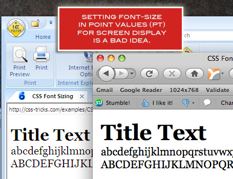
Points
.wrap {
  width: 120pt;
}
A point is a physical measurement equal to 1/72 of an inch. Points are the most common way to size type outside of CSS (likely why it is supported in CSS). It’s still common in language “Of course they set this important information in tiny eight-point type!”.
Points make the most sense in print stylesheets for sizing type, where physical media is involved, but there is nothing preventing you from using pt for screen media or anywhere else a length is accepted.
Notable browser support issues: There used to be big differences in on-screen rendering of pt size. Here’s a comparison of IE 6 vs Firefox (probably 3.6).
Pica
.wrap {
  width: 12pc;
}
The same story as points, only 1pc == 12pt.
ex
.wrap {
  width: 60ex;
}
This is a measurement based on the x-height of the current font. Sometimes that comes from information embedded in the font itself, sometimes browsers figure it out by measuring a lower case glyph, and worst case, it’s set to 0.5em. It is named “x” height because it is supposedly based on the height of the x character. To understand x-height, think of a lowercase character that as a bit that sticks up (ascender) like a lowercase “d”. The x-height doesn’t include that ascender, it is the height of the lower loop part of that character.
Unlike ems, which don’t change when you change the font-family, ex units do change when you change the font-family, as the value of one unit is specifically bound to that font. (proof).
ch
.wrap {
  width: 60ch;
}
This is similar in spirit to x-height, only ch is based on the width of the zero (0) character instead of the height of the x character. It also changes as the font-family changes.
The Viewport Percentage Lengths
This browser support data is from Caniuse, which has more detail. A number indicates that browser supports the feature at that version and up.
Desktop
| Chrome | Firefox | IE | Edge | Safari |
|---|---|---|---|---|
| 26 | 19 | 11 | 16 | 6.1 |
Mobile / Tablet
| Android Chrome | Android Firefox | Android | iOS Safari |
|---|---|---|---|
| 123 | 124 | 4.4 | 8 |
vw
.wrap {
  width: 10vw;
}
This is the “viewport width” unit. 1vw is equal to 1% of the width of the viewport. It is similar to percentage, except that the value remains consistent for all elements regardless of their parent elements or parent elements width. A bit like how rem units are always relative to the root.
Sizing type is the major use case here. See Viewport Sized Typography.
Notable browser support issues: No support in any mobile browsers except the very latest iOS 6. This goes for all the viewport related length units.
vh
.wrap {
  width: 10vh;
}
This is the same as the vw (viewport width) unit only it is based on the viewport height instead.
vmin
.wrap {
  width: 20vmin;
}
This value will be whichever is smaller at the moment, vw or vh. In the standard use case of sizing type, this may be a more useful metric than vw or vh on their own in determining true screen size.
vmax
.wrap {
  width: 20vmax;
}
This value will be whichever is larger at the moment, vw or vh.
Notable browser support issues: WebKit based browsers support vmin but not vmax (yet). Firefox does support vmax though.
Odd Ball Out
Percentage
.wrap {
  width: 50%;
}
A length set in percentage is based on the length of the same property of the parent element. For example, if an element renders at 450px width, a child element with a width set to 50% will render at 225px1.
Trivia: percentage isn’t technically a length unit, but I’m including it here since it is so related.
More Information
What is supported in your browser?
1 Assuming the child element isn’t inline-level or a table cell with some weird table-y stuff going on, or a flex child or grid cell or any other fancy wacky stuff.
Wow, I did not know many of them. Congrats for the post, very nice :D
Pretty interesting. I wish rem’s were better supported because I just find em’s awkward to use – I still can’t help but use pixels.
I agree. You have to be really diligent to use ems properly. They do have their strengths, but I find that people who come from a development background have less of a problem with them.
I find designers usually stick to px as it seemingly gives you the most direct control over the sizes… also they usually come from a print background where you’re working with a fixed medium. It’s not often that you would tell a designer: “I need one design that will work equally well for a business card, a billboard and as on a wall in a wine cellar.
That’s more or less what we have to contend with on the web and until RWD became mainstream, one design had to work for mobile, 30” screens and old cruddy flickering CRT monitors.
rems and ems give you a greater sense of the relative sizes of the text. It also makes it less tempting to just choose pixel size and see if it sticks. Rather, I have found that they tend to encourage developing systems based on how titles are related to content around it.
For example, if you want a heading that’s twice the size of the body text, you can just say it’s 2ems.
When setting line-height, it’s also particularly useful. 1em will always equal the font’s size, whatever it is. Likewise, 1.5em will give you 50% more vertical height.
Compare that to setting things in pixels, you are able to just be arbitrary and set values willy-nilly. body at 16px, h2 @ 34px… line-height 36px, margin of 8px… those are what programmers call magic numbers and there may not be a reason for choosing them.
I’m not AGAINST pixels, I just think that if you CAN work with ems or rems, you will think more about how text is related to other text.
The physical measurements are useful if you’re working on CSS that is meant to be printed.
I was going to post the same answer. I recently did this for a resume site and anothet wherw the user could print out conpleted forms.
-dk
Inches, centimeters, and millimeters are useful for print media stylesheets, because print media is itself measured in those units (ISO 216). In Photoshop and Word, you’ll notice the canvas and document rulers are measured by default in inches or centimeters.
I understand how in, cm, mm == physical measurements and how a piece of printed paper == a physical thing, but I still don’t quite get how that makes them useful for print stylesheets.
I’ve created quite a few print stylesheets in my day and never have I used them. Not that that’s proof positive they are useless, I’m just saying.
Perhaps someone who has used them could share a test page and data on how they were useful?
Chris: Any time you translate a fixed-width layout from screen to print, since the width remains fixed. Some things really do require fixed layouts; CVs, for example. I’ve used inches when creating a print stylesheet for a CV, anticipating it would likely be printed on A4 paper. This allowed me to define the page layout of the CV in Word precisely, since fine control over the page layout is often necessary for a CV; and then to create a stylesheet which mirrored that page layout almost exactly.
A classic A4 paper has 2,5 cm margin, but a webpage goes to about 1 cm if untouched.
I’ve styled many printed pages or more commonly dynamically created pdf’s. In either instance it’s nice to use mm’s as they are more “native” to those media.
Basically if the page/pdf is some sort of report that needs to be produced and you want things to lay out in a specific way I find it much easier and more reliable than px. If the page to be printed is just an ordinary page the having a print style sheet to re-stlye everything with mm’s is overkill.
Excellent article, Chris. Thanks for all the work and research you do.
One small clarification: should the equation for 1mm be equal to 3.78px instead of 37.8px?
thx! fixing and will bury this after fixed.
Ugh too many different font measurements make Mark no think good. Keep it simple, unless you have a very specific use case as others stated above like for a doc meant to be printed.
This is a great article! very informative. I only use px and percent as lengths. I know about mm, cm and inches. But I amazed to know how many length types are supported in css. Thought I would still stick to px in most cases but these measuring units can be really helpful in specific projects.
The test pen doesn’t work right for me in IE9–all bars are tiny-short, but the :fail class doesn’t get added to any of them…
One oddball exception to the oddball unit: Percentage units in margin/padding top and bottom are calculated from the width, not the height, of the containing block.
http://www.w3.org/TR/CSS2/box.html#margin-properties
I find myself only ever using px in css. I must be old-fashioned :)
Same here, just want it to be exactly as I designed it I guess.
Chris: Great article, nice work.
I think it’s less an issue of being old-fashioned and more to do with where you started in web design. Lots of print desigers or old-time web designers use px where they’re used to having control of the media, but ems have their place, especially in responsive web design. For example, if you want all the text to be 10% larger for super wide desktops, then you just need to change it in one place.
Using pixels means you have to adjust everything, everywhere.
Have you never used em or %?
Since device manufacturers always sets the dpi of devices based on a physical length (like monitor resolution: 72dpi, and later 96dpi or larger) the pt is perfectly fine for web or any mobile device. If you use an iPhone 4 with retina display the dpi is above 300 dpi. This helps the system and the browser to render a nearly perfect physical size and you don’t have to deal with dozens of screen sizes and resolutions and recalculate the base font size or play with px. 14pt will be 14pt everywhere. I’ve been using it for a while and pt is far more the most convenient solution to work with (for font size). Give a try :)
That is a very interesting concept Takehito, would really like to see some examples or articles on it, any ideas or recommended sources?
I made this earlier to test something else, but the text is in pt. The best you can do is to test yourself and see the result. I know that it is quite fancy to use em value or percent etc but typography worked fine in the last few hundred years with exact sizes. Don’t forget that em value is only a ratio, nothing more but harder to get lost which item inherit what from which parent and so on. (Or I am getting old :))
When I build a title system for a website (or a printed material) I overwrite only once with media query with pt and that’s it. If you use em value it sound good to change only the base value but is the “distance” in font size between h1, h2 … and p the same on mobile and desktop? If you look at my example you will see that it is okay on desktop but titles looks too large on a mobil. If you use only a ratio, than it is not enough. You will have to recalculate the ratios but isn’t is easier to think in pt?
I’m using Chrome 27 dev and all the units are supported, including ch and vmax.
Chrome 25 stable doesn’t support them, though.
This may mean that their support is going to be added soon, in a couple of months.
Aye, same here with Webkit nightlies. Although that means it’ll likely be a year or two before Safari supports them… the only thing I envy Chrome users is the update schedule.
Damn, I just learnt some new stuff here. Which unit do you find yourself using the most Chris?
If you watch Chris’ series, you’ll find that he most often uses px. Many who have been designing on the web use px. Some switched to ems a few years ago because IE didn’t scale text properly and ran into the complexity of inheritance. Browser scaling is less of an issue now, so px still work quite well.
In some ways, it’s more about the philosophy of it all.
Ties in nicely to the post you made earlier from inamidst.com about px as an angular measurement – I’m sure many of us learnt a lot here. Very interesting!
not really – it avoids working with relative units.
remmay vary depending on the rootemsize, but it is an absolute measurement.That’s a good point, but only mostly true. It’s still relative at least that one level. That means everything adjusts in unison when that root size changes. Imagine word-spacing: 2px; That doesn’t adjust when the root size changes, making it nearly meaningless if you bump up a few font sizes. But if it’s 0.1rem, that relative length still has meaning at any root font size.
Agreed, “mostly true.”
I was thinking of inheritance, really;
remis relative to the root element, not to its parent element.)
great post, why this web not have social share button
We’ve recently used mm measurements in a print stylesheet for media that was meant to be downloaded. The product we worked on allowed the user to download and print a dynamically generated PDF of barcoded label-tags to be used on shelves in book stores.) The PDF was generated using Wicked PDF which converts html/css to a pdf.
The first prototypes used pixels, but we could never get each label to align perfectly. Then I had a eureka moment, and recalled that CSS can handle real measurement units (in, mm, cm.) The label instructions had the measurements already in mm, so translating the CSS to match was a breeze, and now everything lines up perfectly.
+1 to that. mm are a nice way to style printed sites or produced pdf’s
Wow is this true? (in reference to em’s)
Recently when I was working on a design my typekit font failed to render and Helvetica took its place. It seems that there was slightly space everywhere margins, paddings etc. Maybe it was just because Helvetica was a more open typeface?
Physical units could be very useful for touch devices. My finger has a fixed size, so a button should have a fixed size of say at least 1.5cmx1,5cm.
Now my Kindle Fire has 169dpi, my LG Optimus Black has 233dpi. That means the 100px that would make the button 1.5cm on the Fire would result in 1.1cm on the Optimus.
Physical units that were interpreted as such would fix this.
You would think that’s true, but in actual fact, pixels aren’t directly mapped to dots on your screen. They’re arbitrarily set by the device manufacturer.
You can verify this if you have an old iPhone 3GS or an old iPod touch lying around. Bring up this website on both that device and a newer retina iPhone. I use the iPhone as an example, because the screen size didn’t change between generations, just the display’s pixel density changed. You’ll find that they’re the same on both devices.
This doesn’t prevent you from using media queries and setting buttons, for example, to be bigger 15mm as it makes more sense in the markup and doesn’t have the negative aspects of 57px (which in programming, you may call a magic number).
Check out this pen on your devices to test it out:
http://codepen.io/garypaul/full/dnrvK
I recently used ‘ex’ as a font size to normalize the size of the fonts in my font stack. The issue was that the Mac font rendered smaller than the Windows font. The ‘ex’ unit didn’t play well with older versions of IE so I needed to overwrite those values with pixels.
I always wanted to use ems but found them too irritating – every nested element seemed to end up needing a class to control its font size and the maths was too much for my tiny mind.
Then along came rem units – perfect, but, sigh, no good in IE8 which we still support in all projects and will do for some time to come.
But now happiness has been reached thanks to SASS and Chris’ fantastic font-size mixin – this takes an input equal to the desired rem size i.e. 1.6 then multiplies it out to declare the same font size in pixels – so we get both font size declarations to ensure deep browser support.
I also use this in conjunction with setting my html element size at 62.5% so 1 rem = 10px = easy maths!
More here: https://css-tricks.com/snippets/css/less-mixin-for-rem-font-sizing/
The reason for going to this trouble is to allow users to set the text size in their browser – ems and rems are scaled by the browser when the user has set font sizes in their browser to be large or extra large etc.
Great Article ! and really I was not knowing about these types of lengths are supported in CSS. Anyway always appreciating your articles. Thanks once again.
I avoid px like the plague. Love rems. SASS makes it all work together nicely. :)
I love my rems too! I filed this MQ bug a bit back with webkit and then gecko as rems used in a media query condition don’t trigger the content within the actual query. So this example below won’t work at the moment in Gecko -or until FF 20 is released as I’ve been told. This problem also seems to be resolved with webkit now.
Example of non-working MQ condition using rem:
Demo filed w/bug report:
http://cdpn.io/AFjDK
cath, why do you avoid px? is only to know more of web development.
CSS should have an “arc” unit that represents the portion of a user’s field of view.
Font sizes are “too small” when you see them too small. It depends on how big they’re displayed but also from how far you’re watching the screen. I know it pushes the problem to the browser who now needs to know how far you’re standing from the screen but it would be quite helpful for example if you want to display sites on a TV or if you have a retina display.
Thanks for sharing such great information, though i will still prefer px and em.
Great article! I started to work with rems lately, I like them so far.
There are some nice things that people who only work with pixels are missing. You can take this example that I provided as help for one guy over at the forums a few days ago: http://codepen.io/Merri/pen/iFbng
Go ahead and change the font to whatever font you can imagine (on Windows it is nice to atleast test Courier New and Times New Roman). You’ll notice that whatever font you use the text remains aligned perfectly. Now try aligning the text in similar way using only pixels thus replacing all percentages, pts and ems. Use whatever font you prefer to get it right and then try changing font or font’s size.
Essentially the trick you see on that page is the ability to have two lines of smaller text on the same line with bigger text. It is possible to do inline-block layouts using the same idea, although I’m not yet sure if it can bring anything new to the table. If nothing else I guess you could imagine having images where the first image is big and all others are smaller and in two rows. Or even have multiple bigger images on the same row, maybe some kind of “artist preview”. Although that kind of layout would be quite plausible in other methods as well.
It might be flexbox will become plausible for daily use sooner than I can come up with anything truly unique that could only be currently done with line-height and vertical-align trickery as far as doing layout is concerned :)
You say this: width: 20vmax;
My thoughts: isn’t that exactly the same as max-width: 20vw;?
Because vmax sounds stupid. There ain’t either a pxmax or something…
Check this link out:
http://www.kickstarter.com/projects/1894163124/web-designer-t-shirts/backers
On mobile browser support:
All tests pass with FF mobile beta.
Thanks a lot …..
Hey Chris,
Great article! I also wrote about the topic a while ago here
I did a little research about compatibility, you can check the table at the bottom. Hope it’s useful and not treated as spam.
I think we need a line-height unit.
So a horizontal menu’s height can effortlessly be 1 line-height,
a sidebar can easily hold 5 lines of links.
height: 1.4em could be turned to
height: 1lh
Why is this not yet implemented?
I’m using Chrome Canary 27 and it supports
chunits.Hi Chris,
I believe
emhas more to do with inheritance than the cascade.Sure, that’s a better word.
They are always relative to their parent element.
these are so complected i still want to stick with px and percentage
The statement that “px is an angular measurement” is false; the linked article above is deconstructed here:
http://omnicognate.wordpress.com/2013/01/07/in-css-px-is-not-an-angular-measurement-and-it-is-not-non-linear/
Worth noting that ems (and later rems) became popular with the “elastic” / “fluid” layout fads, when everyone was concerned with keeping layout consistent when user zoomed in and out. That seems to have gone out of fashion as everyone got into responsive design.
YouTube used to have their interface completely build with percentages. The rationale, I believe, is that they wanted to support as many smart TVs and video game consoles as possible, and it is ok if some text is slightly squashed as long as the overall layout is roughly maintained. I worked on a clone using the same techniques for a VOD company, it was one of the most nightmarish jobs I have ever had to do.
This is great! I have used the test in many cases to see which browsers support what units. Most of them are uncommon. It is hard to have a preference only because I see downfalls to all of them (mainly support).
Another great article Chris, thanks!
Chris –
The only scenario where I think physical units (in., cm.) would be useful is for building something that will ultimately be sent to a printer.
For example, my company is working with a client to make prints of whatever you want, in a specific print size. You can also upload a logo into a space that is something like 4in. x 2in. The site will have a live preview, so it might be useful to see how a logo will look in that actual physical space.
It is really useful post.
But it need more explanation about the usage of em, rem and other things.
If possible you can take one example program then it will be more useful.
And in the below you have given good example for their usage.
Strange… you say that
chhas no Webkit support, but your test shows it as supported in my Chrome 27 Beta. Great post anyway; it makes a great reference.I always use ems for fonts.
Ive always used pixels for everything else, however with the advent of RWD, Ive started using percentages lately.
Yep, I use relative measurements universally but for one case. Here’s where you saw “no practical use”, and I’d enjoy hearing your thought. My graphics editor(s) store images in exact pixel sizes. To use these as, e.g., background-images (icons?) to illustrate a link, I sometimes use padding-left: [n]px where “n” accommodates the image. Since I’m using a resizeable font but not a resizeable image, what else would you suggest?
These are too many, but I knew only few of them.
Chris Coyier thanks again for such a great article :)
That I often use px
I would like to ask, in the kind of size above which one is better?
thank you
Webkit- and Blink-based browsers seem to incorrectly apply percentage heights to the descendants of the elements that have height in
vhunit. In this fiddle, Fx and (even) IE9 make the nested (green) div as tall as its 70-vh-tall red parent, while Chrome and iOS Safari don’t stretch it at all.Can you please update on the new IOS behavior on retina displays?
I guess they didn’t implemented it before because 10vw is BIGGER in retina displays than it is on a desktop.
I’ve been following your (and others) cool ideas about using vw to dinamically change the font sizes in my new layout, and now that I start testing the touch drop-downs (another bombshell) for the mobile version, I realize that ALL dynamically resized elements (many!) are twice as big in the IOS!.
Chrome developer tool’s simulation for the exact device (iPhone 5) is WRONG, even with custom setup I can’t get the same results.
In short: keep track of the rules using vw units and make a new version with half the value for devicePixelRatio of 2, (it must be easy with SASS, but I haven’t had the time to learn it enough to plan in advance for it)
Now I have to go to research how to add a new pixelratio class to my body element to change the sizes only on retina displays :(