Here are some of the websites we’ve stumbled upon lately that have made us all collectively Oooo and Aaaah with delight. Sometimes we literally type “oooooo” into the Slack channel where we save and discuss these. It’s a fairly new thing we’ve started doing. Enjoy!
The Fine Line
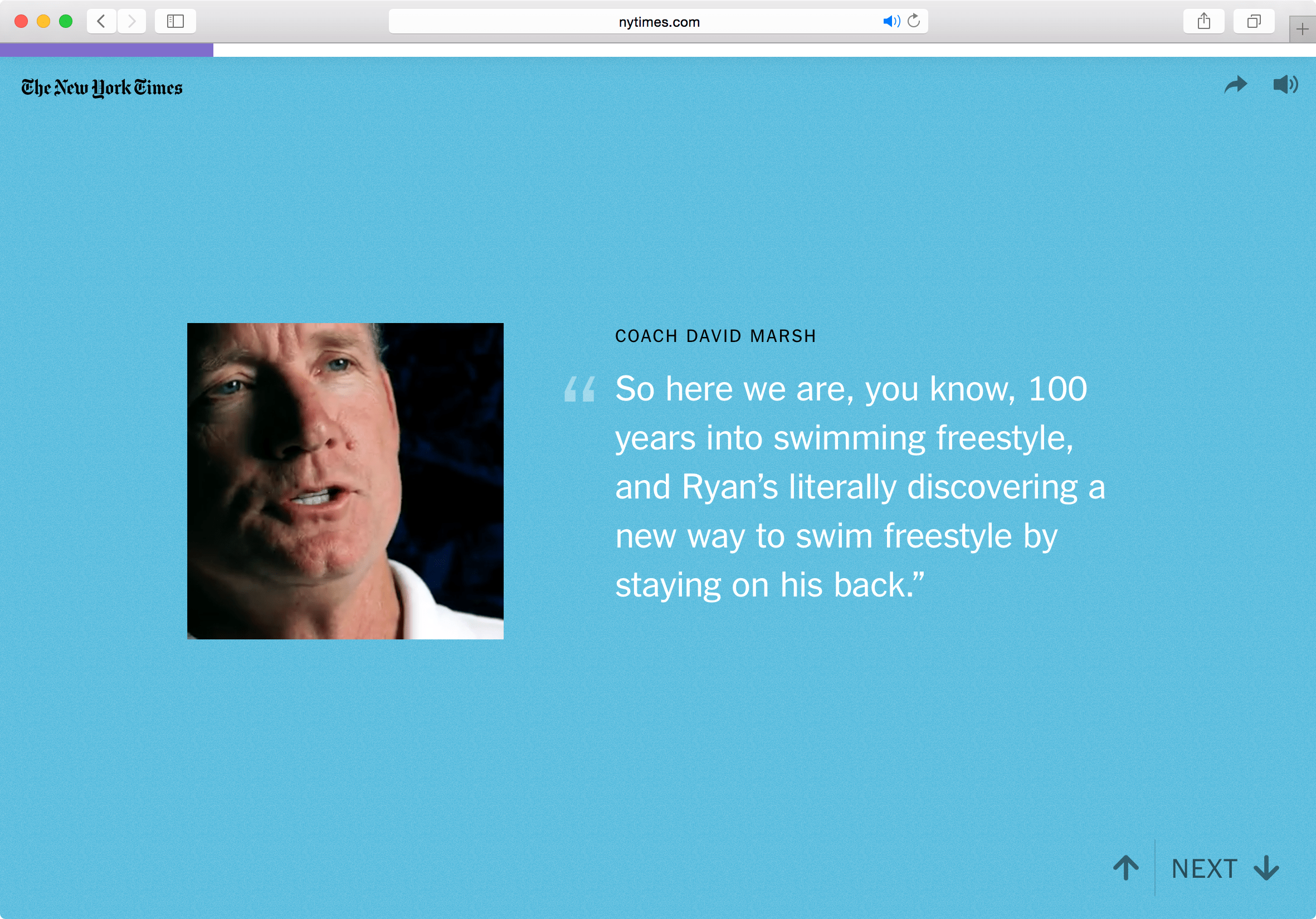
The Fine Line series of articles by the New York Times explores the journey of four Olympic athletes and their extraordinary abilities.
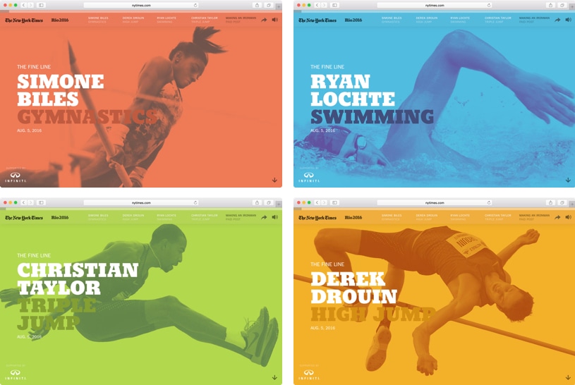
A while back I moaned about the various problems of scrolljacking and now I want to apologize to the scrolljacking community. These articles prove that taking control of the scrolling momentum can feel incredibly intuitive if given the right amount of time and attention.
But what’s most fascinating with these articles, to me at least, is the combination of motion, visuals and sound. Each article has several recordings that are played over the text with accompanying background music and sound effects. This couldn’t have been an easy series of posts to create, as the time it took to plan, design and develop them must’ve been quite considerable.
FiveThirtyEight’s 2016 Election Forecast
FiveThirtyEight is well known for their visualizations and use of data in their coverage, but the latest charts that they’ve begun to use for their election forecast are more subtle and beautiful than ever before:
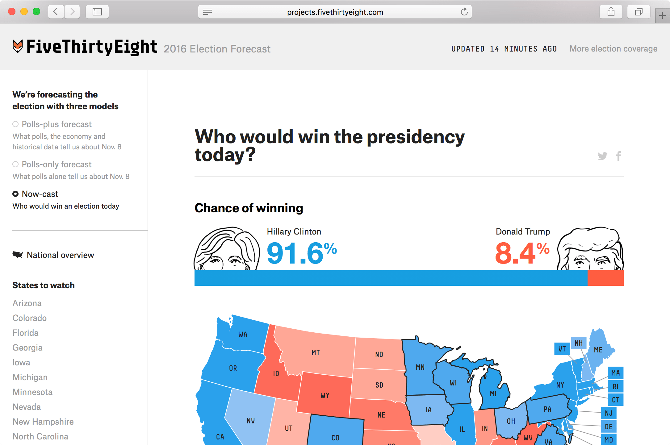
What impresses me about FiveThirtyEight is the restraint in the design, as there’s a very faint use of color to attract the eye to the important information and the use of the bold weights in their typographic palette encourages quick scanning of the information.
But jumping back to this chart specifically: if you want to learn more information about the data from one state in particular then you can click on the map to shift into a different view for closer analysis:

A Visual Introduction to Machine Learning
This is an essay, designed and written by Stephanie Yee and Tony Chu, which contains a number of beautiful animations and visualizations which are certainly worth scrolling through:
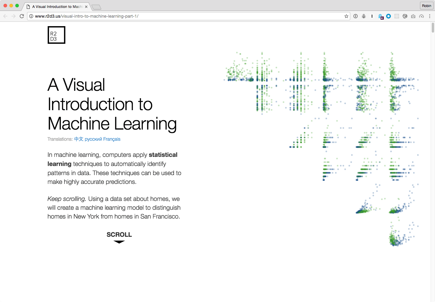
As you scroll further down the page you’ll find the data morph and bend to better work together with the content.
Figma’s 404 page
Figma is a design tool in the browser that lets designers collaborate better with one another and earlier this week I typed the wrong URL and found this lovely gem:

CSS Conf
Over on the new CSS Conf website there’s an interesting use of graphic shapes which I can only describe as “splotches” — SVG elements that overlap content like a transparent PNG might:

I think it’s neat because it’s visually striking and breaks up the monotony of seeing rectangles in every web page all the time.
Michael Ngo
Front-end developer Michael Ngo has a personal site that’s interesting for its use of animation, video and layout.
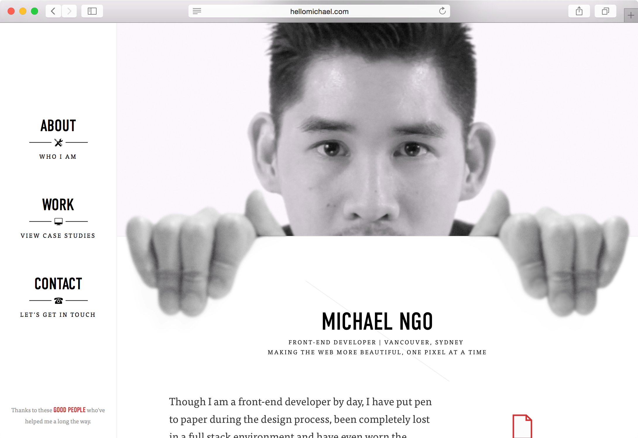
Each section of his portfolio looks like a custom layout, but taking a closer look under the hood each is made of tiny modules that can be used again and again.
Ohio Certifieds
Ohio Certifieds is a website designed to attract industrial investment in the state. Developers can select a plot of land or search for a plot based on a number of factors: what’s interesting here isn’t necessarily the data but the representation of it however.
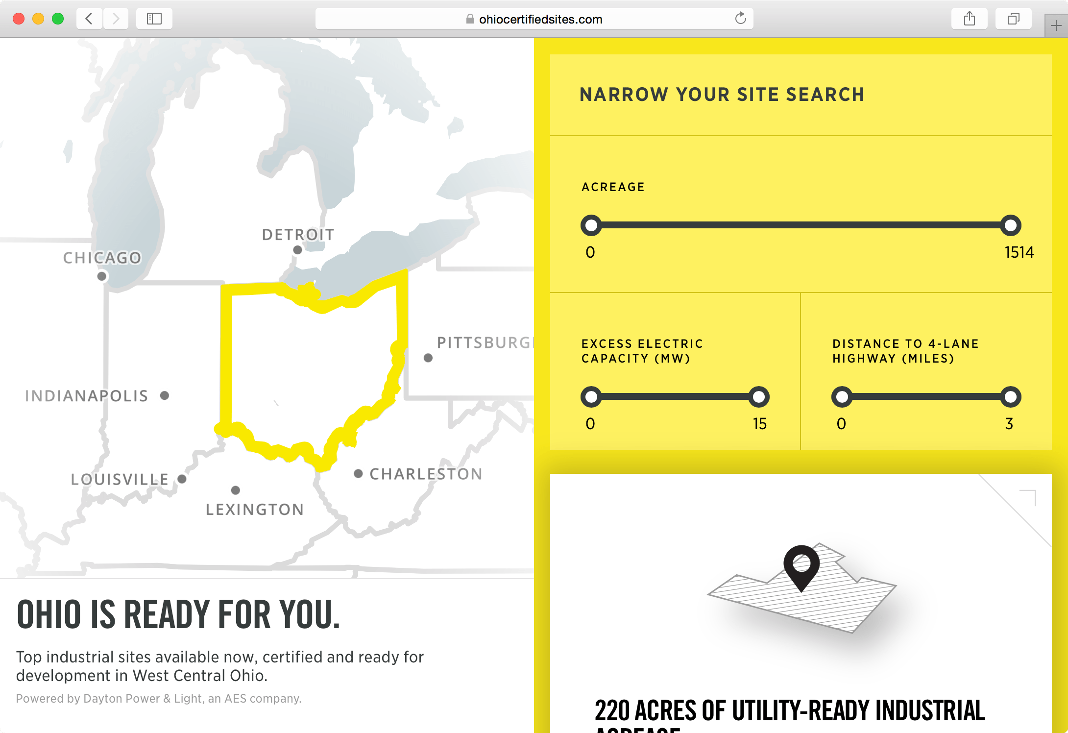
Clicking around is really fun. If you select a plot then you’ll find a bevy of animations that direct your eye and give you a better idea of the space that you’re currently navigating.

Meet Graham
Meet Graham is a project, and a real-life model, of what a human being might look like if they were best shaped to survive car crashes. The site showcases the research experiment in order to bring to our attention the risks of driving and in order for us to learn more about the human body:
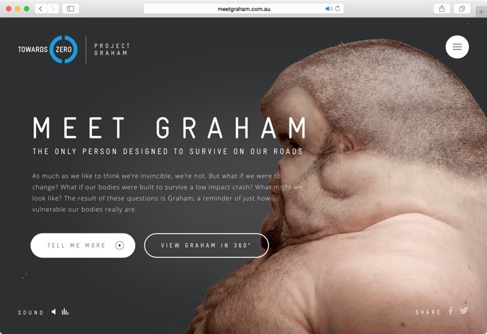
By viewing Graham in 3D it’s possible to look under the surface of the skin and pinpoint specific areas of the body that would need to be changed.

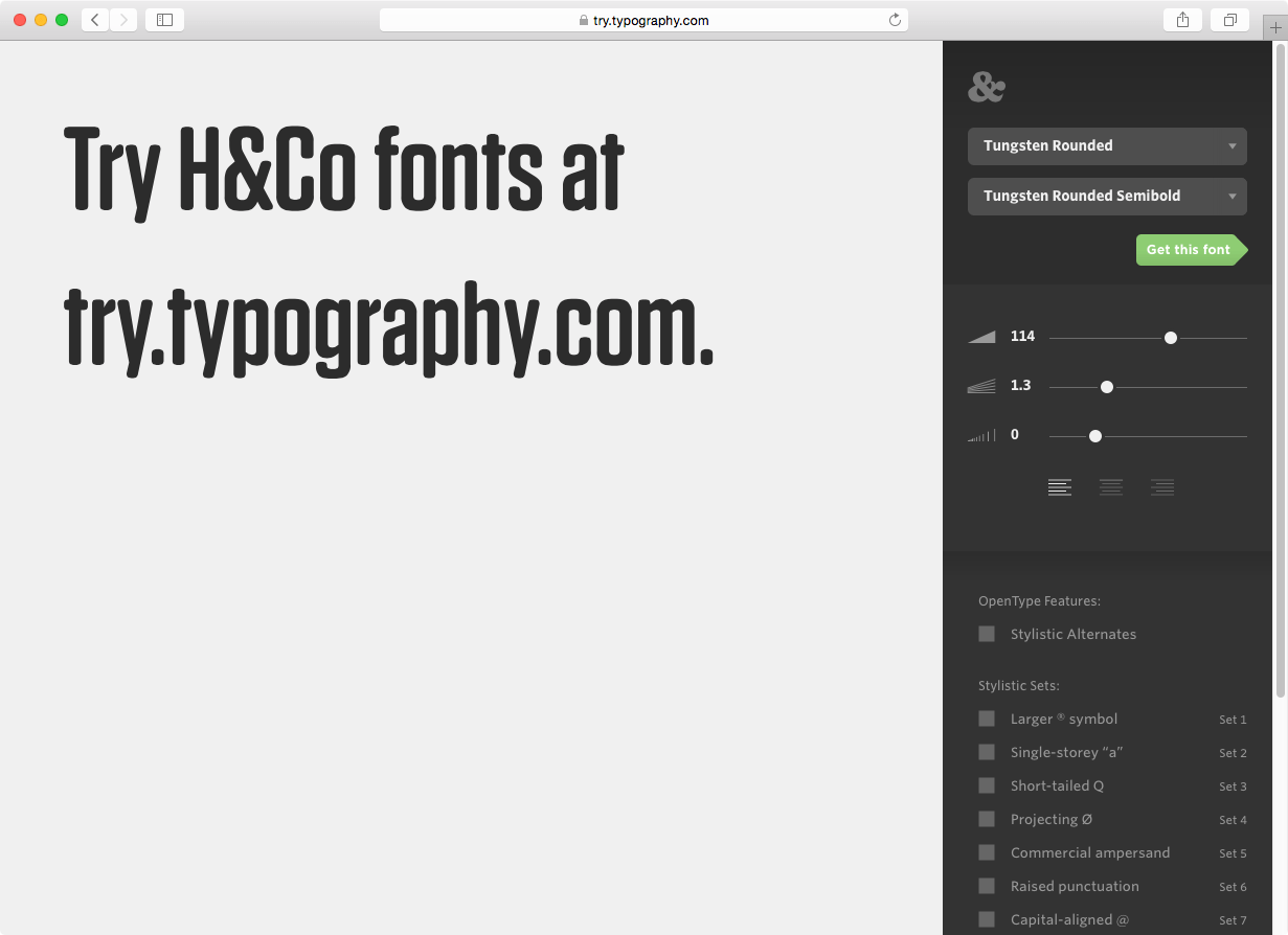
Try Typography
try.typography.com is a new project by Hoefler & Co. that lets you explore their range of typefaces. Ligatures, capitals, small-caps and stylistic alternates are among some of the options you can toggle and discover in more detail.
Did we miss any of your recent favorites, or what is so interesting about the sites we did show? Do you have a favorite website that we might’ve overlooked? Be sure to add a note in the comments below!
The Fine Line series of one-pagers is interesting…in theory. But when I view on my Mac Chrome, the 4th or 5th screen of each is simply a white background with top left NYT logo. Somethings breaking. Inspector shows nothing.
I had that same issue on PC with Vivaldi, Chrome, and Edge.
Disable adblocker, there seems to be an add on that spot.
Heck, if the breaking is caused by an ad, they have a few side UX issues…
They’ve added some JavaScript to tell you if you’re running a blocker and to disable it now. Now that I’ve had a chance to look through them all, I can’t help but be impressed. Good stuff. Couldn’t tell you what car was in the ad I saw way too many times though.
Thanks for the info, Glenn. So much better now. Agreed. Terrific and beautiful way of presenting. Flows very nicely.
Please don’t apologise to the scrolljackers. Ever. Have you tried using it on a diverse set of hardware and software? Surface Book in Firefox (my standard configuration) and it’s pretty much unusable: you scroll the teensiest bit with the precise trackpad and it jumps to the next section, but you’re a little slow about it and it or too enthusiastic (read: you employ a normal degree of scrolling) and it goes through two or more steps. Then maybe in lifting your fingers it gets a tiny upward movement (corresponding to a fraction of a millimetre) and all of a sudden you’ve gone up a section.
Scrolljacking is always bad. Always.
Agreeing here. I found the experience terrible, much like every single scrolljacking site ever. There is no such thing as a good scrolljacking experience. Let my scrolling work like how my scrolling works for 99.9999% of sites. Your site isn’t special. Your site is ctrl+w’d shortly after my first scroll.
Third-person “your” FWIW.
re scrolljacking, fortunately there is a middle ground that can be achieved in pure CSS (with polyfills) by making Fullscreen Sticky elements, as per this concept:
http://codepen.io/samburgers/pen/JKobgQ
i hope that helps someone!
totally agreeing on scrolljacking. I hate it.
Whoever wrote this list, has a fine “hipster” taste for simplistic and custom font-heavy websites… Sadly, we don’t share the same tastes.
That would be everyone here on the CSS-Tricks team. If there are other sites you’ve come across, please do share. That’s the beauty of the web — so many examples to gawk at and admire. :)
i see you hatin and i be like http://codepen.io/chriscoyier/full/bZJZor/
How are they getting the videos to automatically play on mobile on the fine line website?
I haven’t looked extensively at it, but one way they could do it is by using the scroll event. There’s an answer (that I can’t find) on Stack Overflow that suggests doing it that way. As this other answer explains, the
play()function is disabled unless it is used in response to a user action. Since they are already dealing with the scroll event, that’s probably what’s triggering the videos.Here everything looking fine.
Some fine writing there! The incongruity of the phrase “…the scrolljacking community” cracked me up! Every time I read it, it makes me smile. :)