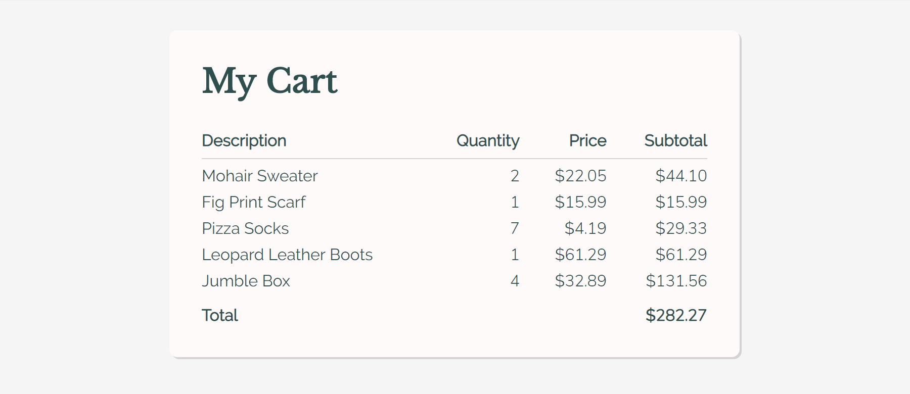
You’re putting the finishing touches on your new million-dollar-idea — your copy is perfect, your color scheme is dazzling, and you’ve found a glorious font pairing (who knew Baskerville and Raleway looked so great together? You did.) but there’s one problem: Raleway’s pesky lowercase numbers make your shopping cart look confusing and overwhelm the user.
This is a fairly mundane problem, but an issue that can make beautiful typefaces unusable if numbers are an important part of your site; a store or an analytics dashboard for example. And this isn’t just an issue with lowercase numerals. Non-monospaced numerals can be equally distracting when glancing at a list of numbers.

We’re going to look at a few techniques to combat this problem, but first we need to find a font whose numerals we can use instead of our main body font. There’s no cut-and-dry way of finding your font twin. The most important characteristics to search for are the weight and width so that you can match it to that of your original font. If you intend to use numerals at multiple weights, try looking at fonts that have a wide range of weights to up your chances at matching your original. You may end up needing a different numeral font for each weight or mismatching the weights of the font pairs, but that’s fine because there are in fact no font police.
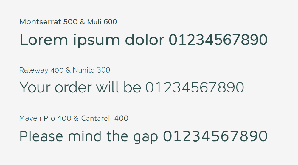
Here are a few Google Font pairings that match well enough to not be noticeable at small sizes:
Method 0: Wrap ‘em in spans
@import url('https://fonts.googleapis.com/css?family=Raleway:400|Nunito:300');

body {
  font-family: 'Raleway', sans-serif;
}

.numeral {
  font-family: 'Nunito', 'Raleway', sans-serif;
}
Your total comes to $<span class="numeral">15</span>.<span class="numeral">99</span>This is not a good solution. Having to add to the markup is bad, and loading both fonts in their entirety is not great, but if you don’t have a lot of content and want a simple solution, then there’s no shame in it.
What we’d prefer to find is a CSS-only solution that isolates the numerals of the number font and loads them instead of (or before the main font) without having to change the HTML. Read on.
How font-family works
The following methods rely on creating a @font-face declaration which only refers to our preferred subset of numerals, and references them in the font stack as normal:
body {
  font-family: 'Custom Numeral Font', 'Main Font', sans-serif;
}
By ordering the subsetted font first in your font-family declaration, the browser will default to it and will fallback to the subsequent fonts for glyphs that are not available in the first. This is a really important distinction — the browser is not only checking that the declared font is available (locally or imported via @font-face), but it is also checking that its character map contains the requested character and will pass onto the next font if it doesn’t, on a character-by-character basis. By the way, the spec for the font-matching algorithm is a surprisingly interesting read.
It’s important to note that the browser will prioritize the font family over the font weight and style, so if you subset the numerals for only a normal weight and then have a number inside a bold-style element, the browser will choose to show the normal-weight character from the numeral font rather than the bold-weight character of the main font. Basically, if you’re doing this, make sure you do it for all the font weights you’ll show numbers in.
Method 1: Font Squirrel custom subsetting
If you self-host your font files instead of serving them from a hosted service like Adobe Fonts or Google Fonts, then you can use the expert configuration of Font Squirrel’s Webfont Generator to create files that only contain the numeral subset. Read the font’s license agreement to make sure this type of manipulation is okay before proceeding.

Once you have the subsetted font files, you can use them as you normally would. Check out this article for more information about @font-face and file type browser support.
@font-face {
  font-family: 'Nunito';
  src: url('nunito-light-webfont.woff2') format('woff2'),
        url('nunito-light-webfont.woff') format('woff');
  font-weight: normal;
  font-style: normal;
}

body {
  font-family: 'Nunito', 'Raleway', sans-serif;
}
If you’re being performance-conscious, you can also subset your main font to remove its numeral glyphs and shave off a few extra bytes.
Method 2: @font-face unicode-range subsetting
The unicode-range property of @font-face is mostly used to declare the character set the font files contain in order to help the browser decide whether or not to download the files; a big potential performance boost for multi-language sites that use non-Latin alphabets. The flip-side is that unicode-range also restricts the @font-face declaration to the specified range, meaning that we can only use it to make certain portions of the font files available for use in the browser.
@font-face {
  font-family: 'Nunito';
  src: url('nunito-light-webfont.woff2') format('woff2'),
       url('nunito-light-webfont.woff') format('woff');
  font-weight: normal;
  font-style: normal;
  unicode-range: U+30-39; /* 0-9 /
}

body {
  font-family: 'Nunito', 'Raleway', sans-serif;
}
This is worse for performance than the previous method as the browser still has to download the whole font file to use the numerals, but preferable if the license agreement disallows manipulation of the files.
Sadly, we can’t use this method to subset fonts already loaded by an external service, but it can be used on local fonts:
@font-face {
  font-family: 'Times Numeral Roman';
  src: local('Times New Roman');
  unicode-range: U+30-39; /* 0-9 */
}
This is a neat way of tweaking particular characters of your main font, perhaps subsetting for just an ampersand or preferred curly quotes (in which case you’d have to give up the “Times Numeral Roman” pun), with no performance loss as the local font will just be ignored if it doesn’t exist. You can check common system font availability here. And you can become Queen of the Type Nerds by making a site that can only be appreciated properly if you have all its subsetted fonts downloaded locally, premium esoteric.
Support for unicode-range is pretty good, but note that the subset font will be used for all text if it’s not supported, so maybe don’t make it Papyrus. Or if you really want to use Papyrus, you can be sneaky and add another web-safe font first so that unsupported browsers will default to it instead of Papyrus:
@font-face {
  font-family: 'Backup Font';
  src: local('Arial');
  unicode-range: U+60; /* backtick because I can't think of a more innocuous character */
}

@font-face {
  font-family: 'Papyrus Ampersand';
  src: local('Papyrus');
  unicode-range: U+26; /* & */
}

body {
  font-family: 'Backup Font', 'Papyrus Ampersand', 'Main Font', sans-serif;
}
Method 3: Google Fonts text subsetting
The Google Fonts API comes with a few handy extra options to aid optimization by specifying only particular font weights, styles and alphabets (the subset parameter takes a list of alphabets like greek,cyrillic and not a unicode range, sadly), but there’s also a little-known “beta” parameter called text which is ostensibly for use in titles and logos but works equally well for our purpose:
@import url('https://fonts.googleapis.com/css?family=Raleway:400');
@import url('https://fonts.googleapis.com/css?family=Nunito:300&text=0123456789');

body {
  font-family: 'Nunito', 'Raleway', sans-serif;
}
So simple! So elegant!
The text parameter can take any UTF-8 characters, but make sure to URL encode them if they’re not alphanumeric. The only possible issue with this method is that we’re not creating a custom name with @font-face, so if the user already has the subset font on their system, it will use that font in its entirety.
I haven’t been able to find any other hosted font services that offer this level of granularity for subsetting but do comment below if you come across one.
A few use cases


Nice tips, thank you! Before searching for an acceptable font twin at all you also could look up if your chosen font already has the figures you need. Raleway for example contains lining numerals (but not proportional ones), Monserat has lining and oldstyle figures – proportional as well as monospaced.
If available in the font you can activate the desired figures with CSS font feature settings, e.g. for monospaced (tabular) numerals:
.dashboard { font-feature-settings: ‘tnum’; }
or if your browser already supports it:
.dashboard { font-variant-numeric: tabular-nums; }
You can combine that, depending if you want to have tabular lining or tabular oldstyle figures (‘tnum’, ‘lnum’; or ‘tnum’, ‘onum’;).
In reading text oldstyle (proportional) figures blend in better, so use them with
article { font-feature-settings: ‘onum’, ‘pnum’; }
respectively:
article { font-variant-numeric: oldstyle-nums proportional-nums; }
As said: This only works if your font file contains the desired number set as an alternative. But they will fit perfectly and in most cases better that an other similar font.
This request, https://fonts.googleapis.com/css?family=Nunito:300&text=0123456789, returns
There’s no
unicode-rangedescriptor here. Does this mean that, if the user had'Nunito Light'installed locally, that font would be used for more than just numbers (i.e., the rest of the font stack would be ignored completely)?I’ve checked with a different subset of characters and got a different kit= parameter; plus the font file looks fairly small. I suppose the font just contains those 10 characters and the usual fallback as described in the article applies. (G is fairly good at browser sniffing to send you CSS with just the working bits, I’d not be surprised at all if they sent different fonts plus unicode-range to, say, Chrome, to improve cacheability.)
Yes, the font file is subsetted, but I asked about the scenario where the user has that font installed locally (notice the
local('Nunito Light')part). In that case, that subsetted font file would not be used, and instead the full, local font would be used, right?It fhat’s correct then I think Google Fonts needs to include the corresponding
unicode-rangea well, to ensure that the local font would only be sued for the same characters that are available in the subsetted font file.This is a neat CSS trick to solve the problem, but just to make sure everyone understands the typography right:
The “lower-case” numbers are called old-style, and the alternative is called lining. I think typically, if a font has old-style numerals, it also has lining numerals…but sometimes not the other way around.
The “monospace” numbers are called tabular, as opposed to proportional, and again…most (good/professional) typefaces have both.
Looks like you can change the style of numerals via either
font-feature-settingsorfont-variant-numeric, although it looks like browser support for those could be problematic for some. Perhaps you could use subsetting to only include the style you need (admittedly I don’t know how those are stored/accessed in unicode…).However you do it—1.) your font may already contain a better set of number glyphs you can use, and 2.)
monospace≠ tabular…designers will cringe hard if you get those mixed up.You could use
@supportsto instruct modern browsers to change the font feature settings for sleed, and have older browsers fall back to loading two fonts.According to https://caniuse.com/#search=font-feature-settings the support for font-feature-settings is really great (92%, except from Opera Mini and IE mobile). Considering that a website stays perfectly usable if e.g. tnum fails …
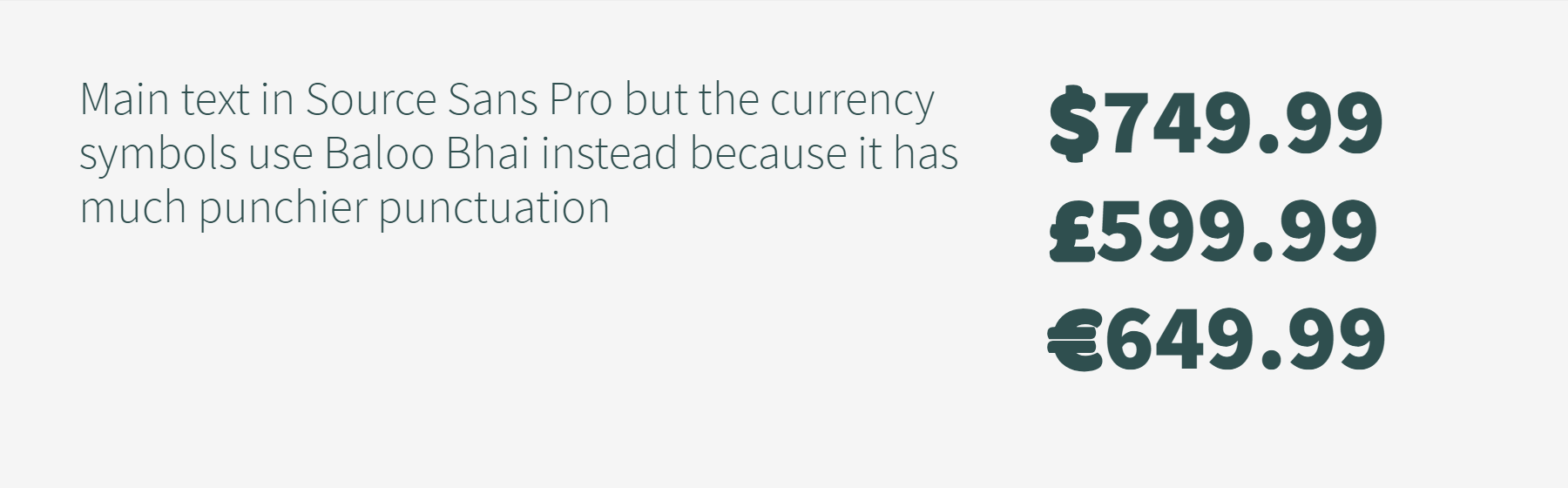
Instead of doing the work with @supports I’d simply subset my font file with https://www.fontsquirrel.com/tools/webfont-generator (in case the figures are available and the license allows it). So you can create font files that have the desired figures as default. I did that for my blog to have the old-style figures of Source Sans in the text.