- This topic is empty.
-
AuthorPosts
-
November 19, 2017 at 3:16 am #262769
r1nk
ParticipantI’m stuck of what selectors i need to add/edit to align all these ‘4 col-x items’ in a line so that they wont stack with each other or have any gaps.
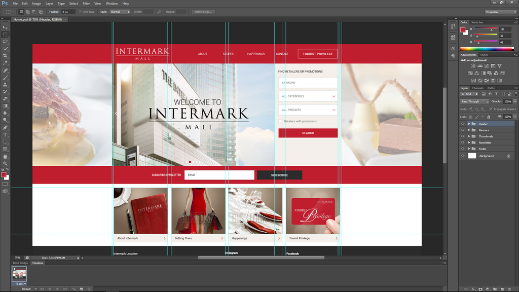
This is what im trying to make : http://i272.photobucket.com/albums/jj178/r1nk_2008/ps1_zpsowz5koxd.png
But now currently my webpage view as this : http://i272.photobucket.com/albums/jj178/r1nk_2008/bannerProb_zpsn52mjdar.png
This is my current codes : https://codepen.io/nazrinnoorzan/pen/bYaKwz
Some solutions including explanation why all those items not align neatly would be a great help.
November 19, 2017 at 3:27 am #262770Paulie_D
MemberFirstly, I’d suggest you reduce the demo to just the relevant HTML & CSS.
No-one likes to have to wade through dozens of lines of irrelevant code to narrow down your issue.
Also, what gaps? It looks to me as though you images aren’t large enough to fill their divs….not that there are gaps between the divs.
A minimal demo is needed here.
November 19, 2017 at 4:24 am #262771ParticipantSorry about that. Here the minimal one.
https://codepen.io/nazrinnoorzan/pen/bYaKwz
So, if i want to make my images take 100% of the container, i need to set my img style to width = 100; and height=100; ?
November 19, 2017 at 7:16 am #262772MemberJust `width:100% will do it…but you have columns of different widths so you may not get the effect you are looking for…
November 19, 2017 at 8:19 am #262773Participanthttps://codepen.io/nazrinnoorzan/pen/bYaKwz
Thanx, there is no more width gap but the height are differents and if i resize the windows, the right img will stack on the form.
Hmmm, do i plan it wrong? Is assigned each column some width percentage a bad idea? (i do it for responsive purpose)
Or do i need to alter more on sumthing?p/s : those 3 images are in same height.
-
AuthorPosts
- The forum ‘Design’ is closed to new topics and replies.