In this article, we’ll be taking a look at the structure inside <input type='color'> elements, browser inconsistencies, why they look a certain way in a certain browser, and how to dig into it. Having a good understanding of this input allows us to evaluate whether a certain cross-browser look can be achieved and how to do so with a minimum amount of effort and code.
Here’s exactly what we’re talking about:
But before we dive into this, we need to get into…
Accessibility issues!
We’ve got a huge problem here: for those who completely rely on a keyboard, this input doesn’t work as it should in Safari and in Firefox on Windows, but it does work in Firefox on Mac and Linux (which I only tested on Fedora, so feel free to yell at me in the comments if it doesn’t work for you using another distribution).
In Firefox on Windows, we can Tab to the input to focus it, press Enter to bring up a dialog… which we then cannot navigate with the keyboard!
I’ve tried tabbing, arrow keys, and every other key available on the keyboard… nothing! I could at least close the dialog with good old Alt + F4. Later, in the bug ticket I found for this on Bugzilla, I also discovered a workaround: Alt + Tab to another window, then Alt + Tab back and the picker dialog can be navigated with the keyboard.
Things are even worse in Safari. The input isn’t even focusable (bug ticket) if VoiceOver isn’t on. And even when using VoiceOver, tabbing through the dialog the inputs opens is impossible.
If you’d like to use <input type='color'> on an actual website, please let browsers know this is something that needs to be solved!
How to look inside
In Chrome, we need to bring up DevTools, go to Settings and, in the Preferences section under Elements, check the Show user agent shadow DOM option.
Then, when we return to inspect our element, we can see inside its shadow DOM.
In Firefox, we need to go to about:config and ensure the devtools.inspector.showAllAnonymousContent flag is set to true.
Then, we close the DevTools and, when we inspect our input again, we can see inside our input.
Sadly, we don’t seem to have an option for this in pre-Chromium Edge.
The structure inside
The structure revealed in DevTools differs from browser to browser, just like it does for range inputs.
In Chrome, at the top of the shadow DOM, we have a <div> wrapper that we can access using ::-webkit-color-swatch-wrapper.
Inside it, we have another <div> we can access with ::-webkit-color-swatch.
 . Right at the top, we have a div which is the swatch wrapper and can be accessed using ::-webkit-color-swatch-wrapper. Inside it, there’s another div which is the swatch and can be accessed using ::-webkit-color-swatch. This div has the background-color set to the value of the parent color input.”/>
In Firefox, we only see one <div>, but it’s not labeled in any way, so how do we access it?
On a hunch, given this <div> has the background-color set to the input’s value attribute, just like the ::-webkit-color-swatch component, I tried ::-moz-color-swatch. And it turns out it works!
 . Unlike in Chrome, here we only have a div which is the swatch and can be accessed using ::-moz-color-swatch. This div has the background-color set to the value of the parent color input.”/>
However, I later learned we have a better way of figuring this out for Firefox!
We can go into the Firefox DevTools Settings and, in the Inspector section, make sure the “Show Browser Styles” option is checked. Then, we go back to the Inspector and select this <div> inside our <input type='color'>. Among the user agent styles, we see a rule set for input[type='color']::-moz-color-swatch!
 Inspector > check the Show Browser styles checkbox.”/>
In pre-Chromium Edge, we cannot even see what kind of structure we have inside. I gave ::-ms-color-swatch a try, but it didn’t work and neither did ::-ms-swatch (which I considered because, for an input type='range', we have ::-webkit-slider-thumb and ::-moz-range thumb, but just ::-ms-thumb).
After a lot of searching, all I found was this issue from 2016. Pre-Chromium Edge apparently doesn’t allow us to style whatever is inside this input. Well, that’s a bummer.
How to look at the browser styles
In all browsers, we have the option of not applying any styles of our own and then looking at the computed styles.
In Chrome and Firefox, we can also see the user agent stylesheet rule sets that are affecting the currently selected element (though we need to explicitly enable this in Firefox, as seen in the previous section).
 Styles in Chrome and Inspector > Styles in Firefox.”/>
This is oftentimes more helpful than the computed styles, but there are exceptions and we should still always check the computed values as well.
In Firefox, we can also see the CSS file for the form elements at view-source:resource://gre-resources/forms.css.

The input element itself
We’ll now be taking a look at the default values of a few properties in various browsers in order to get a clear picture of what we’d really need to set explicitly in order to get a custom cross-browser result.
The first property I always think about checking when it comes to <input> elements is box-sizing. The initial value of this property is border-box in Firefox, but content-box in Chrome and Edge.

box-sizing values for <input type='color'> compared in Chrome, Firefox and Edge (from top-to-bottom).We can see that Firefox is setting it to border-box on <input type='color'>, but it looks like Chrome isn’t setting it at all, so it’s left with the initial value of content-box (and I suspect the same is true for Edge).
In any event, what it all means is that, if we are to have a border or a padding on this element, we also need to explicitly set box-sizing so that we get a consistent result across all these browsers.
The font property value is different for every browser, but since we don’t have text inside this input, all we really care about is the font-size, which is consistent across all browsers I’ve checked: 13.33(33)px. This is a value that really looks like it came from dividing 40px by 3, at least in Chrome.
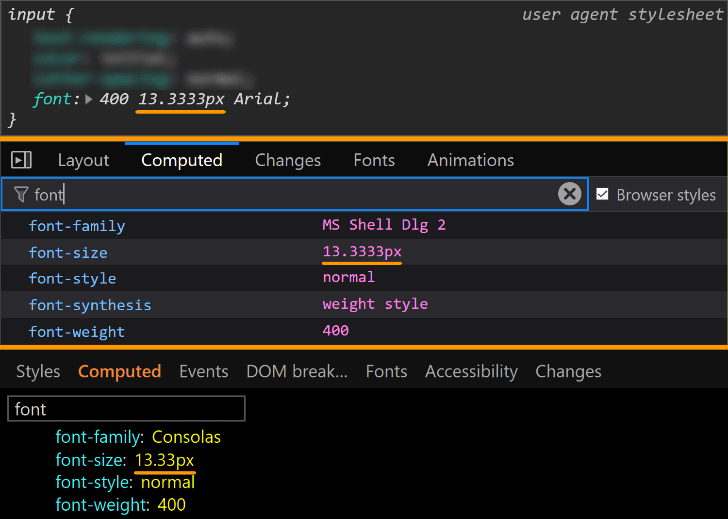
font values for <input type='color'> compared in Chrome, Firefox and Edge (from top-to-bottom).This is a situation where the computed styles are more useful for Firefox, because if we look at the browser styles, we don’t get much in terms of useful information:

The margin is also consistent across all these browsers, computing to 0.

margin values for <input type='color'> compared in Chrome, Firefox and Edge (from top-to-bottom).The border is different for every single browser. In both Chrome and Edge, we have a solid 1px one, but the border-color is different (rgb(169, 169, 169) for Chrome and rgb(112, 112, 112) for Edge). In Firefox, the border is an outset 2px one, with a border-color of… ThreeDLightShadow?!

border values for <input type='color'> compared in Chrome, Firefox and Edge (from top-to-bottom).What’s the deal with ThreeDLightShadow? If it doesn’t sound familiar, don’t worry! It’s a (now deprecated) CSS2 system value, which Firefox on Windows shows me to be rgb(227, 227, 227) in the Computed styles tab.

border-color for <input type='color'> in Firefox on Windows.Note that in Firefox (at least on Windows), the operating system zoom level (Settings → System → Display → Scale and Layout → Change the size of text, apps and other items) is going to influence the computed value of the border-width, even though this doesn’t seem to happen for any other property I’ve checked and it seems to be partially related to the border-style.

The strangest thing is the computed border-width values for various zoom levels don’t seem to make any sense. If we keep the initial border-style: outset, we have:
1.6pxfor125%2pxfor150%1.7pxfor175%1.5pxfor200%1.8pxfor225%1.6pxfor250%1.66667pxfor300%
If we set border-style: solid, we have a computed border-width of 2px, exactly as it was set, for zoom values that are multiples of 50% and the exact same computed values as for border-style: outset for all the other zoom levels.
The padding is the same for Chrome and Edge (1px 2px), while Firefox is the odd one out again.

padding values for <input type='color'> compared in Chrome, Firefox and Edge (from top-to-bottom).It may look like the Firefox padding is 1px. That’s what it is set to and there’s no indication of anything overriding it — if a property is overridden, then it’s shown as grey and with a strike-through.
![Screenshot of Firefox DevTools highlighting how the border set on input[type='color'] overrides the one set on input and the look (grey + strike-through) of overridden properties.](https://i0.wp.com/css-tricks.com/wp-content/uploads/2019/05/override_firefox.png?ssl=1)
But the computed value is actually 0 8px! Moreover, this is a value that doesn’t depend on the operating system zoom level. So, what the hairy heck is going on?!
 isn’t the one that was set on input, even if no override seems to be happening.”/>
padding in Firefox doesn’t match the value that was set on input.Now, if you’ve actually tried inspecting a color input, took a close look at the styles set on it, and your brain works differently than mine (meaning you do read what’s in front of you and don’t just scan for the one thing that interests you, completely ignoring everything else…) then you’ve probably noticed there is something overriding the 1px padding (and should be marked as such) — the flow-relative padding!
![Screenshot of Firefox DevTools showing the flow-relative padding overriding the old padding due to higher specificity of selector (input[type='color'] vs. input).](https://i0.wp.com/css-tricks.com/wp-content/uploads/2019/05/default_l0_padding_firefox.png?ssl=1)
padding overrides in Firefox.Dang, who knew those properties with lots of letters were actually relevant? Thanks to Zoltan for noticing and letting me know. Otherwise, it probably would have taken me two more days to figure this one out.
This raises the question of whether the same kind of override couldn’t happen in other browsers and/or for other properties.
Edge doesn’t support CSS logical properties, so the answer is a “no” in that corner.
In Chrome, none of the logical properties for margin, border or padding are set explicitly for <input type='color'>, so we have no override.
Concerning other properties in Firefox, we could have found ourselves in the same situation for margin or for border, but with these two, it just so happens the flow-relative properties haven’t been explicitly set for our input, so again, there’s no override.
Even so, it’s definitely something to watch out for in the future!
Moving on to dimensions, our input’s width is 44px in Chrome and Edge and 64px in Firefox.

width values for <input type='color'> compared in Chrome, Firefox and Edge (from top-to-bottom).Its height is 23px in all three browsers.

height values for <input type='color'> compared in Chrome, Firefox and Edge (from top-to-bottom).Note that, since Chrome and Edge have a box-sizing of content-box, their width and height values do not include the padding or border. However, since Firefox has box-sizing set to border-box, its dimensions include the padding and border.

<input type='color'> compared in Chrome, Firefox and Edge (from top-to-bottom).This means the content-box is 44pxx23px in Chrome and Edge and 44xpxx19px in Firefox, the padding-box is 48pxx25 in Chrome and Edge and 60pxx19px in Firefox and the border-box is 50pxx27px in Chrome and Edge and 64pxx23 in Firefox.
We can clearly see how the dimensions were set in Chrome and I’d assume they were set in the same direct way in Edge as well, even if Edge doesn’t allow us to trace this stuff. Firefox doesn’t show these dimensions as having been explicitly set and doesn’t even allow us to trace where they came from in the Computed tab (as it does for other properties like border, for example). But if we look at all the styles that have been set on input[type='color'], we discover the dimensions have been set as flow-relative ones (inline-size and block-size).
![Screenshot of the Firefox user agent styles showing flow relative dimensions being set on input[type='color'].](https://i0.wp.com/css-tricks.com/wp-content/uploads/2019/05/default_l0_dim_firefox_logical.png?ssl=1)
<input type='color'> dimensions have been set in Firefox.The final property we check for the normal state of the actual input is background. Here, Edge is the only browser to have a background-image (set to a top to bottom gradient), while Chrome and Firefox both have a background-color set to ButtonFace (another deprecated CSS2 system value). The strange thing is this should be rgb(240, 240, 240) (according to this resource), but its computed value in Chrome is rgb(221, 221, 221).

background values for <input type='color'> compared in Chrome, Firefox and Edge (from top-to-bottom).What’s even stranger is that, if we actually look at our input in Chrome, it sure does look like it has a gradient background! If we screenshot it and then use a picker, we get that it has a top to bottom gradient from #f8f8f8 to #ddd.

Also, note that changing just the background-color (or another property not related to dimensions like border-radius) in Edge also changes the background-image, background-origin, border-color or border-style.

background-color.Other states
We can take a look at the styles applied for a bunch of other states of an element by clicking the :hov button in the Styles panel for Chrome and Firefox and the a: button in the same Styles panel for Edge. This reveals a section where we can check the desired state(s).

Note that, in Firefox, checking a class only visually applies the user styles on the selected element, not the browser styles. So, if we check :hover for example, we won’t see the :hover styles applied on our element. We can however see the user agent styles matching the selected state for our selected element shown in DevTools.
Also, we cannot test for all states like this and let’s start with such a state.
:disabled
In order to see how styles change in this state, we need to manually add the disabled attribute to our <input type='color'> element.
Hmm… not much changes in any browser!
In Chrome, we see the background-color is slightly different (rgb(235, 235, 228) in the :disabled state versus rgb(221, 221, 221) in the normal state).

:disabled styling.But the difference is only clear looking at the info in DevTools. Visually, I can tell tell there’s a slight difference between an input that’s :disabled and one that’s not if they’re side-by-side, but if I didn’t know beforehand, I couldn’t tell which is which just by looking at them, and if I just saw one, I couldn’t tell whether it’s enabled or not without clicking it.

<input type='color'> in Chrome.In Firefox, we have the exact same values set for the :disabled state as for the normal state (well, except for the cursor, which realistically, isn’t going to produce different results save for exceptional cases anyway). What gives, Firefox?!
 in its normal state and its :disabled state. The padding and border set in the :disabled case are exactly the same as those set in the normal case.”/>
:disabled (top) versus normal (bottom) styling.In Edge, both the border-color and the background gradient are different.

:disabled styling (by checking computed styles).We have the following styles for the normal state:
border-color: rgb(112, 112, 112);
background-image: linear-gradient(rgb(236, 236, 236), rgb(213, 213, 213));
And for the :disabled state:
border-color: rgb(186, 186, 186);
background-image: linear-gradient(rgb(237, 237, 237), rgb(229, 229, 229));
Clearly different if we look at the code and visually better than Chrome, though it still may not be quite enough:

<input type='color'> in Edge.:focus
This is one state we can test by toggling the DevTools pseudo-classes. Well, in theory. In practice, it doesn’t really help us in all browsers.
Starting with Chrome, we can see that we have an outline in this state and the outline-color computes to rgb(77, 144, 254), which is some kind of blue.
 :focus.”/>
:focus styling.Pretty straightforward and easy to spot.
Moving on to Firefox, things start to get hairy! Unlike Chrome, toggling the :focus pseudo-class from DevTools does nothing on the input element, though by focusing it (by tab click), the border becomes blue and we get a dotted rectangle within — but there’s no indication in DevTools regarding what is happening.

:focus it.If we check Firefox’s forms.css, it provides an explanation for the dotted rectangle. This is the dotted border of a pseudo-element, ::-moz-focus-inner (a pseudo-element which, for some reason, isn’t shown in DevTools inside our input as ::-moz-color-swatch is). This border is initially transparent and then becomes visible when the input is focused — the pseudo-class used here (:-moz-focusring) is pretty much an old Firefox version of the new standard (:focus-visible), which is currently only supported by Chrome behind the Experimental Web Platform features flag.

:focus comes from.What about the blue border? Well, it appears this one isn’t set by a stylesheet, but at an OS level instead. The good news is we can override all these styles should we choose to do so.
In Edge, we’re faced with a similar situation. Nothing happens when toggling the :focus pseudo-class from DevTools, but if we actually tab to our input to focus it, we can see an inner dotted rectangle.

:focus it.Even though I have no way of knowing for sure, I suspect that, just like in Firefox, this inner rectangle is due to a pseudo-element that becomes visible on :focus.
:hover
In Chrome, toggling this pseudo-class doesn’t reveal any :hover-specific styles in DevTools. Furthermore, actually hovering the input doesn’t appear to change anything visually. So it looks like Chrome really doesn’t have any :hover-specific styles?
In Firefox, toggling the :hover pseudo-class from DevTools reveals a new rule in the styles panel:

:hover styling as seen in DevTools.When actually hovering the input, we see the background turns light blue and the border blue, so the first thought would be that light blue is the -moz-buttonhoverface value and that the blue border is again set at an OS level, just like in the :focus case.
 , it gets a light blue background and a blue border.”/>
:hover.However, if we look at the computed styles, we see the same background we have in the normal state, so that blue background is probably really set at an OS level as well, in spite of having that rule in the forms.css stylesheet.

background-color of an <input type='color'> on :hover.In Edge, toggling the :hover pseudo-class from DevTools gives our input a light blue (rgb(166, 244, 255)) background and a blue (rgb(38, 160, 218)) border, whose exact values we can find in the Computed tab:

background-color and border-color of an <input type='color'> on :hover.:active
Checking the :active state in the Chrome DevTools does nothing visually and shows no specific rules in the Styles panel. However, if we actually click our input, we see that the background gradient that doesn’t even show up in DevTools in the normal state gets reversed.
:active state. It appears to have a gradient (reversed from the normal state), in spite of the info we get from DevTools telling us it doesn’t.In Firefox DevTools, toggling the :active state on does nothing, but if we also toggle the :hover state on, then we get a rule set that changes the inline padding (the block padding is set to the same value of 0 it has in all other states), the border-style and sets the background-color back to our old friend ButtonFace.

:active styling as seen in DevTools.In practice, however, the only thing that matches the info we get from DevTools is the inline shift given by the change in logical padding. The background becomes a lighter blue than the :hover state and the border is blue. Both of these changes are probably happening at an OS level as well.
 , it gets a light blue background and a blue border in addition to sliding 1 pixel in the inline direction as a result of changing the inline padding.”/>
:active state.In Edge, activating the :active class from DevTools gives us the exact same styles we have for the :hover state. However, if we have both the :hover and the :active states on, things change a bit. We still have a light blue background and a blue border, but both are darker now (rgb(52, 180, 227) for the background-color and rgb(0, 137, 180) for the border-color):

background-color and border-color of an <input type='color'> on :active viewed in Edge.This is the takeaway: if we want a consistent cross-browser results for <input type='color'>, we should define our own clearly distinguishable styles for all these states ourselves because, fortunately, almost all the browser defaults — except for the inner rectangle we get in Edge on :focus — can be overridden.
The swatch wrapper
This is a component we only see in Chrome, so if we want a cross-browser result, we should probably ensure it doesn’t affect the swatch inside — this means ensuring it has no margin, border, padding or background and that its dimensions equal those of the actual input’s content-box.
In order to know whether we need to mess with these properties (and maybe others as a result) or not, let’s see what the browser defaults are for them.
Fortunately, we have no margin or border, so we don’t need to worry about these.

margin and border values for the swatch wrapper in Chrome.We do however have a non-zero padding (of 4px 2px), so this is something we’ll need to zero out if we want to achieve a consistent cross-browser result.

padding values for the swatch wrapper in Chrome.The dimensions are both conveniently set to 100%, which means we won’t need to mess with them.

Something we need to note here is that we have box-sizing set to border-box, so the padding gets subtracted from the dimensions set on this wrapper.

box-sizing value for the swatch wrapper in Chrome.This means that while the padding-box, border-box and margin-box of our wrapper (all equal because we have no margin or border) are identical to the content-box of the actual <input type='color'> (which is 44pxx23px in Chrome), getting the wrapper’s content-box involves subtracting the padding from these dimensions. It results that this box is 40pxx15px.

The background is set to transparent, so that’s another property we don’t need to worry about resetting.

background values for the swatch wrapper in Chrome.There’s one more property set on this element that caught my attention: display. It has a value of flex, which means its children are flex items.

display value for the swatch wrapper in Chrome.The swatch
This is a component we can style in Chrome and Firefox. Sadly, Edge doesn’t expose it to allow us to style it, so we cannot change properties we might want to, such as border, border-radius or box-shadow.
The box-sizing property is one we need to set explicitly if we plan on giving the swatch a border or a padding because its value is content-box in Chrome, but border-box in Firefox.

box-sizing values for the swatch viewed in Chrome (top) and Firefox (bottom).Fortunately, the font-size is inherited from the input itself so it’s the same.

font-size values for the swatch viewed in Chrome (top) and Firefox (bottom).The margin computes to 0 in both Chrome and Firefox.

margin values for the swatch viewed in Chrome (top) and Firefox (bottom).This is because most margins haven’t been set, so they end up being 0 which is the default for <div> elements. However, Firefox is setting the inline margins to auto and we’ll be getting to why that computes to 0 in just a little moment.

margin for the swatch being set to auto in Firefox.The border is solid 1px in both browsers. The only thing that differs is the border-color, which is rgb(119, 119, 119) in Chrome and grey (or rgb(128, 128, 128), so slightly lighter) in Firefox.

border values for the swatch viewed in Chrome (top) and Firefox (bottom).Note that the computed border-width in Firefox (at least on Windows) depends on the OS zoom level, just as it is in the case of the actual input.
The padding is luckily 0 in both Chrome and Firefox.

padding values for the swatch viewed in Chrome (top) and Firefox (bottom).The dimensions end up being exactly what we’d expect to find, assuming the swatch covers its parent’s entire content-box.

In Chrome, the swatch parent is the <div> wrapper we saw earlier, whose content-box is 4pxx15px. This is equal to the margin-box and the border-box of the swatch (which coincide as we have no margin). Since the padding is 0, the content-box and the padding-box for the swatch are identical and, subtracting the 1px border, we get dimensions that are 38pxx13px.
In Firefox, the swatch parent is the actual input, whose content-box is 44pxx19px one. This is equal to the margin-box and the border-box of the swatch (which coincide as we have no margin). Since the padding is 0, the content-box and the padding-box for the swatch are identical and, subtracting the 1px border, we get that their dimensions are 42pxx17px.
In Firefox, we see that the swatch is made to cover its parent’s content-box by having both its dimensions set to 100%.

This is the reason why the auto value for the inline margin computes to 0.
But what about Chrome? We cannot see any actual dimensions being set. Well, this result is due to the flex layout and the fact that the swatch is a flex item that’s made to stretch such that it covers its parent’s content-box.

flex value for the swatch wrapper in Chrome.Final thoughts
Phew, we covered a lot of ground here! While it may seem exhaustive to dig this deep into one specific element, this is the sort of exercise that illustrates how difficult cross-browser support can be. We have our own styles, user agent styles and operating system styles to traverse and some of those are always going to be what they are. But, as we discussed at the very top, this winds up being an accessibility issue at the end of the day, and something to really consider when it comes to implementing a practical, functional application of a color input.
Remember, a lot of this is ripe territory to reach out to browser vendors and let them know how they can update their implementations based on your reported use cases. Here are the three tickets I mentioned earlier where you can either chime in or reference to create a new ticket:
Wow, that’s nightmare territory
The colour picker should be burned with fire. No way anyone should use it on a real site.
That was a deep dive !
I had no idea you could inspect browser shadow DOM so easily.
That would make a great article series ;)
Edge Canary (I have 77.0.223.0 currently) has the exact same devtools settings as Chrome, and inspecting the shadow dom gives the same results as Chrome.
The firefox’s padding devtools “inconsistency” is due to the later rule doesn’t override the declared input rule, what’s overriding it is the browser itself when it processes the RTL logic, and devtools doesn’t have access to the browser on-the-fly post-processed styles, showing and associating the “raw input” for the rendering engine.
That was intense! I think we need a follow up on the actual color-picker itself in addition to the input. For a file picker it makes sense for that to be native but for a color picker not at all.
The color picker breaks the 4th wall so to speak … the eye dropper is able to traverse the system windows to get colors, which is a very good reason for that functionality to be a native function.