I got an email from Brendan Foster the other day, a developer at the Australian agency The Competition. He was showing me an interesting CSS trick that helped him pull off a layout thing on a website he was helping work on for Margaret River Beverages. I actually thought the whole site was pretty interesting, and the idea occurred to me to jot down my thoughts as I explored the site. He was cool with it.
Oooo how is that grungy bottom texture stuff made?
It looks super crisp.
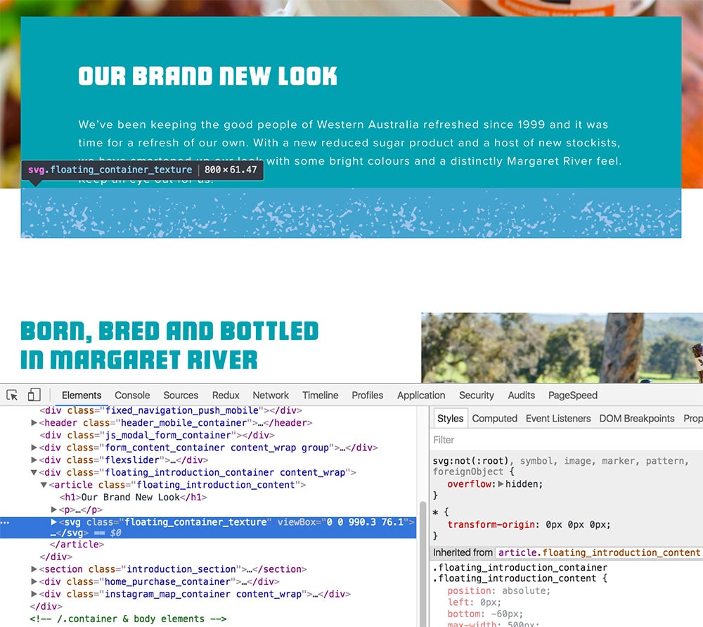
They could style that up on-the-fly then, especially if they removed those inline fill attributes. There is a lot of solid color backgrounds on this site, so that might come in handy.
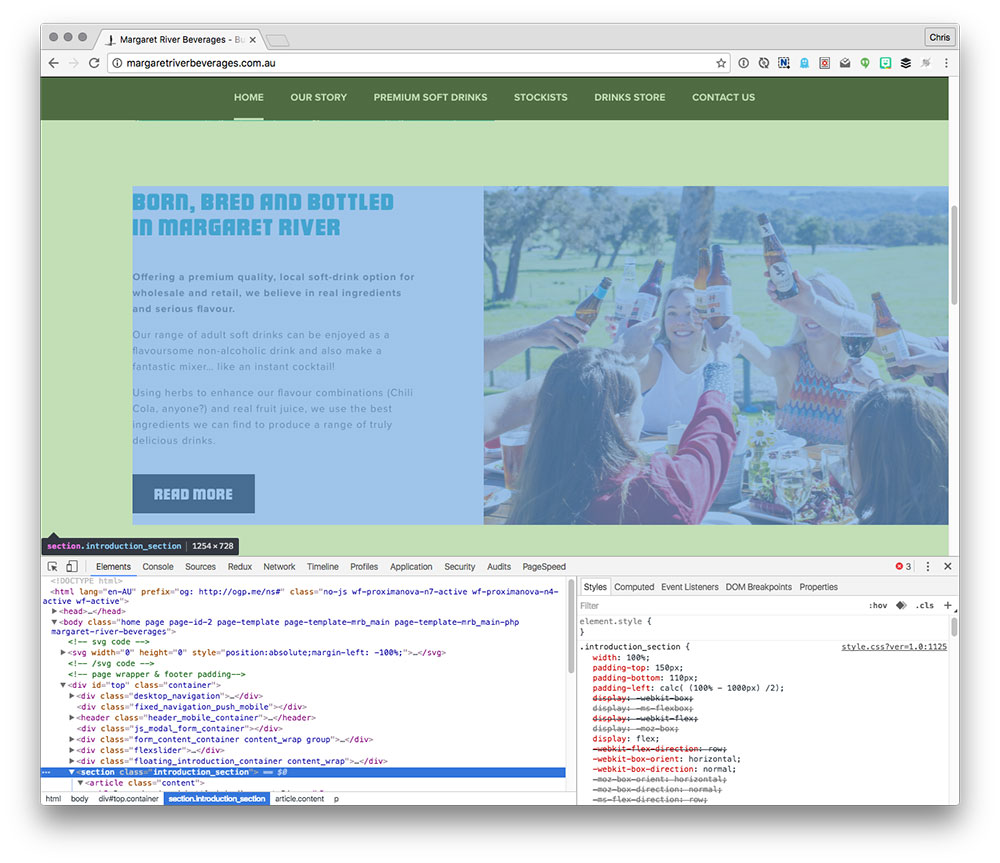
A carousel, huh?
Not typically our favorite thing as web designers, what with them often being there just so everyone in a meeting can high five and eat bloomin’ onions.
This doesn’t appear to be a case of jammin’-more-stuff on the homepage though, at least not ultra-egregiously. Good things about it:
- It animates only with opacity, which is pretty smooth.
- The images within use responsive images. The
<picture>element, specifically. It’s a WordPress site, too, so I wonder if they are using an older responsive images plugin, from before that feature went native. - And also quite importantly, the site has…
Really nice photography
The entire site is covered in it. Such a vital thing for a site like this where they are selling a real product. A “premium” brand, where it’s as much about the perceived lifestyle as it is the product.

Good photos can really make a site. It’s almost cheating. All the better when they are implemented with responsive images.
There are some big wins to be had here though. In running the homepage through WebPagetest, it found that many of the images could have been compressed a lot more:
4,460.7 KB total in images, target size = 1,012.8 KB – potential savings = 3,447.9 KB
3.5 MB of bandwidth savings is super huge.
This test exposed two other huge things as well:
- Gzipping isn’t enabled
- Expires headers aren’t set
Those are two things that will have a massive effect on performance, and luckily are quick wins. The 2-second time-to-first-byte isn’t great either, but that might improve after setting the expires headers, alleviating some server load.
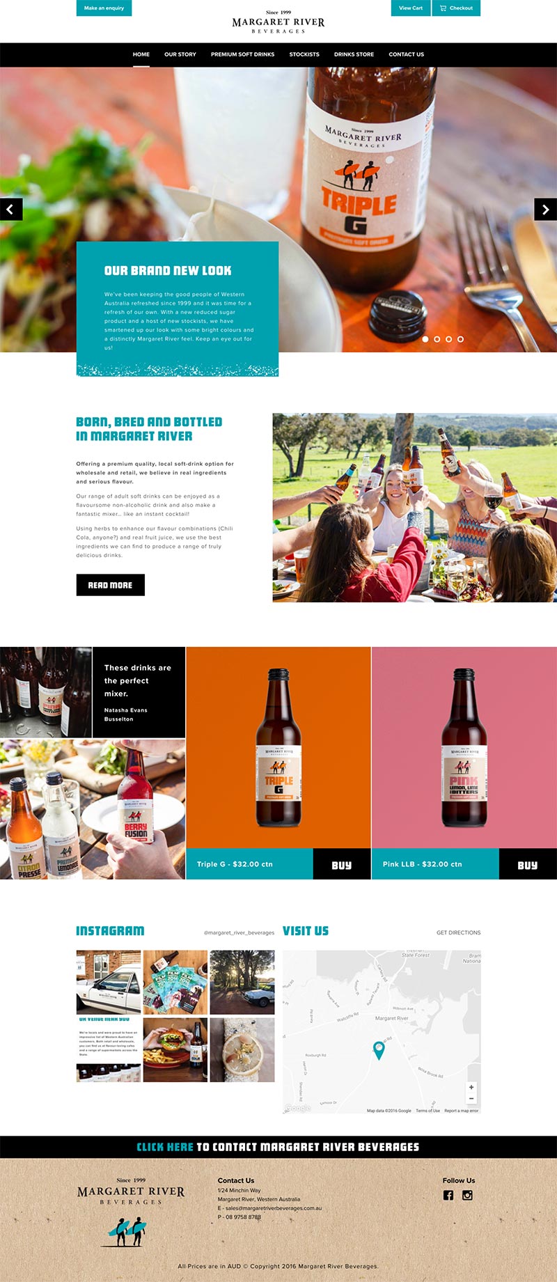
It’s obviously a store
I’ve been to some sites lately that sell stuff, but you can’t really tell until you end up browsing to a section that looks like a product page and happens to have an “add to cart” button. The ever-present “View Cart” and “Checkout” links on the site are more the convenient, they teach you that the site is a store.

An SVG icon system. Sweet.
And speaking of that “Checkout” button, looks like they are rocking an icon there, I wonder what they use for icons?
SVG again, very nice. In the case of the cart button, no fallback or accessibility attributes/elements needed as it’s just visual flair. There are a few places (like the menu open/close icons) that could likely benefit from some accessibility work, particularly adding a <title> into those <svg>s. It would be tempting to move to <symbol> instead of <g> so that those titles can come along with the <use>, as well as the viewBox.
The ol’ edge-to-edge Google Maps thing
The all grayscaled-out map looks pretty sweet, but it goes edge to edge which freaks me out a little because I thought that could be a scrolling trap.
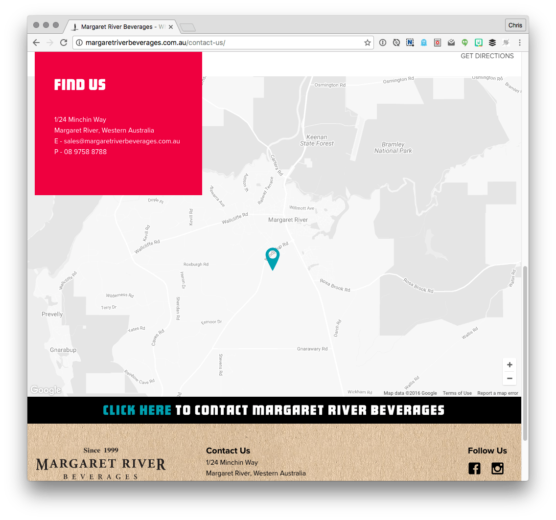
Looks like on desktop it’s no big deal, scrolling doesn’t zoom the map like it does when you’re actually on Google Maps, so you can scroll right past. On mobile though, the edge to edge map does trap your scrolling:

It’s not a major problem though as they have locked the height of the map to be not tall enough to cover (at least, most?) mobile screens.
.contact-us #google_map {
  height: 100%;
  min-height: 655px;
}
@media (max-width: 767px) {
    .contact-us #google_map {
      max-height: 300px;
      min-height: 300px;
    }
}
So if you get trapped you can always move your finger to a non-map area. Probably a good opportunity for an Adaptive Map.
I was able to peak at that CSS right in the source code, meaning it wasn’t compressed CSS. Not too big a deal since gzipping is so much more important, but a slightly bigger deal since gzipping isn’t on yet.
A nice grid
Covers all possible widths nicely:
Notice that some content is full-width and some isn’t. As in, a photo that will always touch the right edge and text to the left of it that doesn’t hug the left edge.
A little SEO in the main nav
This is the weirdest page, to me. “Premium soft drinks” is literally all they do. Why the special one-off page for it? Isn’t that kinda the home page? My best guess is that there is some business value to being super clear about it and potentially an SEO play.
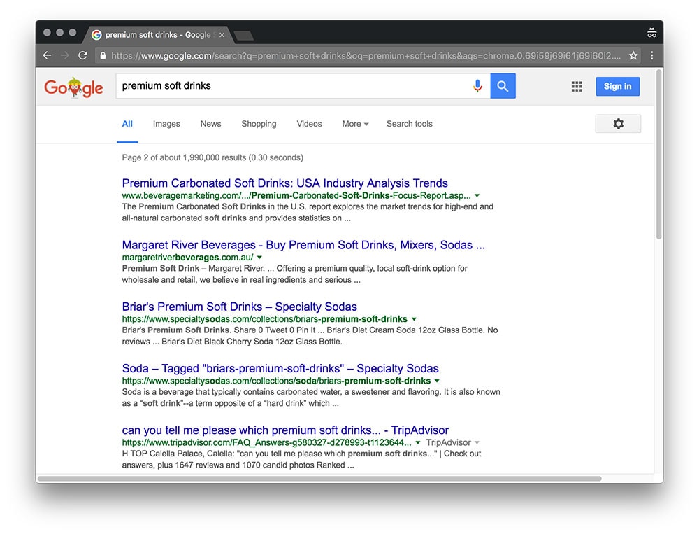
They are 2nd on the 2nd page though, so looks like it could be working.
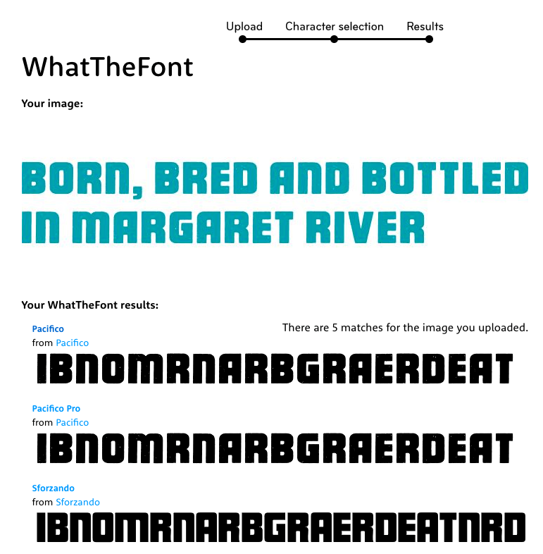
The font on the product and the display font on the web is the same!
It’s not every day you can pull that off. Perhaps the product design team and the web design team are the same company, and they made that a requirement for their recent rebranding.
I took a peak to see what typeface it was:

Which, if you web search, you’ll find a really scripty cursive thing as a free font in places like Google Fonts. I was able to use WhatTheFont though, upload an example, and find it:
More tiny little things I notice right away for whatever reason
<html lang="en-AU">– It wasn’t until I saw that that I realized it was Australian!class="no-js"– That class on the<html>element was probably put their by some boilerplate code, but the JavaScript that typically removes that doesn’t run. It just probably isn’t used anywhere.- Speaking of JavaScript, there is a
<noscript>tag warning that the site works best with JavaScript. Technically true, but it could probably go as the site works pretty well without. The sliders stack up into a block of images, and even adding products to the cart and checking out works. - The
@font-faceblock is looking for a missing `.woff2` file, another little potential performance win. - The fixed navigation bar gets a little stuck when scrolling back up sometimes and covers some of the top of the page. They are aware of this one and trying to fix.
- There is a little bit of letterspacing on the body copy. I thought that was for sheep stealers?
What kind of stuff do you look at when digging into another site for the first time as designer/developer? What goes through your brain?
Beau, here longtime lurker, first-time poster.
Could some kind soul elaborate on the searching for a “.woff2”?
If it’s a performance win, cut me off a piece of that!
Thx, in advance.
I’ll take my answer off the air.
The browser makes an HTTP request that will never return anything useful. Just this alone is a performance issue.
Dear beau.js,
Let me try and elaborate:
1) .woff2 is a font format –> in other words, just like an image might be a .jpg or .png, fonts can be delivered as .woff2 files.
2) The .woff2 file, on this particular site is missing. You can observe this by opening your browsers dev tools and viewing the console output. Currently the google chrome console message states: “Failed to load resource: the server responded with a status of 404 (Not Found)”
3) Having the browser request a files that does not exist is an unnecessary “round trip” between server and client and thus removing the file = faster loading site.
Thanks for the responses.
I suppose I misunderstood the wording of the sentence as written which implies the point that removal of this search for the font–would–be a potential perf win (obviating the necessity for the http request).
Phew. I got it now.
Very helpful, thanks!
Hey Chris,
Awesome write-up! It’s great getting an insight into someone else process. I Really feel like I’m going to over-use WhatTheFont because people either don’t know their fonts are which makes linking media harder, or they don’t care to write it down when they are told.
Do you have any tips to convince people to go for photography and to work with and source great photographers? I’ve actually never had to hire a photographer, having done everything from stock or customer supplied it is as you’d imagine… A mix of shitty-low res images some upper-management person asked their staff to take, some of which have to come down because they showcase something illegal or in some cases have been swiped; sometimes images that a customer has picked from limited stock market missing a serving for niche markets; like expert electro-mechanical engineers.
Have a great weekend! (Maybe a write-up / update of your own design process)
Like you touched on, performance is usually the first thing I notice. I’ll then open DevTools and (hard) refresh the page to see it with real numbers in real time. I remember opening one site which displayed a nice loading icon for awhile. After it loaded, I discovered what took so long — a 20+ MB apparently raw stock photo with the original name. The site itself was very simple. At least the picture was nice.
I also like to see if I can determine what platform the site is running, although that can often be pretty clear, and how well the responsive nature of the site is (if it is).
When I opened the site in your example, I noticed the blue banner start at the top of the screen and snap down causing some visual jank. Some critical CSS or having the banner wait to display would be nice.
I also like to just view source on the page and scroll through it. The site in your example is particularly interesting as they included those SVGs in the .html document that was sent the first time instead of AJAXing for them. As a result, there is A LOT of SVG data in that response. A 145KB initial response doesn’t help that load time.
Thanks for this post. I found it very interesting and liked knowing I am not alone in my website audits. : )
Well done Bfos. Credit to the designer too, Brett at Layton Creative. http://laytoncreative.com.au/margaret-river-beverages/.
This was how we were used to learn in earlier days, right? Right click > view source. This was before we were overwhelmed with all online tutorials :)
When reviewing a site I have to remind myself to look at it with differing disciplines and judge on each one separately. There could be a beautiful site that performs well and is amazingly engineered… But what’s the point if the page doesn’t communicate well and is a UX nightmare?
I tend to look at it from a few different angles…
Communication – is the page performing a task that it was set out to do… Urgh there’s a carousel – but does it work? Is it performing a UX task that aides the usability? The page guide easily guide me to perform a task?
Mark up – Is it valid? Is the content order correct? Is the flow of information in the right order?
Aesthetics – does the design enhance the experience? Review colour contrast, font styles/sizes, use of imagery – does photography or illustration work best? And do all of these suitably styled for different responsive profiles?
Enhancements/usability/accessibility – yay there cool scripty things happening on the page but what if I turn off JavaScript can I still use the page, are there sufficiently thought out steps that allow me to complete my task? What happens when information is hidden in a drop down is that available for screen readers?
Optimisation – how well is the site performing, are there any scripts blocking the rendering time, what could be done to improve the perceived load time? Do the same optimisation work across different pages?
Some sites will be stronger in some areas then others and it’s a bit of a balancing act to improve one aspect without making another fall over and prioritising what is more important… And obviously come up with solutions all within that ridiculous timeline we foolishly agreed to.
What was that? Some making for living? I would rather not see such articles here. I come here for tricks.
lol I don’t even understand the criticism but understand the snark.
I love the analysis and this is super helpful. I just keep getting thrown by really smart people using “peak” when they mean “peek” and….
Here are some welding goggles. Please don’t look at any of my sites. This was very instructive. How much time did your analysis take?
Personally I would have tackled the product grid differently.
Reference: http://store.margaretriverbeverages.com.au/
I think using flex here is over complicating things and as a result, its not being displayed properly.
See: http://i.imgur.com/HM15RMk.jpg
Something as simple as this could have been used: http://codepen.io/tomanagle/pen/xOrrBx
You just need to clear both on certain elements, depending on your breakpoints.
Is it weird to say that I always look at the favicon first? I like to think of it as the start of a web page experience.
I did enjoy this post though. I always find it interesting to see how other people respond to sites initially.
First thing that I look for the technologies based on which website is developed, like pure HTML CSS and JS or wrodpress, or those auto generated files of ASP.Net.
After that I try to get and understand the color combination that the site has used, how they are loading icons, how they are doing that cool effect that I always wanted to do and what are the JS libraries and CSS framework developer has used to code the website.
Check css specificity, validate css using jigsaw, validate html using ‘nu’ website check google page speed, check js code, check accesibility, check breakpoints if they are mobile first, and another 10-15 tests :)
Cut to the chase…
To many if not most sites use the homepage to “big themselves” up, and in many instances user just want to cut straight to get info & or select product, order it, submit, job done. I was recently looking for a ferry crossing, its a ferry what more is there to say, yet I land on the homepage then need to navigate to the booking page, waste of my time. Certainly larger stores cannot show all products on the homepage, filtering must be made. But smaller offerings could just give people want they want from the go.
Ha ! nice to see such article showing what I mostly would do
How did the shopping cart and checkout work without Javascript though?
I don’t know what Chris’s reply is or if the author can give some insight, but try setting the form target to an iframe which you give 0 width, 0 height (or 1px, or display:none, really doesn’t matter). You can then stay on the page and POST to the cart.
As an alternative you could accept that any purchase posts regularly and just returns you to the referrer, or use a hidden input to pass the referrer in with the form data, it’s all very easy but rarely done any more.