Have you seen David Desandro’s site? It’s pretty slick. His footer is especially fun:
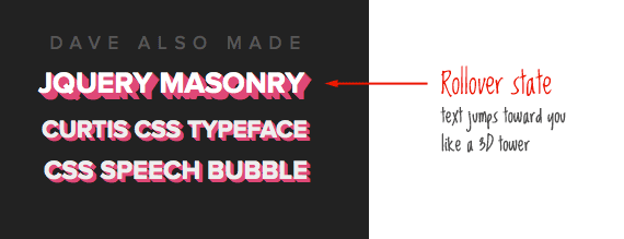
The technique is clever in it’s simplicity. Let’s take a look.
Multiple Text Shadows
The major empowering concept here is the CSS3 property text-shadow. Typically it’s like this:
.shadow {
   text-shadow: 2px 2px 4px #000;
}
Those four properties being:
[X offset] [Y offset] [Blur size] [Color]
Notice there is no vendor prefixes, which is nice (Related: debate on vendor prefixes). You can also apply multiple shadows to the same text:
.shadow {
   text-shadow: 1px 1px 0 black,
                2px 2px 0 black;
}
Multiple shadows happen by using a comma separated list. In the above code, there are two shadows, one offset by 1px on both axes with no blur, the second by 2px on both axes with no blur.
See the trick? We can apply multiple shadows, each offset by 1px from each other to build a “tower” style shadow below it. By default this would apply shadows deeper and deeper underneath the text, but we can appear to have it “pop up” by having the shadows only appear on hover and moving the text up and to the left the same depth of the shadow.
.shadow {
   color: white;
   font: bold 52px Helvetica, Arial, Sans-Serif;
   text-shadow: 1px 1px #fe4902,
                2px 2px #fe4902,
                3px 3px #fe4902;
}
.shadow:hover {
   position: relative;
   top: -3px;
   left: -3px;
   text-shadow: 1px 1px #fe4902,
                2px 2px #fe4902,
                3px 3px #fe4902,
                4px 4px #fe4902,
                5px 5px #fe4902,
                6px 6px #fe4902;
}
Transitions
As it stands with the above code, the rollover will instantly pop up the “tower” on rollover. But we can make it “grow up” instead, as most modern browsers are now supporting transitions (i.e. animation from one state of appearance to another). We don’t get so lucky with the vendor prefixes this time. There are three to cover:
.shadow {
   color: white;
   font: bold 52px Helvetica, Arial, Sans-Serif;
   text-shadow: 1px 1px #fe4902,
                2px 2px #fe4902,
                3px 3px #fe4902;
   -webkit-transition: all 0.12s ease-out;
   -moz-transition:    all 0.12s ease-out;
   -ms-transition:     all 0.12s ease-out;
   -o-transition:      all 0.12s ease-out;
}
.shadow:hover {
   position: relative;
   top: -3px;
   left: -3px;
   text-shadow: 1px 1px #fe4902,
                2px 2px #fe4902,
                3px 3px #fe4902,
                4px 4px #fe4902,
                5px 5px #fe4902,
                6px 6px #fe4902;
}
Note: See CanIUse.com for browser support of CSS transitions.
Fun with Scaling
The middle section of the footer has a different neat affect. As you roll over the different lines they grow in size. This is an other CSS3 effect: transform. Again with the vendor prefixes:
div:hover {
   -webkit-transform: scale(1.1);
   -moz-transform:    scale(1.1);
   -ms-transform:     scale(1.1);
   -o-transform:      scale(1.1);
   text-shadow: 3px 3px 0 #333;
}
Fallbacks
So what happens in Internet Explorer? Text shadow won’t work, but the positioning will.

Demo and Download
If you plan to use this somewhere, be inspired by the idea and the technology, don’t just rip off David’s footer.
whoahh… that’s cool.
David Desandro does amazing work. Love his “Curtis” typeface, the jQuery Masonry plugin, and his Quickie Canvas tool.
He’s equal parts wizard and artist…definitely a source of inspiration for me.
Cool, but in Firefox in Windows (XP) the text isn’t so clear. And that also effects the shadow, which gives it a very blocky feel. It’s a shame FireFox doesn’t do anti-aliasing in windows.
This effect would be even better with a CSS3 animation!
Very nice effect. Too bad IE users miss out on so much.
That is a really neat hover effect. Reminds me of a Paramount Studio spot light action….
Great stuff.
The link for the “download files” seems to be broken.
Thank you so much for your informative articles! The more often I come here the more I learn. Great site, Kudos!
Just needed to say this, since I’m leeching off your site for quite a while now.
Interesting to see you pick this up… I found Masonry the other day and attempted it to display some pupils’ work on my website and the footer jumped out from his website. Check out Masonry some time too! PS. CSS Tricks has helped so much with learning about web design it’s unbelievable. Chris Coyier is a legend in his own lunchtime.
Vendor prefixes aside, now that webkit and mozilla are close to incorporating all the new CSS3 properties into their rendering engines, and designers like David innovate with them on live sites, IE is REALLY getting left behind. I wonder what Microsoft will try and do about it?
Yes, indeed a very interesting effect. Before you bring up this tutorial, I saw his (David Desandro) site. The effect really caught my attention. Now, the myth has been uncovered, thanks Chris.
Wow
That’s great
Thanks Chris
I haven’t looked into this much for IE, but I believe you could declare an IE filter that will accomplish this as well…?
http://msdn.microsoft.com/en-us/library/ms532847(VS.85).aspx
Maybe I’m wrong, because I haven’t actually done it, but most of the CSS3 effects do have IE-only methods, they just aren’t as clean to code or work with.
Site looks great on a mac, but falls pretty far when viewing in IE. IE 7 clips a lot of the larger text and the portfolio is so crazy and busy it doesn’t make much sense.. seems like the site should degrade a bit better. Though honestly I could care less about IE
Yeah me too, unfortunately all of our customers do care about it.
In a dream world there is only one perfect browser, anyone care to vote on the lucky chosen one?
As a long time Mac user you’d think I’d say safari, but the more I use Chrome, the more I like it. That would get my vote.
Thats a pretty cool looking effect. Going to have to keep this on in the back of the toolbox for maybe use one day. Thanks for the share
Thanks, Chris. Great post. Two question..
1) Where can we find new vendors properties or new CSS stuff like what you posted?
2) Why isn’t -webkit-transform working on my safari?
Thank you ;)
Just being nice by saying, that is one cool script!
Curse you Chris!! I was planning to write about that effect in my next article… Ah well, great job mate.
Brilliant effect! I used to use letter spacing with transitions that looked pretty cool… but this is much better.
Wow David Desandro, amazing work.
wow, Thank you!!
some days ago, i found David Desandro’s website and i saw his cute effect like this article,,,i was amazing at that colorful effect, i was wondering that it was a jquery or not……
and now, i read your article, and finally know that it is a css…thank you, and thank you foe your example, i can understand more about css =)
Nice effect, this effect could be used with some subtle expertise or could unfortunately be abused to look ugly. Hopefully it will remain as its former. Your resources are endless. Thanks
thanks
i.8 error
mozilla screen
http://i257.photobucket.com/albums/hh224/KaI3uS/mozilla.jpg
ie.8 screen
http://i257.photobucket.com/albums/hh224/KaI3uS/ie8.jpg
Uh, the IE8 one looks better. The effect looks horrible that that font and color combo.
wow, I knew about the transformation, and using that with text shadow and :hover but this is just so smooth!
Very nice! I think, i can find where i can apply this trick.
Thank you!
Really like the way David Desandro’s site uses the CSS shadows, the colours used in the footer text really work nicely as well.
I’ve only recently started to put CSS shadows onto text, wasn’t keen on the idea due to W3C compliance etc and I really don’t like using fixes. But I think using them is fine as long as the text still looks “good” in IE. But I think there is a good enough percentage using firefox, safari etc to justify using shadows throughout a site design.
Subtle shadows here and there can really transform a website, and the classic way of just using an image can work but is no good for SEO. Especially for headers and company names.
Thanks for posting that site and how he has done it, really useful tip!
Im gobsmacked my the type david made!
Great article too.
Nice… I just wish it worked in IE.
The output did not have any 3D effect :S
TESTED AND WORKS!!
Firefox and Safari are really slow at this thing.. But on Google Chrome and Opera it looks fluently and very nice.
But its a really cool effect. :D
text-shawdow is very effective and efficient way of replacing drop-shadow images !
Thanks for sharing this will use this. Do you have any idea how I can improve this on IE and Firefox?
Very nice effect and it works great. Thanks!
Simply Awesome……………….
This is an awesome effect, well done!
Its a shame that it doesnt work in internet explorer though.. would it be possible to have a work arround for internet explorer? or is that just wishful thinking? haha :)