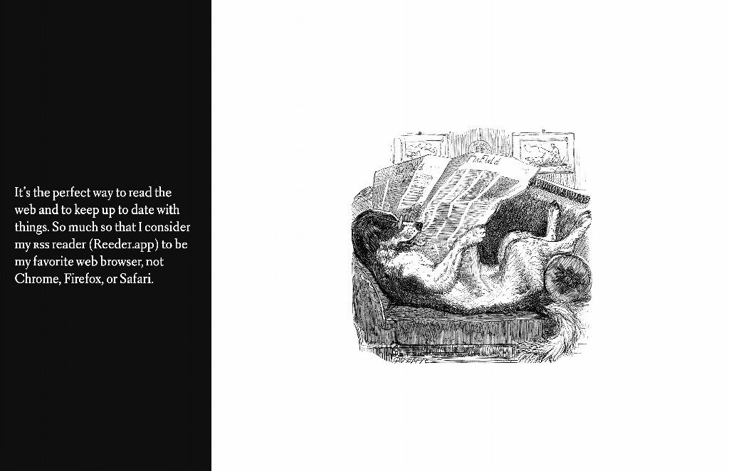
[Robin]: Over the past week I’ve been working on fun side project that I’m calling a Scroll Story—an elaborate blog post where I rant about a thing. The most exciting part about this little website is that it uses scroll-snap from section to section. Here, a screenshot of one of the sections or “slides”:
The idea is to tell a comic book story with the text/illustration pairing whilst each of these “slides” snap into place. To build this thing, first we need a wrapper for all of the slides which looks something like this:
<div class="slide-container">
  <div class="slide">...</div>
  <div class="slide">...</div>
  <div class="slide">...</div>
</div>
And our .slide-container has the styles to make each slide click into place on scroll:
.slide-container {
  scroll-snap-type: y mandatory;
  overflow-y: scroll;
  height: 100vh;
}
And each slide needs to have a height, too:
.slide {
  height: 100vh;
}
100vh tells the browser that we always want the slide to be 100% of the browser’s height—that way each slide takes up the whole screen.
Now, the nifty thing about Firefox is that you can then use the up/down directional keys to jump to each section and it clacks just as you’d expect. And I really wish other browsers implemented this because it’s amazing that you can get the browser to do that with just CSS.
But! The problem here is that mobile browsers disagree about viewport units which is extremely annoying and odd to me. Heck, even Firefox on iOS—which still uses Webkit under the hood—appears to calculate viewport units differently from Safari on iOS.
Thankfully, Louis Hoebregts wrote about this very problem not so long ago:
Viewport units have always been controversial and some of that is because of how mobile browsers have made things more complicated by having their own opinions about how to implement them.
Case in point: should the scrollbar be taken into account for the vw unit? What about a site’s navigation or page controls — should those count in the calculation? Then there are physical attributes of the devices themselves (hello, notch!) that can’t be overlooked.

This was the very problem I was experiencing. To fix the way that browsers calculate vh or vw units correctly we need to use a tiny bit of JavaScript and combine that with CSS custom properties, as Louis writes here:
In JavaScript, you can always get the value of the current viewport by using the global variable
window.innerHeight. This value takes the browser’s interface into account and is updated when its visibility changes. The trick is to store the viewport value in a CSS variable and apply that to the element instead of the vh unit.
So from what I understand, whenever we use vh units we need to use this which is sort of annoying and makes my eye twitch. But in terms of work, it’s not too much bother at all. First, we need to write the following JavaScript:
// Get the viewport height and multiple it by 1% to get a value for a vh unit
let vh = window.innerHeight * 0.01;
// Then we set the value in the --vh custom property to the root of the document
document.documentElement.style.setProperty('--vh', `${vh}px`);
So if the browser height is 600px then we’ll now have a value of 6 to work with. We can then pass this variable into our CSS:
.slide {
  height: 100vh; /* Fallback */
  height: calc(var(--vh, 1vh) * 100);
}
6 * 100 = 600 which happens to be the height of our browser window.
As I said, it’s a bit annoying to me that browsers don’t all agree with how to calculate vh or vw units but it’s not too difficult to get this working. And to get this nifty effect it’s certainly worth the tiny bit of effort to ensure that browsers aren’t being weird.
A Guide to Advanced Selectors
Stephanie Eckles made this swell guide all about just that—the advanced selectors of CSS. That’s like the attribute selector, which looks something like this:
[class*="component_"] {
  background: red;
}
As Stephanie writes, this would match all elements that contain the “component_” string so in this case both .component_title and .component_img would have a red background. There’s a ton of nifty things like this that advanced selectors can do and we even made breakdowns for every single CSS selector which I find handy from time to time when I want to do something punk rock.

The End of Adobe Flash
I liked this thread from Matt May about the end of Flash:
Today is the Adobe Flash end of life date.
I come to bury Flash, not to praise it.
As an animation platform, Flash launched the web into new directions. But once it became a UX platform, without the structure of web or OS apps, it left millions behind.
In that thread, Matt walks through all the accessibility issues that were caused by folks using Flash to create “pictures of interfaces” as he puts it. Back then it’s important to remember that the only way to add fonts to your website, add music, or to create animations was to use Flash to build the entire thing. So either you used Flash or you used web standards to make a website that looked kinda borked in comparison.
But, as Matt says, Flash left so many people behind.
There are a lot of arguments in favor of Flash, but as far as I can tell it comes down to developer experience. It was super neat to have tools that let you create all these things easily and today we’ve sort of lost that as we slowly transitioned away from Flash and chose HTML5 instead.
This reminds me of the “priority of constituencies” section from the design principles of HTML:
In case of conflict, consider users over authors over implementors over specifiers over theoretical purity. In other words costs or difficulties to the user should be given more weight than costs to authors; which in turn should be given more weight than costs to implementors; which should be given more weight than costs to authors of the spec itself, which should be given more weight than those proposing changes for theoretical reasons alone. Of course, it is preferred to make things better for multiple constituencies at once.
I think the issue with Flash is that ultimately we chose authors over users. That doesn’t mean that Flash had benefits but it benefited the wrong folks disproportionately and there’s a ton of lessons that we can take from that and apply to the ever-so-large and inaccessible web apps that we build today.
Alternate take? Here Likes Flash from Mike Davidson:
So here lies Flash. Granddaddy of the rich, interactive internet. Inspiration for tens of thousands of careers in design and gaming. Loved by fans, reviled by enemies, but forever remembered for pushing us further down this windy road of interactive design, lighting the path for generations to come.
There is no doubt there was a lot of creativity to be found in Flash, but Mike calls Flash a transitional or evolutionary technology. Showing us what is possible without promising to be the final answer. It maybe just hung around a little too long.
React and Three.js Tutorial
Here’s a tutorial from Wrong Akram that shows us how to build a Minecraft inventory UI with React and Three.js. You can move items around and it’ll save where each item was placed for later.

This demo that Akram walks us through uses react three fiber which is a React renderer and he also walks through how to take 3D models from the SketchFab marketplace and get started with them. I’ve never done any 3D work before and so this is certainly interesting to see how all these pieces fit together.

Sponsor
WordPress.com
WordPress.com makes it simple to get online. Create any kind of website with no code or tricky setup, with the potential for a bigger and better site — and bigger and better audience — built right in.
[Chris]: I loved this writeup from Tania Rascia about building a really nice looking note-taking app called TakeNote, and then intentionally not shipping it as a production project. Here’s one of the listed reasons:
I don’t want to maintain a server. If I had real users and the app went down, I didn’t feel comfortable having that knowledge in the back of mind that if there was a DDoS or DigitalOcean was down or for any other reason the server went down, the app would be down for users.
This feels super reasonable. I can see wanting to build a product exactly to personal desires, but then not want to turn it into a public product that other people depend on. Your desire for a bit of software to exist doesn’t always to have to translate into entrepreneurial dreams. Tania was extra cool about it, making it all open source, so if someone does want that burden, it’s up for grabs.
