? Links from around the web
Dan Mall wrote a great piece about The Hot Potato design handoff process. That’s where he tackles the misconception that the design handoff should be from designer → engineer and only happen once. Dan argues ideas should be passed back and forth between designers and engineers all the time.

Also, in my experience, this is the best way to work across engineering and design. Once the hand-off happens a designer should expect to sort of work like a consultant, constantly giving feedback and making sure that all the edge cases have been covered; responsive design, accessibility, interactions, and animations, etc. Those things are especially hard to get right in the first mockup.
Here’s a swell post from Hussein Al Hammad on bidirectional horizontal rules in CSS, or building support for left-to-right and right-to-left interfaces with some interesting new CSS properties like border-inline-start and padding-inline-start.

Those properties are pretty handy if you want to add styles depending on which direction the language is flowing, like the example above with the border.
? This week on the blog
Let’s Not Forget About Container Queries
Container queries are a nifty idea: imagine if instead of having to write media queries, where we’re changing the design of something based on the width of the viewport, we could write container queries which would allow us to change the design of something based on the width of itself.
In this post, Chris collects a bunch of thoughts from around the web on this subject:
Container queries are always on the top of the list of requested improvements to CSS. The general sentiment is that if we had container queries, we wouldn’t write as many global media queries based on page size. That’s because we’re actually trying to control a more scoped container, and the only reason we use media queries for that now is because it’s the best tool we have in CSS. I absolutely believe that.
There are a lot of problems that container queries would solve for me in my day-to-day work as now I’m only really focusing on components instead of page design. It makes sense to isolate most styles to components rather than pages anywho and I reckon it would give us web design superpowers that are hard to imagine today.
Why are accessible websites so hard to build?

Last week, I wrote some quick thoughts about accessibility and why there appear to be so few websites and teams that are genuinely working towards making the web accessible for everyone:
I reckon a lot of websites have bad accessibility not because folks don’t care, but because they don’t know there’s an issue in the first place. As my conversation with front-end engineers progressed, I realized that the reason accessibility isn’t tackled seriously probably doesn’t have anything to do with bandwidth, or experience, or money.
I reckon the problem is that the accessibility of a website can be invisibly and silently broken.
This isn’t to say that it’s just about tooling. I think that accessibility and performance are in a category of problems that are almost impossible to identify without good tools. So I made some designs for an inline accessibility and performance tool and how it could help as we type (rather than being left to a build step or warning after you push the code).
What I Like About Writing Styles with Svelte
Ollie Williams writes about what makes Svelte different to other frameworks, such as React or Vue:
…the JavaScript, markup and styling for a component can all exist together in a single
.svelte file. If you’ve ever used single file components in Vue, then Svelte will look familiar.
On the Svelte website, the framework is also described like so: “whereas traditional frameworks like React and Vue do the bulk of their work in the browser, Svelte shifts that work into a compile step that happens when you build your app.”
After reading Ollie’s post I also watched Rich Harris’s excellent talk called “Rethinking reactivity” where he talks about virtual DOM libraries and why he began the development of Svelte:

There’s also a great introduction to Svelte that’s worth checking out by Dave Ceddia.
Digging Into the Preview Loading Animation in WordPress
Geoff investigates how the WordPress team made the fancy animation below and walks us through how to animate inline SVG, step by step. And we can do this with the stroke-dasharray and stroke-dashoffset:

The drawing is a CSS animation using one keyframe. If we start the
stroke-dashoffsetat zero, then the paths will be invisible on initial load and grow to the 300 value we set earlier when the animation reaches 100%. Again, we set the offset at 300 so that the stroke dashes and the spaces between them will extend beyond the SVG to cover the entire thing.
There are so many cool things you can do with this technique. One example is this demo I made with just a few of these layers stacked on top of each other:

Netlify Build Plugins Announcement
Chris has the scoop on Netlify’s new feature called Build Plugins and it works a little something like this:
With this new Build Plugins release, Netlify is opening up access to how Build works. No longer is it just “connect to repo and run this command when the build runs.” There is actually a whole lifecycle of things that happen during a build.
What if you could hook into those lifecycle events and run your own code alongside them? That’s the whole idea with Build Plugins.
There are already a ton of great plugins that exist, like Lighthouse, that tracks your performance score between deployments or SVG optimizer which does just what it says and optimizes all SVGs in a directory when the site is built.
Why Parcel Has Become My Go-To Bundler for Development

Maks Akymenko writes about what he loves most about Parcel:
Parcel allows you to simply start developing. That’s the biggest advantage of using it as a bundler — alongside its blazing fast compiling that utilizes multicore processing where other bundlers, including webpack, work off of complex and heavy transforms. […] The thing I love the most about this bundler: it doesn’t need any configuration. Literally, none at all! Compare that to webpack where configuration can be strewn across several files all containing tons of code… that you may have picked up from other people’s configurations or inherited from other projects.
Maks then takes Parcel out for a test drive to show how simple it is to set things up. He runs us through how to make a little website and it really is remarkable how little configuration is required to get going.
Here’s also another post that might be worth checking out as well that compares webpack and Parcel side by side and breaks down all their differences.
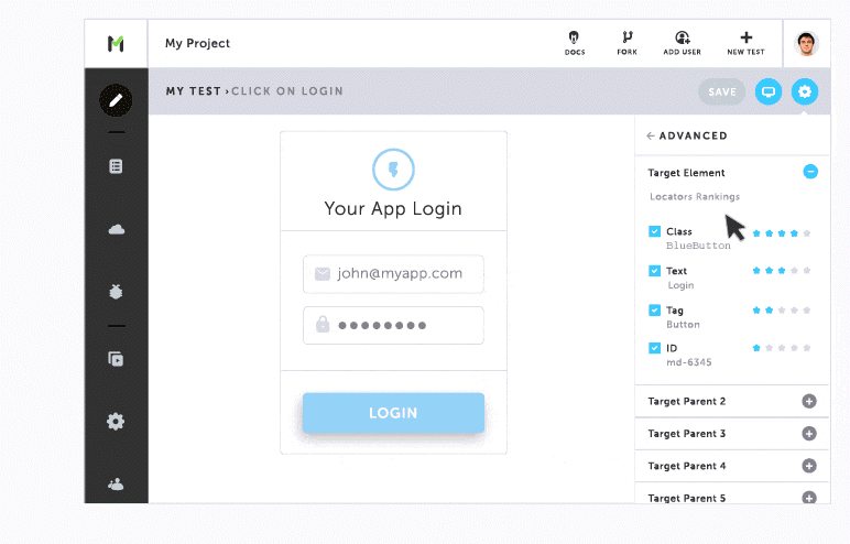
Testim.io Free Trial – See for yourself.
QA & Devs agree on quality releases. Testim.io is the AI-powered solution to speed up the creation, execution, and maintenance of automated tests. We use dynamic locators and learn with every execution — but there is so much more we do!