Home › Forums › Design › Personal Website Design Critique › Reply To: Personal Website Design Critique
Hi i like the look in general. But maybe you could use fewer images in the background to get better load times. they are so toned down that maybe 1 is enough.
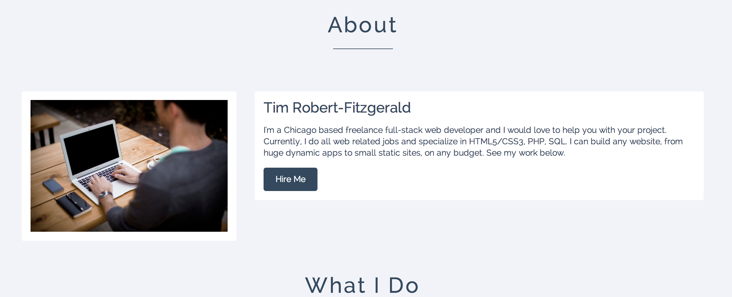
What i really dislike is the spacing on the textboxes. To little on the left way to much top and bottom. Under Recent works the images are to little and the text feels lost and does not line up with the Image.
I just tried to show you what i mean really quick in my browser.
http://abload.de/img/bildschirmfoto2014-07acokr.png
This is what it should look like to me.
Also if you do not have to write alot about your projects you might wanna put the text beneath the images. But i would also try to write a little more about those projects.
http://abload.de/img/bildschirmfoto2014-074hd2u.png
Something like this maybe. With bigger images so you can actually see something on the preview img.
Elsewhise i like it, and wish you the best of luck =)
Fabi