CSS is easy, some might argue, but that “easiness” can cause messy code. This is especially true through power of preprocessors like Sass or Less where, if you aren’t careful, your CSS can become harder to deal with instead of easier. Sass? Harder? This Gist shows a great example of Sass nesting hell.
If your Sass code looks like that, you can definitely improve your code with SEM & BIO, a CSS technique I’ll introduce you to now!
In this article, I am going to use the code example below to explain how SEM and BIO works and how they can help enhance your CSS strategy.
See the Pen by thebabydino (@thebabydino) on CodePen.
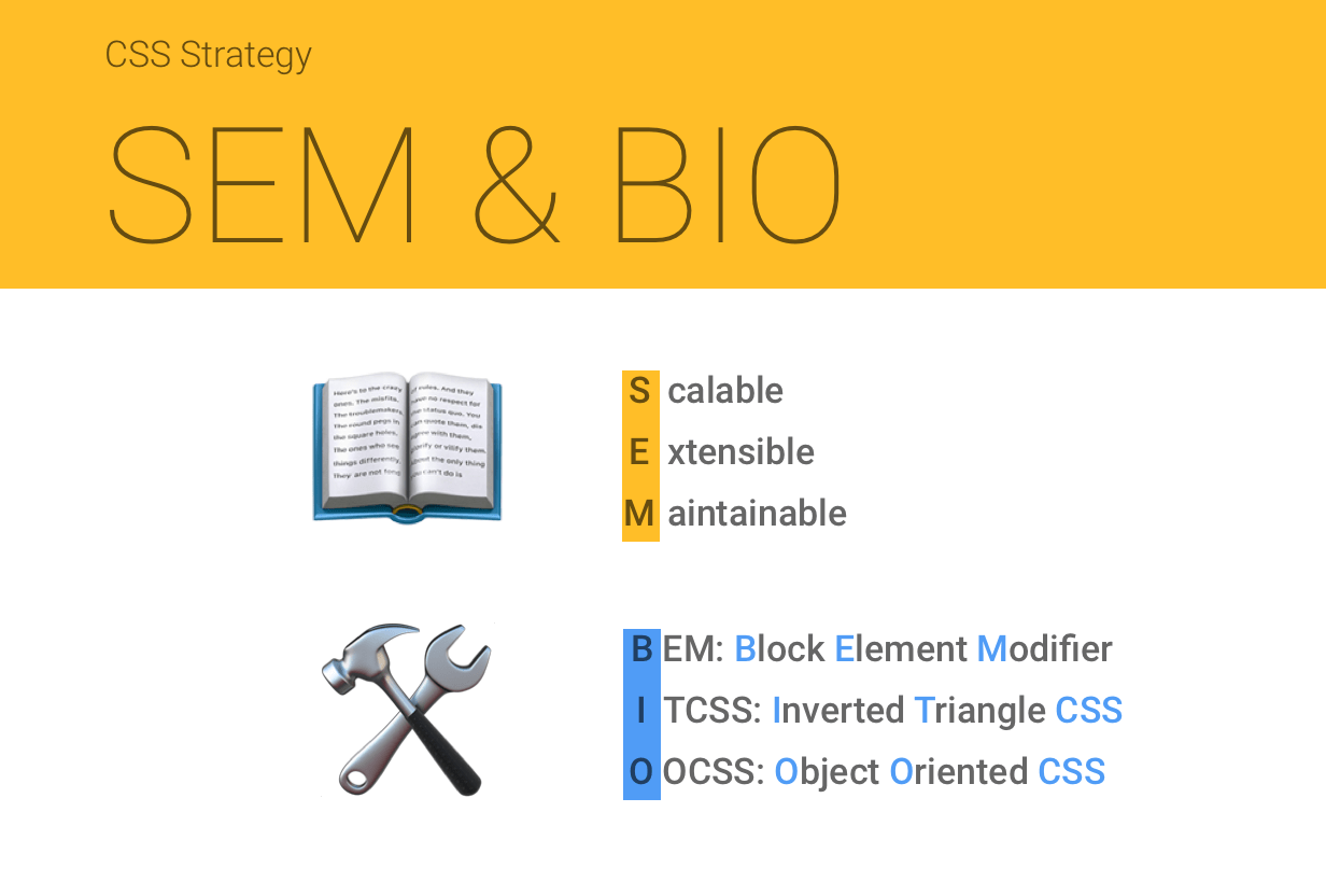
Generally, SEM is concerned with high level CSS philosophy whereas BIO is an actual technique to help you write better CSS to achieve SEM. The main purpose of both SEM and BIO is to better handle the CSS specificity which is one of the most important concepts you should understand for CSS.
First of all, let’s talk about SEM.
SEM
SEM stands for:
- Scalable
- Extensible
- Maintainable
Trying to achieve those three factors can definitely improve your CSS code and it helps you build your components much more solid.
Let’s talk more about each factor in detail.
Scalable
A scalable (or reusable) component means that the same looking components should be used wherever you want without making any coding changes.

From the CodePen example above, the “Search” button in the header looks exactly same as the ‘Link’ button in the sidebar. When we compare the HTML markup,
- the “Search” button is
<button>element - but the “Link” button is
<a role="button" ...>element
…and even if the markup is different, the styles are identical by using the same classes: .c-btn and .c-btn--yellow.
The button styles are scalable and it allows you to add the same looking components anywhere you want as it won’t be polluted by its parents or siblings. This can save you from the big headache of not knowing why totally unrelated components are broken even if the changes are made on a different component from a totally different place.

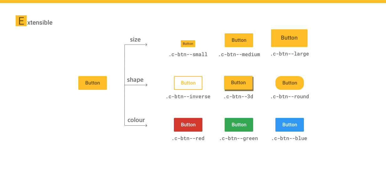
Extensible
An extensible component can easily provide additional features/functionalities without breaking itself or having to be written from scratch.
Let’s look at the CodePen example again.
See the Pen by iamryanyu (@iamryanyu) on CodePen.
The button in the header and in the main section look quite similar besides the 3D effect. In this case, instead of creating two different sets of buttons having totally different code bases, we could extend the plain button style by just adding the 3D effect to it.
It goes the same with the button in the footer. Even though the button has a different color and size, we could easily extend it by adding or removing new or different features.
Maintainable
Probably one of the biggest challenges for most front-enders is to understand CSS written by other people, or our past selves. We sometimes spend more time trying to understand the existing code than adding awesomely-written new code.
The issue usually comes from:
- no comments, whatsoever
- over-engineering
- no single source of truth
- no coding standard/best practice considered
- or all of them above
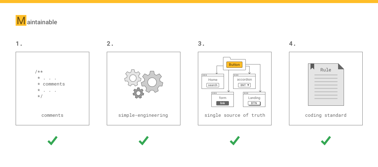
With SEM and BIO, we can definitely improve the code and save others (including ourselves!) from messy, unmaintainable code.
BIO
There are many great techniques out there to improve the way we write CSS, and from my experience, I found the following three techniques that make up the BIO acronym work very well together
- BEM
- ITCSS
- OOCSS

A lot of developers/engineers already know those famous techniques but I would like to go through each of them and talk about the way I use those techniques.
BEM
BEM is very popular methodology and it has been helping us significantly improve the way we think about CSS and Sass/Less.
BEM stands for:
- Block
- Element
- Modifier
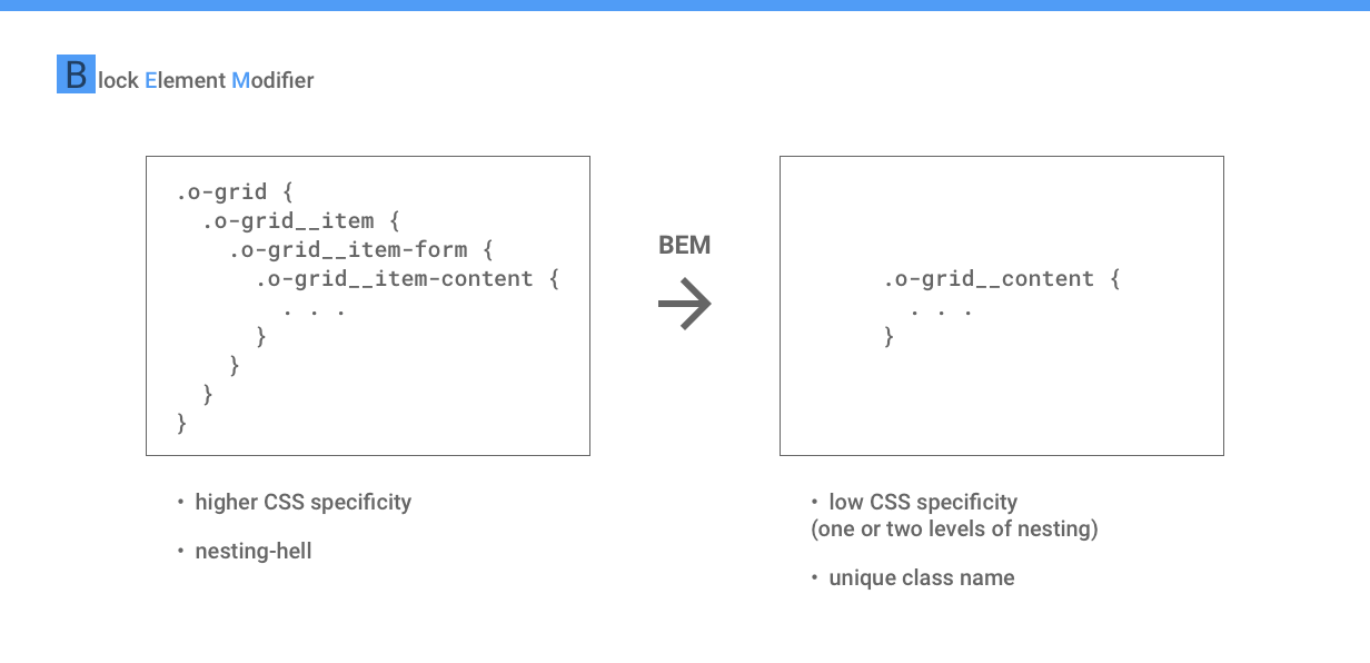
As the bad example above shows, we tend to overuse the power of Sass/Less and falling into nesting-hell. But with BEM, we start to have a very low CSS specificity by maintaining the styles in one (or two) levels of nesting.
If you’ve experienced any battles fighting higher CSS specificity, you will know how painful it is to come out a winner.
Going back to our example, the HTML markup looks like this:
<div class="o-grid">
  <div class="o-grid__item o-grid__header">
    ...
  </div>
  <div class="o-grid__item o-grid__main">
    ...
  </div>
  <div class="o-grid__item o-grid__sidebar">
    ...
  </div>
  <div class="o-grid__item o-grid__footer">
    ...
  </div>
</div>
The example consists of:
- a block:
.o-grid - elements:
.o-grid__item,.o-grid__header,.o-grid__main,.o-grid__sidebar,.o-grid__footer
Because BEM provides a naming convention that stresses unique classes, we don’t have to go into deep nesting like:
.o-grid {
  .o-grid__item {
    ...
  }
}
Instead, we can define the styles it with fewer levels:
.o-grid__item {
  ...
}
This is the biggest merit of BEM; lowering the CSS specificity which improves the whole CSS coding efficiency and experience.
One issue I still see occasionally even with BEM is poor naming. If you don’t pay enough attention, you can wind up with a really long class name like:
/* Yikes! */
.o-grid__item-search-button-text-svg-icon {
  ...
}
When you create a class name, go with the core concept of BEM: your component is a block and all elements inside are individually attached to the block.
From our example again, I named .o-grid__form instead of .o-grid__item-form because the form itself is a separate component and doesn’t have to be tied with and be a child of o-grid__item.
Also, to more efficiently control styles, I have added another class name o-grid__header along with o-grid__item to extend the styles. Moreover, the button contains BEM-styled classes with the approach of OOCSS, which we’ll touch on next.
OOCSS
As we have already discussed, there are many great CSS methodologies and strategies helping us improve the way we write CSS. However, I see a lot of folks forcing themselves to decide on one methodology to use out of the bunch.
From my experience, combining methodologies can actually enhance their benefits by combining the best of multiple worlds. For example, I personally have found that BEM and OOCSS work very well together.
OOCSS stands for Object Oriented CSS and you can think of it working like Lego blocks:

OOCSS creates each individual part separately and then constructs them together in order to build components.
From our example, I have created buttons using the OOCSS naming convention:
.c-btn.c-btn--yellow.c-btn--blue.c-btn--3d.c-btn--large
To render the yellow search button in our example header, we combine these classes:
.c-btn.c-btn--yellow
If we want to have the 3D button in the main section, we add in the 3D class, .c-btn--3d and call it a day.
And for the blue button in the footer, we can switch the yellow modifier to blue along with the large modifier. As you can see, the button is not depending on the header block giving us greater flexibility with how we use and repurpose components. And, by doing so, we can construct the buttons without impacting any other components or patterns while gaining the benefit of easily extending new presentational feature, like alternative colors and shapes.
Here example of a button collection created using OOCSS to create the variations:
See the Pen Modern Button Collection by Ryan Yu (@iamryanyu) on CodePen.

On top of BEM and OOCSS, with the help of ITCSS, we can further improve our CSS strategy. Let’s look at that method next.
ITCSS
ITCSS stands for Inverted Triangle CSS and it helps organize CSS by applying a structure that determines how specific to get with a specific component. Lubos Kmetko has written an excellent overview of ITCSS that is worth reading.
You can see how I have put ITCSS to use by splitting styles up by grouped levels of specificity in this Gist.
Based on that example, you can see how I named components by adding a namespace to the class. So, for example, a the “button” component is prefixed with a “c” (.c-button) to indicate the component status and prevent it from being mistaken for another item. By doing so, everyone working on the project knows the function of that specific class and how changing its properties might affect other areas.
Here’s a visual that illustrates all the ITCSS levels:
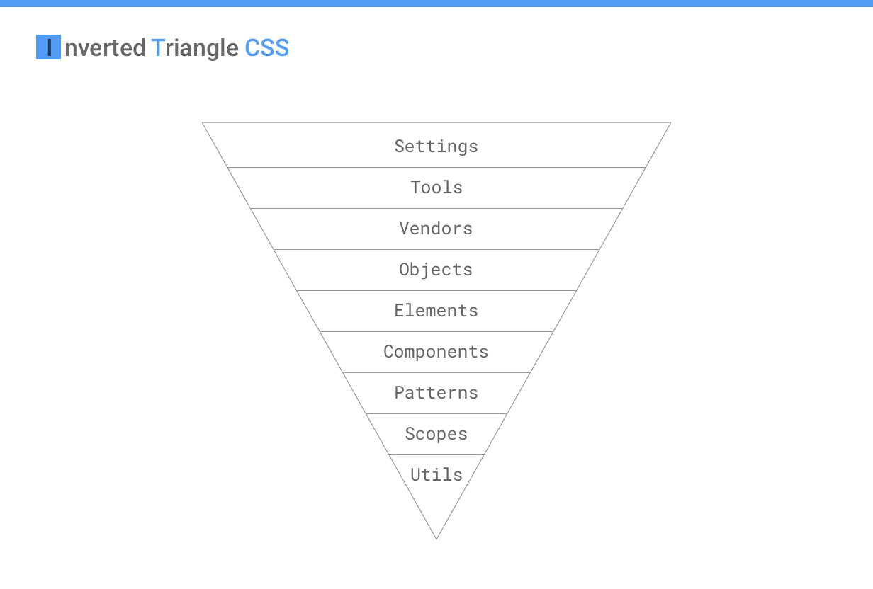
Let’s go through each section.
Settings
Settings are generally a collection of variables that do not generate CSS, but are applied to classes. Some examples include:
- Base
- Color
- Typography
- Animation
Tools
Tools also will not produce any CSS yet and are typically preprocessor functions that help write or extend properties on classes:
- Functions
- Placeholders
- Mixins
- Media queries
Vendors
Vendors are third-party styles that are being used on a project. Think of things like reset.css, normalize.css, or even Foundation and Bootstrap.
The reason these styles are higher up in the structure is so we can override them if needed. As you may recall, if the same class is called twice, the cascade will render the properties of the second instance, assuming the properties are exactly the same:
.btn--large {
  padding: 3em;
}

/* This one wins out */
.btn--large {
  padding: 5em;
}
Just for the side note, in Sass, you can use ~ to point to the node_modules folder so you are able to import style assets from the source rather than having to move it into your own directories.
@import '~modern-normalize/modern-normalize';Objects
Objects (namespace: o-) are used for design patterns, such as layouts, where items are being arranged rather than decorated. Object classes are used across all pages, so if you make any changes to the object classes, you should be very careful because any changes are going to affect each and every page throughout the website.
The most common object classes I use are:
.o-page: the most outer container which usually containsmax-width: 100vwandoverflow: hidden..o-main: the outer container for the main area..o-container: the outer container for components and it usually provides a fixed width..o-content: in case if any extra configuration is needed for the actual content area..o-grid: if a grid layout with different number of columns are required.
Do you use any other object classes? If so, please share with me. 😃
Elements
Elements (namespace: e-) are the HTML native elements which we would not style based on the class names. For example, we should provide default styles to <a> element rather than .link class.
// Do this for the default link style
a {
  text-decoration: none;

  &:hover {
    background-color: blue;
    color: white;
  }
}

// Don’t provide the default link style to a class
.link {
  text-decoration: none;

  &:hover {
    background-color: blue;
    color: white;
  }
}
It is because, especially in a CMS like WordPress, you wouldn’t want to add a class every single time you want to use a link in content. Hence, we provide a default style to the <a> element so without any class, the link will still have good-looking styles.
Components
A component (namespace: c-) is a small feature that makes up a part of the website. Think buttons, accordions, sliders, modal dialogs, etc. Each component is fully functional by itself and does not rely on any other components. This fact should be considered when you name the component.
For example, the button in the main section from the example above shouldn’t be called .c-main-button because main scopes it inside the main section and limits the use of it in other places, like a sidebar. Something like .c-btn is much nicer because the button is no longer tied to any other specific sections of the page.
If you need any extra features, you can always extend properties with a BEM modifier (combining powers!) or use Scope, which is coming up in a bit.
Patterns
A lot of developers/engineers use the terms component and pattern synonymously and that’s totally fine if you are more comfortable with that. It is just my preference to separate those two terms.
For a general rule of thumb, I think of a pattern (namespace: p-) as a combination of components but in a way that is not scaleable.
For example, I would consider the accordion as a component. It is scaleable and reusable on its own, meaning that it can be used in other parts of the website without making any changes even if the accordion would contain other components such as buttons.
On the other hand, the header, for example, would be a pattern because it is not scaleable (the header cannot be used in the content or sidebar area) and also contains other components such as buttons, accordions, menus, logos, search form etc.
Scope
Be warned; I only use the scope if it’s absolutely necessary. The purpose of the scope (namespace: s-) is to give us the highest specificity so we can overwrite any styles for a specific purpose.
Remember, If you find yourself using the scope class many times, you might be writing styles that are too specific and you should consider refactor your CSS structure.
Here is a simple example of the use of the scope class, .s-home.
.c-accordion {
  .s-home & {
    // Changing the background color specically on the homepage
    background-color: tomato;
  }
}
As a side note, the above example could actually be refactored by providing a modifier to the accordion (e.g., .c-accordion--bg-tomato) instead of using the scope class. That would be a much more extensible way of writing and make the component more modular.
Utility
Sometimes you may want to make changes only for a certain style in a specific place. In that case, utility (namespace: u-) classes can help us update it without changing the whole CSS structure.
For example, the font-size of the accordion heading is set to 32px.
.c-accordion__heading {
  font-size: rem(32);
}
But if the font size is only different in the news section of your site and does not change anywhere else, then you might want to apply the utility class instead of setting higher specificity with the parent class or scope class.
<button aria-expanded="false" class="c-accordion__heading u-font-size--24" aria-controls="sect1" id="accordion1id" type="button">...</button>.u-font-size--24 {
font-size: rem(24) !important;
}Please note that we all know !important is BAD but I added !important to the value. It is because when we use the utility class, we are absolutely sure we want the specific style to be updated as we want. Also the utility class should overwrite any other styles, so having the !important actually works well here for the utility classes. That said, the utility classes should only play a role as a helper. It should never be used for structuring your CSS.
Like scope classes, if you are using too many utility classes, you should check with designer if the design can be more consistent across the site.
Extra Namespace
On top of the namespaces we discussed above, there are two more I often use:
is-: this indicates the state of the block or element. Most commonly used class is.is-active, like the active link in navigation.js-: this indicates that the specific element is bound to JavaScript events. For example,js-menu-clickindicates that the element is bound to the click event.
Linting
Finally making rules with .stylelint and .eslint can significantly improve the code quality.
In the frontend workflow, I don’t make it as a recommendation; I make it mandatory so that failing of the rules won’t get approved.
In this way, we can ensure that the coding quality stays at its best and provide better code to other developers, including your future self.
In Action
In this section, I’d like to discuss how we could use SEM and BIO. I have made a simple, practical example to get us started:
See the Pen by iamryanyu (@iamryanyu) on CodePen.
The main practice with the example is to build an accordion that can be used as:
- a normal accordion but with different color themes in the main section
- a menu in the sidebar
- a block displaying social media icons in the footer
What we’re achieving is a component that is:
- Scalable: as it can be added in any part of the page without any coding changes
- Extensible: as it can serve different functionalities with the core functions unchanged
- Maintainable: as it is organized in a way that makes sense
To achieve SEM, BIO has been used including:
- BEM:
.c-accordionas a block and its children as elements, also used modifiers, e.g.,.c-accordion--lightand.c-accordion--dark - ITCSS: The ordering/sorting of SASS files handles the CSS specificity quite well. For example, the accordion button in the sidebar contains
class="c-accordion__trigger p-sidebar-menu__button"which the pattern (p-) overwrites the component (c-) with no issues. - OOCSS: the accordion is constructed with several classes, for example,
class="c-accordion c-accordion--dark c-accordion--single"which creates a dark theme with opening a single panel only each time.
Final thoughts
I have used this approach for almost all of my projects including universities, government departments, commercial retailers, and many other websites. In each case, I have successfully delivered all of the projects to the clients (almost no issues during the client approval stage and delivered on time); this approach has worked for me very well so far and I think it could for you as well.
That being said, technologies always change (especially on the front end) and I am more than happy to hear and discuss any of your ideas/approaches/strategies that worked for you. Let me know in the comments!
We’ve been using a similar approach for CSS at Sky and it’s been working pretty well for us!
I wrote up some of these concepts over at our CSS Style Guide:
https://github.com/sky-uk/css
Don’t be afraid to blend methodologies
Thanks for sharing
Great to hear it’s working well Joe!
And also thanks for sharing your CSS style guide
That really representes my project structure.
Do you think, that utility classes would fit in these methodologies as well?
If, yes how would you combine utility classes with your approach?
Hey Simon,
Thanks for pointing that out and yes definitely. (How I could miss that even though it was in the ITCSS picture :o ).
I have added the Utility section above Extra Namespace section. Let me know what you think :)
excellent article thank you
Thank you!
Great article and a good reference point for a lot of useful CSS bits and bobs which I can link to people when I need these explaining well! My only question is the with the ‘~’ doubling for node_modules in sass, is this supported in bare bones sass, or is it when supported by webpack etc?
Thanks Luke!
For the tilde (~), I am using Sass Loader with Webpack and you can find the details here:
https://github.com/webpack-contrib/sass-loader#imports
For other build tools, you might want to check this out:
https://www.npmjs.com/package/node-sass-tilde-importer
Almost identical to the way I work. I personally don’t use the scoped classes, making a modified version is almost always the best option. Patterns I don’t use either, only components. But maybe I will adopt this in the future, it seems like a good seperation. I never heard of naming this technique SEM & BIO. I think it’s great! Thank’s for this article.
It’s great to see many people are using the similar way and it’s working!
For the naming of SEM & BIO, I actually named them :)
Hope it’s easy to remember.
Oh wow… this article changed my understanding of the difference between a component and an object. For so long I thought something like a button was an Object…. because it’s used in multiple places and, if changed, could have an affect in places outside of the context you’re currently looking at.
In the final example why didn’t you use the ‘js-‘ prefix for your JavaScript selectors?
Hey James, great to hear it helped :)
For the
js-prefix, that’s a great question!I didn’t use
js-prefix which you could actually, it’s because I would repeatedly need to add it to each heading and I thought that’s redundant. Also I believe my team knows that the accordion heading is clickable so if there is any issue with it, they will most likely look at the JS code.But again, the decision would be depending on the project and how you and your team work together.
Very interesting.. kind of a lot of rules to keep in your head though.
Hey Jon, at first, it might be a bit overwhelmed, but once trying it for 1-2 projects, from my experience, it makes more sense :)
How about ABEM? Do you have been using them?
I think ABEM is great as you can avoid the long class name which you would often face with BEM.
For me though, it’s just my preference to always lower the CSS specificity so ABEM doesn’t quite fit in my css strategy.
That being said, again, there is no right or wrong answer and if it works well for yourself and your team, and your code can meet SEM, then go for it :)
You can find the great article about ABEM here:
Awesome article and a good reference for people starting to get into frontend development. I will definitely share it with me colleagues.
Would you mind sharing your build process or at least part of it? I saw you writing in the comments that you are using webpack in combination with sass. Are you using this approach in combination with patternlab or are you developing everything plain from scratch?
Thanks Quentin!
I have my own boilerplate (built with Webpack) and pattern library (built with SEM & BIO). I am planning to share it with public as soon as it’s more stable :)
I wouldn’t even think of using class names as JS hooks.
I’ve been building and curating a collection of what I call behaviors that hook on data attributes and are configured by similarly prefixed data attributes.
Really, in a normal CMS driven website we can’t effectively use vuejs or react, and your team may not understand them so you’re limited to some basic class toggling/adding/removal.
This is why having frameworks like jsblocks or stimulus is really helpful.
I am not an expert on Stimulus but from my previous experience and comments from other engineers, it is a great framework. I believe Stimulus would be very helpful if used together. Thanks for mentioning it!
The above is more pure CSS strategy and by using JS hook, we can tell other developers that the specific element has a JS bind.
I am just wondering if there were any reasons you wouldn’t use JS hooks except handling it with the frameworks you mentioned?
I’m a little torn on this as it makes maintaining some of the HTML that little bit harder.
Case in point, a brand decision by the client changes the colours, so all yellow buttons are now blue. You’ve either got to change the class in the HTML, or have a class called “yellow” where the colour is actually blue.
Wouldn’t it be better, rather than using less specific names, e.g., “.c-btn–primary-color”? The name would be dependent on the client, but would mean it’s easier to maintain on larger projects when the brand decides to go through a rebranding exercise.
I have actually tested it using the
primary-colorand I found that it wasn’t really safe/stable to do it especially for large projects such as universities, banks, government departments and e-commerce sites.It is because:
1) the large organizations usually don’t change their brand and if they do re-brand, usually they totally revamp their websites.
2) the large organizations usually have their own dev teams too and the teams also work on CSS and JS at their side. The problem is the communication. Even if well-written documentations are provided, they are often going their own way and it leaves some colors not having the primary-color variables or classes. That means if you change the primary-color to something else, we cannot guarantee that all of the primary-color we believed it was would be updated.
3) Having the primary-color class which would contain not only colors, but also other styles (e.g., width, padding, font size, font weight, box shadow etc) becomes harder to update if a specific button has a slightly different style.
4) It is hard for end-users to control the styles in CMS. The users might want to have different variations of colors for A/B testing or any marketing reasons. Especially, e-commerce sites do a lot of split testing and it is quite important for them to be able to create patterns in different variations.
5) If there is a ‘primary-color’, there would be a ‘secondary-color’ and maybe a ‘tertiary-color’ too. If those 3 button styles are quite different, I think the design needs to be addressed and I would discuss with designers as I believe the consistency takes an important role in web development. If those 3 buttons look similar, then most likely, those 3 styles (primary, secondary and tertiary) are repeating same properties.
It may work fine in smaller projects, but from my experience, I would prefer not to go with ‘primary-color’ for large projects.
Great write-up, Ryan, thanks! Especially the ITCSS part. Though I still find the distinction between objects and components vague in most cases, no matter how many articles I’ve read about the concept. I usually end up just throwing everything into the components namespace.
Also just want to mention that the tilde expansion to import from Node modules is no Sass standard as your wording seems to imply. Might leave some people confused.
Hi Matthias,
Objects and components could be confusing but you could think this in a way that objects are the ones absolutely used in all of the pages (e.g., layout) but components may not be used in some pages (e.g., accordions). Hope it isn’t confusing you even more :)
And thanks a lot for pointing that out and I have added some explanation in the comment above: @Luke
I like the ITCSS structure and it did work well for me in combination with BEM in my projects. But the “patterns” thing is new to me and the name is really confusing me. For me a better name would be section, region or area for this.
Great to hear ITCSS with BEM worked out well for you.
You don’t need to use ‘patterns’ if you felt confused :)
That’s my preference and you may use easier terms. And I would suggest to talk with your team and make sure everyone is on the same page.
Thanks for it, awesome pure css tips.
Thank you!
Hey Ryan, isn’t the class:
.is-activea bit generic? For instance a button or some other kind of link could be active and use the same class but could have completely different appearances. How would you deal with that?Hey Morgan, you are right and thanks for bring that up!
I should have mentioned it in the article but there are some possible ways you could do.
1. Use more specific
.is-activeclass.2. Join two classes.
3. Use BEM modifier.
#1 is what I usually do because the class name is more descriptive and we can also separate the styles and state.
Also it works well if you had to add the state hook in the
<body>(e.g., page overlay for modal).Would you be able to share how you handle this?
Hey Ryan, thanks for the examples!
It does depend upon the use-case; for example working by yourself on your own code or working in a team. Working by myself means that I am responsible for making sure I don’t write
.is-activeoutside of the scope of example #2. However working a team means that anyone could write.is-activeas it is something that is already in the vernacular. So in the case of working in a team I’d go for #1 or #3 as it is less likely that someone will write out a prefixed class such as:.is-accordion-active.Thanks again, great article!
Thanks for sharing Morgan!
Yep, and I found that whichever method we go, it is always important to make sure everyone in the team including myself is on the same page and aware of the best practice of the team so we can reduce the chance of having a messy code.
This is brilliant Ryan, thanks for taking the time to put it together. You’ve given me a much better understanding of the things I’ve been trying to do but getting slightly wrong :)
Thanks Bekah, happy to hear it helped!
Absolutely awesome article Ryan! Some really great standards here, I want to adopt all of them from now on!
Thanks a lot James :D !
After many years of coding, i also use some usefull technics.
Maybe this share can give you some ideas :-)
/* Play with Vars in pure css */
:root
{
/* Define the theme */
–color-primary : hsl(30, 70%, 60%) ;
}
/* Set the Responsive Vars for less work and lighter code! */
@media (min-width:50em)
{
:root
{
–responsive-type : “tablet” ;
–responsive-indice : 1.2 ;
}
}
@media (min-width:72em)
{
:root
{
–responsive-type : “small-screen” ;
–responsive-indice : 1.3 ;
}
}
@media (min-width:100em)
{
:root
{
–responsive-type : “medium-screen” ;
–responsive-indice : 1.4 ;
}
}
/* Add a accessible whitness mode, with a simple key in the page url (index.html?debug) */
@-moz-document regexp(“.+(update|debug)”)
{
:root
{
–debug-visibility : visible ;
}
}
/* Work with Extensible class! /
/ @sample
test
test
*/
/* Build your ui class name /
[class^=”ui-“]
{
box-sizing : border-box
}
/ easily extend your ui class name /
[class^=”ui-“][class=”-dark”]
{
background-color : silver
}
/* and more… /
[class=”-3d”]
{
border : 5px outset silver ;
}
[class*=”-right”]
{
float : right ;
}
/* Then, write your generic code */
/* My Css Helper */
body::after
{
position : absolute ;
background-color : var(–color-primary) ;
bottom : 0 ;
right : 0 ;
z-index : 1000 ;
display : block ;
padding : 0.5em;
content : “Css message”;
content : “Css responsive type: ” var(–responsive-type) ;
visibility : hidden ;
visibility : var(–debug-visibility) ;
font-family : courier ;
font-size : 80%
}
/* My theme */
body
{
font-size : calc( 1em * var(–responsive-indice) );
}
Hi Xavier,
It doesn’t seem the markdown for your code is working correctly. Would you be able to re-post your code so we all can see your techniques?
Thanks for great article, but i have a question. You make different types of buttons and tell that it is a OOCSS. But also you can make all types with help modifiers and say that it’s a BEM methodology. What difference in it?
Thanks!
The main difference between BEM and OOCSS is what each one mainly focuses on.
BEM helps us lower down the CSS specificity by having a unique class name. The heading in the accordion as an example with BEM would look like:
but without BEM, we would be doing:
which ends up with a higher specificity.
OOCSS gives us a better way to construct components as explained in the article above.
In BIO, I have combined those two methodologies so the syntax looks like BEM which gives us a lower CSS specificity but helps us construct components in a better way with OOCSS.
That’s why you are seeing like
.c-button--redwhich is BEM + OOCSS.Hope that helps :)
Hey Ryan, great article!
One thing I´m curious about is: What are your thoughts on helper classes?
Since Bootstrap 4 my colleges are heavily relying on them like for margin, padding, flex etc.
Yet I´m not convinced so far as I find them not dynamic enough.
Thanks Sebastian!
Regarding the helper classes, it may be depending on the project.
The helper classes might work well with frameworks like Bootstrap because they, in most cases, want to provide certain styles so the end users could construct components with different variations. However, that usually causes the size of the frameworks unnecessarily big.
There is no doubt that Bootstrap is a great framework in a certain way, but personally I never use any HTML/CSS frameworks unless it’s absolutely required (e.g., a client request etc). The main reason is the size (with unused CSS) and also the design I usually work on is very different from what frameworks usually provide.
From my experience, using helper classes too much could cause some issues, but especially those two issues.
1. Maintenance
For example, let’s say you have this helper class:
and added this to all buttons.
One day, the client asked us to change the button padding to 15px.
In an ideal world, we could just go and replace
.u-padding-10to.u-padding-15but in the real world, it is actually quite time-consuming to find all the buttons and replace the helper class when comparing to just updating the padding from the button styles.2. Responsiveness
If you wanted to have
padding: 10pxin the smaller screen size, but20pxfor the larger screen size, it’s quite hard to overwrite the helper class because 1) the helper class is supposed to be the highest CSS specificity and 2).u-padding-10might be also used in other components which shouldn’t be 20px in the larger screen size.Overall, if you are working on a framework-like project, the helper classes might be actually helpful, but if you are building websites/components from scratch, I will definitely avoid over-using it.
What’s your thoughts on that?
Hi, I was thinking why not have utility classes with media queries… so for example you could have `class=”u-padding-sm-10 u-padding-lg-20″.
Hey James,
Yes, definitely we can.
However, with that approach, we should have a good agreement between designers and engineers what spacing we are going to use.
I am using the similar approach for the Design System here at Campaign Monitor and I found that it’s quite important to make sure both designers and engineers are on the same page. If not, it can end up with many utilities which could actually be merged (e.g.,
.u-padding-sm-20with.u-padding-lg-21etc).How would the project-structure look for this (file-structure)? Do you have an example?
Hi Fredrik,
It is probably depending on the boilerplate you use. I use my own with Webpack due to the different specs between static front-end projects and React projects, but for the static front-end projects, the general structure looks something like:
https://www.dropbox.com/s/9h3eu03d0k2xi87/file-structure.png?dl=0
Would you like to share how you structure your projects?
Hi Ryan,
Really great article for understanding in-depth CSS.
Question though how do you structure your CSS classes?
.class {
Positioning
Display (Box Model)
Styling
Typography
Appearance
Animation
Etc
}
Might be a good idea to include it :)
Thanks zngiron!
Regarding ordering CSS properties, here is actually a great article you can check out:
Personally I follow the alphabetical order because almost always I know what I want to update and it’s easier to find.
Also my team doesn’t have to make/remember an extra rules on how to group properties.
In my opinion, it would help us organize the properties a lot better if CSS itself groups the property names naturally.
For example, if all text related properties come with
text-, we would not really worry about how to group the properties. However, as mentioned by Jen Simmons here (https://twitter.com/jensimmons/status/1001242807758196736), now we havefont-andtext-; alsocolor.But it’s just my personal opinion/wish :)
What’s your thought? How would you order the properties?
Hi Ryan Yu,
I haven’t seen any particular examples that use this pattern, so I’m not sure if I might be “doing it wrong”.
Consider that I have a button:
<button class="c-button c-button--large">Click Me</button>And I want to use the button inside a card, but I don’t want to have to repeat the styles. And I’d rather make it clear in the markup that the card is extending the styles of the button – as opposed to using a SASS
mixinor@extendin the CSS.The
c-card__buttonclass still has low specificity and I DON’T do this with the selectors in my CSS:So it’s not actually nested in the conventional sense – it doesn’t increase specificity via nesting.
The
c-card__buttonwill add styles that are relevant only in the card – it may be positioning or some extra spacing or whatever – but ultimately those styles would only be relevant when the button is used inside thec-card.Hey James,
It would be depending on how the card component is designed/structured, but for the simple case, I would say that’s gonna work fine; simply putting the buttons inside the card scope with
.c-card__button(and with a comment of why the card scope is used so other engineers will understand it too).However, what if there are several different button styles in the card? Then woudn’t we need to overwrite each button? I guess that might pile up the CSS specificity issue later.
In that case, I would talk with a designer and architect the button in a way that it can be more scalable with OOCSS.
Nice write up! This is similar method I’ve been using for about a year now after reading about ITCSS and it has definitely helped keep my projects organized. It took a bit to get used to starting off but becomes natural after a project or two.
The only critique I have is regarding Elements and their prefix of
e-. Being that it is only for elements without a class such as<a>doesn’t it make a namespace irrelevant since you’d never use the prefixe-?Otherwise, great article and nice overview.
Thanks Bernard, glad you liked this article.
Regarding the Elements, I usually use
e-prefix in a situation that requires different styles from the actual markup.For example, let’s say we have
<h2>This is heading</h2>, however in some places, the<h2>may look like<h1>.In that case, I add the
e-prefixed class like<h2 class=“e-h1”>This is heading</h2>. That way, we can keep both markup and styles correct.For
<a>, as you said, I don’t usually use the element prefix (e.g.,e-link), but I do use the component prefix (e.g.,c-link) and use it for both links and buttons.@Ryan I guess it’s personal preference, but I’ve always applied that use case with the utility section/prefix. It’s the most specific part of ITCSS so I’ve used it where you semantically need an
h2element but would like it sized as anh4or similar. In those cases I just use u-h4 similar to what you mentioned so I guess it’s just a personal preference on how specific you think that override should be.Anyways, great article, cheers!
Yep I agree.
A good use of utilities can reduce the CSS weight and it seems Sara is using it with BEM too :) https://mobile.twitter.com/SaraSoueidan/status/1019157731796799488