I thought I would take a crack at a couple of common multi-column fluid-width layout styles that are notoriously quirky with CSS.
One way to accomplish a multi-column fluid layout is to set the columns with percentages. For example, floating a left column that is 19% wide and a right column that is 80% wide (keeping it under 100 prevents them from knocking into each other and knocking down). I really dislike doing it this way. It prevents you from doing pixel-based padding on those columns (problematic), leading toward extra div’s. Even worse, the “gutter” between those two columns grows and shrinks, so at the browser windows narrowest, 1% is too narrow, and at it’s widest, it is too wide.
A far better fluid-width technique (assuming you are comfortable with only one of your columns being the “fluid” one) is to not rely on percentages at all, but rather min and max widths on a single column. In fact, that single column isn’t really a column at all, but the entire width of the layout. The content inside can be pushed away from the edges with padding, making room for absolutely positioned sidebars.
This technique is littered with juicy advantages:
- No floats mean a much less fragile layout. No worries about columns expanding and breaking from the content they contain
- Gutters between columns can be controlled consistently
- Pixel-based in general, allowing pixel based padding/margins
For a very nice write up of the theories at work here, check out Dan Rubin’s Absolute Columns. These are very similar, only with the idea extended for fluid width.
See the demos:
IE 6
I’m sure most of you immediately thought of all the problems with this in IE 6. We know darn well min/max width isn’t going to work in IE 6. And setting top/left/bottom or height: 100% for those sidebars isn’t going to work either. So what do we do?
There are a number of ways to deal with it, you just need to assess the exact situation on your own site to determine how. Maybe you don’t mind min-max width breaking (all that happens in IE 6 is that the max width is 100% and the min width is 0%). Maybe your sidebars aren’t different colors so you don’t care if they extend all the way to the bottom or not.
I think the most elegant solution to dealing with IE 6 (As Dan suggested in his Absolute Columns article) is the Dean Edwards IE7.js script. Just chuck this little nugget in the head section and your troubles are over:
<!--[if lt IE 7]>
    <script src="//ie7-js.googlecode.com/svn/version/2.0(beta3)/IE7.js" type="text/javascript"></script>
<![endif]-->
Testing
I’ve looked at these in IE 6 and up, and in all the other popular browsers I have installed and they worked in everything. If you guys find problems though, let me know and we can work on solutions.
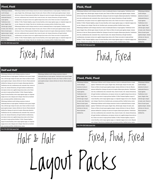
*Half and Half makes use of percentages, not really in keeping with the theory of the other examples (but still potentially useful).
Whatsup Chris?!
Just started coming to your site and wanted to tell you I dig it and you’re doing a great job. Thanks for all of the info :)
I just wanted to state my personal opinion on your example layouts and others out there on the web similar to this.
I think it super important when you using these techniques to pay close attention to your typography:
a) amount of words per line
b) line height (leading)
c) font size
Obviously all of these factors (and probably more) affect the readability of your page. It’s a must that we consider these before just letting that copy “flow”.
Love to hear your feedback.
AG
Absolutely, all of those things are important. Words per line, in a fluid width environment, can easily become a problem. This is another reason using min and max width is ideal, as you can set those to only allow for appropriate lengths.
By using em-units instead of percent, this is easily done through some calculations.
First of all, the line-height does not need a unit specificed. You can give your p { line-height: 1.5; } and it will be calculated by the browser.
Font sizes can also be calculated, as long as you’re careful to track the parent-divs’ widths. The same can be done with line length, thanks to max-width.
For more information about fluid gruids and calculations, check out ALA’s article Fluid Grids
@koew – I was just going to suggest the ALA 1em = 16px formula. It is good stuff and doesn’t require much hacking around IE browsers.
Or you could use the 62.5%-trick: Set your body’s font-size to 62.5%. Then 1.0em will be calculated as 10px, 1.3em as 13px, 2.5em as 25px. It’s a good trick if you’re not used to em-calculations, and still want things to be pixel-ish.
wow, these are really great, thanks Chris (when do you sleep). I have been using the IE7.js script for a while now and I think it works really great, much better than hacking around IE6 and below. Plus you get the added satisfaction of knowing that your punishing those who still use IE6 by making them download the extra file.
Cheers for the layout packs, keep it up :)
What will happen if you have more text in the fluid column? The page will totally brake.
The solution will probably be: overflow:auto; like in the Dan Rubin’s Article.
I resolved the problem of fluid columns in very simple way just block everything around the fluid column :)
Here is the solution: Emastic Templates
Some really nice methods there. Never been a huge fan of fluid width layouts, but certainly when you’re utilising min/max-width then you can easily address some of the bigger problems of a pure percentage approach (such as the layout breaks that occur on really high resolution screens).
The fixed/fluid approach allows for the best of both worlds, to design for a fixed width but to cater for those viewing through smaller windows or on unusually low resolution screens.
I tried this a while back and had problems on IE……..
i also noticed you had to have a strict doc type as well.
I remember an article from A list aprt http://www.alistapart.com/articles/fluidgrids while I was reading yours. Thanks Chris.
IE7.js is fantastic. The only minor issue with using it like this is that if the user has JavaScript disabled, the layout breaks. Of course, if you’re using it to design a layout that wouldn’t be possible in IE6 anyway, that’s irrelevant :-P
CSS newbie question, ref [Fixed -Fluid-Fixed] 3 cols example:
Right now, the middle column is Fluid:
#main-content { position: absolute; right: 0; top: 0; width: 160px; bottom: 0;
background: white; padding: 0 10px }
What would be the CSS for #main-content to make it Fixed,
i.e.: to get all 3 cols to be Fixed ?
Thanks for help!
To get that one to be FIXED, just set a WIDTH instead of a MIN and MAX width.
Hi Chris,
Sorry, my mistake in my post, above…
Right now the CSS definition for the “Fluid” middle col, is:
#main-content { padding: 0 190px; background: white; }
What would the above CSS definition be,
to make the middle col (content) Fixed?
ie: just like the 2 side bars (left & right), are Fixed now .
Need all 3 cols to be “Fixed” width…
Thanks!!
Set the width on the #page-wrap, I should have said.
Great tips Chris~
There is a problem with these layouts though…
Since you are using absolute positioning for the side columns, what will happen when the center content is shorter in height compared to the sidecolumn? The footer will tuck up with the fluid center content, allowing the sidecolumns to seep through.
I’m actually writing an article on something similar to this which I will probably post next week, I would def love to hear your opinion on it.
I used a min-height (w/ *html hack with a set height for IE6) on a container that wraps the side columns and center content.
This way if the center content does not have much content (for example an error page, with one sentence), the footer still wont tuck up past the side columns.This has worked for me in previous projects I’ve had :-)
-Soh
Hey Soh,
The total failsafe way would be to put overflow: auto; on the sidebars so they don’t break out but instead get a scroll bar for overflow.
Another way would be the height of the guts with JavaScript and set the #page-wrap to be at least that tall.
I could see the min-height on the wrapper working in some situations, but that value is kind of arbitrary and not totally fool-proof. Unless I don’t understand correctly. Can’t wait to see your take on it!
Great point Chris. I agree this is not a bullet proof solution~
With the javascript,
I did have an incident, where I calculated the height of the sidecol + center, and found the max-height of the two and set that height to the wrap, but when we added an accordion to the content, it seemed to of calculated the max height without taking in consideration of the collapsed content. So what happened was we ended up with massive white space towards the bottom after it loaded. Perhaps the js was faulty (very well could be), but it seemed to hit snags for me before.
But anyways, good stuff as always Chris :-)
Nice!
I just tried the fixed fluid fixed one. is there some way to make the site scale vertically when more content is put into the side bars? currently it just spills out the bottom making it look quite ugly?
Other than that really great work Chris :-)
Hey Chris,
I’m really no big fan of fluid layouts but I really like what J.R.V. http://www.jrvelasco.com/ has done. What would you call a layout like that?
To me this is the only way fluid layouts make sense.
Thanks for a nice article.
looks to me as if this is a grid system css framework he might me using…
Thanks for the layout packs … I need this more than css framework…
I think I agree with Farid above about J.R.V fluid layout. Usually the content is set to fluid and the sidebar fixed but he does the opposite and it works (at least for him).
Fluid content can lead to too long lines of text, hard to read…
Thx man, very useful!
Nice !
That IE 7 script seems to be a life saver to one of my projects. Thanks a lot for the information!
Thanks for this, especially the IE7 one; just what I need at the moment :]
I’m working on a site where the IE fix doesn’t seem to work. The pages look fine in IE8, Firefox and Safari, but not in IE7 and below.
Could you take a look and see why the DIV #homeContent (http://test.rwrightarchitects.com/) is ignoring the “margin-top” value and moving the DIV to the top of the page.
Thanks
Raj
Never mind. I did some searching and found that using padding instead of margin fixed the problem.