A page element with relative positioning gives you the control to absolutely position children elements inside of it.
To some, this is obvious. To others, this may be one of those CSS “Ah-ha!” Moments. I remember it being a big deal for me when I first “got it”.
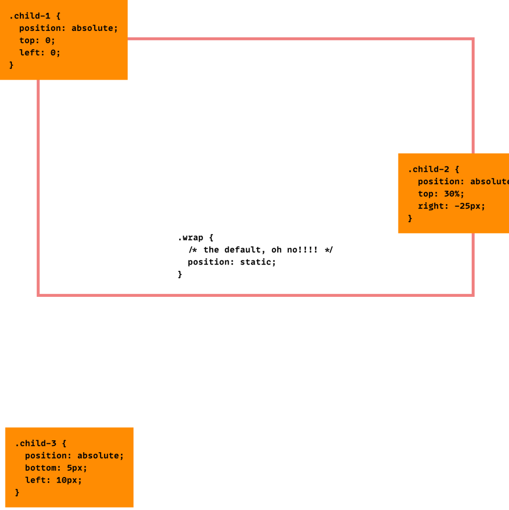
Here is a visual:

The relative positioning on the parent is the big deal here. Look what would happen if you forgot that:
This is a significant change. What is happening is the absolutely positioned elements are positioning themselves in relation to the body element instead of their direct parent. So if the browser window grows, that one in the bottom left is going to stick with the browser window, not hang back inside like his well-behaved brother from the first image.
Once you “wrap” your head around this concept (rim-shot) you will find little uses for it all over the place, and start noticing examples of other places using it. It’s like when you learn a new word and then you start hearing it everywhere. Yeah.
You can play with the above demo here:
How about some examples?
I’d be delighted.
 | A “close” button you always want positioned in the upper left of a box (to replicate an operating system window). |
 | A “home” button placed in the upper right of the window so that your users never feel too lost |
 | A reminder on a sign up form to remind users that if they are already members to sign in above. |
 | “Back to top” links to be placed in the lower right of each big block of text. |
Ah ha! Thanks Chris. :)
This is definitely MY “a-ha!” css moment, when i realised this, i realised i could do anything.
Is it true that support for “position:” isn’t too solid across browsers? because i used to do all my page builds with positioning, and got told that, due to diminished support, i should always try to organise my columns using floats.
The abs-positioned elements are positioning themselves against the first ancestor not static postitioned, and there is none here, so they position against html (this can be seen by adding margin-top to body, and the Back-Home image is not moved)
The preview looks awfull in safari, its really messed up o.o Did u test it? Or is it my safari 4.0 developer edition =/
It’s looking OK in Safari 3.1.1 to me. The “sign in above” button is a little higher than it should be. Might be a difference in how safari renders it’s fieldsets.
This trick can also be used for making image maps with CSS. This can be much more flexible and do more stuff than the usual html image map.
This is something that I always get the wrong way around just for semantic reasons; I always think that I should be positioning child elements in RELATION to an ABSOLUTE, but in effect they are absolute items in relation to a relative, which seems wrong!
I am a bit like Epic. I thought that apply relative to something made that something relative to what ever contained it. I had kind of worked out that I was wrong just the other night but it is good to hear someone say it as it still didn’t seem right in my logic.
Thanks
Good post. I recently had this “a-ha” moment as well. Really makes things easier. I was wondering why my boxes would position way to the far left of the browser window when I had them inside another box. But a-ha! I needed to give the outer box a relative position.
Sometimes the supposed simple things need to be explained with clear words and a good diagram.
Oh my goodness! My brother asked me a question similar to this recently… This is definitely an a-ha. I was under the impression that the default was relative so I didn’t realise this happened… there you go!
I’ll send my bro the link :D
I had such a moment when I found that absolutely positioning something without parameters (right, top etc.) would leave it where it would go normally, but take it out of the flow, so that it would end up on top of the other elements. I used it to have a transparent-backed image overlap some divs slightly.
Brilliant examples, Chris. Well done!
I’ve been doing CSS for some time now, and this was definitely an important lesson when I learned it only a week or two ago.. However your post might help me actually remembering it.. Thank you for that..!
hm, totally OT, but do you by any chance know what that grey font is on your icon examples, it’s a really nice one…?
@James: “Agenda”
Perfect timing. Is there a way to center an element horizontally as well as place it vertically at the bottom?
Another Ah-Ha and I LOVE YOU, thanks.
Ah-ha!
:D THANKS!! This gave me a lot of head-scratching in the past. Now I finally figured it out. ^.^
Thx for this tut. I always have a problem with positioning using CSS. Now, I got more knowledge.
regards,
AM
I guess you really do learn something new every day (as long as there are sites like this :)
And to think I was using floats all these years
is relative position better than absolute positioning?
Thx for this tut. I always have a problem with positioning using CSS. Now, I got more knowledge.
Didn’t think this would happen, but: WOW! What an A-HA moment here :) Used it for nested lists to display them horizontal, works (as far as I can see now) great! Thanks!
Well done
I have a relatively positioned div with no specific height, with an absolute div inside. I want the relative div to stretch to accommodate the absolute.
This doesn’t work, as the absolute div renders outside the relative one’s boundaries.
e.g. Here’s a relative div, with an absolute inside it to display a red box.
reldiv {
position: relative;
text-align: left;
}
absdiv {
position: absolute;
top: 200;
left: 200;
width: 50px;
height: 50px;
border: 1px solid #ff0000;
}
Hi
Is there any way around this?
Good information to know!
…but I have the same question as MeepMeep above me.
When using a container that is relatively positioned and has absolutely positioned elements inside of it, the absolutely positioned elements are taken out of the normal flow of the container and the container renders “empty”. This is especially noticable when applying a background to the container and it no longer “stretches” to the appropriate size according the flow of the elements within.
Tried using the “clear fix” as you do with floated elements but the absolute positioning seems to take them completely out of the flow, so that fix doesn’t work.
Any CSS masters have a solution? (please don’t say floats)
Definitely A-ha! Thank you!
This relationship between parent and child is not always good.
Problem comes if you need to use relative parent and absolute positioned child outside the parent box with 100% width. This way child will get parents width and not “normal” width.
I haven’t found any workarounds for this. So if you have some ideas about canceling this rule from parent, please post. =)
Let me just say back what I think I’ve learned here. The parent element should be positioned using {position: relative}, that way you can use {position: absolute} on the elements inside. If that’s the case, and it seems to be, then I’ve been doing it wrong. I was just having a conversation with an individual on a forum who was suggesting that using {position: absolute} should be used very rarely. However, if I understand this post correctly, I should be using it to position elements contained in a relatively positioned parent element such as a div. If that is correct then I would think that I would be using it quite often, just not in the way that I have been using it.
You just made my day!
Ah-ha!! :) ++
Thanks! Saved me a lot of work!
Hi Chris, thanks for this explanation.
I’m trying to understand where the CSS 2 spec (http://www.w3.org/TR/CSS2/visuren.html#choose-position) describes what you said about the parent needing to have position: relative. The spec says that for a box with absolute positioning, the top/bottom/left/right “properties specify offsets with respect to the box’s containing block.” And the containing block is defined as “means “the containing block in which the box lives.” I don’t see anything about the parent (or ancestor) needing to have position: relative in order to be the containing block that the descendent’s offsets interpreted are with respect to.
I’ve read other people saying what you said, but I’m trying to find that in the spec and so far I haven’t been able to.
Thanks it really solves my problem. Keep up the good work :)
Einstein would be proud that relativity even applies in CSS!
This works perfectly in Chrome, but for some reason Firefox treats the absolute positioned div like normal. Any ideas how to make FF behave?
Hi Chris,
Thank you very much, your website helped me a lot.
There is one issue that I couldn’t figure out any solution for it, whether on my own nor in web. The problem is how to make a container to contain the absolutely positioned divs inside a relative div. No need to mention that the heights are dynamic and we don’t want to use JS.
Do you have any idea?
Thanks Chris, another great article. The diagrams in the article illustrate very well.
Thanks Chris! You are so helpful! Can you please tell, is there any way to out child elements when parent element position is relative like static positioned element does? If you have time, please..
In the demo several label element “for” atrributes point to the wrong or non-existent input.
label for=”name” Username /label
input id=”username” type=”text” name=”username” /input
should be label for”username”
Finally I clear example the use of absolute and relative position. I was very confuse about them before. Thank you!!!!!
Finally *a clear example….
Perfecto!
Aha! So that’s why my div’s were anchoring to the edge of the page!!
Very simple yet very helpful tip!
Chris you rock!
Ah-Ha! Thank You!!!
“The relative positioning on the parent is the big deal here” YES! THANK YOU!
“Ah-ha!” Moment, thanks!
I’m one of those “Ah ha!” people. I’m more of a programmer, not a CSS designer, so this was exactly what I needed to know! thanks!