In CSS, attribute selectors have some fairly powerful matching abilities. You can match any attribute and any attribute with exact values, values that start with certain text, contain certain text, end with certain text, etc. This allows you to get pretty weird with a styling “language” if you want to.
For example…
<div fencing="a bit dotty"></div>That’s a totally made up attribute, so hopefully that never means anything in future HTML. We can select on it now though:
[fencing="a bit dotty"] {
  border: 2px dotted black;
}
If we were building a “language”, we could make an alternate:
[fencing="a lot dotty"] {
  border: 4px dotted black;
}
or even split it up like…
[fencing] {
  border-color: black;
}
[fencing*="dotty"] {
  border-style: dotted;
}
[fencing*="a bit"] {
  border-width: 2px;
}
[fencing*="a lot"] {
  border-width: 4px;
}
weird right.
I see it around sometimes. Here’s an even more fleshed out example by Dan Chilton:
<p style="three quarters width with a black
          background, light text, red border,
          thick border, rounded, lots of padding,
          and a drop shadow">
  Lorem ipsum...
</p>
The CSS accommodates the language like…
[style*="full width"] { width: 100%; }
[style*="three quarters width"] { width: 75%; }
[style*="half width"] { width: 50%; }
[style*="quarter width"] { width: 25%; }

[style*="gray background"] { background-color: #CCC; }
[style*="black background"] { background-color: #000; }
[style*="yellow background"] { background-color: #FF0; }
[style*="pink background"] { background-color: #FAA; }

/* a bunch more */
Demo:
See the Pen Semantic style language exercise by Dan Chilton (@bjork24) on CodePen.
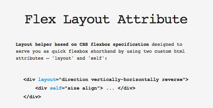
That might seem silly, but “Real Things” use it sometimes too, like the Flex Layout Attribute thing that was going around not too long ago.
Mark Huot combined this idea with unicode characters. How about some HTML like this:
<div class="box" box="↖"></div>
<div class="box" box="▣"></div>
And CSS to match the “language”:
[box*="▣"] { padding: 20px; }
[box-xl*="▣"] { padding: 40px; }

[box*="↑"] { padding-top: 20px; }
[box*="→"] { padding-right: 20px; }
[box*="↓"] { padding-bottom: 20px; }
[box*="←"] { padding-left: 20px; }

[box*="↕"] { padding-top: 20px; padding-bottom: 20px; }
[box*="↔"] { padding-left: 20px; padding-right: 20px; }

[box*="↖"] { padding-top: 20px; padding-left: 20px; }
[box*="↗"] { padding-top: 20px; padding-right: 20px; }
[box*="↘"] { padding-right: 20px; padding-bottom: 20px; }
[box*="↙"] { padding-bottom: 20px; padding-left: 20px; }
Demo:
See the Pen Crazy Box Padding by Mark Huot (@markhuot) on CodePen.
This idea of putting a styling language into attributes isn’t far away from what Atomic CSS is:
Made some handy @code snippets to write Atomic CSS. Now no need to remember the #acss syntax!
/cc @thierrykoblentz pic.twitter.com/IvfdsKdOak
— Pankaj Parashar (@pankajparashar) March 13, 2016
Or Expressive CSS, either, which encourages style-specific class names.
Consider using the
~=attribute selector instead of*=to properly handle space separated values.MDN says:
So yeah it does sound like that’s the most-correct usage. Why though? CSS selector performance I suppose? Which is usually a non-issue.
Chris, I believe the reason to use
~=instead of*=is becausebox*="low"will errantly match in a case likebox="yellow", when you only want it to match on the actual wordlow. Here’s an example: http://codepen.io/csuwldcat/pen/QEokbdPretty cool! (Why not with data-*?)
What about semantics by the way? I remember the old Google mantra, “presentational markup is not maintainable” – https://webmasters.googleblog.com/2012/07/on-web-semantics.html – and most maintenance problems seem to revolve around exactly that. When developers use classes and stuff like “clear”, “left”, “vertical”, then we all have extra work to do. It’s silly that this is not clear by now.
These are fun. The unicode stuff sorta reminds me of this Mathias Bynens post about ES5 identifiers.
Is there a reason to use custom attributes over
data-*?I’d probably use
data-*if I was doing it “for real”, it’s just less fun.This is cool but please, never do it :D
+1
Exactly.
box="↖"to meanpadding-leftandpadding-topis not that meaningful if you have a responsive design in which the sides that need padding changes depending on viewport width. Or if it comes time to change your design, and the HTML is spread over hundreds of pages on multiple sites, being generated from different technologies (or being static pages). Or if you want to take better advantage of inheritance to assign padding.Go with something semantic instead.
Also, every example here could have used classes instead. It’s neat that you can use attributes instead, but doesn’t seem to offer any improvement over classes.
Instead of css classes, you could declare your styles in cryptic haikus. Job security!
Shouldn’t you use data-* with custom attributes in HTML.
Just using a custom attribute without data-* isn’t valid in HTML5, I think.
Did exactly this when building a complicated (read: crapload of variations) grid system for use in our CMS:
Used
data-*attributes because HTML5 but totally see the appeal of made-up attributes. Found this approach to be really helpful because it eliminated confusion around “how is this going to be rendered?” Being able to base everything off the.gridbase class was super helpful (e.g..grid { &[data-cells="2"] { .grid-cell { … } } }).Nice article!
Why not to use a class?
Example:
instead of data-cells=”3″ use: .cell-3 or better .col-md-3 like a framework that we know ;)
@Juanma — Normally I would! The decision was made primarily to be incredibly declarative. There were a ton of different grid combinations and reading an attribute like
class="grid grid-cells-2 grid-cell-asset-download grid-mode-1lg"I felt wasn’t as clear as dedicated attributes that controlled specific aspects of styling. In this case it made sense because we were combining so many different, independent styles.@Juanma You can use the value of the custom attribute to be the content in a pseudoelement – I can’t think of a way this could be done with just a class. For example:
I love when I see actual tricks on here, and this has to be one of the most incredible and least useful ones I’ve seen yet.
That’s exactly why you should use
data-fencinginstead. Because, you never know…This is a neat idea! I love posts like this. They really get you thinking in fun, fresh, wacky ways.
(Pssst…. Don’t worry folks, it’s pretty clear from the tone that Chris isn’t recommending you use this in production – it’s just an article to stimulate your head, and your mind, and your brain too….)
There’s another reason to use attributes instead of class names: When using javascript and CSS you might want to keep both worlds as separate from each other as possible.
In our projects we try to maintain concept separation as exactly as possible. CSS is for visualisation only, such are class names. Javascript implements functionality, not visualisation, and apart from the occasional settings of display or visibility there shouldn’t be any style or CSS references in JS. Now, if you use attributes for everything that’s controlled by JS you benefit from maximum of concept separation. Looking at your HTML code or watching it live you will be able to tell wether a feature is controlled by JS or CSS. If for example you want to switch a containers’ state you simply set an attribute value from JS. Your CSS picks that up and visualizes the state. For application states you could use the body element if you like. This might even solve some CSS specifity problems.
Another pro is the possible replacement of IDs. With larger projects they can become a real pain. Just use something like data-id=”…” and you can use the same component more than once per page. Conflict solved.
To stay HTML5 compliant we always use “data-” attributes.
This is pretty how Bootstrap works (via data-*).
Quality post. Its clear and comes with some good example.
A real Css trick that was completely new for me.
Thanks!
Thanks for sharing a useful information
Thanks
Augustin
Glen Maddern did a thing with this a while back. It’s mighty compelling.
We wrote something similar-ish at my company using
{framework}.{element}:{modifier}@{screen-size}syntax. I found some frontend engineers were struggling with some of the more complexflexboxfeatures, so I attempted to simplify it.I had a platform I needed to build on, where I had stylesheet control but not markup control. I could only customize the style attributes of rows and widgets. So I ended up doing stuff like this:
HTML
CSS
I do wonder how I sleep at night sometimes.