Another month, another collection of fascinating websites! Here’s a few that have caught our attention lately.
GitHub Octoverse 2016
Alongside releasing a bunch of neat updates, GitHub recently published their annual breakdown of what’s been going on in the community. It’s called the GitHub Octoverse:
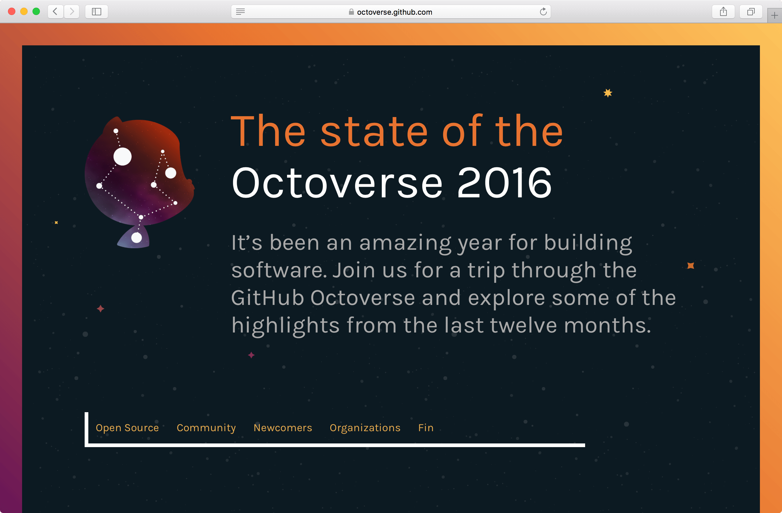
It’s funny to think that the Octoverse used to be little blog posts and now they’ve flourished into beautiful standalone websites filled to the brim with infographics and charts.

I especially like the choice of big text and the use of the typeface Karla.
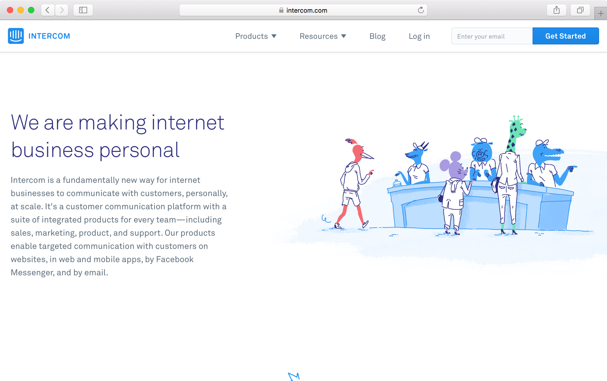
Intercom
Intercom, the customer communication platform, recently launched a redesigned website chock full of illustrations and beautiful imagery:
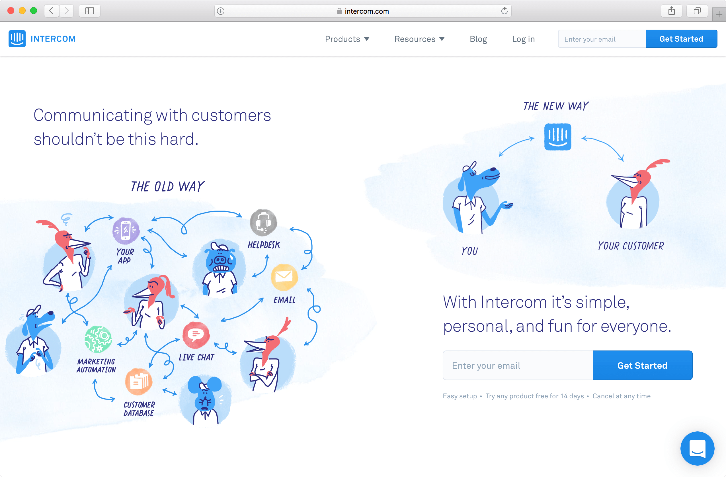
Every page on the website is worth exploring for the way in which they describe their product, their team and their goals. A cast of animal characters bring a sense of levity and quirkiness to what might be an otherwise straight forward and boring experience.
Digital Ocean
You might be already familiar with DigitalOcean, the cloud computing company, and they’ve launched a redesigned website, too.
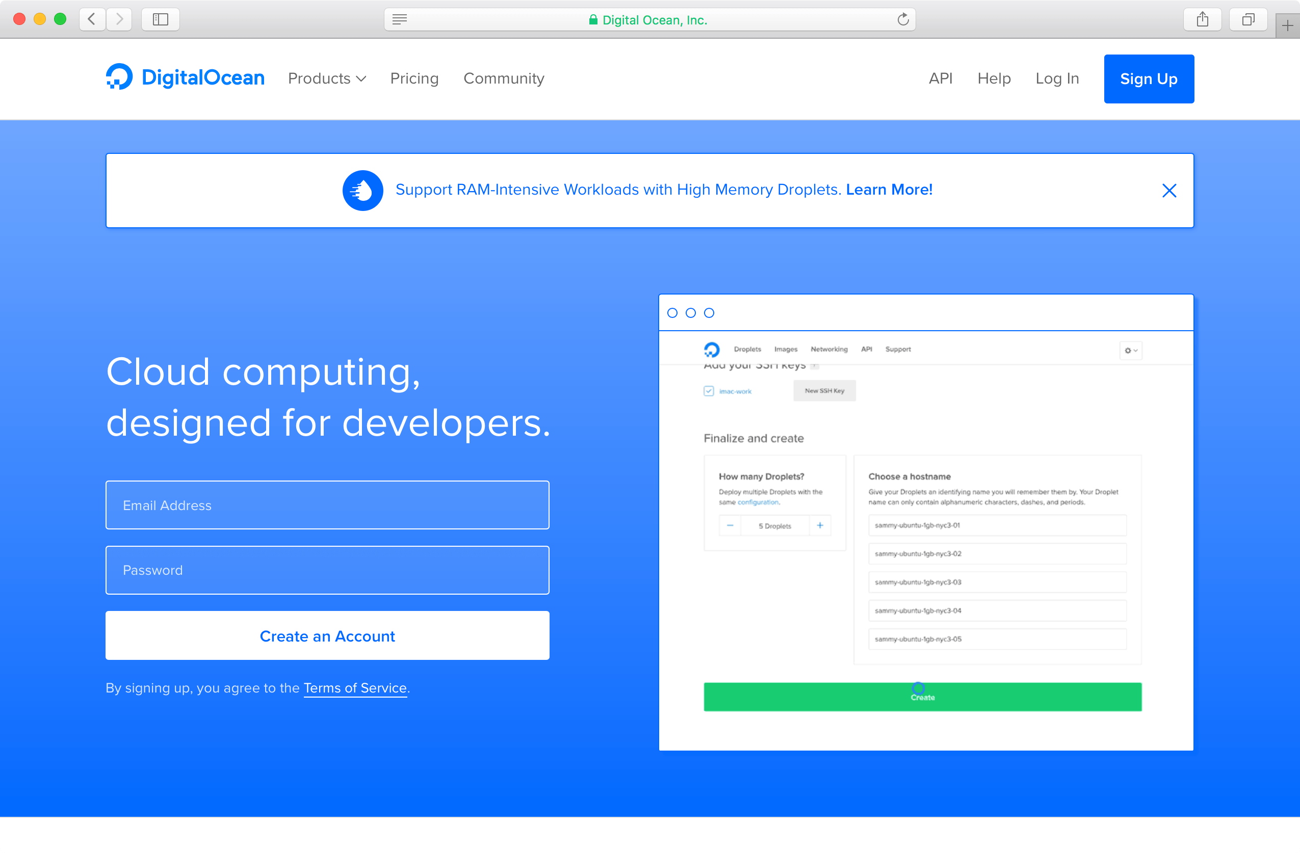
The design team wrote about the goals of the redesign which included prioritising accessibility and CSS architecture:
The old digitalocean.com CSS had thousands of rules, declarations, and unique colors. The un-gzipped file size came out to a whopping 306 kB.
For the redesign, we implemented a new design system called Float based on reusable components and utility classes to simplify and streamline our styles. With the Float framework, which we hope to open source soon, we were able to get the CSS file size down to almost a quarter of its original size: only 80kB!
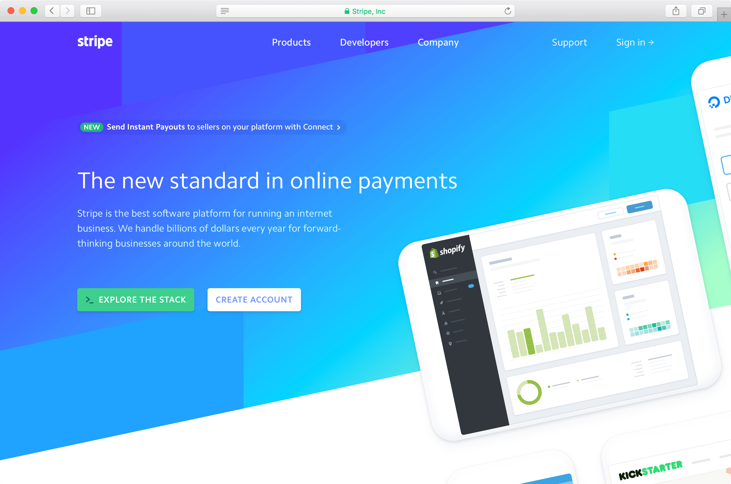
Stripe
Stripe also received a lovely redesign a short while back:
One neat thing I noticed was how the font Camphor is being loaded in the head:
This is one of many useful tricks to loading a webfont super quickly, with preloading. It’s not an ideal approach, and you certainly shouldn’t be preloading multiple fonts because that’ll impact performance, but in this case since Stripe isn’t loading many weights then this is a solid approach.
Anyway, there’s a tiny bit of UI that stood out to me here: the hover states in the main navigation. There’s a delay as you hover over each item that feels in that wonderful “sweet spot” of animation that’s so hard to get right:
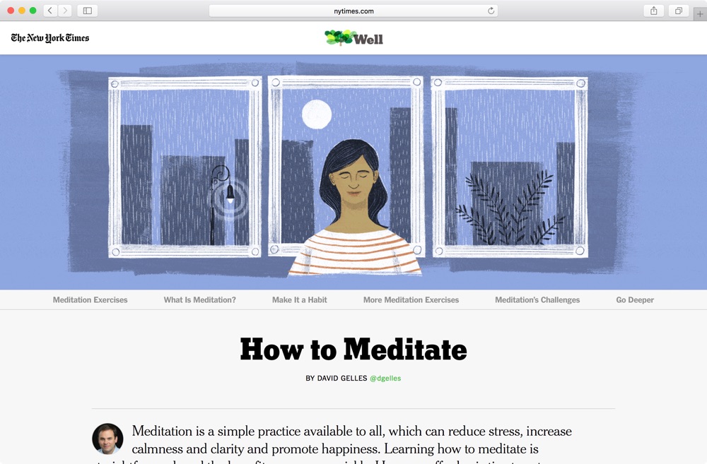
NYT: How to Meditate
The New York Times published an article on How to Meditate. The background animation and illustration is particularly beautiful on big screens:
Type Terms
Type Terms helps designers learn more about the specific elements of a letterform and typeface:
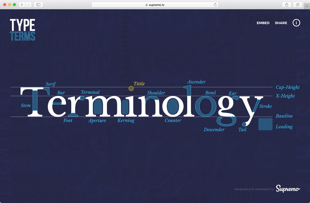
Again, subtle animations play a part in moving through the interface that really makes all the difference:

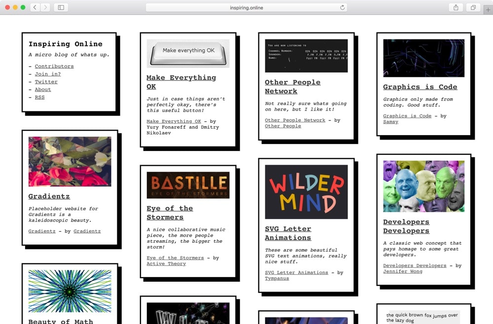
inspiring.online
inspiring.online, in the words of its creator Tim Holman, is…
…a blog for those looking for encouragement, and inspiration in the tech world, but is also an experiment. The entire blog is open source, so anyone can submit amendments to posts, fix spelling mistakes, add discussion links, and create new posts too! Ideally, it’s a great starting area for someone to enter the open source world!
And that’s it until next time! If you have any more websites that you’ve found interesting then be sure to let us know in the comments!
I’ve got nothing prolific to say except “Thanks!” Not only a bunch of neat looking sites, but also ones with some awesome content I wasn’t aware of.