It’s been far too long since we rounded up some of the most interesting websites out there. But this time we have a diverse round-up of whacky interfaces and beautiful layouts to look at. Let’s dive straight in!
Nick Jones’ Portfolio
The portfolio of Nick Jones is one of the neatest personal websites I’ve ever seen. As you flip through each page and project that Nick has worked on, the interface rotates and zooms in as you get closer to the end. Not only that but the interface changes color and the tiny animation on the title of each post draws your eye to it. In fact, I think this is the first time I’ve felt comfortable with a designer changing the basic paradigm of mouse scrolling – it somehow feels fluent and natural rather than janky and weird.
Hey, they always tell us the cheapest things to animate are transforms like scale and rotate!
Font Map
The Font Map is a nifty tool that lets you visually explore all the typefaces on Google Fonts by category and style. It’s designed by the folks at IDEO and in the about section, they wrote about how they used machine learning to make these distinctions between the fonts:
Font selection is one of the most common visual choices designers make—and most fall back on old favorites, or search for a font within categories. By leveraging AI and convolutional neural networks to draw higher-vision pattern recognition, we have created a tool that helps designers understand and see relationships across more than 750 web fonts.
Melanie David
Melanie is a UX designer and art director but her portfolio and personal website use a particularly interesting layout which splits the viewport in half. On the left side is the title of the section and on the right is the content.
However, my favorite part of the UI is right at the end where a chopped up illustration fits back together again in time with the scroll.
Field Notes

I never really noticed just how pretty the product pages on the Field Notes website are — especially the details on the Pitch Black Note page. For example on larger screen sizes when you scroll the product on the right locks into place which gives you enough space to read about the process behind the scenes.
Shopify Polaris
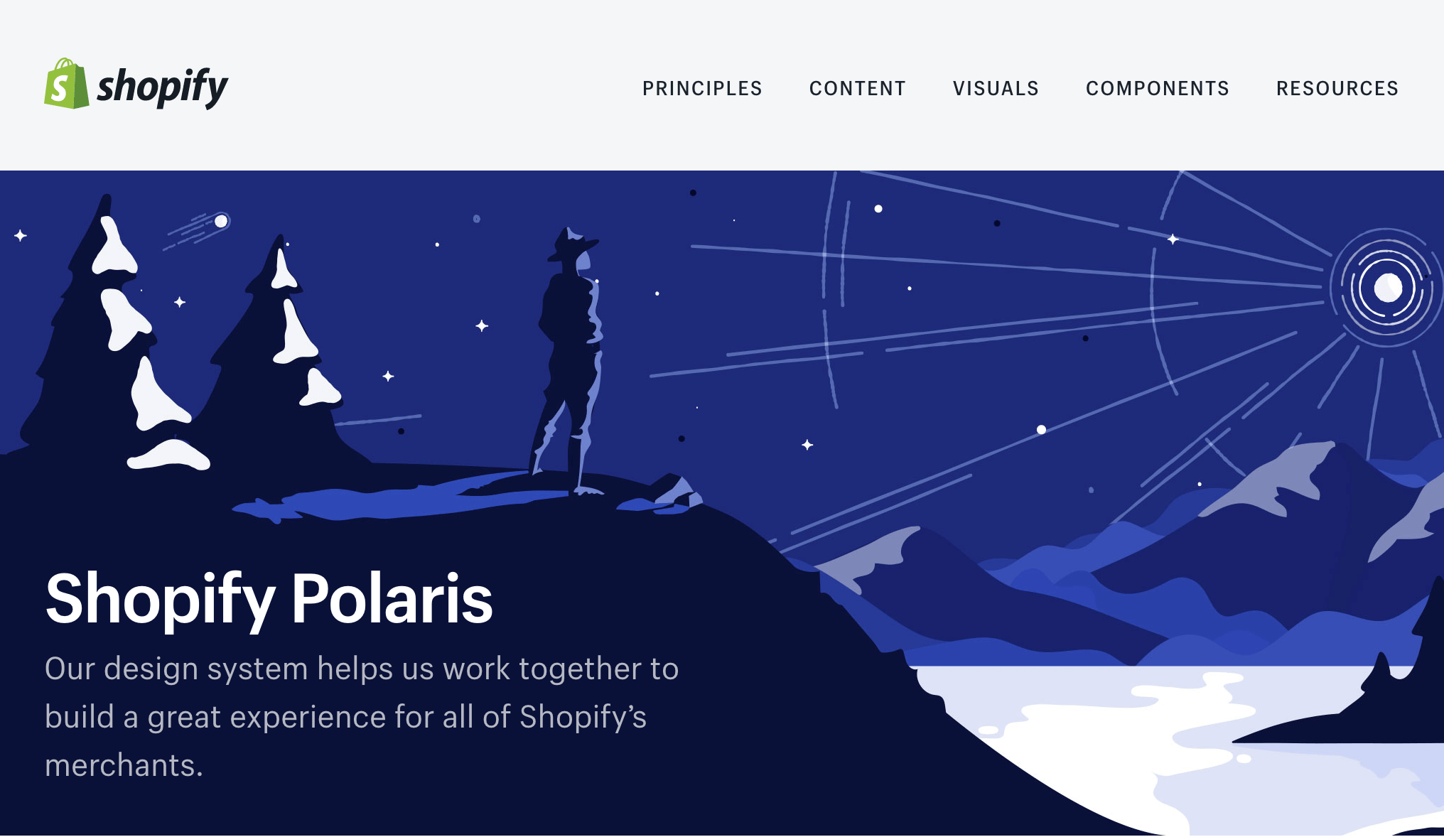
A while back Shopify made their design system, Polaris, public for everyone to ooh and aah over. At the time lots of folks pointed at the illustrations that make the site really flourish but I’m much more interested in the tiny bits of UI, such as the color picker where you can switch between seeing the HEX value of a color and the Sass function, like so:

Audiograph
Audiograph is an absurdly beautiful visual representation of Trans, Pilotpriest’s 2016 album by Matt DesLauriers. As the music plays in the background we can see shapes and colors floating all around the place and it’s really quite the spectacle.
Floodfonts
Check out the surprising, bold, weird navigation at Floodfonts:
A is for Albert
A to Z books always a glorious excuse for artistic expression. Bringing that idea to the web is lots of fun, particularly when it’s as well done as this one by Studio Lovelock.
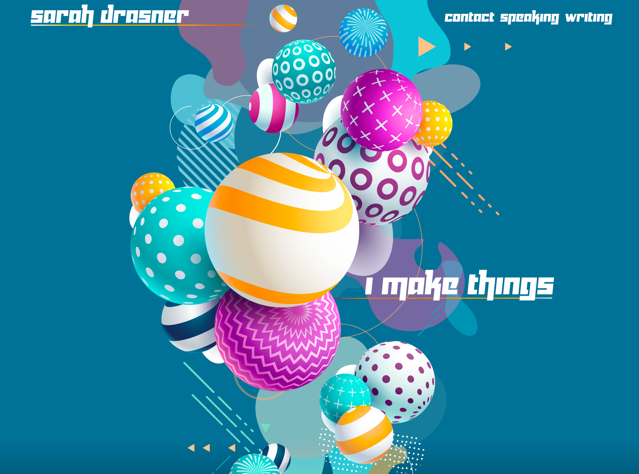
Sarah Drasner
Our very own Sarah has a wonderfully beautiful new site!
Jigsaw
With a name like Jigsaw, you gotta use the puzzle imagery:
It’s a little weird that the API associated with this project, Perspective, has a totally different vibe to it. But it’s also super nice!
Adult
Advocode Design Report 2016
Really gorgeous layout and fun interactions, but the illustrations on each page, each by a different artist, make it extra worth exploring.
Work & Co
Samsy Lab
Source Han Serif
Cool to see a site done in 99% black and white.
DDC Hardware
Now that’s how you sell a typeface!
Climber
Increment
Algorithm-Driven Design
Joe Coleman
This one is way more fun to go explore at your own pace.
Make sure to add your favorite website in the comments below!
