Back when I did the Kickstarter for this site, one of the rewards I offered was a critique, public or private, of any website. The only taker was Gus Fune, who opted for the public critique of a site he worked on: epicawesome.co. Thank you Gus for allowing this to be a public learning opportunity!
Here’s the desktop view:

Before you get there though, the site has a loading screen:

That was common in the Flash days, but you don’t see it much anymore. This site is indeed a normal HTML5 site. There is a “preloader” script that must do some fancy stuff making sure images are loaded before revealing the site. When the pre-loader finishes the overlay slides away revealing the site.
It’s tempting to harp on the size of the site and recommend reducing the size so that a pre-loader isn’t necessary. But I didn’t mind it so much here. The loading time for me was about 8 seconds. Without a pre-loader I would have been annoyed, but showing me the loading progress kept me around. Bear in mind I have fairly decent broadband internet. If my 8 seconds was someone else’s 60 seconds, I bet they wouldn’t have the same patience.
I would recommend some slow-bandwidth testing. There is a Mac app called SpeedLimit which could help with this, by throttling your fast internet down.
Here’s the network waterfall:

The DOM ready happens at a healthy 1 second, which makes it all the more tempting to figure out another loading strategy. Perhaps you could only load the top biggest image right away, and then wait for a scroll event to trigger the loading of the rest of them. You’d save on bandwidth as a bonus.
I’m not going to harp on the huge images. It looks like that is the stylistic direction you wanted to go and you can do that if you want. I ran the images through an image optimizer and got zero savings, so you are optimizing correctly!
As you scroll down the page, the content is divided into sections each with new colors, new styles, and a new hero background image. If the screen is tall enough, the next section is revealed and the transition is rather abrupt.

While it’s probably good to have these images separate rather than one enormous image (for caching reasons), perhaps they could be designed to morph into each other a little more smoothly. I also think it would be a good idea to do a little viewport size detection and make each section exactly one browser window large, so that next section isn’t revealed until scroll.
The mobile version is this:

It is a smart move to not show the 7.7 MB version to a small screen mobile device!
This version is so worlds away different though that it has me thinking. Is this enough to function for you as a web experience? If it is, can some of this minimalism be present on the large screen version? The large screen version is so intense and colorful you might even describe it as “maximalist”! I’d wonder if people would even realize it’s the same agency.
I think it stands to reason someone on a mobile device might want to know more than your blurb and phone number. The large screen version explains your services, shows who you have worked with, shows examples of past work, and more. I might try and get a little closer to content parity with the mobile version and bring the stylistic direction closer one way or the other.
Mobile detection is always tough too. On a retina iPad, it goes mobile:

I would think that device could handle the desktop version OK.
One easy win might be to offer some kind of action to “View the full site”.
I feel like the site could benefit from some reigning in of the typography. I’m counting about 13 different typefaces in use. Some of that is just fun variation, and I get that, so I don’t want you to think I’m just regurgitating some arbitrary rule about how many you can use in any given situation.
Here’s some specifics.
The only place Tahoma is used is here:

I feel like you could pick something else that is already in use elsewhere, or pick a new font that screams “venue sign lettering” more than Tahoma does. I think this is a perfect opportunity to go the extra mile and make sure those letters line up on the lines in the image. That would demonstrate a dedication to craft I know I would appreciate.
The font ‘SeasideResortNF’ is only used in two places. One of them is this language switcher:
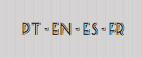
I feel like that typeface was designed to be used only much larger than that and it’s breaking down at this small size. Good opportunity to cut it and pick one of the other faces in use on the site.
The ‘eurostileregular’ font looks pretty good here:

So I’d use it again here rather than busting out Helvetica for the first time on the site.

Super clever how the text is hidden behind the lamp here.

I just might see if you can introduce a shadow somehow to complete the illusion of depth and possibly ditch the Courier for one of the other typefaces already established. If it was coming out of a typewriter or something, sure, but this looks just like a poster on a wall and could be anything.
As far as resources, I already mentioned the images are nicely optimized, so that’s great. The CSS is minified and the JS is minified, so great work there! Since this is a one-page site, you could squish the three JavaScript resources together (jQuery + Preloader + Scripts). They aren’t big enough for that to be a bad idea.
Stylesheets in the header, scripts in the footer, perfect.
Semantically, it looks pretty solid to me. The header is a <header>. Sections are <sections>. Each section has a proper header. Stylistic-only stuff is a <div>.
One suggestion I would have would be to get the navigation inside of an unordered list. Right now it’s just <nav> <a> – which is semantic enough, but after some healthy community debate, navigation in lists seems to be the best practice.
It’s somewhat hard to comment on the CSS because, in all honestly, I don’t think little one-page sites like this need to be scrutinized to death for their architectural choices. But for the sake of critique, let’s find a few things.
I’m looking at the style.less file specifically.
LESS can do includes, so no need to dump the Normalize.css stuff at the top.
@import "normalize.css";I love Normalize, but might be overkill for a one-page super stylized site like this. Probably 2/3 of it deals with elements you don’t have on this site. And some of the other stuff you reset anyway. For instance Normalize sets margins and sizes on headers which you later reset.
There are mixins specifically for box-shadow and border-radius included, which aren’t necessary anymore. On the subject of vendor prefixes, I’d suggest removing them entirely and using Autoprefixer as part of your build.
There are quite a few IDs used in the stylesheet. You might just disagree with me philosophically, but I’m a fan of never ever using them to style elements. I’d especially avoid tag-qualifying them like you have in some cases like section#home. ID’s are unique so there will never be an article#home, for instance. If you like the tag there for readability or a reminder, you can do /*section*/#home. Tag qualifying anything is generally a bad idea only rarely should you style elements themselves (rather than use a meaningful class), so that’s something to look out for in general.
Toward the bottom you have a retina display media query, which you can simplify to:
@media
(-webkit-min-device-pixel-ratio: 1.5),
(min-resolution: 192dpi) {
    /* Retina-specific stuff here */
}
I hope this was useful to you Gus!
If anyone else has any thoughtful critique, share it in the comments.

Oh, if all critics were as gracious and constructive as you! Thanks for the link on lists in nav. That has been a very confusing conversation indeed.
Although the site is very different from the sorts of sites I make, I still learned a lot from this critique. Thanks!
A really great critique! I could only be so lucky to have 1/5 of that critique on any of my projects, web or print. Thanks for this!
That is a talent right there, to be critical and totally nice at the same time. Wow. For me, being critical and being nice seem totally exclusive. Great breakdown.
I love the idea of creating a retro-inspired design with big, colorful imagery. It’s a nice change to all the minimalist-helvetica-driven-flat designs that we’ve been seeing quite often lately. The epic cinema neon signage at the top, the whole space-science-fiction-ufo-space-deal and the retro telegraph guy (or whatever) at the bottom fit great in that concept.
However, there’s a few things that, in my opinion, work against that awesome retro feeling: First of all, the grey header. It looks just dull and boring and takes away from the vibrant, friendly look of the site. I can think of two ways to make it better:
That’s pretty much all I got. Good luck!
Hi Max,
I’ve loved your feedback on the aesthetics. I’m taking a lot of notes for tweaking and making some changes soon.
The “work selected” problem is something that I’d like to share: localization. This can be a HUGE issue, specially when works have different sizes on different languages. The website was made first in Brazilian Portuguese, then I have localized it into other 3 different languages. One problem that showed up was setting up the phrases on big titles like this one.
For next multi-language projects, the content translation will surely come up before the design phase. It can save you a lot of time trying to fix things or having to stick with a small detail that it’s not perfect in that specific language. I wish there is more material online for designing for internationalization.
You claim you have worked with coca-cola brasil, but your two examples are wordpress installs. Why aren’t there more examples?
Can you link to some of the well-known brand work? If not, the pitch seems deceptive.
For what it’s worth, I believe the “loading” page is really bad. But it makes the site score well under automated site testing :-)
It’s great that you have the courage to open yourself up to critisism, so thank you for that.
Most of work done were via an advertising agency and due contractual obligations we can’t upload the cases into the section below, but they allow us to point out we have worked with those clients. If you hover at each big brand, it says the agencies we have worked.
I hope in the future we might be able to upload some cases, including with more insightful feedback. There are more details on projects on the facebook fanpage if you want to check it out.
Well, that angular text in the 2nd section looks pretty bad on my screen: http://i.imgur.com/dq9dEUn.jpg
I am on Vista, using latest version of Firefox.
Yeah text rotation isn’t perfect in any browser that I’ve seen. I’m on chrome on mac and it’s still a little off, certainly not as bad as firefox though.
@Dan – you are correct, in the case that the design calls for this, you can do the following.
-webkit-transform: translate3d(0,0,0);
basically allows your gpu to do the rendering :)
Note: translate3d needs to be used carefully, if its over used you can really make you site perform badly. I see this alot these days :(
Here’s another thing I’ve noticed. The ‘selected work’ section is basically the most important one on your entire website. That’s what people will be most interested in.
Therefore, you should provide bigger images (!), maybe a more detailed description for each project and definitely a link to the live website.
Very poor french translation with many mistakes (looks like a google translate) Bad point for a professional website. I would’nt contact them just because of this point.
Hi Emmanuel,
One of the house project-managers that worked on the translation. I myself am not a frenchphonic. Would you help point out some problems so I could work out?
Website doesn’t load if JS is disabled. That’s a pretty big flaw…
Fair play to you though for allowing this critique to be made public :)
I noticed it also doesn’t load on my Commodore 64 and if I disable my internet connection all links seem to be broken…
This is definitely my favourite post of all time!
Also, > Project developed using all WC3 guidelines> – you might want to change that to W3C :)
“I want to be challenged. I like collaborating with team members who excel in their specialties and who are as eager for a challenge as I am. I want to work in an environment that doesn’t just react to limitations and setbacks but that seeks out opportunities.”
Of-course the site is awesome as the name reflects. but the size of website is too much about 8MB. simply customer would not worry about this size. they are just showing their excellence to attract customer.
check here…. http://tools.pingdom.com/fpt/#!/cczcHZ/http://epicawesome.co
@Gus Fun: here are the corrections for the French translation: http://pastebin.com/LHQwRYAM
Nice design by the way, Gus. Love the retro style ;)
Woah! Very cool of you to offer that.
Benjamin’s example inspired me. Corrections for the Spanish translation can be found at the link below.
http://pastebin.com/4cYb2znX
Wow guys! You’re awesome! I will be publishing them on the next hours! Awesome!
I totally agree with this point, but often wonder which elements are best suited to being styled directly, and under which circumstances. Is there a general consensus?
Adding some margin to paragraphs… Removing/adding/changing list styles… Styling pre/code… mostly text-based stuff.
As an upcoming developer, I must say I have learned a lot from your design style. I like the minimalistic usage of the parallax scrolling – it is not so in your face and the colour combination blends very well with the retro theme.
The mobile approach is also a clever idea… If I am to rate the site, a 4/5
Chris, this is an awesome checklist to use for reviewing my own websites, thanks for posting it.
There are a few minor probs w/the English translation, as well (e.g., “plataform” for “platform”).
You’re obviously extremely well-versed in English (much better, say, than I am in español or français or русскйи, the languages I can at least claim to be a beginner in), so this isn’t a critique of your English. And, while I’d be happy to do a deep proofread of the site (just hit me up – seriously, if you want it, it’s on offer), I’m thinking that just doing a spell/grammar check in LibreOffice or Microsoft Office (or whatnot), with a good English dictionary installed, would be more than sufficient (and would make it so that you can have it on demand).
Just a quick thought. :) Otherwise, beyond the advice already provided by those far more knowledgeable than I, it looks great!
Learned a lot from this site. :)
Mr. Coyier, you have an inspiringly gentle-yet-firm, informed critical style. I learned a lot reading the critique from a technical perspective, but your delivery and community of commenters speak volumes about the positive intent and sincerity woven into your writing and interactions. Thank you for making my daily reading all the more pleasant.
Just because all the images are optimized, doesn’t mean improvements can’t be made. Looking it the waterfall it appears they are mostly PNGs, but the site is using photo type images, not low-color graphics.
Using JPGs at 100% quality should save you a chunk of download (around 10% in my experience). You can go as low as 80% without any noticeable degradation for most (non designer) people. You could go to 90% without any noticeable degradation for anyone, even designers. You would probably save 30-50% on the file size!
Surely there are a lot of things to optimize. One of the biggest challenges was that de designer was not the coder (which was myself). So there were a lot of setbacks.
All JPEGs are really optimized, and you can go with 60% without problems. All JPEGs in this page are at 60.
Hey everyone,
This isn’t exactly criticism on my part, but I just wanted to point out a few things that have been bugging me with designs like this.
1. Aren’t these kind of designs getting old? I am subscribed to a number of newsletters and all the time as “an inspirational website” I get sent one-page websites with parallax effects. Sure, it’s interesting .. but it seems like the designer community is stuck on this for some time now
2. Readability – When I open this website I basically have to struggle with the AWESOME graphics and animations so I can find the relative text I want to read. In most cases, in such one-page websites you have to be a true jungle explorer to find what you need.. And this website makes no exception. The text is so well fitted in the environment that the normal person would think that’s just a picture and wouldn’t read it (thinking it just fills space)
3. Intuitive? This type of websites are not intuitive at all. I get it that they are supposed to show off skills, but If I was a customer and visited this, I would be left with the impression that the creator will pull off the same stuff on my website.
Sorry about the off-topic here, I am just getting annoyed with the same stuff being shown as the cutting-edge of Front End lately.
Unfortunately, my company wants me to create a similar website for our portfolio in a few weeks.. so I guess my opinion doesn’t matter on the subject.
Nevertheless, great website! A lot of work has been put into it and I respect that! Cheers!
What image optimizer do you use?
I have used OptiPNG, it’s a command line tool.
It is surprising how much you can learn by reading someone else’s critique. Nice article.
I like this sort of critique, helpful and something to learn from and well conducted.
I’m interested to know what browsers you are targeting (based on your traffic analysis maybe?). Just looked at it using IE8 for sadistic purposes! ;-)