When creating navigational tabs that use real web text, some positioning issues may arise when that text is resized. The natural flow of a web page when text is resized is to push down. This can push your main content area down and/or force the tabs into that area. Using some smart CSS, we can fix this issue by creating tabs that grow upward when text is resized.
Bad Example

In this example of bad tab behavior, when text is resized the tabs grow downward and push into the main content area.
One solution could be to have the tabs push down the main content area as they grow. In this example that may be fine, but that may be unacceptable for a more image-based design or for folks nervous about losing content below the “fold”.
Good Example

In our good example, the main content area stays put. The tabs grow upward and the rest of the text grows downward as usual.
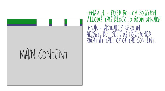
The Trick
The meat of the trick is using two nested block level elements. The outside block controls the positioning. We need to lock to the top of the main content, so the outside block needs top: 0;. The inside block then sticks to the bottom of the outside block with absolute positioning. By setting a fixed bottom value, bottom: 0;, the menu items have no where to grow but up.
Menu markup:
<div id="nav">
	<ul>
		<li><a href="#">Tab 4</a></li>
		<li><a href="#">Tab 3</a></li>
		<li><a href="#">Tab 2</a></li>
		<li><a href="#">Tab 1</a></li>
	</ul>
</div>
Code purists will notice right away the common folly of wrapping an unordered list in a div unnecessarily. In our case though, it is very necessary, and we need both of those block level elements for our trick.
CSS for the two blocks:
#nav	 {
   position: absolute;
   left: 0;
   top: 0;
   width: 100%;
   height: 0;
}
#nav ul {
   position: absolute;
   bottom: 0;
   right: 0;
}
Here is a visual:
Note
This is becoming less and less of an issue as more browsers are using full zoom instead of straight text resizing. But still, it’s just good responsible design at this time.

I’m probably picking at little things here, but one little problem with this option is that if you increase the text size enough, 3 of the tabs disappear (in FF3 without full page zoom and Safari anyway). I prefer the content to just push down and build my site images accordingly.
Why don’t you use a float: right for the ul-tag and no height for the div? I think it’s the same result
For what it is worth .. neither example work in IE.. Yes I know it is supposed to be inferior, but 70% or your web users, use it.
Bulletproof tabs solved! Thanks for the article. I took a few minutes to put together a demo to illustrate how to add round corners using the mountain top corners technique as well as having two sets of tabs (positioned left and right). Thanks again!
I have the same trouble with Internet Explorer making it work. But the tips I just picked up from this post helped a lot. Keep up the good work, we all appreciate it.