The following is a guest post by Ana Tudor. Ana always does a great job digging into the math behind what we can do graphically on the web. In this case, that’s extra-useful as there are several ways to handle SVG transforms and they require a bit of mathematical thinking, especially converting one type to another for the best cross browser support. Here’s Ana.
Just like HTML elements, SVG elements can be manipulated using transform functions. However, a lot of things don’t work the same way on SVG elements as they do on HTML elements.
For starters, CSS transforms on SVG elements don’t work in IE. Of course, there’s the option of using the SVG transform attributes for IE if we only need to apply 2D transforms on our elements.
Update: Edge supports CSS transforms on SVG elements starting with EdgeHTML 17 released on the 30th of April 2018.
However, if we use the transform attribute approach, all parameters for transform functions are numbers, meaning we cannot control and combine units anymore. For example, we cannot use % values for translate functions (though % values wouldn’t work for CSS transforms in Firefox either, whether we’re talking about transform-origin values or translate() parameters) and all rotate or skew angle values are in degrees, we cannot use the other units we have available in CSS.
% values for transform-origin, but they are relative to the SVG, not to the element we’ve set transform-origin on like it is the case in Chrome. Firefox seems to behave correctly in this case.Also problematic is the fact that JavaScript feature detection fails in IE (reading the CSS transform value via JS will return the matrix equivalent of the transform we have set in our stylesheet). This means we either need another way to check for IE or we use the transform attributes across the board (which feels like less work overall).
The main thing that works differently between HTML elements and SVG elements is the local coordinate system of the element. Every element, whether we’re talking about HTML elements or SVG elements, has one.
For HTML elements, this coordinate system originates at the 50% 50% point of the element.
For SVG elements, the origin is, assuming we have no transform applied on the element itself or any of its ancestors inside the <svg> element, at the 0 0 point of the SVG canvas.
The different origins will cause different results following rotate, scale, or skew transforms if the 50% 50% point of the SVG element doesn’t coincide with the 0 0 point of the SVG canvas.
In order to better understand this, let’s see how transform functions work.
How transform functions work
One thing we need to understand about transforms is that they have a cumulative effect when applied on nested elements. This means that a transform applied on an element having descendants also affects all of its descendants along with their own systems of coordinates and the results of any transforms on those descendants. For simplicity, we always assume that in the following cases, our elements don’t have any ancestors with transforms applied on them. We also assume our elements don’t have any descendants.
Translation
A translation moves all the points of an element in the same direction and by the same amount. Translation preserves parallelism, angles and distances. It can be interpreted as shifting the origin of the element’s system of coordinates – when that happens, any element whose position is described with respect to that origin (the element itself and any descendants it may have) gets shifted as well. Its result does not depend on the position of the system of coordinates.
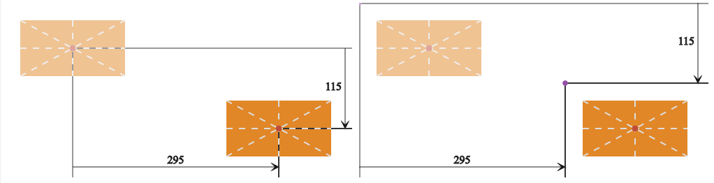
The figure above presents the HTML case (left) versus the SVG case (right). The faded versions are the initial ones (before a translation was applied). Applying a translate transform shifts our elements and their systems of coordinates along with them. It would also shift any descendants if they had any.
As we already know, what differs between the two is the position of the coordinate system. For the HTML case, the origin of the system of coordinates is at the 50% 50% point of the element. For the SVG case, it’s positioned at the 0 0 point of the SVG canvas (we have assumed there are no transforms on any of the element’s possible ancestors inside the <svg> element). However, in a translation, the position of the system of coordinates relative to the element does not influence the final position of the element.
Both for HTML and SVG elements, when using CSS transforms, we have three translation functions available for 2D: translateX(tx), translateY(ty) and translate(tx[, ty]). The first two only act on the x and y directions (as given by the element’s system of coordinates) respectively. Note that if another transform is applied before the translate, the x and y directions may not be horizontal and respectively vertical anymore. The third translation function moves the element by tx along the x axis and by ty along the y axis. ty is optional in this case and defaults to zero if not specified.
SVG elements can also be translated using transform attributes. In this case, we only have a translate(tx[ ty]) function. Here the values can also be space-separated, not just comma-separated like in the similar CSS transform function. So in the very simple case where 1 SVG user unit is equivalent to 1px, the following two ways of translating an SVG element are equivalent:
• using a CSS transform:
rect {
  /* doesn't work in IE/ older Edge */
  transform: translate(295px, 115px);
}
• using an SVG transform attribute:
<!-- works everywhere -->
<rect width='150' height='80' transform='translate(295 115)' />
The SVG transform attribute and the CSS transform property are going to be merged.
Consecutive translate() transforms are additive, meaning that we can write a chain like translate(tx1, ty1) translate(tx2, ty2) as translate(tx1 + tx2, ty1 + ty2). Note that this is only true if the two translations are consecutive, without another type of transform chained between the two. Reversing a translation translate(tx, ty) is done via another translation translate(-tx, -ty).
Rotation
A 2D rotation moves an element and any descendants it may have around a fixed point (a point whose position is preserved following the transform). The final result depends on the position of this fixed point. Starting from the same element, two rotations of identical angles around two different points will produce different results. Just like translation, rotation doesn’t distort the element and preserves parallelism, angles, and distances.
Consecutive rotate() transforms around the same fixed point are additive, just like translations, meaning that rotate(a1) rotate(a2) is equivalent to rotate(a1 + a2) (but only if our two rotations are consecutive, without any other type of transform in between them).
Reversing a rotation rotate(a) is done via another rotation of the same angle in the opposite direction rotate(-a) around the same fixed point.
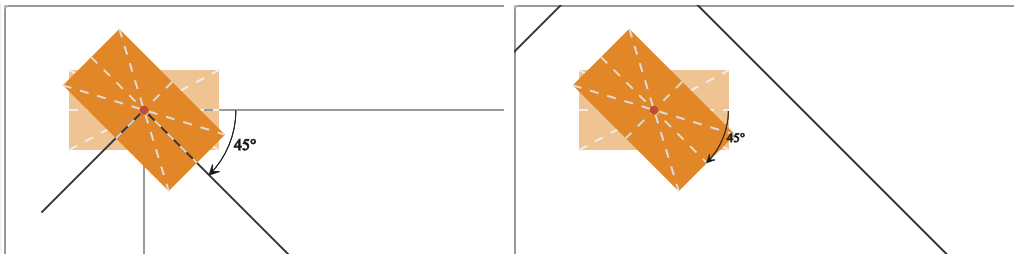
The figure above presents the HTML case (left) versus the basic SVG case (right). The faded versions are the initial ones (before a rotation was applied). Applying a rotation moves the elements and their systems of coordinates around the fixed origins and it would do the same to any descendants of our elements if they had any.
In the HTML case, the origin of the element’s system of coordinates is situated at the element’s 50% 50% point, so everything rotates around this point. In the SVG case, however, the origin is situated at the 0 0 point of the SVG canvas (we have assumed there are no transforms on any of the element’s possible ancestors inside the <svg> element), causing everything to move around that point.
The 2D rotation function is pretty straightforward in the case of the CSS transform property: just rotate(angle). The angle value can be expressed in degrees (deg), radians(rad), turns (turn) or gradians (grad). We could also use a calc() value (for example, something like calc(.25turn - 30deg)), but this only works in Chrome 38+/ Opera 25+ at the moment.
Update: Firefox 59+ also supports using calc() as an angle value for rotate() functions.
If we use a positive angle value, then the rotation is a clockwise one (and, conversely, a negative angle value gives us a counter-clockwise rotation).
In the case of SVG transform attributes, the rotation function is a bit different – rotate(angle[ x y]). The angle value works in the same way as for the similar CSS transform function (positive value means clockwise rotation, negative value means counter-clockwise rotation), but it has to be a unitless degree value. The optional unitless x and y parameters specify the coordinates of the fixed point we rotate the element (and its system of coordinates) around. If they are both omitted, then the fixed point is the origin of the system of coordinates. Specifying just the angle and the x parameters makes the value invalid and no transform is applied.
Just like in a translate() function, the parameters can be space-separated or comma-separated.
Note that the presence of the x and y parameters does not not mean the origin of the system of coordinates gets moved to that point. The system of coordinates, just like the element itself (and any descendants it may have) simply gets rotated around the x y point.
This means that we have two ways of rotating an SVG element (the result can be seen on the right in the previous figure):
• using a CSS transform:
rect {
  /* doesn't work in IE/ early Edge */
  transform: rotate(45deg);
}
• using an SVG transform attribute:
<!-- works everywhere -->
<rect x='65' y='65' width='150' height='80' transform='rotate(45)' />
We can also specify a transform-origin value in our CSS to emulate the use of the x and y parameters. Length values are relative to the element’s system of coordinates, but percentage values are relative to the element itself, so they seem perfect for what we want were. However, we should keep a couple of things in mind.
First, the CSS transform-origin and the fixed point specified inside the rotate() function are not the same. For a very simple example, let’s say one using just a rotation around the 50% 50% point of the SVG element, this won’t matter. Consider the following two:
rect {
  transform: rotate(45deg);

  /* doesn't work as intended in Firefox
   * % values are taken relative to the SVG, not the element
   * which actually seems to be correct */
  transform-origin: 50% 50%;
}
<rect x='65' y='65' width='150' height='80'
transform='rotate(45 140 105)' />
<!-- 140 = 65 + 150/2 -->
<!-- 105 = 65 + 80/2 -->They both rotate the element the same way in Chrome, as seen in the following figure:
This shows the difference between the two. When using CSS, the element’s system of coordinates is first moved from the 0 0 point of the SVG canvas to the 50% 50% point of the element. Then, the element is rotated. When using an SVG transform attribute, the element and its system of coordinates are simply rotated around the point specified by the second and third arguments of the rotate() function, a point whose coordinates we’ve computed so that it’s situated at the 50% 50% point of the element. The origin of the element’s system of coordinates is still way outside the element, and that origin is going to influence any subsequent transform depending on it.
In order to better understand this, let’s chain another rotation after the first that rotates the element by 45° in the opposite direction:
rect {
  transform: rotate(45deg) rotate(-45deg);
  transform-origin: 50% 50%; /* Chrome, Firefox behaves differently */
}
<rect x='65' y='65' width='150' height='80'
transform='rotate(45 140 105) rotate(-45)' />
<!-- 140 = 65 + 150/2 -->
<!-- 105 = 65 + 80/2 -->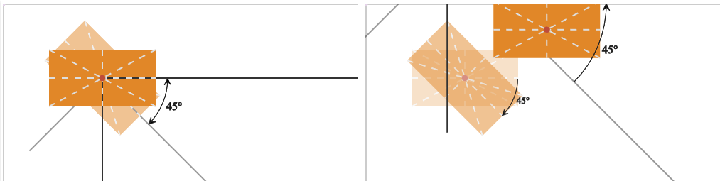
As the figure above shows, when using a CSS transform and setting the transform-origin to 50% 50%, the two rotations cancel each other, but when using the SVG transform attribute, the fixed point we rotate the element around differs from one rotation to the other — it’s the 50% 50% point of the element for the first rotation, and the origin of the element’s system of coordinates for the second. In this situation, we need to use rotate(-45 140 105) instead of rotate(-45) to reverse the rotation.
However, this does not change the fact that we only have one transform-origin (because the element’s system of coordinates only has one origin), but when using the SVG transform attribute, we can apply multiple rotations, each and every one of them rotating the element around a different point. So, if we want to first rotate our rectangle by 90° around its bottom right corner, and then by 90° more around its top right corner, that’s easy with an SVG transform attribute — we just specify a different fixed point for each rotation.
<rect x='0' y='80' width='150' height='80'
      transform='rotate(90 150 160) rotate(90 150 80)'/>
<!--
bottom right:
  x = x-offset + width = 0 + 150 = 150
  y = y-offset + height = 80 + 80 = 160
top right:
  x = x-offset + width = 0 + 150 = 150
  y = y-offset = 80
-->
But how can we get the same effect with CSS transforms? It’s easy for the first rotation because we can set the transform-origin to right bottom, but what about the second rotation? If we simply chain it after the first, it’s just going to rotate the element by 90° more around the same fixed point (right bottom).
We need three chained transforms in order to rotate an element around a fixed point regardless of where its transform-origin is. The first one is a translate(x, y) transform that moves the origin of the element’s system of coordinates such that it coincides with the fixed point we want to rotate everything around. The second one is the actual rotation. And, finally, the third one is a translate(-x, -y) — the reverse of the first translation.
In this case, our code would be:
rect {
  /* doesn't work as intended in Firefox
   * % values are taken relative to the SVG, not the element
   * which actually seems to be correct */
  transform-origin: right bottom; /* or 100% 100%, same thing */
  transform:
    rotate(90deg)
    translate(0, -100%) /* go from bottom right to top right */
    rotate(90deg)
    translate(0, 100%);
}
The figure below shows how this works, step by step:
The second problem with transform-origin is that only length values work in Firefox. Percentages and keywords don’t, so we would have to replace them with length values. And, percentage values used inside translate() transforms also don’t work in Firefox.
Update: percentage values now work as transform-origin values in Firefox as well, but they don’t behave the same way they do in Chrome. Moreover, Firefox appears to be right in this case, so don’t use this method!
Scaling
Scaling changes the distance from the origin of the element’s system of coordinates to any point of the element (and of any descendants it may have) by the same factor in the specified direction. Unless the scaling factor is the same in all directions — in which case we have uniform (or isotropic) scaling — the shape of the element is not preserved.
A scaling factor within the (-1, 1) range makes the element contract, while a scaling factor outside this range will enlarge it. A negative scaling factor will also perform a point reflection about the origin of the element’s system of coordinates in addition to a size modification. If only one scaling factor is different from 1, then we have directional scaling.
The result of a scale transform depends on the position of the origin of the system of coordinates. Starting from the same element, two scale transforms of the same factor will produce different results for different origins.
The figure above presents the HTML case (left) versus the SVG case (right). In both cases, we scale the element using a scale factor of sx along the x axis and a factor of sy along the y axis. What differs is the position of the origin of the element’s system of coordinates, situated at the 50% 50% point of the element in the HTML case and at the 0 0 point of the SVG canvas (we have assumed there are no transforms on any of the element’s possible ancestors inside the <svg> element) in the SVG case.
When using the CSS transform property, we have three scaling functions available for 2D: scale(sx[, sy]), scaleX(sx) and scaleY(sy). The first scaling function scales the element by sx along the x axis and by sy along the y axis. The sy parameter is optional and, if not specified, it is assumed to be equal to sx, thus making the scale isotropic. sx and sy are always unitless values. The other two functions only act on the x and the y direction (as given by the element’s system of coordinates) respectively. scaleX(sx) is equivalent to scale(sx, 1), while scaleY(sy) is equivalent to scale(1, sy). If another transform is applied before the scale, the x and y directions may not be horizontal and respectively vertical anymore.
In the case of the SVG transform attribute, we only have a scale(sx[ sy]) function. Again, here the values can also be space-separated, not just comma-separated like in the similar CSS transform function.
So for SVG elements, the following two methods of scaling them are equivalent:
• using a CSS transform
rect {
   /* doesn't work in IE/ early Edge */
  transform: scale(2, 1.5);
}
• using an SVG transform attribute
<!-- works everywhere -->
<rect x='65' y='65' width='150' height='80' transform='scale(2 1.5)' />
These both produce the same result, shown in the right half of figure #7. But what if we want the same effect we get when applying this exact scale function to an HTML element? Well, the same way we can do this in rotations.
Using CSS transforms, we have the option of setting the the appropriate transform-origin on our SVG element, or of chaining translates before and after the scale — first we translate the system of coordinates so its origin is at the 50% 50% point of our SVG element, then apply the scale, and then reverse the first translation. Using an SVG transform attribute, we only have the option of chaining transforms. So the code for our case above would be:
• using a CSS transform with transform-origin (don’t do this)
rect {
  /* doesn't work in IE/ early Edge */
  transform: scale(2, 1.5);

  /* doesn't work as intended in Firefox
   * % values are taken relative to the SVG, not the element
   * which actually seems to be correct */
  transform-origin: 50% 50%;
}
• using chained CSS transforms
rect {
  /* doesn't work in IE/ early Edge */
  transform: translate(140px, 105px)
             scale(2 1.5)
             translate(-140px, -105px);
}
• using chained transform functions as the value for an SVG transform attribute
<rect x='65' y='65' width='150' height='80'
      transform='translate(140 105) scale(2 1.5) translate(-140 -105)'/>
<!-- works everywhere -->
The following demo illustrates just how the chaining method works (click the play ► button to start):
See the Pen Chaining on SVG elements to scale wrt a certain point by Ana Tudor (@thebabydino) on CodePen.
Something else to remember about scaling is that two consecutive scale() transforms scale(sx1, sy1) scale(sx2, sy2) can be written as scale(sx1*sx2, sy1*sy2) and reversing a scale(sx1, sy1) transform is done with a scale(1/sx1, 1/sy1) one. If all scale factors in absolute value are equal to 1, then that scale is its own inverse.
Skewing
Skewing an element along an axis displaces each of its points (except those being precisely on the skew axis) in that direction by an amount that depends on the skew angle and the distance between that point and the skew axis. This means that only the coordinate along the skew axis changes, while the coordinate along the other axis remains unchanged.
Unlike translation or rotation, skewing distorts the element, turning squares into non-equilateral parallelograms and circles into ellipses. It doesn’t preserve angles (for a skew of angle α, the 90° angles of a rectangular element become 90° ± α) or the length of any segment not parallel to the skew axis. However, the area of the element is preserved.
Unlike translation or rotation, skewing is not additive. Skewing an element along an axis by an angle α1 and then skewing it again along the same axis by another angle α2 is not equivalent to skewing it along that axis by an angle α1 + α2.
The demo below illustrates how skewing works — change the angle and/or the axis to see how it affects the initial square.
See the Pen How the skew transform works by Ana Tudor (@thebabydino) on CodePen.
The skew angle is the angle between the final and initial position of the axis that changes after applying the transform (not the axis along which we skew the element). A positive skew angle in the [0°, 90°] interval adds a value of the same sign as the unchanged coordinate to the initial value of the coordinate that changes (the coordinate along the skew axis), while a negative value in the [-90°, 0°] interval adds a value whose sign opposes that of the fixed coordinate.
If we perform a skew along the x axis, then for any point of our element, the y coordinate of that point remains the same, while the x coordinate changes by an amount d depending on the skew angle and on the fixed y coordinate (this talk explains how the d amount can be computed around minute 15). The top and bottom edge (and any other segment parallel to the x axis) stay the same length, while the left and right edges get longer as we increase the skew angle, going to infinity in the case of a ±90° angle. Once that value is exceeded, they start getting shorter until we get to a ±180° angle, where they’re back to their initial length.
Note that the result of a skew using an angle α in the (90°, 180°] interval is equivalent to the result of a skew of angle α - 180° (which would end up being in the (-90°, 0°] interval). Also, the result of a skew of an angle α in the (-180°, -90°] interval is equivalent to the result of a skew of angle α + 180° (which would end up being in the [0°, 90°) interval).
If we perform a skew along the y axis, the x coordinate remains the same for any point of our element, while the y coordinate changes by an amount d depending on the skew angle and on the fixed x coordinate. The right and left edge (and any other segment parallel to the y axis) stay the same length, while the top and bottom edges get longer as we increase the skew angle, going to infinity in the case of a ±90° angle. Once that value is exceeded, they start getting shorter until we get to a ±180° angle, where they’re back to their initial length.
Just like with scaling, the result of a skew operation depends on the position of the origin of the element’s system of coordinates. Starting from the same element, two skew transforms of the same angle along the same axis will produce different results for different origins.
The figure above presents the HTML case (left) versus the SVG case (right). In both cases, we skew our elements along the x axis by the same angle. What differs is the position of the origin of the element’s system of coordinates, situated at the 50% 50% point of the element in the HTML case and at the 0 0 point of the SVG canvas in the SVG case. We have assumed there are no transforms on any of the element’s possible ancestors inside the <svg> element in the SVG case.
For simplicity, let’s focus on what happens with just one point of our elements: the top right corner. In both cases, the y coordinate gets preserved — the point does not move vertically, only horizontally. However, we see that, horizontally, this corner moves to the left (the negative direction of the x axis) in the HTML case and to the right (the positive direction of the x axis) in the SVG case. And, the bottom right corner moves to the right following the skew in both the HTML and the SVG case. So, how does this work?
Well, as mentioned before, in a skew along the x axis, the y coordinate of any point stays the same, while to the initial x coordinate of the same point we add an amount d which depends on the skew angle and on the fixed y coordinate. This amount d has the sign of the fixed coordinate y (with respect to the element’s local system of coordinates) if the skew angle is in the [0°, 90°] interval, and the opposing sign if the skew angle is in the [-90°, 0°] interval.
Our angle is 60° in both cases, so the sign of the y coordinate of the top right corner is what makes the difference here. In the HTML case, with the origin of the element’s system of coordinates situated at the 50% 50% point of the element, the y coordinate of the element’s top right corner is negative as the y axis points down. However, in the SVG case, with the origin of the element’s system of coordinates situated at the 0 0 point of the SVG canvas, the y coordinate of the element’s top right corner is positive. This means that in the HTML case, we add a negative amount to the initial x coordinate of the top right corner, causing it to move left, while in the SVG case, we add a positive amount to the initial x coordinate of the top right corner, causing it to move right.
Whether we’re skewing an SVG element using CSS transforms or the SVG transform attribute, we have two functions available: skewX(angle) and skewY(angle). The first skews the element along the x axis, while the second one skews it along the y axis.
For the CSS transform property, the angle is a value with a unit. It can be expressed in degrees (deg), radians (rad), turns (turn), gradians (grad) or even using calc() to combine any of these units (but keep in mind that using calc() with angle units only works in Blink browsers at this point).
When skewing the element with the help of an SVG transform attribute, our angle value is always a unitless degree value.
This means that we have two equivalent ways of skewing an SVG element (the result can be seen on the right in the previous figure):
• using CSS transforms:
rect {
  transform: skewX(60deg); /* doesn't work in IE/ early Edge */
}
• using an SVG transform attribute:
<!-- works everywhere -->
<rect x='65' y='65' width='150' height='80' transform='skewX(60)' />
If we want the same effect we get when applying this exact skewing function on an HTML element, we have three ways of obtaining it, just like for scaling:
• using a CSS transform with transform-origin (don’t do this)
rect {
  /* doesn't work in IE/ early Edge */
  transform: skewX(60deg);

  /* doesn't work as intended in Firefox
   * % values are taken relative to the SVG, not the element
   * which actually seems to be correct */
  transform-origin: 50% 50%;
}
• using chained CSS transforms
rect {
  /* doesn't work in IE/ early Edge */
  transform: translate(140px, 105px)
             skewX(60deg)
             translate(-140px, -105px);
}
• using chained transform functions as the value for an SVG transform attribute
<!-- works everywhere -->
<rect x='65' y='65' width='150' height='80'
      transform='translate(140 105) skewX(60) translate(-140 -105)' />
The following demo illustrates just how the chaining method works:
See the Pen Chaining on SVG elements to skew wrt a certain point by Ana Tudor (@thebabydino) on CodePen.
Shortening the chain
Alright, chaining transforms does the job. We can rotate, scale and skew SVG elements and they behave just like HTML elements would with those same transforms. And, if we use chained transforms as the value for an SVG attribute, we can even get the result we want in IE. But it’s ugly! Isn’t there a simpler way of doing this?
Well, if we start with our SVG rectangle positioned with its 50% 50% point at the 0 0 point of the SVG canvas, we can cut one translation out of the chain, reducing our rotation code to:
<rect x='-75' y='-40' width='150' height='80'
      transform='translate(140 105) rotate(45)'/>
<!-- 75 = 150/2, 40 = 80/2 -->
See the Pen
Chaining on SVG elements to rotate wrt a certain point #1 by Ana Tudor (@thebabydino) on CodePen.
We could also get rid of the first translation with a properly chosen viewBox attribute on the <svg> element containing our rectangle. The viewBox attribute has four space-separated components. The first two specify the x and y coordinates of the top left corner of the SVG canvas in user units, while the other two specify its width and height in user units. If a viewBox attribute is not specified, the coordinates of the top left corner will be 0 0.
Below, you can see the difference between an <svg> element with no viewBox specified, and one with viewBox='-140 -105 280 210':
<svg> element with no viewBox specified vs. <svg> element with viewBox specifiedComing back to our example, if we set the viewBox such that the 0 0 point of the SVG canvas is positioned where we want to have the 50% 50% point of our rectangle, our code becomes:
<svg viewBox='-140 -105 650 350'>
  <rect x='-75' y='-40' width='150' height='80' transform='rotate(45)'/>
</svg>
See the Pen Setting proper `viewBox` to rotate wrt a certain point #1 by Ana Tudor (@thebabydino) on CodePen.
Practical use
Putting the 0 0 point of our SVG canvas and any other element we might want right in the middle makes it easier to work with transforms because it makes the 0 0 point of the SVG canvas coincide with the 50% 50% point of the element we want to transform. The following demo (click to play/pause) shows three four-point stars which are initially positioned in the middle and then rotated, translated, skewed, and scaled without any need for setting a transform-origin or adding additional translations to the chain:
See the Pen SVG Stars – final by Ana Tudor (@thebabydino) on CodePen.
Let’s see how this demo works, step by step.
The star itself is a polygon with eight points. The demo below shows how they’re positioned relative to the origin (0 0) of the SVG canvas. Hover the x,y pairs in the code or the points themselves to see which corresponds to which.
See the Pen 4 point star – the points by Ana Tudor (@thebabydino) on CodePen.
We have three such stars. We don’t repeat the code for the polygon 3 times — instead, we put it inside <defs> and <use> it three times later.
<svg viewBox='-512 -512 1024 1024'>
  <defs>
    <polygon id='star' points='250,0 64,64 0,250 -64,64 -250,0 -64,-64 0,-250 64,-64'/>
  </defs>

  <g>
    <use xlink:href='#star'/>
    <use xlink:href='#star'/>
    <use xlink:href='#star'/>
  </g>
</svg>
The first thing we do is scale our stars from 0 to 1:
use {
  animation: ani 4s linear infinite;
}

@keyframes ani {
  0% { transform: scale(0); }
  25%, 100% { transform: scale(1); }
}
This gives us the following result:
See the Pen SVG Stars – step #1 by Ana Tudor (@thebabydino) on CodePen.
The next thing we want to do is add some rotation to our keyframe animation. But we want a different rotation for each star — let’s say a random angle plus a specific angle computed based on the index of the star. This means we can’t keep using the same keyframe animation for all three of them; we need three different animations. This also helps us make the fills different.
$n: 3;
$α: 360deg/$n;
$β: random($α/1deg)*1deg;

@for $i from 1 through $n {
  $γ: $β + ($i - 1)*$α;

  use:nth-of-type(#{$i}) {
    fill: hsl($γ, 100%, 80%);
    animation: ani-#{$i} 4s linear infinite;
  }

  @keyframes ani-#{$i} {
    0% { transform: scale(0); }
    25% { transform: scale(1); }
    50%, 100% { transform: rotate($γ); }
  }
}
You can see the result of this code below:
See the Pen SVG Stars – step #2 by Ana Tudor (@thebabydino) on CodePen.
The next step is translating and scaling down our stars:
@keyframes ani-#{$i} {
  0% { transform: scale(0); }
  25% { transform: scale(1); }
  50% { transform: rotate($γ); }
  75%, 100% {
    transform: rotate($γ) translate(13em) scale(.2);
  }
}
See the Pen SVG Stars – step #3 by Ana Tudor (@thebabydino) on CodePen.
We’re almost there! We just need to skew our stars and use a scale transform to correct their dimensions post-skew.
@keyframes ani-#{$i} {
  0% { transform: scale(0); }
  25% { transform: scale(1); }
  50% { transform: rotate($γ); }
  75% {
    transform: rotate($γ) translate(13em) scale(.2);
  }
  83% {
    transform: rotate($γ) translate(13em) scale(.2)
      skewY(30deg) scaleX(.866);
  }
  91% {
    transform: rotate($γ) translate(13em) scale(.2)
      skewY(60deg) scaleX(.5);
   }
  100% {
    transform: rotate($γ) translate(13em) scale(.2)
      skewY(90deg) scaleX(0);
  }
}
Here I’ve added more than one new keyframe for precision. While the skew angle changes linearly, the corrective scale factor doesn’t — its value is the cosine of the skew angle and, as the next figure shows, the graph of the cosine function is not a straight line between 0° and 90°.
However, this pure CSS demo is a bit buggy in Firefox and doesn’t work at all in IE since no IE version supports CSS transforms on SVG elements. We can fix all this if we use SVG transform attributes and animate their value changes with JavaScript. You can see the JavaScript version below (click to start).
See the Pen SVG Stars – step #3 by Ana Tudor (@thebabydino) on CodePen.
Wow, great job explaining everything Ana!
As you demonstrated, animation can be pretty challenging due to all the browser inconsistencies. Like you, I concluded that the only way to do it well is by using JS. Interestingly, motion appears smoother that way too particularly on iOS devices compared to CSS.
Curious: have you seen what GSAP is doing to solve these issues? For example, the transform-origin dilemma: https://css-tricks.com/svg-animation-on-css-transforms/
Thanks again for putting together this deep-dive into SVG transforms.
Yesss, I remember that article that article very well, firstly because it came out around the time I started writing this one (checked with GitHub now, tells me October 30, so less than 2 weeks apart… yeah, I’m that bad with writing :P ) and secondly, because it was my first time seeing
getBBox(), which I’ve since found immensely useful for positioning text.I’m more of a tech head, so I’ve never created an SVG in a graphical editor and I think I’ve used a ready made one maybe twice.
I mostly generate them via JavaScript, because I may want something a bit more complex which writing manually would be more insanity than I’m capable of. This normally means that everything is generated following a rule (even if I introduce randomness there, it’s still never going to be something like a horse – sorry, Chris, the horse in your SVG talk is stuck to my brain), often times it involves a lot of very similar components which I just create once inside
<defs>, positioned in the middle of the SVG, thenusea number of times and position in the right spot with the help of transforms. So for something like geometric shapes I already know everything about all their dimensions and about the transforms I’ll have applied on them even before I add the correspondinguseelement to the parent SVG, but sometimes I’ll also want some text for something and, in that case, I really needgetBBox()because I don’t know that text’s dimensions beforehand and I’ll need to compute positions according to those dimensions so that it’s placed where I want it to.The text thing used to be my worst SVG nightmare before getting the idea to use that function, so thank you too! :)
Great work, Ana.
(If a picture is worth 1k words, what is the value of an animated explain?)
Awesome article!
Awesome article, great explanation, thank you.
Superb article Ana, I’ve been using GSAP to solve the transform-origin issues with SVG animation, amongst other things for quite a while now.
It’s actually nice too understand the inner workings and identify why this problem exists and how we could go about solving these things ourselves without having to rely on a plugin.
GSAP is awesome, but is probably a little heavy if all we’re using it for is to fix the transform-origin on an svg that has a very simple transform animation.
This is the website for my wedding http://yennyetygustavo.com/, i use SVG images and GSAP animations. Firefox mess up my transform origin, using a little js function i was able to resolve it.
Nice, Gustavo. I just wanted to point out that you’re using a super old version of GSAP that predates all the SVG workarounds we implemented. If you update to the latest version, it’ll handle all the transform-origin stuff including in Firefox…automatically. We explain it in this article: https://css-tricks.com/svg-animation-on-css-transforms/
Demos could be much more illustrative if they apply transformation in order from right to left as it happens in SVG.