There are a couple of different (rational) approaches to SVG artboard sizing.
The term “Artboard” here is referring to that concept in Illustrator, basically the white drawing area you have for the document. Ultimately it refers to the viewBox in the actual SVG output. It matters very much for front end developers, because if there is no consistency, the positioning of the SVGs will always be a little one-off battle and really hurt the idea of SVG being a useful system.
I recently met developer Emma Arce at a conference who relayed a very interesting conversation between her team as they were attempting to standardize on something and get this right. Here’s my take on the situation.
Approach #1: Make them all the exact same size
You’ll probably be applying sizing through CSS, so size of the artboard doesn’t matter much, but the dimensions should be identical. Here’s what that looks like:

Advantages
Relative sizing. You control right in the design of the icon itself how it is sized compared to other icons. So if you size them all the same in CSS later, all the icons will maintain that size relationship and look good together.

Disadvantages
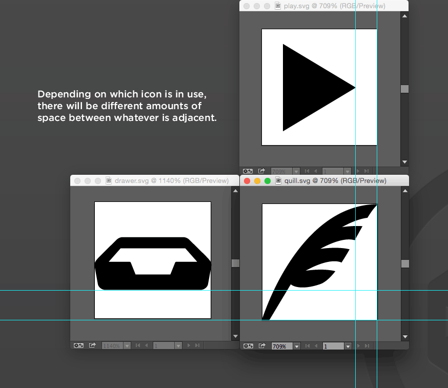
Directional alignment. Since there is an arbitrary amount of whitespace on any given side of any given icon, it’s hard to align things to the edge of an icon or expect a consistent amount of space between an icon and adjacent element.
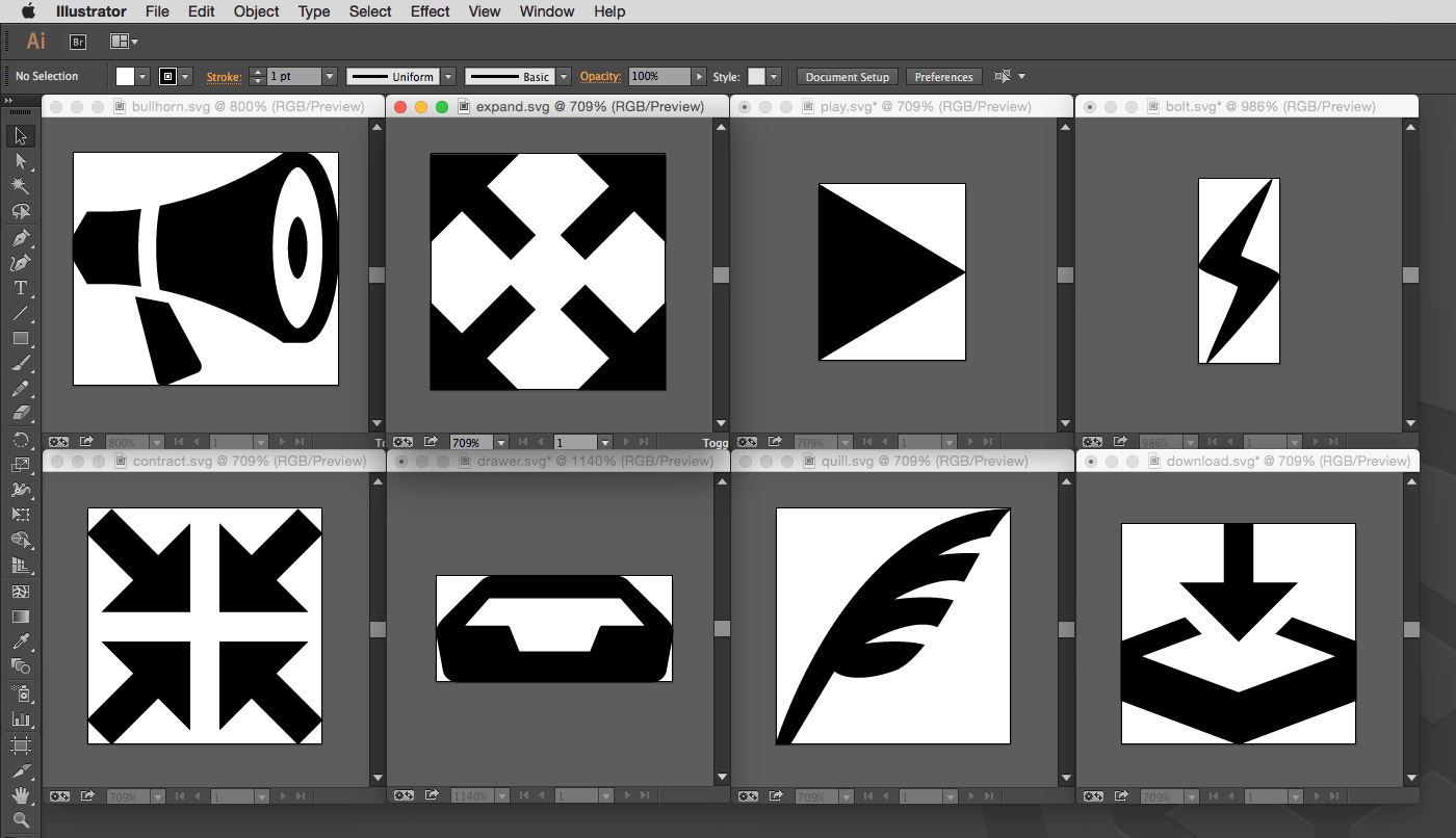
Approach #2: Crop to edges
Again the actual “size” of the artboard doesn’t matter since you’ll likely be applying sizing through CSS anyway, but the artboard should meet the edge of the artwork on all sides. In Illustrator, it’s an easy move:

Here’s what that looks like:
Advantages
Alignment and positioning. If you want to position an icon in the upper right corner of an element, it’s going to go there and look nice and aligned. There won’t be some weird arbitrary amount of whitespace to compensate for.

Disadvantages
Sizing inconsistency. All the icons have different aspect ratios now. That’s not a huge problem for complexity, because you can still size them with CSS with a fixed width/height and they will center within that area (assuming a default preserveAspectRatio). But, that will affect their sizing. The closer any given icons aspect ratio is to a square, the bigger it will seem (it will fill the space given). Taller or wider icons will need to shrink to fit in the space and appear smaller. So consistant and other-icon-relative sizing is harder.

Winner?
I’m afraid I just can’t pick one. I really like the positioning consistency of cropped icons, but the inconsistent sizing can drive me nuts. And I’m sure it would work exactly the opposite if I changed.
Other Considerations
Consistency through boxes: If in every single instance of using SVG you are placing the icon within a visually-defined box, alignment becomes a non-issue since you can align the boxes and they will look fine.

You can always do one-offs: Let’s say you have one really long and skinny arrow shape. You can always do some special CSS just for that one. I wouldn’t change a whole system based on a handful of outliers. This is about the system as a whole.

I used exact sizes personally. It’s much easier as a workflow when you have a large library of icons, but more importantly I’d rather work around the distribution issue rather than trying to maintain every possible view box size.
The other upside is one offs are a bit easier. I’ve found cropping the art board for logos is definitely the way to go.
Siri, Remind me to proofread my post next time.
Is there a way to combine a bunch of SVGs into something like a “Sprite” so you only have a single HTTP request for all of your icons.
If so how do you go about that? How do you determine what icon shows up where? Thanks.
SVG-sprites are awesome… although they aren’t quite like a sprite that you usually use for jpgs and pngs.
http://lmgtfy.com/?q=svg+sprites
While it’s possible, browser support is lacking for certain spriting techniques and use-cases. I like the :target method detailed in this SitePoint article on SVG sprites but have had problems with its support in certain browsers, especially if it used in a CSS background. Chris posted some good caveats on support that you might want to read.
I would hightly suggest using Sketch 3 for SVG (well, really ALL your web design needs)… makes dealing with SVG’s a delight and you don’t have to use a heavy tool like Illustrator.
Just my $0.02! Thanks for the post, as usual!
Artboards can be helpful if a consistent whitespace around the graphic is a design consideration, for instance in brand guidelines.
Sometimes I think I just need to do everything 256×256 and nicely snug against the edges. Then remember that using CSS I can scale them appropriately and have my padding or whatever dealing with the rest.
If you would only use established standards you would know that sizing is relative to the screen which for HD displays is 1920 by 1080.
BTW Chris; svgdesign.guru is a URL
Great article, thanks Chris! My team and I have decided to split our images in two categories: icons and symbols. For icons we plan to use 100 x 100 px artboards, and for everything else (symbols) we’ll crop the artwork to its edges. It’s not a perfect solution but I think it’s the best solution for now.
An arbitrary rubric, but I’d determine if the project will have more regularly proportioned (probably square, but really I mean consistent) icons, or irregularly proportioned icons. If most of the icons are regular, then imposing a consistent size make sense, since you’ll have fewer exceptions to code around, and consistency is helpful. Likewise, if most of your icons are irregular, then why impose a constraint that you’ll constantly fight against.
Most sites will likely have consistently square icons, so we can deal with the exceptions with a little masking.
Great article, Chris! It seems like a combination of approaches may be the solution, since no one approach is perfect for every situation. Kind of like what Emma mentioned above: grouping SVGs based on their function and adjusting your approach for each group.
Very thoughtful post!
If you really want to be able to switch back and forth between icons with matching size and aspect ratio and icons that are just as big as they need to be for embedding in natural text flow, you could use nested <symbol> elements. The inner symbol would be cropped to the graphic dimensions, but then it could be <use>d to place it inside another symbol with the standard viewbox aspect ratio.
Of course, you could specify
preserveAspectRatiovalues on either symbol type if you wanted a behaviour other than centering within the SVG in both directions.For actually implementing these in Illustrator, you'd want to use the crop-to-fit artboard technique to generate the "original" view boxes, and then work in an XML editor for positioning and sizing the standard versions.
P.S. Chris, when you going to fix the markdown parser vs code sanitizer conflict? Writing code in plain HTML is just annoying...
I think I first came across it in an older version of Google’s Android icon guidelines, but I thought there was an approach that involves surface area and visual centre-of-gravity.
Google’s current guide is here, but doesn’t seem to discuss this anymore: http://developer.android.com/design/style/iconography.html
I’m guessing it didn’t work out for Android, but as a designer newbie I don’t fully appreciate the benefits of the visual centre-of-gravity approach. /shrug