A little while back, I was in the process of adding focus styles to An Event Apart’s web site. Part of that was applying different focus effects in different areas of the design, like white rings in the header and footer and orange rings in the main text. But in one place, I wanted rings that were more obvious—something like stacking two borders on top of each other, in order to create unusual shapes that would catch the eye.

I toyed with the idea of nesting elements with borders and some negative margins to pull one border on top of another, or nesting a border inside an outline and then using negative margins to keep from throwing off the layout. But none of that felt satisfying.
It turns out there are a number of tricks to create the effect of stacking one border atop another by combining a border with some other CSS effects, or even without actually requiring the use of any borders at all. Let’s explore, shall we?
Outline and box-shadow
If the thing to be multi-bordered is a rectangle—you know, like pretty much all block elements—then mixing an outline and a spread-out hard box shadow may be just the thing.
Let’s start with the box shadow. You’re probably used to box shadows like this:
.drop-me {
  background: #AEA;
  box-shadow: 10px 12px 0.5rem rgba(0,0,0,0.5);
}
That gets you a blurred shadow below and to the right of the element. Drop shadows, so last millennium! But there’s room, and support, for a fourth length value in box-shadow that defines a spread distance. This increases the size of the shadow’s shape in all directions by the given length, and then it’s blurred. Assuming there’s a blur, that is.
So if we give a box shadow no offset, no blur, and a bit of spread, it will draw itself all around the element, looking like a solid border without actually being a border.
.boxborder-me {
  box-shadow: 0 0 0 5px firebrick;
}
This box-shadow “border” is being drawn just outside the outer border edge of the element. That’s the same place outlines get drawn around block boxes, so all we have to do now is draw an outline over the shadow. Something like this:
.boxborder-me {
  box-shadow: 0 0 0 5px firebrick;
  outline: dashed 5px darkturquoise;
}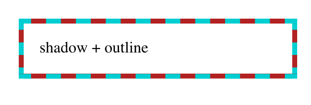
Bingo. A multicolor “border” that, in this case, doesn’t even throw off layout size, because shadows and outlines are drawn after element size is computed. The outline, which sits on top, can use pretty much any outline style, which is the same as the list of border styles. Thus, dotted and double outlines are possibilities. (So are all the other styles, but they don’t have any transparent parts, so the solid shadow could only be seen through translucent colors.)
If you want a three-tone effect in the border, multiple box shadows can be created using a comma-separated list, and then an outline put over top that. For example:
.boxborder-me {
  box-shadow: 0 0 0 1px darkturquoise,
              0 0 0 3px firebrick,
              0 0 0 5px orange,
              0 0 0 6px darkturquoise;
  outline: dashed 6px darkturquoise;
}
Taking it back to simpler effects, combining a dashed outline over a spread box shadow with a solid border of the same color as the box shadow creates yet another effect:
.boxborder-me {
  box-shadow: 0 0 0 5px firebrick;
  outline: dashed 5px darkturquoise;
  border: solid 5px darkturquoise;
}
The extra bonus here is that even though a box shadow is being used, it doesn’t fill in the element’s background, so you can see the backdrop through it. This is how box shadows always behave: they are only drawn outside the outer border edge. The “rest of the shadow,” the part you may assume is always behind the element, doesn’t exist. It’s never drawn. So you get results like this:

This is the result of explicit language in the CSS Background and Borders Module, Level 3, section 7.1.1:
An outer box-shadow casts a shadow as if the border-box of the element were opaque. Assuming a spread distance of zero, its perimeter has the exact same size and shape as the border box. The shadow is drawn outside the border edge only: it is clipped inside the border-box of the element.
(Emphasis added.)
Border and box-shadow
Speaking of borders, maybe there’s a way to combine borders and box shadows. After all, box shadows can be more than just drop shadows. They can also be inset. So what if we turned the previous shadow inward, and dropped a border over top of it?
.boxborder-me {
  box-shadow: 0 0 0 5px firebrick inset;
  border: dashed 5px darkturquoise;
}
That’s… not what we were after. But this is how inset shadows work: they are drawn inside the outer padding edge (also known as the inner border edge), and clipped beyond that:
An inner box-shadow casts a shadow as if everything outside the padding edge were opaque. Assuming a spread distance of zero, its perimeter has the exact same size and shape as the padding box. The shadow is drawn inside the padding edge only: it is clipped outside the padding box of the element.
(Ibid; emphasis added.)
So we can’t stack a border on top of an inset box-shadow. Maybe we could stack a border on top of something else…?
Border and multiple backgrounds
Inset shadows may be restricted to the outer padding edge, but backgrounds are not. An element’s background will, by default, fill the area out to the outer border edge. Fill an element background with solid color, give it a thick dashed border, and you’ll see the background color between the visible pieces of the border.
So what if we stack some backgrounds on top of each other, and thus draw the solid color we want behind the border? Here’s step one:
.multibg-me {
  border: 5px dashed firebrick;
  background:
    linear-gradient(to right, darkturquoise, 5px, transparent 5px);
  background-origin: border-box;
}
We can see, there on the left side, the blue background visible through the transparent parts of the dashed red border. Add three more like that, one for each edge of the element box, and:
.multibg-me {
  border: 5px dashed firebrick;
  background:
    linear-gradient(to top, darkturquoise, 5px, transparent 5px),
    linear-gradient(to right, darkturquoise, 5px, transparent 5px),
    linear-gradient(to bottom, darkturquoise, 5px, transparent 5px),
    linear-gradient(to left, darkturquoise, 5px, transparent 5px);
  background-origin: border-box;
}
In each case, the background gradient runs for five pixels as a solid dark turquoise background, and then has a color stop which transitions instantly to transparent. This lets the “backdrop” show through the element while still giving us a “stacked border.”
One major advantage here is that we aren’t limited to solid linear gradients—we can use any gradient of any complexity, just to spice things up a bit. Take this example, where the dashed border has been made mostly transparent so we can see the four different gradients in their entirety:
.multibg-me {
  border: 15px dashed rgba(128,0,0,0.1);
  background:
    linear-gradient(to top,    darkturquoise, red 15px, transparent 15px),
    linear-gradient(to right,  darkturquoise, red 15px, transparent 15px),
    linear-gradient(to bottom, darkturquoise, red 15px, transparent 15px),
    linear-gradient(to left,   darkturquoise, red 15px, transparent 15px);
  background-origin: border-box;
}
If you look at the corners, you’ll see that the background gradients are rectangular, and overlap each other. They don’t meet up neatly, the way border corners do. This can be a problem if your border has transparent parts in the corners, as would be the case with border-style: double.
Also, if you just want a solid color behind the border, this is a fairly clumsy way to stitch together that effect. Surely there must be a better approach?
Border and background clipping
Yes, there is! It involves changing the clipping boxes for two different layers of the element’s background. The first thing that might spring to mind is something like this:
.multibg-me {
  border: 5px dashed firebrick;
  background: #EEE, darkturquoise;
  background-clip: padding-box, border-box;
}
But that does not work, because CSS requires that only the last (and thus lowest) background be set to a <color> value. Any other background layer must be an image.
So we replace that very-light-gray background color with a gradient from that color to that color: this works because gradients are images. In other words:
.multibg-me {
  border: 5px dashed firebrickred;
  background: linear-gradient(to top, #EEE, #EEE), darkturquoise;
  background-clip: padding-box, border-box;
}
The light gray “gradient” fills the entire background area, but is clipped to the padding box using background-clip. The dark turquoise fills the entire area and is clipped to the border box, as backgrounds always have been by default. We can alter the gradient colors and direction to anything we like, creating an actual visible gradient or shifting it to all-white or whatever other linear effect we would like.
The downside here is that there’s no way to make that padding-area background transparent such that the element’s backdrop can be seen through the element. If the linear gradient is made transparent, then the whole element background will be filled with dark turquoise. Or, more precisely, we’ll be able to see the dark turquoise that was always there.
In a lot of cases, it won’t matter that the element background isn‘t see-through, but it’s still a frustrating limitation. Isn’t there any way to get the effect of stacked borders without wacky hacks and lost capabilities?
Border images
In fact, what if we could take an image of the stacked border we want to see in the world, slice it up, and use that as the border? Like, say, this image becomes this border?

Here’s the code to do exactly that:
.borderimage-me {
  border: solid 5px;
  border-image: url(triple-stack-border.gif) 15 / 15px round;
}
First, we set a solid border with some width. We could also set a color for fallback purposes, but it’s not really necessary. Then we point to an image URL, define the slice inset(s) at 15 and width of the border to be 15px, and finally the repeat pattern of round.
There are more options for border images, which are a little too complex to get into here, but the upshot is that you can take an image, define nine slices of it using offset values, and have those images used to synthesize a complete border around an image. That’s done by defining offsets from the edges of the image itself, which in this case is 15. Since the image is a GIF and thus pixel-based, the offsets are in pixels, so the “slice lines” are set 15 pixels inward from the edges of the image. (In the case of an SVG, the offsets are measured in terms of the SVG’s coordinate system.) It looks like this:

Each slice is assigned to the corner or side of the element box that corresponds to itself; i.e., the bottom right corner slice is placed in the bottom right corner of the element, the top (center) slice is used along the top edge of the element, and so on.
If one of the edge slices is smaller than the edge of the element is long—which almost always happens, and is certainly true here—then the slice is repeated in one of a number of ways. I chose round, which fills in as many repeats as it can and then scales them all up just enough to fill out the edge. So with a 70-pixel-long slice, if the edge is 1,337 pixels long, there will be 19 repetitions of the slice, each of which is scaled to be 70.3 pixels wide. Or, more likely, the browser generates a single image containing 19 repetitions that’s 1,330 pixels wide, and then stretches that image the extra 7 pixels.
You might think the drawback here is browser support, but that turns out not to be the case.
This browser support data is from Caniuse, which has more detail. A number indicates that browser supports the feature at that version and up.
Desktop
| Chrome | Firefox | IE | Edge | Safari |
|---|---|---|---|---|
| 56 | 50 | 11 | 12 | 9.1 |
Mobile / Tablet
| Android Chrome | Android Firefox | Android | iOS Safari |
|---|---|---|---|
| 123 | 124 | 123 | 9.3 |
Just watch out for the few bugs (really, implementation limits) that linger around a couple of implementations, and you’ll be fine.
Conclusion
While it might be a rare circumstance where you want to combine multiple “border” effects, or stack them atop each other, it’s good to know that CSS provides a number of ways to get the job done, and that most of them are already widely supported. And who knows? Maybe one day there will be a simple way to achieve these kinds of effects through a single property, instead of by mixing several together. Until then, happy border stacking!

2 notes:
I was surprised there’s no mention of outline-offset here! That has been a property I reach for in similar situations.
Given that various accessibility techniques are often relied upon in combination, are there any gotchas with any of the techniques when combined with high contrast mode? I recall some background and box shadows get dropped which could mean invisible focus styles. But I’m not sure.
Mark, I made a CodePen with all the code samples from above. Then I opened in Edge in debug mode and switched to Windows High Contrast Mode. I took a screen shot and embedded it in the pen (since I cannot post an image here): https://s.codepen.io/aardrian/debug/EMdvdO
In short, shadows go away, outlines are retained but reset to the text color (and so should be used sparingly if a control is interactive), and gradient colors are retained.
For future reference: The CSS Working Group agreed a couple years back that stacked borders or outlines should be supported natively in CSS (by allowing a list of border-colors/styles).
There are still some details being discussed in that (long) thread about how it would work, but the main argument for it is the same as what started Eric’s exploration here — creating robust focus styles that are high contrast against many different component and background colors.
Thanks, Amelia! My impression was that multiple borders would be nested, not stacked, as per section 3 of the Editor’s Draft, at least when I wrote this. Is stacking also under discussion?