A few links that I’ve been holding onto:
- “How to pick a Typeface for User Interface and App Design?” by Oliver Schöndorfer. I like the term “functional text” for everything that isn’t display or body type. Look for clearly distinct letters, open shapes, and little contrast. This reminds me of how we have the charmap screen on the Coding Fonts site, but still need to re-shoot most of the screenshots so they all have it.
- “Uniwidth typefaces for interface design“ by Lisa Staudinger. “Uniwidth typefaces, on the other hand, are proportionally-spaced typefaces, but every character occupies the same space across different cuts or weights.” So you can change the
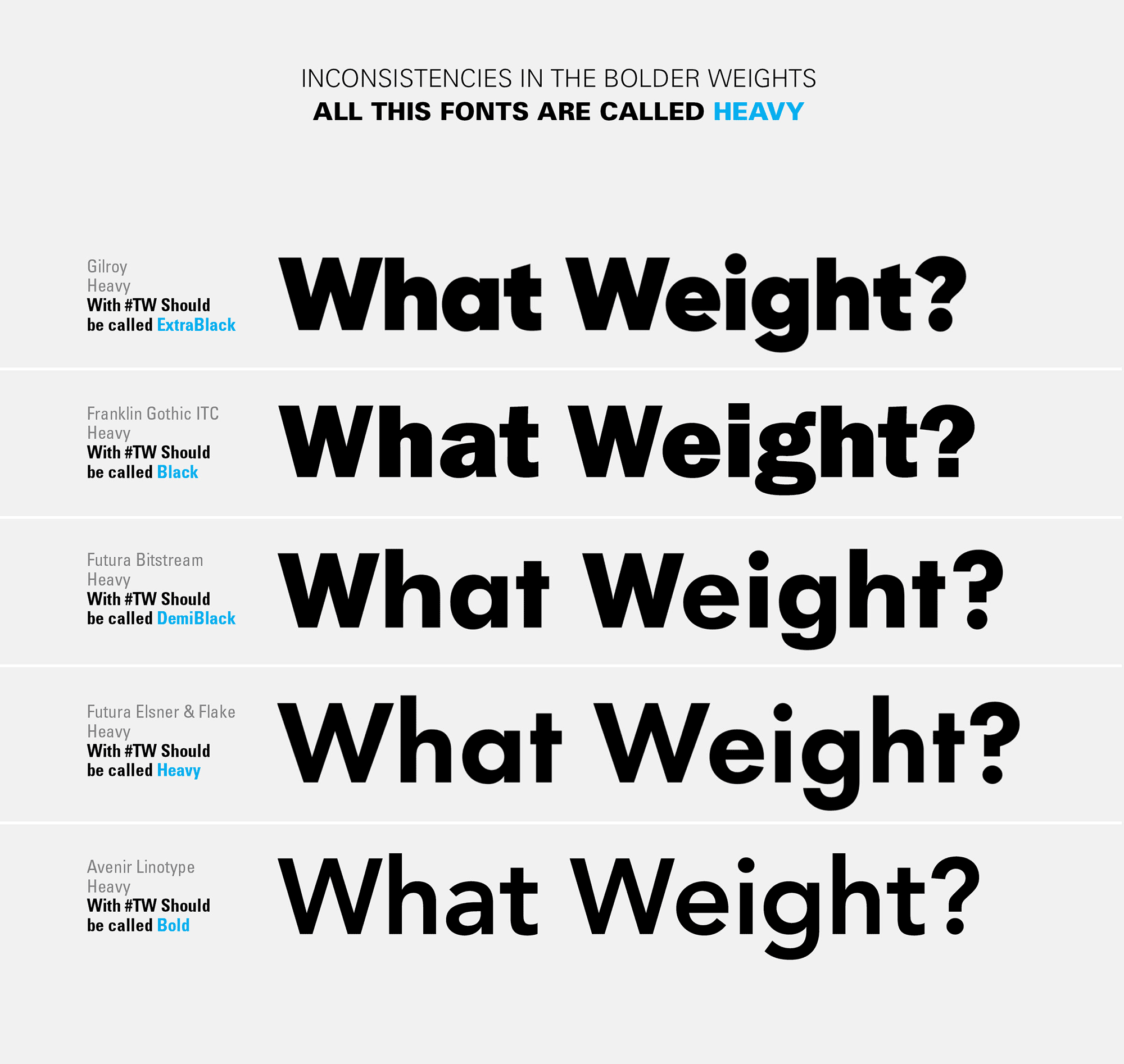
font-weightbut the box the type occupies doesn’t change. Nice for menus! This is a different concept, but it reminds me of the Operator typeface (as opposed to Operator Mono) which “is a natural width family, its characters differing in proportion according to their weight and underlying design.” - “Should we standardize the naming of font weights?” by Pedro Mascarenhas. As in, the literal names as opposed to
font-weightin CSS where we already have names and numeric values but are at the mercy of the font. The image of how dramatically different fonts, say Gilroy Heavy and Avenir Heavy, makes the point. - “About Legibility and Readability” by Bruno Maag. “Functional accessibility” is another good term. We can create heuristics like specific
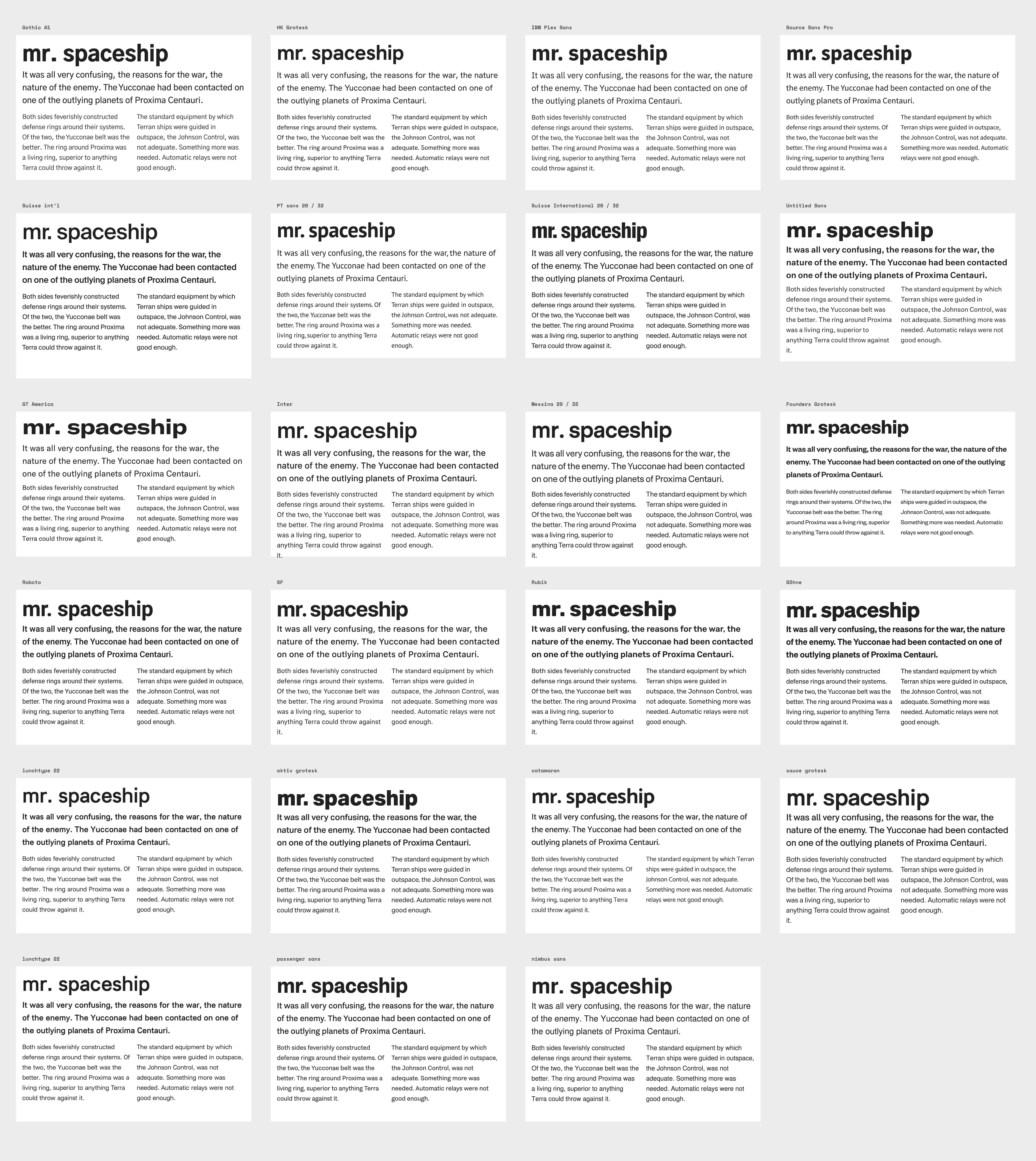
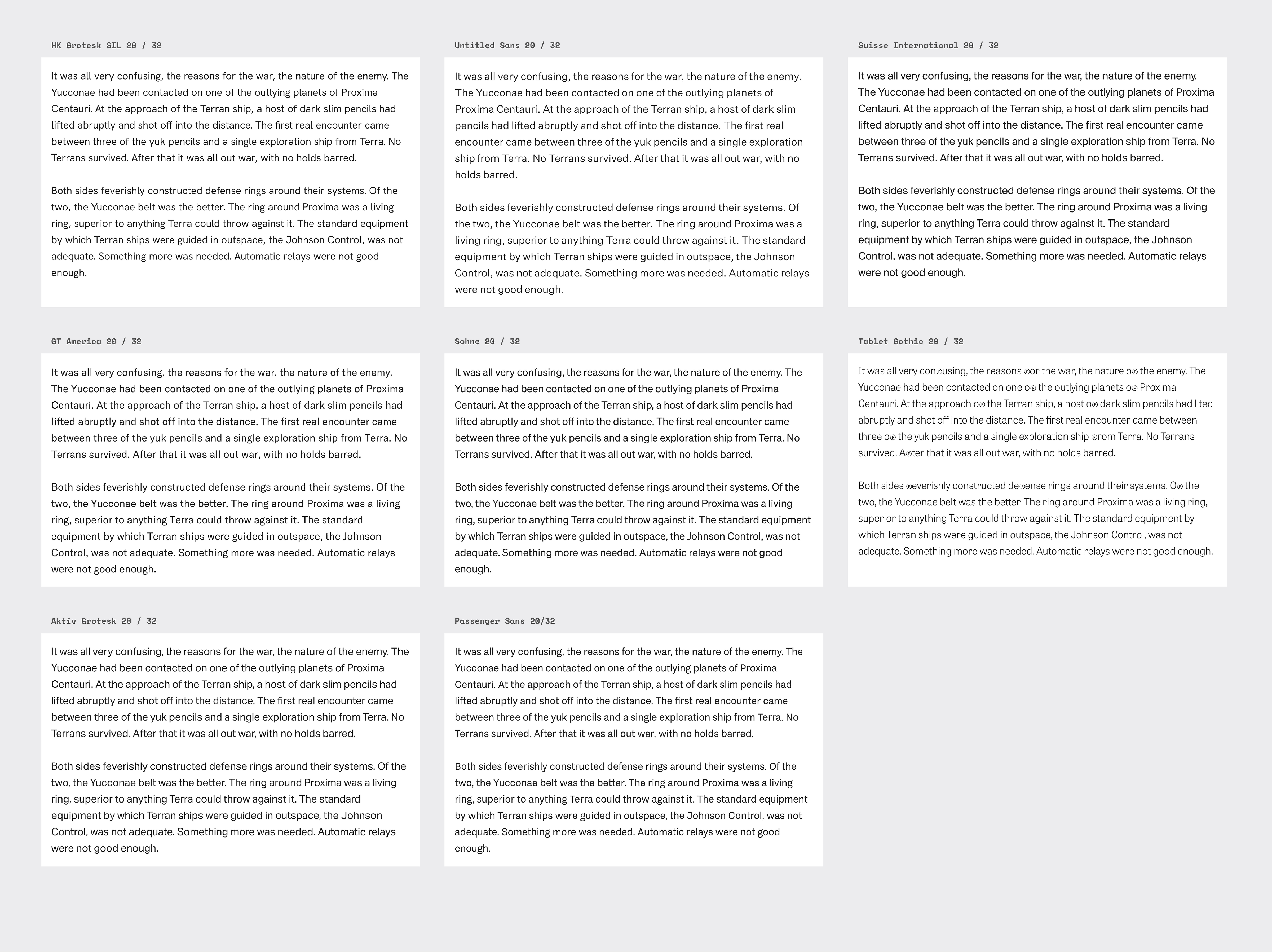
font-sizes that make for good accessibility, but all nuance is lost there. Good typography involves making type readable and legible. Generally, anyway. I realize typography is a broad world and you might be designing a grungy skateboard that is intentionally neither readable nor legible. But if you do achieve readability and legibility, it has sorts of benefits, like aesthetics and me-taking-you-seriously, but even better: accessibility. - “Font size is useless; let’s fix it” by Nikita Prokopov. “Useless” is maybe strong since it, ya know, controls the font size. But this graphic does make the point. I found myself making that same point recently. Across typefaces, an identical
font-sizecan feel dramatically different. - “The sans selection” by Tejas Bhatt. A journey from a huge selection of fonts for a long-form journalism platform down to just a few, then finally lands on Söhne. I enjoyed all of the very practical considerations like (yet again) a tall x-height, not-too-heavy, and even price (although the final selection was among the most costly of the bunch).
- “Plymouth Press” by James Brocklehurst. You don’t see many “SVG fonts” these days, even though the idea (any SVG can be a character) is ridiculously cool. This one, being all grungy, has far too many vector points to be practical on the web, but that isn’t a big factor for local design software use.
- “Beyond Calibri: Finding Microsoft’s next default font” (I guess nobody wanted that byline). I’m so turned off by the sample graphics they chose for the blog post that I can’t bring myself to care, even though this should be super interesting to follow because of the scale of use here. The tweet is slightly better.
- “Why you should Self-Host Google Fonts in 2021″ by Gijo Varghese. I am aware of “Cache Partitioning” (my site can’t use cached fonts from your site, even if they both come from Google) but I could have seen myself trotting out the other two arguments in a discussion about this and it’s interesting to see them debunked here.

There is also a great article about accessible fonts – https://uxdesign.cc/testing-fonts-for-accessibility-817f47011078
Inspired by this article – https://css-tricks.com/a11y-is-web-accessibility/ – I created an illustration about “accessibIl1ty” as an alternative to “a11y”. I wanted to visualize several legibility and readability issues such as: Il1-test, geometric and confusable character shapes (a, c, e, s), thin strokes, low color contrast, too bright background and tight letter spacing – https://www.behance.net/gallery/113484209/accessibIl1ty-an-alternative-to-a11y