The DayTrip website uses a neat effect on its page header that distorts the background image with an animated, grainy texture. The effect is subtle but creates a dusty, retro vibe.
The effect is very subtle. You can see the the difference where the effect is in place on the right and disabled on the left:

We can create the same rustic effect with a single image and a little bit of CSS.
Step 1: Setting Things Up
First, let’s set up the our page header. We’re going to use a common pattern where a background image takes up the entire space.
.page-header {
  height: 100vh;
  background-image: url("/path/to/image.jpg");
}
Here’s an example to get us started:
See the Pen RpLKdx by Geoff Graham (@geoffgraham) on CodePen.
Step 2: Selecting a Texture
Next, we need an image with a grainy texture to it. You can create this yourself. Subtle Patterns also has a number of nice options, including this one that we’ll use for our demo. Note that the image does not need to be huge. Something in the neighborhood of 400px square will do the trick.
The idea is that we will overlay the grainy texture on top of the .page-header. We can use the :after pseudo-element on .page-header so there is no need to create another element.
.page-header {
height: 100vh;
background-image: url("/path/to/image.jpg");
}
.page-header:after {
/* content is required when using :after */
content: "";
/* The grainy image */
background-image: url("/path/to/grainy/image.jpg");
/* Specify a height and width above and beyond the page header for movement */
height: 300%;
width: 300%;
/* We're using opacity in place of a transparent image */
opacity: 0.3;
/* We'll need this when the animation kicks in to hold the position of the texture */
position: fixed;
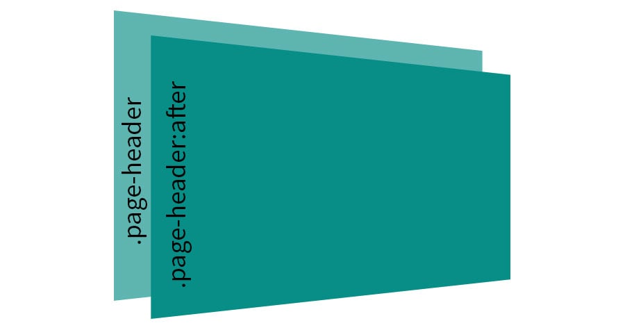
}Note that we placed a height and width on the pseudo-element as well as a top and left so that it actually exceeds the boundary of the page header and is centered to it. We want to do this so that the grainy texture layer has room to move around without exposing the page header layer underneath. This means are layers are arranged more like this:

Now we have a nice big page header with a grainy image on top:
See the Pen evGvKg by Geoff Graham (@geoffgraham) on CodePen.
Step 3: Animating the Grainy Layer
The last thing we need to do is animate the grainy layer. This is the effect that we’re going after and gives the page header that retro, analog appeal.
The DayTrip site uses the following to define the animation keyframes:
@keyframes grain {
  0%, 100% { transform:translate(0, 0) }
  10% { transform:translate(-5%, -10%) }
  20% { transform:translate(-15%, 5%) }
  30% { transform:translate(7%, -25%) }
  40% { transform:translate(-5%, 25%) }
  50% { transform:translate(-15%, 10%) }
  60% { transform:translate(15%, 0%) }
  70% { transform:translate(0%, 15%) }
  80% { transform:translate(3%, 35%) }
  90% { transform:translate(-10%, 10%) }
}
It’s sort of tough to visualize what that code means, but it’s basically moving the top grainy layer around in a zig-zag pattern. Here’s an illustration of what that looks like at a smaller scale:

Now all we have to do is apply the keyframes to .page-header:after to see it take effect. We’ll set the animation to play for 8 seconds and loop infinitely:
.page-header:after {
  /* content is required when using :after */
  content: "";
  /* The animation */
  animation: grain 8s steps(10) infinite;
  /* The grainy image */
  background-image: url("/path/to/grainy/image.jpg");
  /* Specify a height and width above and beyond the page header for movement */
  height: 300%;
  width: 300%;
  /* We're using opacity in place of a transparent image */
  opacity: 0.3;
  /* We'll need this when the animation kicks in to hold the position of the texture */
  position: fixed;
}
Putting it All Together
Here’s the full snippet with all the pieces in place. Note that we are assuming the use of Autoprefixer for all vendor prefixing.
.page-header {
  height: 100vh;
  background-image: url("/path/to/image.jpg");
}

.page-header:after {
  animation: grain 8s steps(10) infinite;
  background-image: url("/path/to/grainy/image.jpg");
  content: "";
  height: 300%;
  left: -50%;
  opacity: 0.3;
  position: fixed;
  top: -100%;
  width: 300%;
}

@keyframes grain {
  0%, 100% { transform:translate(0, 0) }
  10% { transform:translate(-5%, -10%) }
  20% { transform:translate(-15%, 5%) }
  30% { transform:translate(7%, -25%) }
  40% { transform:translate(-5%, 25%) }
  50% { transform:translate(-15%, 10%) }
  60% { transform:translate(15%, 0%) }
  70% { transform:translate(0%, 15%) }
  80% { transform:translate(3%, 35%) }
  90% { transform:translate(-10%, 10%) }
}
See the Pen Animated Grainy Effect by Geoff Graham (@geoffgraham) on CodePen.

Ha, no kiddin’. I don’t think I’d have ever noticed if it weren’t pointed out— I quite like it now that I’ve seen it though.
LOL!
It’s subtle, but try turning it off in web inspector on Daytrip and the image is decidedly more flat. The animation also seems to give the page some life.
Now that I understand how it works, I can see the grain moving and changing directions. Trippy CSS trick.
Note: Link to Subtle Patterns is broken.
If the toptal.com site looks like too much of ad whoring, you might want to link to the github repo instead ;)
cu, w0lf.
Well, I have been using gifs. Only did it once and it never made it to the public.
Here is an example (not my code): https://codepen.io/leemark/pen/dJxHp
Are there any limitations to using gifs?
Really simple and tricky effect! Like it
Cheers!
If you remove the opacity from the overlay and use ‘mix-blend-mode: color-dodge;’ then you get a cleaner finish.
interesting technique. just wondering if SVG filter like feTurbulence could help in making this kind of animation.
I’ve seen similar texture animations with SVG like in loading patterns, perhaps they can also provide grainy effect as well…
body{
background-color: black;
}
.main-box{
}
.main-box .box-1{
height: 200px;
width: 200px;
background-color: aqua;
animation-name: demo;
animation-duration: 10s;
animation-iteration-count: infinite;
margin-left: 30%;
}
@keyframes demo {
0%{
transform: translate(0, 0);
background-color: blue;
}
25%{
transform: translate(500px, 0);
background-color: blueviolet;
}
50%{
transform: translate(500px, 500px);
background-color: brown;
}
75%{
transform: translate(0, 500px);
background-color: chartreuse;
}
100%{
transform: translate(0, 0);
background-color: cornflowerblue;
}
}
Ha! I love the idea of swapping colors at the same time. Pretty rad.
I ran into an issue with this, in the keyframes, the one at 80% was
transform: translate(3%, 35%);The35%was a bit extreme on my screen, and moved the top of the grain layer onto the screen, ruining the effect. To fix, I just moved it to a smaller number.Otherwise this is a really brilliant effect, considering this post is a couple of years old, I’m suprised I’ve not seen it more.
But from where I can get grain images?