I got the idea for doing something of the kind when I stumbled across this interactive SVG pie chart. While the SVG code is as compact as it gets (a single <circle> element!), using strokes for creating pie chart slices is problematic as we run into rendering issues on Windows for Firefox and Edge. Plus, in 2018, we can accomplish a lot more with a lot less JavaScript!
I managed to get the following result using a single HTML element for the chart and very little JavaScript. The future should completely eliminate the need for any JavaScript, but more on that later.

Some of you may remember Lea Verou’s Missing Slice talk—my solution is based on her technique. This article dissects how it all works, showing what we can do in terms of graceful degradation and other ways this technique can be put to use.
The HTML
We use Pug to generate the HTML from a data object that contains unitless percentage values for the past three years:
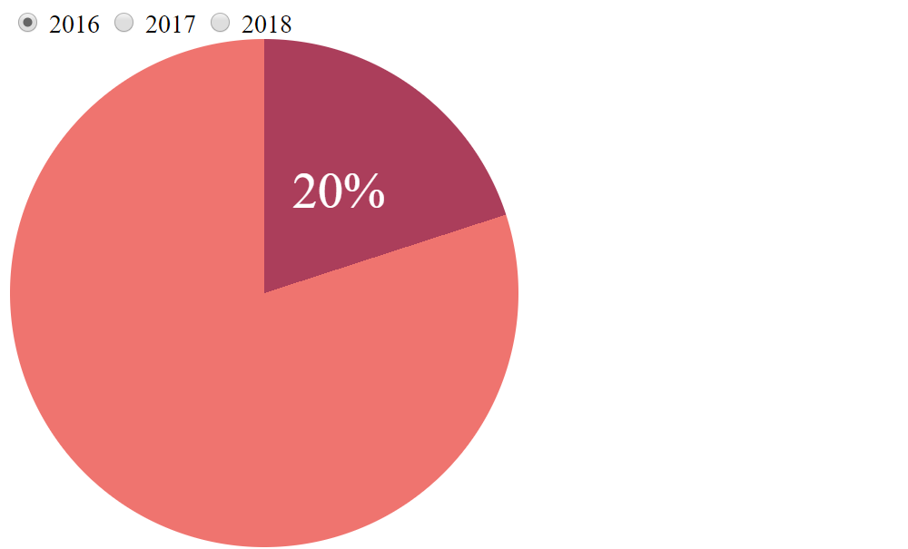
- var data = { 2016: 20, 2017: 26, 2018: 29 }We make all our elements reside in a .wrap element. Then, we loop through our data object and, for each of its properties, we create a radio input with a corresponding label. After these, we add a .pie element to the mix.
- var darr = [], val;

.wrap
  - for(var p in data) {
    - if(!val) val = data[p];
    input(id=`o${p}` name='o' type='radio' checked=val == data[p])
    label(for=`o${p}`) #{p}
    - darr.push(`${data[p]}% for year ${p}`)
  - }
  .pie(aria-label=`Value as pie chart. ${darr.join(', ')}.`
       role='graphics-document group')
The above Pug code compiles to the following HTML:
<style><div class="wrap">
  <input id="o2016" name="o" type="radio" checked="checked"/>
  <label for="o2016">2016</label>
  <input id="o2017" name="o" type="radio"/>
  <label for="o2017">2017</label>
  <input id="o2018" name="o" type="radio"/>
  <label for="o2018">2018</label>
  <div class="pie" aria-label="Value as pie chart. 20% for year 2016, 26% for year 2017, 29% for year 2018." role="graphics-document group"></div>
</div>
Note that we also made sure only the first radio input is checked.
Passing custom properties to the CSS
I normally don’t like putting styles in HTML but, in this particular case, it’s a very useful way to pass custom property values to the CSS and ensure that we only need to update things in one place if we need to change any of our data points—the Pug code. The CSS remains the same.
The trick is to set a unitless percentage --p on the .pie element for every radio input that might be checked:
style
  - for(var p in data) {
    | #o#{p}:checked ~ .pie { --p: #{data[p]} }
  - }
We use this percentage for a conic-gradient() on the .pie element after making sure neither of its dimensions (including border and padding) are 0:
$d: 20rem;

.wrap { width: $d; }

.pie {
  padding: 50%;
  background: conic-gradient(#ab3e5b calc(var(--p)*1%), #ef746f 0%);
}
Note that this requires native conic-gradient() support since the polyfill doesn’t work with CSS variables. At the moment, this limits support to Blink browsers with the Experimental Web Platform features flag enabled, though things are bound to get better.

Update: Chrome 69+ now supports conic-gradient() natively without the flag as well.
We now have a working skeleton of our demo—picking a different year via the radio buttons results in a different conic-gradient()!

Displaying the value
The next step is to actually display the current value and we do this via a pseudo-element. Unfortunately, number-valued CSS variables cannot be used for the value of the content property, so we get around this by using the counter() hack.
.pie:after {
  counter-reset: p var(--p);
  content: counter(p) '%';
}
We’ve also tweaked the color and font-size properties so that our pseudo-element is a bit more visible:

Smoothing things out
We don’t want abrupt changes between values, so we smooth things out with the help of a CSS transition. Before we can transition or animate the --p variable, we need to register it in JavaScript:
CSS.registerProperty({
  name: '--p',
  syntax: '<integer>',
  initialValue: 0,
  inherits: true
});
Note that using <number> instead of <integer> causes the displayed value to go to 0 during the transition as our counter needs an integer. Thanks to Lea Verou for helping me figure this out!
Also note that explicitly setting inherits is mandatory. This wasn’t the case until recently.
This is all the JavaScript we need for this demo and, in the future, we shouldn’t even need this much as we’ll be able to register custom properties from the CSS.
With that out of the way, we can add a transition on our .pie element.
.pie {
  /* same styles as before */
  transition: --p .5s;
}
And that’s it for the functionality! All done with one element, one custom variable, and a sprinkle of Houdini magic!

Prettifying touches
While our demo is functional, it looks anything but pretty at this point. So, let’s take care of that while we’re at it!
Making the pie… a pie!
Since the presence of :after has increased the height of its .pie parent, we absolutely position it. And since we want our .pie element to look more like an actual pie, we make it round with border-radius: 50%.

We also want to display the percentage value in the middle of the dark pie slice.
In order to do this, we first position it dead in the middle of the .pie element. By default, the :after pseudo-element is displayed after its parent’s content. Since .pie has no content in this case, the top-left corner of the :after pseudo-element is in the top-left corner of the parent’s content-box. Here, the content-box is a 0x0 box in the center of the padding-box. Remember that we’ve set the padding of .pie to 50%—a value that’s relative to the wrapper width for both the horizontal and the vertical direction!
This means the top-left corner of :after is in the middle of its parent, so a translate(-50%, -50%) on it shifts it to the left by half its own width and up by half its own height, making its own mid-point coincide with that of .pie.
Remember that %-valued translations are relative to the dimensions of the element they’re applied on along the corresponding axis. In other words, a %-valued translation along the x-axis is relative to the element’s width, a %-valued translation along the y-axis is relative to its height and a %-valued translation along the z-axis is relative to its depth, which is always 0 because all elements are flat two-dimensional boxes with 0 depth along the third axis.

Next, we rotate the value such that the positive half of its x-axis splits the dark slice into two equal halves and then translate it by half a pie radius along this now-rotated x-axis.
See the Pen by thebabydino (@thebabydino) on CodePen.
What we need to figure out is how much to rotate the :after pseudo-element so that its x-axis splits the dark slice into two equal halves. Let’s break that down!
Initially, the x-axis is horizontal, pointing towards the right, so in order to have it in the desired direction, we first need to rotate it so that it points up and going along the starting edge of the slice. Then it needs to rotate clockwise by half a slice.
In order to get the axis to point up, we need to rotate it by -90deg. The minus sign is due to the fact that positive values follow a clockwise direction and we’re going the other way.
See the Pen by thebabydino (@thebabydino) on CodePen.
Next, we need to rotate it by half a slice.
See the Pen by thebabydino (@thebabydino) on CodePen.
But how much is half a slice?
Well, we already know what percentage of the pie this slice represents: it’s our custom property, --p. If we divide that value by 100 and then multiply it by 360deg (or 1turn, it doesn’t matter what unit is used), we get the central angle of our dark slice.
After the -90deg rotation, we need to rotate :after by half this central angle in the clockwise (positive) direction.
This means we apply the following transform chain:
translate(-50%, -50%) rotate(calc(.5*var(--p)/100*1turn - 90deg)) translate(.25*$d);The last translation is by a quarter of $d, which is the wrapper width and gives us the .pie diameter as well. (Since the content-box of .pie is a 0x0 box, it has no border and both its left and right padding are 50% of its wrapper parent width.) The .pie radius is half its diameter, meaning that half the radius is a quarter of the diameter ($d).
Now the value label is positioned where we want it to be:

However, there’s still one problem: we don’t want it to be rotated, as that can look really awkward and neck-bending at certain angles. In order to fix this, we revert the rotation at the end. To make things easier for ourselves, we store the rotation angle in a CSS variable that we call --a:
--a: calc(.5*var(--p)/100*1turn - 90deg);
transform:
  translate(-50%, -50%)
  rotate(var(--a))
  translate(.25*$d)
  rotate(calc(-1*var(--a)));
Much better!
Layout
We want to have the whole assembly in the middle of the screen, so we solve this with a neat little grid trick:
body {
display: grid;
place-items: center center;
margin: 0;
min-height: 100vh
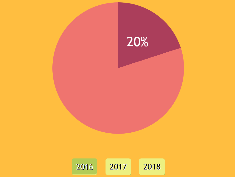
}Alright, this puts the entire .wrap element in the middle:

The next step is to place the pie chart above the radio buttons. We do this with a flexbox layout on the .wrap element:
.wrap {
  display: flex;
  flex-wrap: wrap-reverse;
  justify-content: center;
  width: $d;
}
Styling the radio buttons
…or more accurately, we’re styling the radio button labels because the first thing that we do is hide the radio inputs:
[type='radio'] {
  position: absolute;
  left: -100vw;
}
Since this leaves us with some very ugly labels that are very hard to distinguish from one another, let’s give each one some margin and padding so they don’t look so crammed together, plus backgrounds so that their clickable areas are clearly highlighted. We can even add box and text shadows for some 3D effects. And, of course, we can create a separate case for when their corresponding inputs are :checked.
$c: #ecf081 #b3cc57;

[type='radio'] {
   /* same as before */

  + label {
    margin: 3em .5em .5em;
    padding: .25em .5em;
    border-radius: 5px;
    box-shadow: 1px 1px nth($c, 2);
    background: nth($c, 1);
    font-size: 1.25em;
    text-shadow: 1px 1px #fff;
    cursor: pointer;
  }

  &:checked {
    + label {
      box-shadow: inset -1px -1px nth($c, 1);
      background: nth($c, 2);
      color: #fff;
      text-shadow: 1px 1px #000;
    }
  }
}
We’ve also blown up the font-size a bit and set a border-radius to smooth out the corners:

Final prettifying touches
Let’s set a background on the body, tweak the font of the whole thing and add a transition for the radio labels:
Graceful degradation
While our demo now looks good in Blink browsers, it looks awful in all other browsers… and that’s most browsers!
First off, let’s put our work inside a @supports block that checks for native conic-gradient() support so the browsers that support it will render the pie chart. This includes our conic-gradient(), the padding that gives the pie equal horizontal and vertical dimensions, the border-radius that makes the pie circular, and the transform chain that positions the value label in the middle of the pie slice.
.pie {
  @supports (background: conic-gradient(tan, red)) {
    padding: 50%;
    border-radius: 50%;
    background: conic-gradient(var(--stop-list));
    --a: calc(.5*var(--p)/100*1turn - 90deg);
    --pos: rotate(var(--a))
           translate(#{.25*$d})
           rotate(calc(-1*var(--a)));
    }
  }
}
Now, let’s construct a bar chart as a fallback for all other browsers using linear-gradient(). We want our bar to stretch across the .wrap element so that the horizontal padding is still 50%, but vertically as a narrow bar. We still want the chart to be tall enough to fit the value label. This means we go for a smaller vertical padding. We also decrease the border-radius, since 50% would give us an ellipse and what we need is a rectangle with slightly rounded corners.
The fallback also replaces conic-gradient() with a left-to-right linear-gradient(). Since both the linear-gradient() creating the fallback bar chart and the conic-gradient() creating the pie chart use the same stop list, we can store it in a CSS variable (--stop-list) so that we don’t even have it repeated in the compiled CSS.
Finally, we want the value label in the middle of the bar for the fallback since we don’t have pie slices anymore. This means we store all the post-centering positioning into a CSS variable (--pos) whose value is nothing in the no conic-gradient() support case and the previous transform chain otherwise:
.pie {
  padding: 1.5em 50%;
  border-radius: 5px;
  --stop-list: #ab3e5b calc(var(--p)*1%), #ef746f 0%;
  background: linear-gradient(90deg, var(--stop-list));
  /* same as before */

  &:after {
    transform: translate(-50%, -50%) var(--pos, #{unquote(' ')});
    /* same as before */
  }

  @supports (background: conic-gradient(tan, red)) {
    padding: 50%;
    border-radius: 50%;
    background: conic-gradient(var(--stop-list));
    --a: calc(.5*var(--p)/100*1turn - 90deg);
    --pos: rotate(var(--a))
           translate(#{.25*$d})
           rotate(calc(-1*var(--a)));
    }
  }
}
We also switch to using a flexbox layout on the body (since, as clever as it may be, the grid one is messed up in Edge).
body {
  display: flex;
  align-items: center;
  justify-content: center;
  /* same as before */
}
This all gives us a bar chart fallback for the browsers not supporting conic-gradient().

Responsifying it all
The one problem we still have is that, if the viewport is narrower than the pie diameter, things don’t look so good anymore.
CSS variables and media queries to the rescue!
We set the diameter to a CSS variable (--d) that gets used to set the pie dimensions and the position of the value label in the middle of our slice.
.wrap {
  --d: #{$d};
  width: var(--d);
  /* same as before */

  @media (max-width: $d) { --d: 95vw }
}
Below certain viewport widths, we also decrease the font-size, the margin for our <label> elements, and we don’t position the value label in the middle of the dark pie slice anymore, but rather in the middle of the pie itself:
.wrap {
 /* same as before */

@media (max-width: 265px) { font-size: .75em; }
}

[type='radio'] {
   /* same as before */

  + label {
    /* same as before */

    @media (max-width: 195px) { margin-top: .25em; }
  }
}

.pie{
   /* same as before */

  @media (max-width: 160px) { --pos: #{unquote(' ')} }
}
This gives us our final result: a responsive pie chart in browsers supporting conic-gradient() natively. And, even though that’s sadly just Blink browsers for now, we have a solid fallback that renders a responsive bar chart for all other browsers. We also animate between values—this is even more limited at this point, to just Blink browsers with the Experimental Web Platform features flag enabled.
See the Pen by thebabydino (@thebabydino) on CodePen.
Bonus: radial progress!
We can also apply this concept to build a radial progress indicator like the one below (inspired by this Pen):

The technique is pretty much the same, except we leave the value label dead in the middle and set the conic-gradient() on the :before pseudo-element. This is because we use a mask to get rid of everything, except for a thin outer ring and, if we were to set the conic-gradient() and the mask on the element itself, then the mask would also hide the value label inside and we want that visible.
On clicking the <button>, a new value for our unitless percentage (--p) is randomly generated and we transition smoothly between values. Setting a fixed transition-duration would create a really slow transition between two close values (e.g. 47% to 49%) and a really fast transition when moving between values with a larger gap in between (e.g. 3% to 98%). We get around this by making the transition-duration depend on the absolute value of the difference between the previous value of --p and its newly generated value.
[id='out'] { /* radial progress element */
  transition: --p calc(var(--dp, 1)*1s) ease-out;
}
const _GEN = document.getElementById('gen'),
_OUT = document.getElementById('out');
_GEN.addEventListener('click', e => {
let old_perc = ~~_OUT.style.getPropertyValue('--p'),
new_perc = Math.round(100*Math.random());
_OUT.style.setProperty('--p', new_perc);
_OUT.style.setProperty('--dp', .01*Math.abs(old_perc - new_perc));
_OUT.setAttribute('aria-label', `Graphical representation of generated percentage: ${new_perc}% of 100%.`)
}, false);This gives us a nice animated radial progress indicator for browsers supporting all the new and shiny features. We have a linear fallback for browsers not supporting conic-gradient() natively and no transition in the case of no Houdini support:
See the Pen by thebabydino (@thebabydino) on CodePen.

Great information. Since last week, I am gathering details about the CSS Variables
There are some amazing details on your blog which I didn’t know. Thanks.
Awesome tutorial! So helpful.
Awesome post! I’ve been experimenting with conical gradients and pie charts as well since Chrome enabled the option behind the flag, but Houdini makes it so much better allowing the animation.
Just a silly question, why hide the radio inputs off the viewport? wouldn’t just display none work?
Because afaik, not all screen readers read elements hidden with
display: none. I haven’t tested this. I tried using a screen reader, but found it pretty much impossible to understand how it works. So just to be on the safe side, I don’t setdisplay: noneon stuff that I want to be read by screen readersGreat article, but do you need to use pug? This just adds an extra layer of complexity for those (me) trying to learn the core concepts you’re trying to get across. Just some constructive criticism :)
If you hit “View compiled” (appears in the lower right corner on hover) then you can read the good ol’ HTML.
I had the same issue with the article. The “View compiled” option doesn’t seem to be available on mobile (maybe it’s hidden offscreen?)
What do you find difficult to understand about the Pug? Serious question. Because I’m using Pug instead of plain HTML precisely to remove an extra layer of complexity. I know that seeing this kind of stuff for the first time, I’d have a harder time understanding the HTML. The Pug is just a compact and more easily readable version, that’s why I’m using it, to make it easier to understand because the HTML can sometimes look like somebody just barfed characters on the screen, there’s a lot of repetition and redundancy that makes it harder to figure out where to start from with it.
In any event, I’m adding the compiled version to the article.