I’ve been using Google Hangouts a bunch. It’s really pretty great. One on one or group text chat, audio, or video. Text is archived, maintains history, and is searchable. Video / audio is recordable. It works great on desktop and mobile devices and keeps them in sync. It’s free. Hard to beat that.
Anyway, on a whim I decided to replicate some of the look of the chat window on desktop. Turns out there is a bunch of interesting stuff that comes up! Radial gradients, pseudo elements and animations, flexbox, and more.

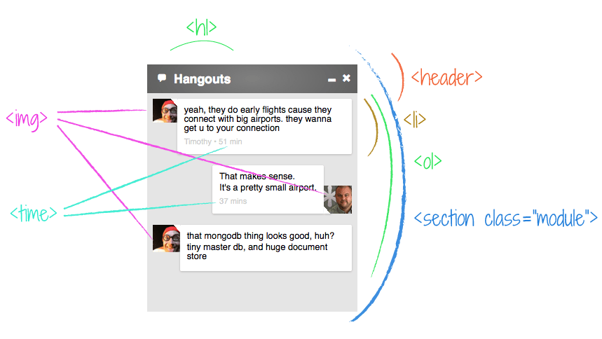
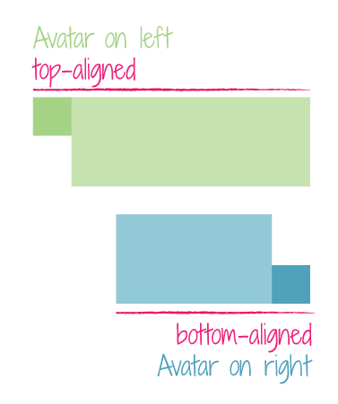
The image above is what we’re going to build.
Overall Structure
Everything we see here is related. That calls for a <section> I think. There will probably be others like it, so that calls for a class name.
<section class="module">
  <!-- everything -->
</section>
The top is more of a “header” than a “heading” because it’s not just text, it has other stuff going on up there. The conversation happens in a very specific order, so I’m thinking <ol> with each group of text/image being a <li>. Within the list item, stuff like images and paragraphs.
I find little charts like this useful. While not comprehensive, it shows the thought process:
<section class="module">

  <header class="top-bar">
    <h1>Hangouts</h1>
    <!-- likely some spans and stuff -->
  </header>

  <ol class="conversation">
    <li>
      <img class="avatar" />
      <div class="message">
        <p>Talkie talk talk.</p>
      </div>
    <li>
  </ol>

</section>
In the header there are some icons. In the demo, I use some quick-and-dirty stuff from We Love Icon Fonts. In production I would use a streamlined icon font made from IcoMoon and inserted with this HTML.
The Pulsing Header
When you get a new message, the header kinda glows/pulses. The solid-color bar now has essentially a radial gradient in the center of it that becomes more and less intense. At peak intensity, it’s like:

Which you could picture like this:
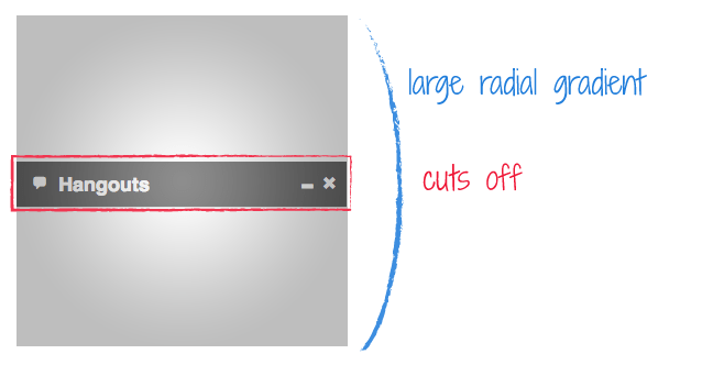
Creating that gradient isn’t quite as easy as you might hope1. You might think it’s the most basic syntax of all, from one gray to another:
background: radial-gradient(#666, #999);But no, that just fills the area with an elliptical gradient (white and black for clarity):

You can force it into a circle, which gets us pretty close:
background: radial-gradient(circle, #666, #999);
But if you really want fine-grained control over how large that gradient in the middle is, you’ll want something like:
background: radial-gradient(center center, circle closest-side, #999999, #666666 800%);
Where you can adjust that 800% to get it just how you want it. That syntax is still prefixed at the time of this writing. With all prefixes it’s like:
background: -webkit-gradient(radial, 50% 50%, 0, 50% 50%, 800, color-stop(0%, #999999), color-stop(800%, #666666));
background: -webkit-radial-gradient(center center, circle closest-side, #999999, #666666 800%);
background: -moz-radial-gradient(center center, circle closest-side, #999999, #666666 800%);
background: -o-radial-gradient(center center, circle closest-side, #999999, #666666 800%);
background: radial-gradient(center center, circle closest-side, #999999, #666666 800%);
And even then it doesn’t work in Opera 12.15. So… instead we could use the most simple gradient syntax and apply it to a pseudo element on the header. That way we can animate the opacity to get the pulse effect anyway.
.top-bar {
  background: #666;
  position: relative;
  overflow: hidden;
}
.top-bar::before {
  content: "";
  position: absolute;
  top: -100%;
  left: 0;
  right: 0;
  bottom: -100%;
  opacity: 0.25;
  background: radial-gradient(white, black);
}
The absolute positioning will make it sit on top of anything inside the header with default static positioning. But we can fix that.
.top-bar > * {
  position: relative;
}
Then animate it:
.top-bar::before {
  animation: pulse 1s ease alternate infinite;
}
@keyframes pulse {
  from { opacity: 0; }
  to { opacity: 0.5; }
}
Which won’t work in everything but it’s a lot better than it was. You’d do it with an extra element / image / jQuery if you deemed the effect critical enough.
Basic Chat Box Setup
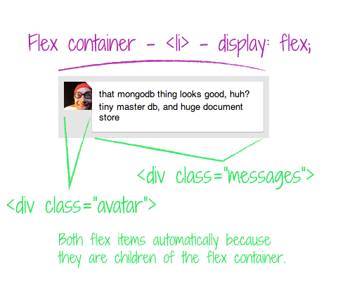
We already decided the conversation itself is an ordered list. Each person talking is a list item. Each individual message is a <p>, but there can be multiple messages together, so those are all grouped in a <div class="message">. We’ll wrap the avatar as well.
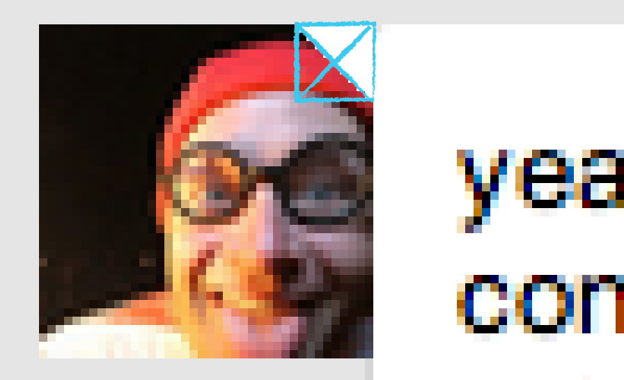
<li>
  <div class="avatar">
    <img src="//s3-us-west-2.amazonaws.com/s.cdpn.io/5/profile/profile-80_9.jpg" />
  </div>
  <div class="messages">
    <p>yeah, they do early flights cause they connect with big airports.  they wanna get u to your connection</p>
    <time datetime="2009-11-13T20:00">Timothy • 51 min</time>
  </div>
</li>
Note that <time> element in there. The actual content of the time element can be whatever makes sense. But the datetime attribute is in a specific format. See more.
We also need a way to distinquish between our messages and other people’s messages. A class will do…
<li class="self">
  <!-- ... -->
</li>
<li class="other">
  <!-- ... -->
</li>
The Variable Width Chat Bubbles
An interesting design feature of this chat design is that the chat “bubble” is only as wide as the longest sentence it contains. It’s a nice feature as it makes very short messages less visually intense and gives rhythm to the conversation.
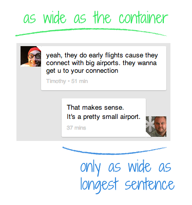
If (avatar + messages = full width) every time, floats would work fine. There is a way we could get this working with floats, but it would require extra non-semantic wrappers. Instead, let’s make this a super-progressive demo and use flexbox for layout2. This is going to make a couple of other things awesomely easy, which we will get to in a moment.
Flex items, by their nature, are just as wide as they need to be. They also exhibit no natural desire to fill their flex container. If they do, they do, if they don’t, they don’t. You can even have them wrap if you want, but we don’t in this case.
So our CSS becomes:
.discussion li {
  display: flex;
}
.avatar {
  width: 40px;
}
.avatar img {
  width: 100%;
  display: block;
}
Deliciously easy.
The Switcheroo
I’m sure you noticed the flip-flop design. Messages from others have the avatar on the left, messages by you have the avatar on the right. Again, do-able with floats but kinda janky. Flexbox makes this extremely easy.
In our markup, we put the avatar first, so that will be the default (“other people”). In list items with the class name “self” (our own messages) we’ll switch the order of layout.
.self {
  justify-content: flex-end;
}
WELL THAT WAS EASY. But wait. It’s not just the horizontal alignment that switches, it’s the vertical alignment too.
Floats would never be able to help us here. Things would get freaky with some placeholder elements and absolutely positioning and who knows what. With flexbox…
.self {
  /* switch horizontal layout */
  justify-content: flex-end;
  /* switch vertical layout */
  align-items: flex-end;
}
Wipes hands.
The Message Bubble Triangles
This has been covered a million times, so I’ll keep it brief. You can make triangles in CSS with zero-width zero-height elements and borders. The borders on elements will meet each other at an angle. So if one is colored and the other is transparent, it will look like a shape.
Here, we’ll color the top and right borders, and leave the bottom and left borders transparent. This makes the type of triangle you see here:
.other .avatar::after {
  content: "";
  position: absolute;
  top: 0;
  right: 0;
  width: 0;
  height: 0;
  border: 5px solid white;
  border-left-color: transparent;
  border-bottom-color: transparent;
}
Then just switch up the positioning of it and which borders are colored for “self” messages:
.self .avatar::after {
  content: "";
  position: absolute;
  bottom: 0;
  left: 0;
  width: 0;
  height: 0;
  border: 5px solid white;
  border-right-color: transparent;
  border-top-color: transparent;
}
The message bubbles have little box-shadows under them. We didn’t cover it, but you can see in the demo. In the “self” messages, the triangle meets the bubble where the shadow is most pronounced, so it looks weird if it’s not there. We can apply the shadow to it to fix it.
.self .avatar::after {
  box-shadow: 1px 1px 2px rgba(black, 0.2);
}
The Demo
1 Here’s a couple of more resources on radial gradients: Impressive Webs, Web Directions
2 I went totally un-prefixed and new-school with all the flexbox stuff in this article, Here’s some resources on that: CSS-Tricks, Dev.Opera. It’s a good time for flexbox right now. IE 10 has a prefixed semi-old version, but IE 11 will be un-prefixed and new. Firefox has supported various versions forever but will be un-prefixed and new in 22 (late June 2013). Safari has old version prefixed in 6 but going unprefixed and new in 7. Chrome has new verison prefixed but is unprefixing in (30?). iOS and Blackberry are prefixing, but at least new syntax. Android at least has old prefixed version.

Nice post Chris (as usual)!!!
Thanks Chris, it’s nice
I love how more and more people are replicating the beautiful designs Google puts into the market. Thanks Chris, lovely little HTML5 & CSS3 tutorial.
Pure awesomeness :D
Thats great Chris :) Thanks for the heads up on flex-box :) :)
Is it really necessary to add all those prefixes for the gradient background?
After all, Mozilla and Opera dropped it a while ago, while the older WebKit syntax is buried. These are all self-updating browsers, so we can fairly pretend they’re always updated to the latest version, can’t we?
I go by Lea Verou’s article when trying to justify not using this to someone. More often than not I abide by it too, depending on the stats of the site I’m working on.
Love when you do these. So insightful and educational. Particularly this one, learnt a lot about gradients and flex :)
Great post, as always . There were a couple of things that I really appreciated.
-The mocks were a fantastic way to explain page layout and your thought process behind them, I can actually see myself using that approach in the future, I’d always put notes inside elements before and that doesn’t translate as nicely for containers.
-Absolute positioning on the before element to force the sizing… I don’t know why this surprises me, but the cleanliness of this is so good. I had been using forced shrink-wrapping on parents with children before and then messing with z-indexes to force the layer to the back. That worked, but was nowhere near as clean as I’d like. I probably will move over to this approach.
There is a lot of great stuff throughout the rest, of course, but these were the things that hit home for me today.
This pulsing header is lovely; very nice catch on this. Great use of Flexbox as well, especially regarding the bottom/right align for the avatar.
About the last two chunks of code, you have a lot of repeated stuff. You might want to put all this stuff into
.avatar:afterthen simply change borders for.self .avatar:after.Cool idea of doing this kind of stuff with client-side languages anyway. :)
Just out of curiosity: is this Google Hangouts for iPhone? Or what Android device do you have? Or is this a specific view…? (Are you in a voice chat or something?)
The chat is the same, but the top bar and stuff is significantly different on my Nexus 4. Screenshot of empty chat: http://cl.ly/image/0S1i2r2d0Q2Q
I believe he’s talking about Hangouts on desktop
Hangouts on desktop? Like in Gmail? I must still be using an old version… mine doesn’t look anything like that, haha.
Ok, my bad… I went to the link at the top of the article and saw there was a “Desktop App” (it’s a special Chrome extension). This is pretty cool! Maybe finally a replacement for Adium…?
First of all, I’m really happy to see that flexbox finally takes its leap into modern applications. I’ve been using it on a regular basis for over a year for a number of projects, and haven’t looked back since. :)
Just a couple of notes on the ordering of item –
In the article it says that in order to switch the elements’ place you use ‘justify-content’. That’s partly true, since you also need to use the ‘order’ property (and in the codepen example you are using it).
The ‘justify’ only does the “pushing” to the other end. The ‘order’ is the “switcheroo” thingy :)
A little hack – In the fiddle you use ‘order:1’ and ‘order:2’. You can just use ‘order:-1’ on the paragraph. That’s not actually different from what you did, just a nice trick for saving a line of code (I’m so lazy).
You can also use ‘flex-direction:row-reverse’. Using the ‘row-reverse’ property also saves us the use of ‘justify-content’ (since after reversing the box, it’s flex-start is the right-end). So the lazy developer that I am I would use that instead :)
Great article :)
Google does have some great designs.
Chris, thanks for the post..
I see you’re using
:afterand::after. Is there a reason for the difference or just a spelling mistake?:afteris the old syntax, and::afteris the new syntax. The new syntax was introduced in order to differentiate pseudo classes (like:hover) from pseudo elements (::afteris a pseudo element).IE8 does not support the new syntax so it’s best to keep using the old syntax for a while.
Really nice article. Amazing how something so simple was the product of a lot of deliberation and creativity!
Very strange, I did not see the correct result in Firefox 21. I went to about:config and noticed that
layout.css.flexbox.enabledwas set tofalse(the default / non-bold setting).Changing that solved it but I was kind of surprised that I needed to do that, I hope the default changes in the next version…
Great article by the way :)
Placing experimental features behind flags is a standard practice in browsers. The next version of Firefox will indeed enable Flexbox by default.
Btw, it’s less than a week until that next version of Firefox :-D
A great example of what the web can do now that just wasn’t possible (or couldn’t be done well/semantically at least) just a couple of years ago. It’s a pity it’s still -too- bleeding edge (and thanks to a lack of IE9 support, we could be a yet another full Windows-version-cycle away from flexbox taking its rightful place as layout-king).
But, maybe with the rise of web technologies in mobile (I’m looking at you, especially, FirefoxOS), this is a good sign of what we can do in that field for presenting on par with native with less holding us back.
The page layout and your thought process behind them, I can actually see myself using that approach in the future. You can also use ‘flex-direction:row-reverse’. Using the ‘row-reverse’ property also saves us the use of ‘justify-content.ECommerce Design Calgary
Great use of flex-box. I think it can be achieved without it though. Here’s my pen using the same html and a mix of absolute positioning and floats.
Always amazing posts Chris! The layout is (almos) perfect. You just missed the rounded corner on the top left of the “other” messages, which left a pixel broken before the arrow. That’s easy to fix with that on line 74:
Thanks for the great post!
Very Constructive and have strong concepts.
Thanks for the share.
This is a great example of how to use Flexbox, could you put together a CodePen to demonstrate the correct cross-browser syntax? It’s very confusing when you add that layer, and I think this would be helpful.
Great post. What program did you use to do the markup on the screen captures? I love the font, colors, etc. that bring out the screenshots.
This kids, is how you get to the top. Find something hard and try to build it using your nothing but your wits.
The biggest lesson here isn’t to do with the actual content of this post, but the demonstration of keeping your eyes open and using discipline to challenge yourself.
Hat tipped!
Some nice code examples Chris! Thanks for sharing. You have given me some ideas for another project I am working on.
Cheers
Laurence
Here’s my beef:
There is some weirdness on some of the box shadows at CSCC line 108
I attempted to fix it with an anonymous
CodePen but I can’t seem to get it quite right.
Also thanks for all of your excellent posts and also shop talk show dot com
Thank’s a lot, I always learn a lot with your code examples.
Thank you!
Under Chrome 28 beta (and 30 canary, I have not tried Chrome 27), the first image is much smaller (19 pixels or so) for some reason. Are you seeing that as well?
I had a problem with this too. What you can do is instead of setting
width: 40px;you can do:min-width: 40px;max-width: 40px;
Will fix the problem!
nice post! Have you such post for Google plus vcard-styled reversible posts? When on the back of post you can find related posts with the same hash-tags?
Hi there Chris,
Awesome post/article. Rather sad that I only came across it now. I am by no means a css expert but for the life of me I cannot get my ‘Hangouts’ module to look anything like yours.
Even if I copy and paste your CodePen HTML and CSS code.
Any ideas?|