One Sunday morning, I woke up a little earlier than I would’ve liked to, thanks to the persistent buzzing of my phone. I reached out, tapped into Facebook Messenger, and joined the conversation. Pretty soon my attention went from the actual conversations to the funky gradient effect of the message bubbles containing them. Let me show you what I mean:

This is a new feature of Messenger, which allows you to choose a gradient instead of a plain color for the background of the chat messages. It’s currently available on the mobile application as well as Facebook’s site, but not yet on Messenger’s site. The gradient appears “fixed” so that chat bubbles appear to change background color as they scroll vertically.
I thought this looked like something that could be done in CSS, so… challenge accepted!
Let’s walk through my thought process as I attempted to recreate it and explain the CSS features that were used to make it work. Also, we’ll see how Facebook actually implemented it (spoiler alert: not the way I did) and how the two approaches compare.
Getting our hands dirty
First, let’s look at the example again to see what exactly it is that we’re trying to achieve here.
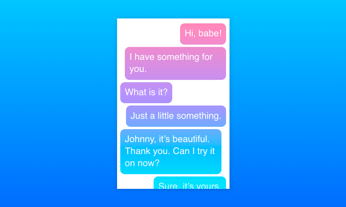
In general, we have a pretty standard messaging layout: messages are divided into bubbles going from top to bottom, ours on the right and the other people in the chat on the left. The ones on the left all have a gray background color, but the ones on the right look like they’re sharing the same fixed background gradient. That’s pretty much it!
Step 1: Set up the layout
This part is pretty simple: let’s arrange the messages in an ordered list and apply some basic CSS to make it look more like an actual messaging application:
<ol class="messages">
  <li class="ours">Hi, babe!</li>
  <li class="ours">I have something for you.</li>
  <li>What is it?</li>
  <li class="ours">Just a little something.</li>
  <li>Johnny, it’s beautiful. Thank you. Can I try it on now?</li>
  <li class="ours">Sure, it’s yours.</li>
  <li>Wait right here.</li>
  <li>I’ll try it on right now.</li>
</ol>
When it comes to dividing the messages to the left and the right, my knee-jerk reaction was to use floats. We could use float: left for messages on the left and float: right for messages on the right to have them stick to different edges. Then, we’d apply clear: both to on each message so they stack. But there’s a much more modern approach — flexbox!
We can use flexbox to stack the list items vertically with flex-direction: column and tell all the children to stick to the left edge (or “align the cross-start margin edges of the flex children with cross-start margin edges of the lines,” if you prefer the technical terms) with align-items: flex-start. Then, we can overwrite the align-items value for individual flex items by setting align-self: flex-end on them.
What, you mean you couldn’t visualize the code based on that? Fine, here’s how that looks:
.messages {
/* Flexbox-specific styles */
display: flex;
flex-direction: column;
align-items: flex-start;
/* General styling */
font: 16px/1.3 sans-serif;
height: 300px;
list-style-type: none;
margin: 0 auto;
padding: 8px;
overflow: auto;
width: 200px;
}
/* Default styles for chat bubbles */
.messages li {
background: #eee;
border-radius: 8px;
padding: 8px;
margin: 2px 8px 2px 0;
}
/* Styles specific to our chat bubbles */
.messages li.ours {
align-self: flex-end; /* Stick to the right side, please! */
margin: 2px 0 2px 8px;
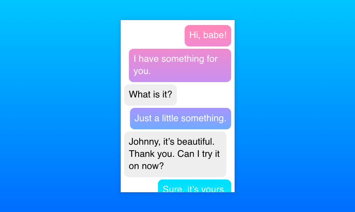
}Some padding and colors here and there and this already looks similar enough to move on to the fun part.
Step 2: Let’s color things in!
The initial idea for the gradient actually came to me from this tweet by Matthias Ott (that Chris recreated in another post):
This is a nasty hack with a pseudo-element on top of the text and mix-blend-mode doesn't work in IE / Edge, but: Yes, this is possible to do with CSS! 😅https://t.co/FLKGvd1YoI
— Matthias Ott (@m_ott) December 3, 2018
The key clue here is mix-blend-mode, which is a CSS property that allows us to control how the content of an element blends in with what’s behind it. It’s a feature that has been present in Photoshop and other similar tools for a while, but is fairly new to the web. There’s an almanac entry for the property that explains all of its many possible values.
One of the values is screen: it takes the values of the pixels of the background and foreground, inverts them, multiplies them, and inverts them once more. This results in a color that is brighter than the original background color.
The description can seem a little confusing, but what it essentially means is that if the background is monochrome, wherever the background is black, the foreground pixels are shown fully and wherever it is white, white remains.

mix-blend-mode: screen; on the foreground, we’ll see more of the foreground as the background is darker.So, for our purposes, the background will be the chat window itself and the foreground will contain an element with the desired gradient set as the background that’s positioned over the background. Then, we apply the appropriate blend mode to the foreground element and restyle the background. We want the background to be black in places where we want the gradient to be shown and white in other places, so we’ll style the bubbles by giving them a plain black background and white text. Oh, and let’s remember to add pointer-events: none to the foreground element so the user can interact with the underlying text.
At this point, I also changed the original HTML a little. The entire chat is a wrapper in an additional container that allows the gradient to stay “fixed” over the scrollable part of the chat:
.messages-container:after {
  content: '';
  background: linear-gradient(rgb(255, 143, 178) 0%, rgb(167, 151, 255) 50%, rgb(0, 229, 255) 100%);
  position: absolute;
  left: 0;
  top: 0;
  height: 100%;
  width: 100%;
  mix-blend-mode: screen;
  pointer-events: none;
}

.messages li {
  background: black;
  color: white;
  /* rest of styles */
}
The result looks something like this:
Step 3: Exclude some messages from the gradient
Now the gradient is being shown where the text bubbles are under it! However, we only want it to be shown over our bubbles — the ones along the right edge. A hint to how that can be achieved is hidden in MDN’s description of the mix-blend-mode property:
The
mix-blend-modeCSS property sets how an element’s content should blend with the content of the element’s parent and the element’s background.
That’s right! The background. Of course, the effect only takes into account the HTML elements that are behind the current element and have a lower stack order. Fortunately, the stacking order of elements can easily be changed with the z-index property. So all we have to do is to give the chat bubbles on the left a higher z-index than that of the foreground element and they will be raised above it, outside of the influence of mix-blend-mode! Then we can style them however we want.
Let’s talk browser support
At the time of writing, mix-blend-mode is not supported at all in Internet Explorer and Edge. In those browsers, the gradient is laid over the whole chat and others’ bubbles appear on top of it, which is not an ideal solution.
This browser support data is from Caniuse, which has more detail. A number indicates that browser supports the feature at that version and up.
Desktop
| Chrome | Firefox | IE | Edge | Safari |
|---|---|---|---|---|
| 41 | 32 | No | 79 | TP |
Mobile / Tablet
| Android Chrome | Android Firefox | Android | iOS Safari |
|---|---|---|---|
| 123 | 124 | 123 | 17.5 |
So, this is what we get in unsupported browsers:

mix-blend-mode render the chat.Fortunately, all the browsers that support mix-blend-mode also support CSS Feature Queries. Using them allows us to write fallback styles for unsupported browsers first and include the fancy effects for the browsers that support them. This way, even if a user can’t see the full effect, they can still see the whole chat and interact with it:

Here’s the final Pen with the full effect and fallback styles:
See the Pen
Facebook Messenger-like gradient coloring in CSS by Stepan Bolotnikov (@Stopa)
on CodePen.
Now let’s see how Facebook did it
Turns out that Facebook’s solution is almost the opposite of what we’ve covered here. Instead of laying the gradient over the chat and cutting holes in it, they apply the gradient as a fixed background image to the whole chat. The chat itself is filled with a whole bunch of empty elements with white backgrounds and borders, except where the gradient should be visible.
The final HTML rendered by the Facebook Messenger React app is pretty verbose and hard to navigate, so I recreated a minimal example to demonstrate it. A lot of the empty HTML elements can be switched for pseudo-elements instead:
See the Pen
Facebook Messenger-like gradient coloring in CSS: The Facebook Way by Stepan Bolotnikov (@Stopa)
on CodePen.
As you can see, the end result looks similar to the mix-blend-mode solution, but with a little bit of extra markup. Additionally, their approach provides more flexibility for rich content, like images and emojis . The mix-blend-mode approach doesn’t really work if the background is anything but monochrome and I haven’t been able to come up with a way to “raise” inner content above the gradient or get around this limitation in another way.
Because of this limitation, it’s wiser to use Facebook’s approach in an actual chat application. Still, our solution using mix-blend-mode showcases an interesting way to use one of the most under-appreciated CSS properties in modern web design and hopefully it has given you some ideas on what you could do with it!

Cool stuff! It’s sad Facebook went with the markup mess but given their “Sponsor” work-around, I’m not surprised.
I made a variant using
background-position: fixedthat works but is less flexible because you must specify the size (for convenience, I used SCSS variables): https://codepen.io/chriskirknielsen/pen/bZEZjbOn the upside, there is better browser support (I assume?), and you could use
100vw/vhif the message container took up the whole screen (or any set amount).How about
background-attachment: fixed? Does it’s the same? Maybe attachment may have performance issues:https://codepen.io/equinusocio/pen/PLZLxr?editors=1100
I went the same way with
background-attachment: fixed. But instead of using flex, I justmargin-left: autoed the “inbound” bubbles.Oh, wait. It doesn’t quite work on mobile devices. The gradient extends the length of the document and not just the viewport. Not ugly, but also not quite what we were trying to do.
I had the same idea as the above people:
I once read that adding a transform to a parent item of something that is fixed recreates a root anchoring point but sadly it roots every chat bubble instead of the surrounding element (I wonder if container queries could solve this).
As long as that’s not possible (anchoring a fixed background to a parent element instead of the document) the chat wrapper would need a set
background-sizeandbackground-positionNot about code, but it makes perfect sense to illustrate some Mark Zuckerberg’s Facebook thingy with Tommy Wiseau’s The Room. Love it!
Interesting tidbit about the suggested approach that might not have been noticeable (or visible) on a non-Windows computer: it also blends the scrollbar with the background gradient, giving it the same effect. That’s something worth noting about CSS blend modes that I never even thought about.
Thanks for an interesting write up! Anyway, in your approach the scrollbar has been blended as well. Any additional tweak for that?