Jen Simmons has a compelling talk (video) where she calls out web design as being far too dominated by the HEADER CONTENT SIDEBAR FOOTER pattern we’re all too familiar with. Print design, despite so often being dubbed “dead” or in massive decline by those of us in web design, still excels in quality and variety of layout.
Certainly we can learn from print design on the web, yeah?
Do we have the tools on the web to do it?
I’d say: yes. In the sense that we don’t need incredibly fancy CSS abilities to do more interesting layouts than we are doing now. Old school tools like floats and absolute positioning are capable of doing pretty cool stuff. Especially combined with slightly more modern web technologies we readily reach for today, like web fonts, media queries, and flexbox.
What are some modern tools that take us further?
CSS shapes are pretty cool! Razvan Caliman has an article about them. You can force text inside and element to wrap along a specific path. Those paths can be things like curved ellipses, polygons, or even an image mask.
.element {
  shape-outside: polygon(0 0, 0 300px, 300px 600px);
}
Sara Soueidan has written about it for A List Apart. Chen Hui Jing has a great article about it too. Check out the demo right in that blog post:

Notice how it falls back well?
A great thing about CSS Shapes is that is has a natural fallback. No biggie. Have a square. http://t.co/u9D6y6Apfc pic.twitter.com/mfg8BFTMgP
— Jen Simmons (@jensimmons) February 11, 2015
Viewport units are pretty useful for print-style layouts as well. They make it trivially easy to, for example, size a container the exact size of the screen:
header.full-screen-hero {
  height: 100vh;
  background: url(/images/supergirl.jpg);
  background-size: cover;
}
Not to mention layout’s-best-friend – flexbox. If you invest some time into learning flexbox, I think it gives you super layout powers in that your brain readily reaches for it to solve pretty much any sort of layout.
What is a shame we don’t have?
The most significant is probably “CSS regions”, which were close to being a real thing. Adobe put a bunch of work into it. There were use cases (magazine layout being a pretty solid one). There were polyfills. They allowed you to flow content from element to element. Those elements could be positioned and styled however you wanted. Super cool.
Then they kinda got the smack down (unfair, imho) and Blink pulled support. Sara Soueidan did an excellent job vouching for their importance in CSS Regions Matter, but alas, they seem off to history’s junk pile.
I would argue :nth-everything would be pretty darn useful too.
Are there things coming in the future to help?
Perhaps:
@chriscoyier I think what will get us closest to print on web is CSS Figures + Regions combined w/ Overflow module https://t.co/UvcR97kiLi
— Sara Soueidan (@SaraSoueidan) January 13, 2016
The figures spec The CSS Page Floats seems targetted directly at print layout!
This specification describes how figures commonly seen in print – e.g. tables, photographs with captions, and pullquotes – can be formatted with CSS.

The overflow spec seems to be working out a way to do what CSS regisons was trying to do (flow content):
The continue property gives authors the ability to request that content that does not fit inside an element be fragmented, and provides alternatives for where the remaining content should continue.
… although it doesn’t sound like you can specify an entirely different element for the content to flow to.
Wanna practice? Buy or borrow a magazine and give it a shot.
I did that the other weekend. I bought a Gourmet magazine and replicated one of the layouts I found in it.

It doesn’t mean you need to give up on what makes the web the web.
Universal access, responsiveness, all that good stuff. My demo used some flexbox to make the layout easier and ultimately more rigid. I used a little background-size: cover; to make the burgers fit the space as best they could. A few media queries to top it off and this print layout translated pretty well to the web.

More Examples
Here’s another one I did:
See the Pen Magazine Layout Attempt #2 by Chris Coyier (@chriscoyier) on CodePen.
This one was from a Scientific American:

It even had an SVG type lockup in it.
Stuart Robson created a layout based on an article he saw in Lagom magazine:

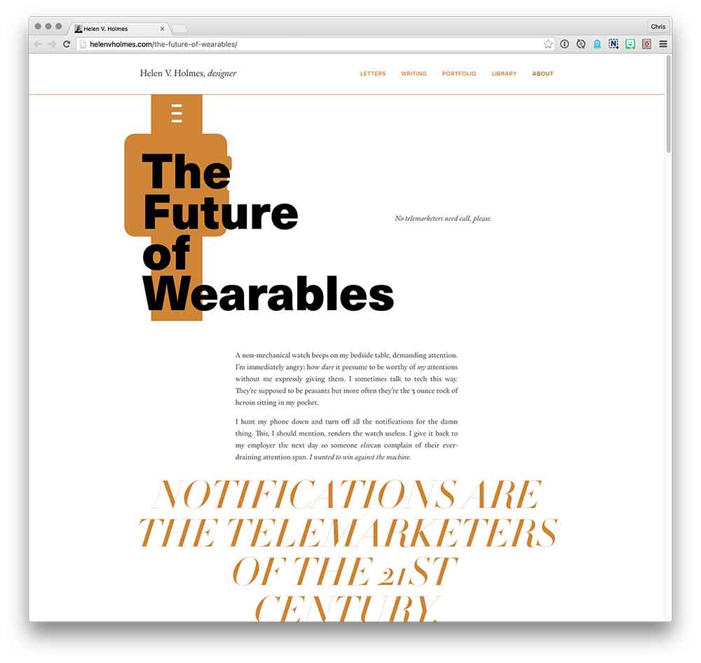
Helen V. Holmes is into the idea:
@chriscoyier I’m into that sorta thing (https://t.co/oPPnKAvvXR). Planning to do more. Really inspired by https://t.co/l07e3NHX9R.
— Helen (@helenvholmes) January 13, 2016
And she’s right about The Great Discontent:

Here’s another by Bart Veneman:
See the Pen Magazine layout – A piece of Pierce by Bart Veneman (@bartveneman) on CodePen.
This is kinda like “Art Directed Articles” right?
In some sense. I thought of those as one-offs that were sort of intentionally different from one anothers. It seems like a bit of a trend, but in looking back over the last 5-6 years, it’s maybe not so much a trend but just web designers stretching their arms once in a while.
Taking inspiration from print layout could be in the form of one-off articles, or entire sites.
Another thing attempted back-in-the-day: Treesaver. It was an attempt at automating these kind of layouts that was probably a bit before it’s time.
There is some pushback on this whole idea.
Some folks straight don’t like it.
@chriscoyier It's an excercise in futility that translates into non-productive burned hours and wasted $.
— John V. Petersen (@johnvpetersen) January 13, 2016
Ah well. You can’t convince them all.
Further Reading
- DESIGN MACHINES How to survive the digital apocalypse by Travis Gertz
- The Web’s Grain by Frank Chimero
I like how there’s a separation of content and ad in print. I think, I wouldn’t mind if those print-inspired layouts were interrupted by full-page (i.e. full-viewport) ads, instead of the current status quo, where content and ads compete for the same space.
Wired do this to some extent, in their longer articles which contain image slider galleries, every six or so the slider is interrupted by a slide containing an ad.
Google Adsense doesn’t have any “full-page” ads, and no one makes them, so I’d have to be like the print magazines and directly work with the vendors to create those large ads.
Sometimes I see pages that are dedicated to showing you an ad before redirecting you to a page, which seems pretty close to this idea, but this is even more annoying to me.
I liked most that you transformed green veggie-spreads in hamburgers!
ahem css off ahem
Oh I’ve been thinking about this a great deal in recent months, but magazines are certainly not the only area where typographic layouts are frequently, and unusually, inventive!
I’d certainly recommend books like Typographie by Emil Ruder, along with this book about Jan Tschichold. There’s lots more to recommend, of course, but these two stick out in my mind as being some of the most shocking, at least in terms of showing us new ways in which to organize graphic information.
Another few traits I’d love to see ported from Print would be how awesome print designers are complete experts of their craft and what mediums they are working with.
They are obsessed with paper AND all their different sizes (think devices)
They know how ink works with that paper (think HTML,CSS,JS)
They know and respect the entire printing process new & old
They embrace new printing technologies rather than bitch about them
Does anyone actually like reading newspaper-style columns? ..in a scrollable context?
I think many designers like the look of it.
One have to understand that printed paper and web is read differently. The typography is strongly related to the medium, being printed books and magazines for hundred of years, until now.
That being said, I do like some of the designs above and type lockup is something very neat. :)
I love the power we have now to design truly inspired layouts. I don’t want to call them print layouts ever for good reasons, I think. Print sure innovated these types of designs, but now we can push them further than print ever could.
My biggest concern with these types of articles is portability and to some extent maintainability. It’s fun enough to build these as a standalone page or site, but when enough of these are designed within a CMS (Content Management System), it can be really cumbersome down the road. The designs might not be super portable from one “theme” to another should the site go through a redesign process. They also may not get the tweaks and design updates they’ll need to stand the test of time.
That said, there are options to handle both of those concerns. If the article was written with a CMS, you might just say “heck with it!” and go back to your CMS’s default styling and layout. Not so bad, but a little sad for the designer. Another option would be to simply keep the old CSS for that particular article.
There’s also the option to do these outside of your day-to-day CMS. This means the sky is the limit, even if you lose some of the cool features (distribution, etc) your CMS might bring. But, maybe not. WordPress has this rad REST API thingy being worked on as we speak. This means you could build your own little site outside your CMS theme and edit/pull in all the data via your CMS.
To be clear, all of these concerns are relatively minor. This type of layout can be super fun to design and build, especially when motion and interactive elements are tied in. Love the article. I hope to see more of these layouts spread and some of the above concerns vanish.
This is a excellent information about how to separate the two things in html with css. Thanks a lot for this information.
This is certainly the way forward for web design. While web design can communicate a message and emotion well, print design does this a lot better. Print design has evolved over many years and always seems to have so much more freedom when compared to the web and the limitations the web has. Times are definitely changing because the technology is now available to web designers.
I like the idea of replicating print designs using css and I’m going to try a few of these myself. Great article.
I think this is a great excercise, I’ll try to do it when I get a chance…
as for the person who twitted it was a waste of $, it’s not it’ll make u a better designer and developer so you’ll be elegible for better jobs or projects.
The only thing I don’t like about these is that you either have to…
1) Somehow create a magazine layout that is easily reusable for many different articles/pages
or
2) Create a new magazine layout for each article/page
Either one will take a good deal of time. It may be worth it if you have that willpower/manpower/brains/time to do it, but I can’t justify anything like that for my own blog or anything.
I did this for a while, for a film magazine I created. Every page had custom artwork, fonts, css and js.
First (somewhere in 2011) with fixed layouts like this:
http://www.cultjer.com/magazine/article/a-dangerous-method-cover
And later with responsive layouts (up to 1920px wide):
http://www.cultjer.com/magazine-v2.0
You can see an overview of the articles here:
http://www.cultjer.com/magazine/article/
I tried to make it work down to IE8, so no fancy CSS, but every article had its own javascript. So I did try to do stuff like CSS Regions when it made sense: http://www.cultjer.com/magazine/world-war-z-or-why-zombies-never-needed-a-200-million-blockbuster
Most articles had some interactive element, but I see some don’t work anymore like the 3D spec that probably changed.
I still like the concept, but no one cares as much about design as the designers. There’s just no budget and no way to compete with expensive layouts in a world of clickbait articles, unless you’re doing some kind of fancy online magazine sponsored by Google. I think it makes sense when you have a big piece going up, that you know a lot of people will read. You see some big sites experiment with it, like The Verge in their important reviews.
But it’s really hard to justify coding for specific content. And when you start making layout elements re-usable, you start making them simpler and dumbing them down. When you get down to the size of a smartphone (which for many publishers is the main source of traffic), there’s really only so much you can do.