We were recently re-doing the signup page for Are My Sites Up, and we were looking at the way we were ordering our plans. At the time, it was from least expensive (free) to most expensive (Premium Pro). We looked around at a couple of other web services to see how they were doing it, and at first look it seemed like everyone was doing it the opposite way:


Of course, I’m not one to just up and do something just because everyone else is doing it. In looking around at more web apps, some people were definitely doing it the other way:


So, does it matter?
Well, ultimately, I switched AMSU around:


But I’m not entirely convinced it is going to have any effect. The only proof would be in the numbers, and our sales volume just isn’t high enough to have any hard-data comparisons that would be very reliable. So all we have to go on is gut instinct as a designers.
My own gut instinct is that it matters a little, but much more important is just overall layout and design fundamentals. First and foremost, the “plans” need to be clearly presented and everything needs to be easy and quick to understand. After that is accomplished, suggestive selling is more effectively accomplished through color and sizing than through order.

Funny how a small thing can have such a big effect on what we choose to buy.
-FireDart
I would think order is somewhat important. Personally when I see something like that I expect it to get more expensive from left to right.
Its kind of like when you go to the gas station and you accidentally press the “Super” button rather than the “Regular” because they’re ordered differently. The question is, was this done intentionally? I think so.
Have you ever seen it so the cheapest gas is in the middle? That really kills me. We could never get away with that on the web, influence is one thing but deception is another.
Yeah, my favorite is when the labeling doesn’t match the button.
Ugh, the gas station thing happened to me before. It did affect me…I never went back to that gas station again. I doubt someone would accidentally order the wrong price plan on a site like AMSU, but who knows. And if they did, would it negatively affect their opinion of the site like the gas station thing negatively affected my opinion of that station?
One thing that strikes me with the change is that now the list is more visually appealing to me with the greater color distinction between the feature and the pricing column.
Really like MailChimp pricing form, simple and effective;
great topic that seldom people talk about before.
Try to do a A/B Testing.
Thats actually not a bad idea. It would be interesting to see the results.
I agree. When I read this I simply thought that the best solution would to do some A/B testing with good ol’ Google Website Optimizer. That’s really the only sure fire way to know that you picked the best solution.
Exactly what I was thinking too. Analytics lets you do A/B testing BTW.
Susan M. Weinschenk in her book Neuro Web Design explains exactly why you should put the more expensive items first. You should always put the option that you MOST want the user to select at the far left. I don’t have my copy right in front of me, so I can’t pinpoint the exact quote, but I highly recommend you check out that book.
It’s short, but sweet, and answers questions exactly like this.
Dan referenced my book, Neuro Web Design… the research on persuasion tells us that:
a) the first choice gets picked a lot
b) if you have multiple choices based on price people will NOT pick the most expensive one…
c) if you have too many choices people won’t pick anything at all
Very interesting insights Susan, thanks for dropping in!
Interesting that people DO like picking the first thing, but the DO NOT like picking the most expensive thing, so this complicates things.
Do you put the most expensive thing first, since people like that? Or would you be wasting the power of the “first” because people won’t pick it anyway?
But then you wouldn’t want to put your free plan first, since you don’t really want people to choose that one….
I wish I could remember what book I saw this in, but there was a study that showed that, as Susan said, when there are multiple pricing tiers, people will choose to buy the less expensive options, because it seems like a deal compared to the more expensive option. But if you get rid of the most expensive, then the next tier down becomes most expensive so people avoid it, and, most interestingly, fewer people overall buy. So, in the end, the most expensive option exists not so people can choose it (though it’s nice when they do), but to convince more people to buy the cheaper options.
Chris, just wanted to say I have really enjoyed your videos and have learned tremendously from them. Thanks!
Along these same lines there is a great TED video on how we make very irrational decisions that seem rational and how by adding a choice or subtracting a choice can definitely change what we choose. An example in the video demonstrates this with multiple prices/options for the Economist magazine and is very surprising in the end result. This is a snippet about Dan Ariely the very entertaining speaker:
“Despite our best efforts, bad or inexplicable decisions are as inevitable as death and taxes and the grocery store running out of your favorite flavor of ice cream. They’re also just as predictable. Why, for instance, are we convinced that “sizing up” at our favorite burger joint is a good idea, even when we’re not that hungry? Why are our phone lists cluttered with numbers we never call? Dan Ariely, behavioral economist, has based his career on figuring out the answers to these questions..”
Here is a link to the video:
AWESOME video, thanks for sharing that! God I wish I could go to TED someday.
If I had to put some logic behind it, I would say that reading direction has a lot to do with it. Think about it like this:
If you’re reading starting with the top grade features, that immediately sets the baseline of expectations. With each further block, you start missing more and more of the features. Perhaps the opposite would be “Oh I don’t need that much” instead of “I don’t want to sacrifice that”.
…or it could be completely irrelevant. That works too.
Exactly! I just made the same argument below (you beat me by 20 minutes, haha).
A little tip / bug:
On your sign up page (aremysitesup.com/signup/) for step 2, where the user enter’s their details you should make the label of the form element clickable so that it puts the user’s cursor in the text box:
Label Name
‘for’ should match ‘id’
Other than that, the page looks awesome
It makes more sense to me to put the least expensive item first, so you can upsell users to the more expensive ones. One example of this is Apple’s site – you look at the first (least expensive) model, and then you think “hey, but if I spend just another $200, I can get this, this and this!” Before you know it, you end up with something you don’t really need because you keep justifying the relatively tiny increases in price.
When the items are sorted with the most expensive first, then you immediately see what you could get with the best option, and then anything less feels like a compromise. You end up thinking “I can’t afford that – I’ll have to settle for the thing underneath.” Even though it’s the same amount of money, it makes it feel like you’re losing rather than gaining.
@Chris: here’s an experiment you could try – what if you keep both variations of the form and load them at random? Then see how many people bought which package from which page (i.e., did more people buy the highest-end package when it was at the left or the right of the list?).
oops, looks like I forgot the code tags
Label Name
I find that looking for prices irritates me – pricing is important, especially on a list of price-dependent choices. Make me look for the price, and I will often walk away – I figure you are trying to finesse me, and I resent it.
I think listing expensive first, to the left, assumes that most visitors will be eager for the full service – making them look at additional options is meant to confirm that assumption. This presentation, most expensive to the left, implies that you have a full product, and progressively stripped down version.
Where different service levels represent realistic choices about features, then I think the free-first layout has value. This implies that visitors looking for a no-money solution find what they are looking for right off. Those that have are looking for a more substantial solution will cruise the chart, looking for the point where their needs and budget cross paths. I think the assumption with the “pro” or “commercial” option on the right is that each step is a valid decision point for some segment of your visitor community. And I think it feels a bit more respectful to the customer, even though the inverted “free-last” order may produce a larger bias toward the more expensive options.
We are so used to seeing the cheapest first that its easily to choose it and be done without considering the other options. James had a great post about this above, and I believe this is true. I can relate to being much more persuadable when seeing my options listed as most expensive option first.
Marketing theories come heavily into play when doing something like this, and I bet with a bit of research you will find a winner in how to list items and research that has been done.
I take the view that if the first thing that is seen is too expensive, people won’t stop to read the rest. Cheapest First.
I think going most –> least is best because it forces the reader to see the most expensive options. If least is on the left, I don’t need to read any further if I don’t want to spend any money.
Andrew, I 100% agree with you that customer/reader will not go throught the other options listed towards right. So going most -> least is better.
Do users visit a page, thinking “I want to see the most expensive item”?
My own experiences from using internet shops, is that I always sort by price: lowest to highest. Why would I want to pay more, when I can pay less? (Personally, I’d say this goes without thinking…)
For me, the Free column stands out more on the right side.
We all have an opinion as to which way WE prefer. But to know which is actually more or less effective you would need to conduct a usability test and judge on a case by case scenario.
For me, I feel like if the convention is to always see the cheapest item / service first and most expensive to the right, to go against that convention would seem like you are trying to trick people into picking something they were not looking for. That’s just my opinion though.
Ultimately, usability tests would show the best solution for YOUR product.
I have to agree with Sebastian. Opinions abound about topics like this, but the only way to know how your users will react is to do usability studies (and quick, easy ones are sufficient usually). Coming from a research background in human factors, I know that basing decisions like these on the personal preference of the developer, designer, business owner, etc. is rarely a good idea.
One point of interest — at least to me — is what I suspect would be different recommendations given on this issue by the marketing field versus the human factors (i.e., usability) field. Branson’s comment above referencing marketing theories got me thinking about how those two fields butt heads on a regular basis. Although some sort of happy median can usually be found, my experience is that there is usually a competing choice between the marketing goals and the usability goals (rarely do they agree). Personally, I try to lean toward making my users happy. Although my background makes me a bit biased, the fact that I’m a business owner with my own marketing objectives should help to balance that. …in theory anyway. :)
One final thought. James (June 12, 2009 at 9:30 am) suggests possibly loading the two versions of the pages at random and seeing how it affects purchasing decisions. As a user advocate, I would HIGHLY recommend against that, unless you’re doing it within a usability test. It’s quite possible that users could view your site once while doing research, and come back to it later to make the actual purchase (or choose the free option). If they happen to get a different version of the page when they return to it…well, I think it’s pretty obvious that confusion would be a likely outcome. The last thing you want to do is build resentment and distrust in your users. For something like this…stick to offline testing. But still, James, good idea to test it. :)
it depends on what and to whom (not to mention if they are commited to the sell already) you are selling. If you are selling Maserati’s, odds are price is not an option, features are, so go with Expensive on left. If you are selling gas, Cheapest on left. If your focus is on Amercian buyers, left to right is more natural..etc.
But of course, none of this matters when you want to “influence” the buyer….so most important goes left. . .
No right or wrong answer, let your profits dictate which works best.
Great roundup of pricing charts, if nothing else!
From experience, I can say that the way you present your content blocks will have implications on the implied priority of various elements. It also has influence on the workflow that you either expect a user to take or that you want a user to take.
Most people reading your site will be reading left to right. The same way we prioritize important items at the top of the page (because we read top to bottom), items on the left will seem to have more emphasis. Placing your cheapest package on the left will give it more visibility at the risk of users not seeing or paying attention to the premium packages. This is okay if it’s part of the usual workflow you’ve mapped out for your users (i.e. you expect free trials to organically lead to upgrades).
On the flip side, placing the more expensive plans on the left is a subtle way to lead the user to glance over the premium accounts first before settling on the freebie. Not saying that this will necessarily drive more premium signups, but it’ll increase awareness to some degree.
I think the more important strategic consideration to make is not the order in which you place your plans, but how you differentiate them from one another and whether you recommend a specific plan. Remember that a large number of options can cause choice paralysis (the inability to make any choice due to the multitude of options available). Even with only 4 plans, I’d suggest maybe highlighting the one you consider to be the ‘best’ plan for most users (doesn’t have to be the free one), and you may see better conversions overall.
Hey thanks for the post, it will be interesting to see the effect. Thanks for doing the searching on all the other services
I think more important than order is color. Still, if you offer a FREE service among paid ones, marketing has a little value. It applies only to attract and influence paying customers to chose a certain plan. In this case, I think the best way to go is to stress the “best value” option (both by position and color), as most people (who pay) do not go for the most expensive, but they often stay away from the cheapest option too. Just my 2 cents.
Definitely if you test it please, I’d love to hear the results. Maybe just an A/B test with Google Website Optimzer or check out Genetify (http://wiki.github.com/gregdingle/genetify). We come across this, somewhat in a different context, with products in emails and typically end up lowest to highest price.
Regardless all the examples in one place is a great gallery on it’s own.
Thanks for that link Kevin, that looks like an incredibly cool system, and easy enough for any of us to use.
When search engines search for sites and webpages, they look at the content closer to the top, and then go down. I suggest Least Expensive->Most.
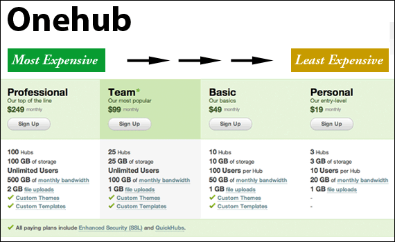
i think if leftmost column is a plan rather a name/description column then it looks better to use: more expensive (left) —- less expensive (right). like wufoo, onehub. otherwise keep the more expensive on right. like your old way. im also not convinced but let us know if you see any effect from your new version.
Nice question. But looking back to the past decisions, I had to make as a client, other aspects were much more important to me:
1. If the page design is the standard pastel-wordpress-style with blue liquid buttons, I am not ready to pay for the service. If it would be important to me to know when my sites down, I’d pay for your service without regard how you present your styles, because the page has something individual.
2. How can I pay? I recently didn’t buy Camtasia though I wanted it and the company is fine. But the payment procedure wasn’t clear enough in my European eyes and I the dialog froze. That’s the overkill. If you want Europeans to quote their credit card number you have to be very convincing.
Finally I would say: It is much more important that you present properly what your service is all about (this is indeed the case with your site). If this is easy to understand, I am going to make my decision however you present your pricing.
I think an important thing to note here is also that a lot of the other sites you listed (all but one) – list the price at the top near the name of the plan.
With the ones that list their price from least expensive to most expensive I think Ballpark, DropSend and Stay Valid do a great job with providing icons that seem to indicate very well that the further up the $$ tree you move, the more stuff you get.
This is a perfect case for using an A-B testing scenario – essentially just have both versions of the signup form on the site and see which attracts more signups. If you haven’t tried it yet – Google Website Optimiser (http://www.google.com/analytics/siteopt/splash) provides some nice functionality that could help you sort this out.
thanks for the link John
You could do A/B testing of both styles to determine which one give the greater sign ups at the higher price points.
Google Analytics is useful for that kind of thing.
That’s kind of what I was thinking. You could randomize the display, attaching an analytics call on each version and see which resulted in more sales (of course, you could really drill down into targeting specific demographics certain ways, but like you said, sales volume may not exactly make this amount of time/research that useful right now).
It’ll be really interesting to see if what the google analytics says. But, is any of this stuff really rocket science, because if we start second guessing it, then yes it is.
The basic principles of left to right are that the further away… the more effort the would be to read all the way through. Patterns are used so that effort is minimized and people can quickly scan through it.
People will quickly get the gist of value/package and we should generally see a small % of people picking packages nearer to the left.
Unless they’re Chinese. Then you just have to factor in for… are your target audience a bunch of opensource kids that cant/wont afford to pay. Then you have your answer! Which hopefully GA will backup. Happy days :D
Great post and really interesting! When do you think you will post a followup with results on how it worked out?
We have been planning to split test this same thing at Site5, we built a little program that does it by cookie so if the visitor returns later they see the same version as otherwise it would impact the test.
Looking forward to seeing results,
thanks, Ben
I think, more than ORDER, the graphical element influences thsoe who are trying to choose an option. The Ballpark site, with its “bar chart”, is DEFINITELY influential, with the most-options/ most-cost plan looking SO much more desirable.
Basecamp, too, with its “highlighted”, pulled-forward, larger-font choice labeled “most popular”…and the fact that it is NOT the most expensive option on the page, is motivation on a plate!
Having too MANY options is also a point. In my industry, you REMOVE from the dressing room the least-desirable dresses, leaving the customer 2 or 3 choices… more than that, and the customer starts feeling stupid, and when people feel stupid, they beat it outta there!
I vote for 3-4 choices, graphically presented. (Am I registered to vote? ;) )
The biggest thing that struck me is that a lot of the sites going from free to expensive (the well-designed ones, at least), really show, graphically, that the plans on the right are better.
In BallPark, the columns get higher and higher as they fill with features, which gives a user the physical “I want that” tingle.
In DropSend, they show the basket fuller and fuller with each upgrade. That also gives a user the idea that they actually HAVE something — it’s not just numbers.
I generally think that the cheapest plan should be on the left. As people read from left to right, it generally seems more logical. I don’t like it when sites get it backwards. It comes off as looking a bit like you’re trying to trick the end user.
Plus, if you offer a free plan, it’s better to put that front and center so you can get people to sign up, get hooked, and want more.
I think it is best to go greatest to least with a highlighted best offer. This way customers can see the features they are missing out on with the cheaper plan
I was just checking out a A/B testing solution called genetify… you could make it both ways and see which one sells more…
http://wiki.github.com/gregdingle/genetify
Have you considered only showing one price plan option on say the homepage, and then once the user clicks through, you can tell them more about that particular plan, and then maybe have a link to other plans that are available.
I don’t really think this falls under deception like with the petrol example though, for example many mobile companies show one tariff on their homepages, because it’s the tariff they are pushing at that time, but of course, others are available. Maybe this way people might be more keen on signing up for the first one they see, even if it is the most expensive.
I believe Jakob Nielsen’s latest alertbox-article is related to your question about pricing order, Chris:
http://www.useit.com/alertbox/guesses-data.html
Any research data > own/commenters opinions.
Nice work !