Color within Constraints
Here’s a fantastic piece by Linzi Berry about the design systems team at Lyft and how they work on their color guidelines:
On the surface color seems simple, but getting 100+ designers and engineers to follow guidelines that are a part of literally everything they make is a huge undertaking. To put it in perspective: over 50% of Lyft’s design system team’s office hours, high visibility projects and inner team disagreements are color related. We’ve learned a lot over the past three years. It sure as hell ain’t perfect, but it’s working pretty well so far.
This is partly the reason why, at Sentry, we decided to make two color systems: UIs and charts. For most of the UI we can work within an extremely small band of colors — buttons, text, etc. — because we often don’t need that much variation in styles. But charts most certainly do. And since our app has a whole bunch of complex chart variants then that helps us draw this line between them.
That distinction between UI colors and chart colors helps us keep things consistent. But also it’s worth noting that the problems Linzi’s team at Lyft are trying to tackle are much more complex, with hundreds of designers and engineers.

The failed promise of Web Components
Lea Verou made some notes about why Web Components failed.
Perusing the components on webcomponents.org fills me with anxiety, and I’m perfectly comfortable writing JS — I write JS for a living! What hope do those who can’t write JS have? Using a custom element from the directory often needs to be preceded by a ritual of npm flugelhorn, import clownshoes, build quux, all completely unapologetically because “here is my truckload of dependencies, yeah, what”. Many steps are even omitted, likely because they are “obvious”. Often, you wade through the maze only to find the component doesn’t work anymore, or is not fit for your purpose
Lea continues by arguing that we need a directory of vanilla web components out there and I’ve made the same case before. I think what we need is to understand why something like Bootstrap is so dang popular. Because every place I’ve worked at has copy-pasted this giant monolith of styles into their codebase because they don’t want to build things over and over again. How do we make this library easier to use than Bootstrap?
What we need, Lea argues, is a directory where you can pick and choose from hundreds of accessible interface elements (like tabs) that you can plug straight into your own project. Perhaps they’d have extremely light styles applied to them, but by default, they’d be designed to be changed to match the styles of your site.
Lea takes this idea one step further:
Only one component of a given type in the directory, that is flexible and extensible and continuously iterated on and improved by the community. Not 30 different sliders and 15 different tabs that users have to wade through. No branding, no silos of “component libraries”. Only elements that are designed as closely as possible to what a browser would implement in every way the current technology allows.
Perhaps there could be basic HTML, web component, React, Vue, and Angular versions of these same components though. Just to make it so embarrassingly easy to get things up and running.
Anyway, I love this idea. And I think it’s what all of us need to build on the web today.
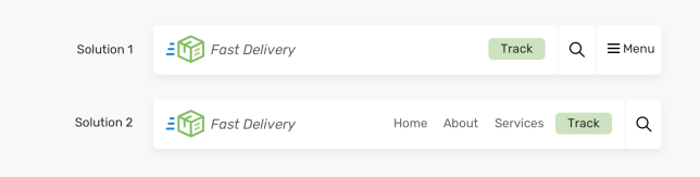
Building headers with CSS flexbox
Headers can be notoriously tricky to build, especially when it comes to making them responsive. There’s lots of navigation elements and sticky headers, dropdown menus and layout shifts for smaller screens. That’s why it’s great to read this post by Ahmad Shadeed earlier this week on how to build headers with flexbox.
Some might argue that it’s easy nowadays to make a website header as we have modern CSS layout techniques. That’s not the case as there are some interesting challenges to tackle.
Nova, a new code editor for Mac
There’s lots to love with Nova, Panic’s latest code editor app for the Mac, such as being able to run tasks right within the app itself.

Imagine building content, and with the single click of a button watching as Nova fires up your local server, grabs the appropriate URL, and opens a browser for you, instantly. Just think of the time you’ll save.
Neato! This seems extremely smart to me. But the design of the website is also lovely and worth taking a close look at: check out this animation when you hover over the download button:

Fancy onboarding animations
I’ve been following along with Jonnie Hallman’s blog where he writes about building out his freelancer app Cushion, and just the other day he made a note about some lovely onboarding animations once you submit this form:

I love this sense of progress you get from this background moving here. The animation doesn’t feel distracting or annoying and makes you feel like you can trust this app since they’d care about small details like that. Jonnie writes:
To make the animation as performant as possible, I separated each layer into its own SVG, so the browser would hardware accelerate them with the GPU. Otherwise, if you transform all the paths within a single SVG, the browser will rely on the CPU and repaint the canvas with each frame. Along with performance, I wanted the landscape to feel infinite. If I ever added another step to the onboarding, I didn’t want to also need to update the animation.
The Economics of the Front-end
Jim Nielsen about the economics of our front-end decisions:
From small scale to big, there is an economics to the front-end that shapes decision making. You can argue all day long about the proper client/server relationship in delivering HTML, CSS, and JavaScript, but to paraphrase Upton Sinclair: it is difficult to get someone to understand a certain way of thinking when their bottom line depends upon them not understanding it.
I don’t have any insight into how these sort of front-end decisions are impacted by saving a company money this way, but I do know that people think about saving money when it comes to shipping features and code. Is there a framework that can vastly decrease how much effort it takes to ship code to our customers that will make us money? I’ve only really heard these questions discussed when it comes to productivity, rather than “let’s move the complexity of building our app onto our customers devices.” Still a very interesting post though.

Sponsor
Sendbird Chat
An easy-to-use Chat API with a fully-managed platform on the backend means faster time-to-market. Build modern chat and messaging experiences with delivery receipts, offline messaging, presence, translation, moderation tools, and analytics.

Sponsor
Jetpack Search: Instant Results, Easy to Use
One of the biggest upgrades to CSS-Tricks in the past year is how search works on the site. Not only are the results better than before, but it was incredibly simple to set up, thanks to Jetpack Search. In fact, here’s a write-up on how we did it.
Would we recommend Jetpack Search on other WordPress sites? Absolutely. Like the search results themselves, we’ve seen instant improvement at CSS-Tricks since adding it and we think you’ll love it too.
Psst… Automattic is hiring! If you’ve been hunting for a new job, there are tons of openings and one of them might just have your name written all over it. Check them out!
[Chris]: I think it’s interesting to watch technologies play out over long periods. Sass is an interesting one, isn’t it? I’d say it’s still easily the most popular CSS preprocessor. But it was an unlikely journey. Sass spent most of it’s life as a Ruby language, which is a pretty heavy local dependency especially if Sass is the only thing you’re using it for. Features wise, while I think it offers the nicest set, languages like Stylus and Less really aren’t that different and have a handful of features of their own that are uniquely nice. And yes, Sass perseveres. Arguably, “next gen” CSS processing is here with lots of people using CSS-in-JS solutions. And still, using Sass within those is almost ubiquitous. Fascinating.
More abstractly, I think the idea of building websites from components is shaking out to be a long-term success story. Front-end technologies heavily trend in that direction. Designing in that way via design systems trend in that direction. Data that facilitates being requested arbitrarily from components trends in that direction.
Smart of Chromatic to build essentially a landing page for the idea: Component Driven User Interfaces. Toward the bottom, in the Tools section, it lists almost every single modern front-end tool and almost every single modern design tool.
I just re-published my slide-based essay ooooops I guess we’re* full-stack developers now which gets into more of my thoughts and personal experience with this.