Folding pages with CSS
Let’s kick things off this week with a remarkable demo from Amit Sheen where he’s made the pages of a book animate with nothing but CSS:

The trick? Every page is divided into 7 segments, each with its own animation.
It’s also worth checking out Amit’s other nifty CSS demos like this dancing Batman/Joker animation:

Hopefully we’ll get Amit to share some fancy CSS tricky over on the blog soon.
Introducing Rome
Whoa is the first thing I thought when I read about Rome the other day. Sebastian McKenzie, the creator of Babel, writes:
Rome is designed to replace Babel, ESLint, Webpack, Prettier, Jest, and others.
[…] Rome is the spiritual successor of Babel. I’ve taken the lessons I learnt, and refined the mission. Rather than exposing a large public API for other tools to be built on, we are building them all in one place, with batteries included. I’m excited to be trying something new that the JavaScript and web ecosystem haven’t seen before.
Just. Whoa. That sounds particularly ambitious and I’m excited to see where this project goes.
The drop-shadow CSS filter
”HUH!” I exclaimed loudly to myself in my empty room. I was reading this great post by Michelle Barker about how drop-shadow is an underrated CSS filter and ya know what? I don’t think I’ve ever used it before. You can use it to create a shadow on the non-transparent parts of an image just like in this example where Michelle compares this CSS filter to the trusty and ever-so-familiar box-shadow:

This is one of those posts where I read it and realize — aha! — I can use this thing right away in a project I’m working on at the moment, too.
content-visibility
Una Kravets mentioned this super interesting CSS property last week called content-visibility and alongisde Vladimir Levin, Una writes:
The
content-visibilityproperty, launching in Chromium 85, might be one of the most impactful new CSS properties for improving page load performance.content-visibilityenables the user agent to skip an element’s rendering work, including layout and painting, until it is needed. Because rendering is skipped, if a large portion of your content is off-screen, leveraging the content-visibility property makes the initial user load much faster. It also allows for faster interactions with the on-screen content. Pretty neat.
So I wonder if the right way to think about this is like lazy loading images, except for HTML content in a document. And the experiments in this rather excellent blog post suggest that this can have enormous impact on performance.
This seems all very related to the contain property which is also about teaching the browser about our page for rendering benefit. The introduction blog post gets into this, but the property is used as contain-intrinsic-size instead which apparently refers to the height (presumably the block direction length?). It also feels related to stuff like will-change where, more and more, authors are asked to provide information to the browser to help maximize performance.
I think the most interesting part of this is how content-visibility: hidden is like a cross between display: none and visibility: hidden. The behavior is more like display: none, except the “rendering state is preserved” making it, presumably, more efficient to unhide.
Looking for design inspiration?
There are a lot of sources for design inspiration out there and I often turn to Dribbble and Codepen to learn about what folks are messing about with when it comes to aesthetics and UI. But this weekend I was working on a project and realized I needed to see some Victorian-esque designs: typesetting, color usage, ornaments, etc. Where would I go for that?
And then I realized that the best place for that sort of inspiration is the mighty Fonts In Use, my favorite website about typography. It’s a wondrous archive of design and there’s just so many aesthetic quirks in these old prints, leaflets, and books that we can learn from and incorporate into our own work today.

After a few moments searching around I stumbled upon the exact style that I was looking to emulate. And perhaps it might help you out in the future, too.
Self-updating READMEs for GitHub
I spotted this fancy trick the other day from Simon Willison where he updates the new GitHub profile feature with the latest blog posts he’s written as well as any recent project releases.
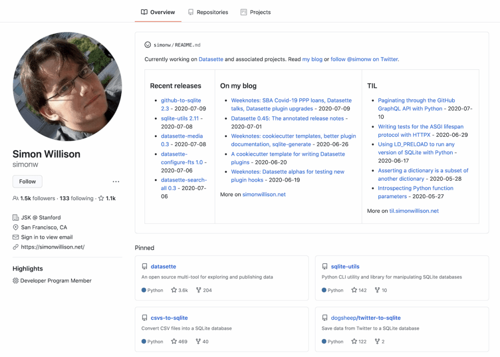
I like this a lot because GitHub profiles can act as resumes of a sort, letting folks know more about you than just the code you’ve written lately. Simon pulls this off by using a GitHub Action to run a Python script.
Fancy website of the week
I spotted this website for Sonuum just the other day as I was spelunking on the web—the app is sort of like Figma but for audio, in that multiple folks can work on a project at once. However! The website advertising the app looks particularly snazzy and breaks the UI apart as you scroll down the page:

The other thing I like about this Sonuum website is that it’s basically an argument. They introduce themselves and the product, show how it works under the hood, and then they let folks signup for the newsletter at the end. Just as I wrote the other day: I reckon the best websites are secret essays. In that piece I argued that thinking about websites as essays helps in a bunch of ways:
Every website that’s made me oooo and aaahhh lately has been of a special kind; they’re written and designed like essays. There’s an argument, a playfulness in the way that they’re not so much selling me something as they are trying to convince me of the thing. They use words and type and color in a way that makes me sit up and listen.
And I think that framing our work in this way lets us web designers explore exciting new possibilities. Instead of throwing a big carousel on the page and being done with it, thinking about making a website like an essay encourages us to focus on the tough questions. We need an introduction, we need to provide evidence for our statements, we need a conclusion, etc. This way we don’t have to get so caught up in the same old patterns that we’ve tried again and again in our work.

Sponsor
WordPress.com
Have an idea for a subscription business? Need to charge customers on a monthly or yearly basis for something, not just a one-off charge?
WordPress.com can do that for you. You connect your Stripe account (the best payment gateway out there!) and the rest is as easy as adding button blocks to your site. The UI your customers see is clean and clear, and the pricing is straightforward. The eCommerce plan pays no fees, the Business plan pays 2%, and the less expensive plans go up from there.

Sponsor
Deployment Previews for All
Shorten feedback loops, increase code quality & push stable releases. Get started today with a 2-week free trial.
[Chris]: I think we’re still in the early days of figuring out all the amazing possibilities in CSS with all the new features we have. We only got CSS grid and custom properties a couple of years ago, not nearly enough time for those things to settle out into solid best practices and tease out all the clever possibilities. And there are much newer things… consider min(), max(), and clamp(), which we only got in 2020.
Lea Verou recently wrote “Hybrid positioning with CSS variables and max()” where she pulls off a particular layout effect that is similar to position: sticky but had some particular nuances that she needed. Part of her solution is making information typically only known by the document and accessible via JavaScript accessible via CSS as well:
… we can use JS to set & update CSS variables on the root that describe pure data (mouse position, input values, scroll offset etc), and then use them as-needed throughout our CSS, reaching near-perfect separation of concerns for many common cases.
I’ve seen that used a lot in the wild. If I was a betting man I’d bet CSS gets access to this information eventually.
But my point is that this stew of CSS (custom properties, fallbacks, number functions, @supports) all came together to pull off one little layout thing, which is definitely not something the internet at large is doing. We need time to let these patterns come to life, and that’s a fun place to be.
Sometimes the behavior of these things is weird and unexpected. Jeremy latched onto one of these weird behaviors the other day. Consider his brain teaser:
:root {
  --test: green;
}
p {
  background-color: red;
}
p + p {
  background-color: var(--test);
}
p + p + p {
  --test: nonsense;
}
If there are three <p>s in a row on a page, clearly the first one is red, the second one is green… what is the third one? The background-color declaration that takes effect is the second one that uses a custom property. And that custom property is an invalid color value, so it should fallback to the last valid color value, which is red. But that’s incorrect. There will be no background color here, because the invalid property make it essentially evaluate to background-color: unset (per the spec). Tricky tricky!
