To kick things off this week, here’s a great post about how to add a gradient overlay to text with CSS. Sarah L. Fossheim walks through it all and I think it’s worth adding this technique to our toolbox since I don’t see this effect enough on the web:

Here’s a particularly nifty use of it in an animation for a button hover effect that Sarah shows off at the end of the post:

As I was looking through Sarah’s work I found another great post about how to recreate a Polaroid camera with CSS gradients. In this post, Sarah shows how that project got started and looks at each bonkers step along the way of making this absolute gem:

Speaking of which, this reminds me of this post about the “Chameleonic Header” technique which looks sort of similar to that button animation above but is done by adding multiple bits of HTML and hiding each new heading with a clip-path:

It’s a smart and beautiful technique!
Ana Tudor shows us how to weave a line through text in CSS and looks at an implementation by Florin Pop and then takes a few steps to improve it. I love this! The way that folks are riffing on the same ideas and building on top of them over time.

There’s a lot of accessibility problems with HTML and Dave Rupert has made a big list of issues that he’s keeping track of. I particularly like this bit of his rant though:
I’ve always abided in the idea that “HTML is accessible by default and then we come along and mess it up.” In a lot of places this is very true and by just using a suitable HTML element instead of a generic div or span we can have a big Accessibility impact.
But that’s not always the case. There are some cases where even using plain ol’ HTML causes accessibility problems. I get frustrated and want to quit web development whenever I read about these types of issues. Because if browsers can’t get this right, what hope is there for the rest of us. I’m trying to do the best I can, use the platform, but seems like there’s a dozen “gotchas” lurking in the shadows.
Not so long ago I was talking to a front-end engineer on my team and we were discussing where a lot of our design systems problems come from. We both came to the same source of the problem: it’s the HTML! There are so many missing elements and shortcomings and workarounds that are required to make HTML usable in a big design system that it seems something desperately needs to change.
This why I’ve come to the conclusion that we need HTML6 more so than we need a concerted effort like CSS4 or CSS2020. And that’s because the problems Dave outlines lie at the very foundations of the web. And I reckon all of us developers should make it clear to browser makers that we need help. And by batching up all of these different accessibility improvements together and branding it with a name like HTML6 would do wonders for getting everyone to care about something we’ve disregarded for far too long; accessibility and the markup.
We know, we know. Every day you wake up and ask yourself: “How do I make Animated Matryoshka Dolls in CSS?” You constantly refresh CSS-Tricks waiting for your demands to be answered and we’ve answered tens of thousands of emails from everyone about this subject. Well, thankfully Jhey Tompkins has resolved all of our burning questions by making this delightful animation:

Jhey walks us through how to create these lovely chaps by using the checkbox hack.
I wrote about why people believe that CSS is so frustrating:
I reckon the biggest issue that engineers face — and the reason why they find it all so dang frustrating — is that CSS forces you to face the webishness of the web. Things require fallbacks. You need to take different devices into consideration, and all the different ways of seeing a website: mobile, desktop, no mouse, no keyboard, etc. Sure, you have to deal with that when writing JavaScript, too, but it’s easier to ignore. You can’t ignore your the layout of your site being completely broken on a phone.
With just twenty-odd lines of CSS, Keir Watson makes a fully responsive fluid layout that includes responsively resizing multi-column elements. Here’s the before and after:

There’s a lot in the code to unpack, such as: what does grid-auto-flow: dense do? How does auto-fit work? Keir walks us through the whole thing and it’s packed with tons of CSS Grid information that I wasn’t aware of!
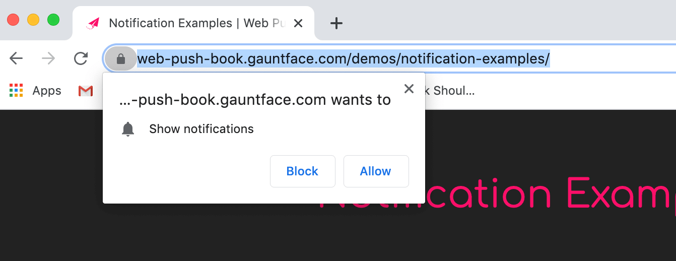
Jeremy Osborn accepted a browser notification and lives to tell the tale:
Notifications are typically triggered when you first visit a site, before you know if the content is any good (or even if you’re in the right place). Imagine walking into a store and immediately being asked for your phone number. Are you going to give it to them? No, no you’re not.
Furthermore, you’re going to be distrustful of every single interaction in the store from that point on. A browser notification demanding your immediate response is no different.
Jeremy’s argument here is a strong one: notifications are annoying and almost entirely useless on the web because we’re asked right away if you want to sign up. However! Jeremy argues that we can make user-friendly notifications when he was using a service called Otter that prompted him to be notified when an action was complete:

This is a great time to ask and is perhaps one of the only notification prompts I’ve seen that I would actually click on! I wonder if notifications on the web will ever really catch on though.
And finally, Garrett Dimon wrote this great piece about his relationship with front-end frameworks:
There’s promise in the front-end frameworks. They’re not entirely bad or wrong, but the gains in developer productivity shouldn’t come at the expense of the visitor. It may not be fashionable, but rendering usable HTML on the server and then sprinkling in progressive enhancement via CSS and JavaScript is still the best all around experience for the people visiting the site. That’s the direction these frameworks should be heading.

Sponsor
Sell CBD Online with WooCommerce
If you’d like to sell CBD products on your WordPress/WooCommerce site, you can! You’ll want to be complying with federal and state laws of course. And now, if you’d like to use things like Jetpack and WooCommerce Shipping & Tax, you can if you use Square as your payment processor. Here’s a page of guidelines.
