To kick things off this week, here’s a beautiful website all about a new typeface for coding called Recursive Sans and Mono. The nifty thing about this typeface is that it’s also a rather intricately made variable font, which means that it has a ton of customizable options to best suit our needs.

So effectively this is actually two separate typefaces in one font file. That means you can animate between the two easily if needs be! In the type specimen website there’s a great example of how to switch between these different options, or “axes”, with the CSS font-variation-settings property:

What does this mean? Well, it means we have all this control now that was previously impossible, we can maybe have more performant sites since we don’t need to download multiple resources, and we can animate text like so:

The example on the left is of a regular spaced font that’s switching between regular and bold, but the example on the right shows how since Recursive is a monospaced variable font there’s no need for that jarrring text jump. Interesting stuff!
Here’s a smart post from Manuel Matuzovic where he digs into why accessibility is so important for building websites:
Web accessibility is not just about keyboard users, color contrast or screen readers. Accessibility is a perfect indicator for the quality of a website. Accessibility is strongly interlocked with other areas of web design and web development. If your website is accessible, it usually means that it’s inclusive, resilient, usable, it offers great UX for everyone, and it’s fast.
I love this idea: that you can’t have a good UI that isn’t accessible. And how accessibility and performance and quality are all intermingled. This has me thinking though: I’ve never worked on a project where either accessibility, performance or UI quality was the problem. It’s all of them, always.
Sarah’s written a fantastic piece all about how to animate on the web with Greensock. She breaks down why you might want to use GreenSock over other animating methods, such as it’s really great API for doing the actual animating (whereas CSS animations can get a bit finicky if they’re complicated).
Here’s a great example where Sarah has connected a bunch of these animations together to show what’s possible:

Sarah also has a great course on Frontend Masters all about this stuff which is very much worth checking out.
Chris wrote about the joys of using NetNewsWire and Feedbin for reading RSS feeds and blogs:
I know a lot of people miss Google Reader, but I think we’ve arrived at an even better place after all these years. The UI for Google Reader was OK, but the main benefit was that it was the central place where everything synced together.
I completely agree! Not only is RSS today the best way to keep up to date with blogs from folks you admire but it’s also the best way (in this humble blogger’s opinion) to learn CSS and keep up with the web development world.
Chen Hui Jing has some notes about using the Web Speech API to make a funny website that will change the background-color of the page based on what color you yell at your browser. In the example below I screamed “blue” into it:
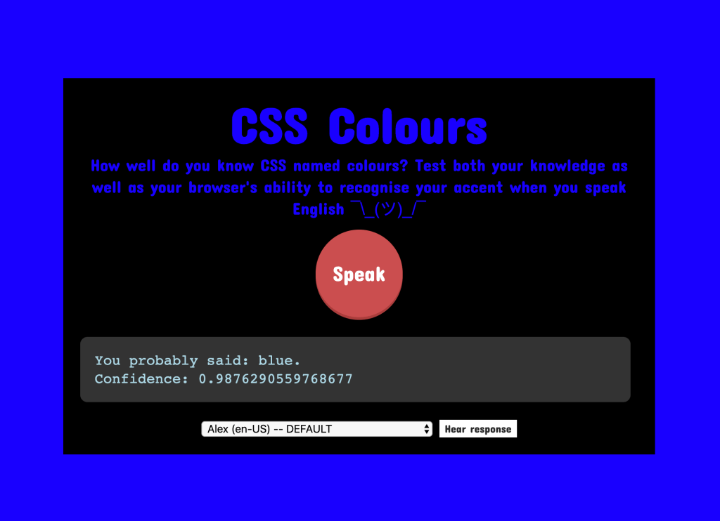
I love websites like this that experiment with a new technology that I’ve never seen before. I think this was definitely the first time I screamed at my browser and so it was only fitting that it was about CSS.
Ben Frain looks at how to recreate Material design’s effects when clicking with nothing more than pointer-events and some CSS custom properties.

This is a good reminder as to why CSS custom properties (or CSS variables as some folks call them) are just so helpful in our day to day work.
Jonnie Hallman’s newly redesigned personal site is rather lovely as it’s sort of like a little essay all about him and his work. It’s the perfect introduction to the history of his web design and development career and I might steal a bunch of his ideas for a redesign of my own. Anyway, he’s been blogging consistently in small bursts about the redesign process and I love everything about it.
Likewise, Frank Chimero’s redesign for his blog has been just as fascinating. Like Jonnie, he’s been building it all very slowly and meticulously, documenting his decisions such as picking typefaces and why he’s doing this out in the open so publicly:
…the web, by and large, has become a dumping ground for garbage. Most design content has become poor quality, surface-level content marketing that does more damage than good, because it offers over-simplified, misinformed perspectives dressed up as guidance. One hardly gets the sensation of lived experience and professional acumen in the words. When the experienced don’t write, grifters step in, feign expertise, and sell it.
I feel like my problem with design in general today is that folks want to burn everything to the ground and start again all the time. Whether that’s with a website, a new web standard, a design system, or even with a political policy. Most folks don’t want to fix what’s wrong with things bit by bit, as everyone would rather jump to Thing 2.0 whilst ignoring all the small and incremental improvements that are required to get there.
And I think that’s what I find so exciting about Jonnie and Frank’s writing—progress is made slowly today. Step by step.

TinaCMS
Most clients expect developer-built sites to be as intuitive as Squarespace or Medium. TinaCMS is an open-source CMS that gives your Gatsby and Next.js sites real-time editing capabilities… a next-gen CMS for next-gen sites :)

Jetpack
Have you found yourself wanting more blocks when writing WordPress posts in Gutenberg? Jetpack gives you access to some great options, including this one that makes it ridiculously easy to drop in a slideshow wherever you’d like. And that’s just one block out of more than a dozen, not to mention all the other benefits that are baked right into Jetpack, including extra custom post types, social media integration, downtime monitoring, and a word-class CDN. It’s actually kinda wild how much you get in a single plugin.
